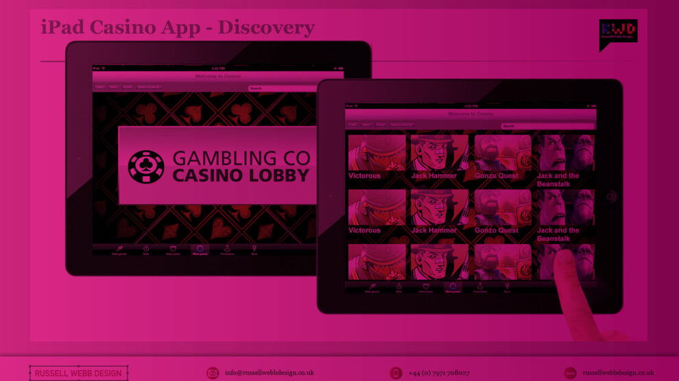
1.0 Aims and Objectives
To produce the best-in-class iPad and iPhone App for playing slots and table games.
Recently I was involved in conceptualise and leading the UI for a iOS casino App for both iPhone and iPad. I’m not going to detail all design decisions here but walk you through my perspective on why branding for this product is so important and why the decisions made differentiate it enough to stand-out in what is already a fiercely competitive and crowded marketplace.
2.0 Brand Identity
Initial brain-storming indicated ‘Casino’ as a brand name would be used to it’s full across the whole offer, this was to:
- Remain consistent with desktop
- Indicate to third parties and affiliates what was the offer
- Follow conformity
Various graphic devices options where then presented Business for consideration.
2.1 Textured luxury
Raising brand awareness with patterns and textures
Whilst decisions were being made on logo and logo name, a selection of background imagery as a more graphically rich design route was also developed. This was to take advantage of the the new retina displays available across the iOS range. .
2.2 People and lifestyle
A sense of excitement
Top level design direction was still up for grabs at this point. Making the connection with the potential audience this direction introduces that vital ‘human’ element. Maintaining an overall clean and modern aesthetic
More James Bond than James May2.3 Vegas showtime
A sense of excitement
Using vibrant and almost over-saturated imagery, this route focuses on that thrill the punter should get each time they play. Using high-gloss imagery this visual language brings home a true ‘showtime’ experience.
2.4 On-brand and build awareness
Red for impact
Building on the positives of gambling, and on the variety of games available this red-hot branding direction both differentiates the product and indicates that this casino has something in the way luxurious then its competitors.
What next?
Options for:
So, in summary, as the lead UX’er and here, the lead UI designer I balanced wearing these two hats to produce both thr visual UI and the build on the Brand Identity to add value at the UX level
- Sleek and clean or Bubblegum and glossy
- Consistency versus new brand
- Visual look n’ feel
Conclusion
Again, the overall visual direction was still yet to be determined. This walk-through was on my perspective on why branding for this product is so important hopefully illustrates why ideas and concepts, at this stage, should be the primary driver.
If you can engage your stakeholders, get buy-in from your product owners and, through design, win over the hearts and minds of the whole team then, and only then, as a UX designer can you say you’ve done your job well.
Get in touch
This is but part of a selection of design comment russellwebbdesign generated for the creative community out there. Please contact us further to discuss if your brand really wants to benefit from this new immersive experience here:
info@russellwebbdesign.co.uk
If something has peaked your interest. Please leave a comment below.


