Category: +Blog Special

Editor’s picks: Discover a curated selection of exceptional blog content, handpicked by the editors.

  • Redefining Consent Mngt

    Redefining Consent Mngt

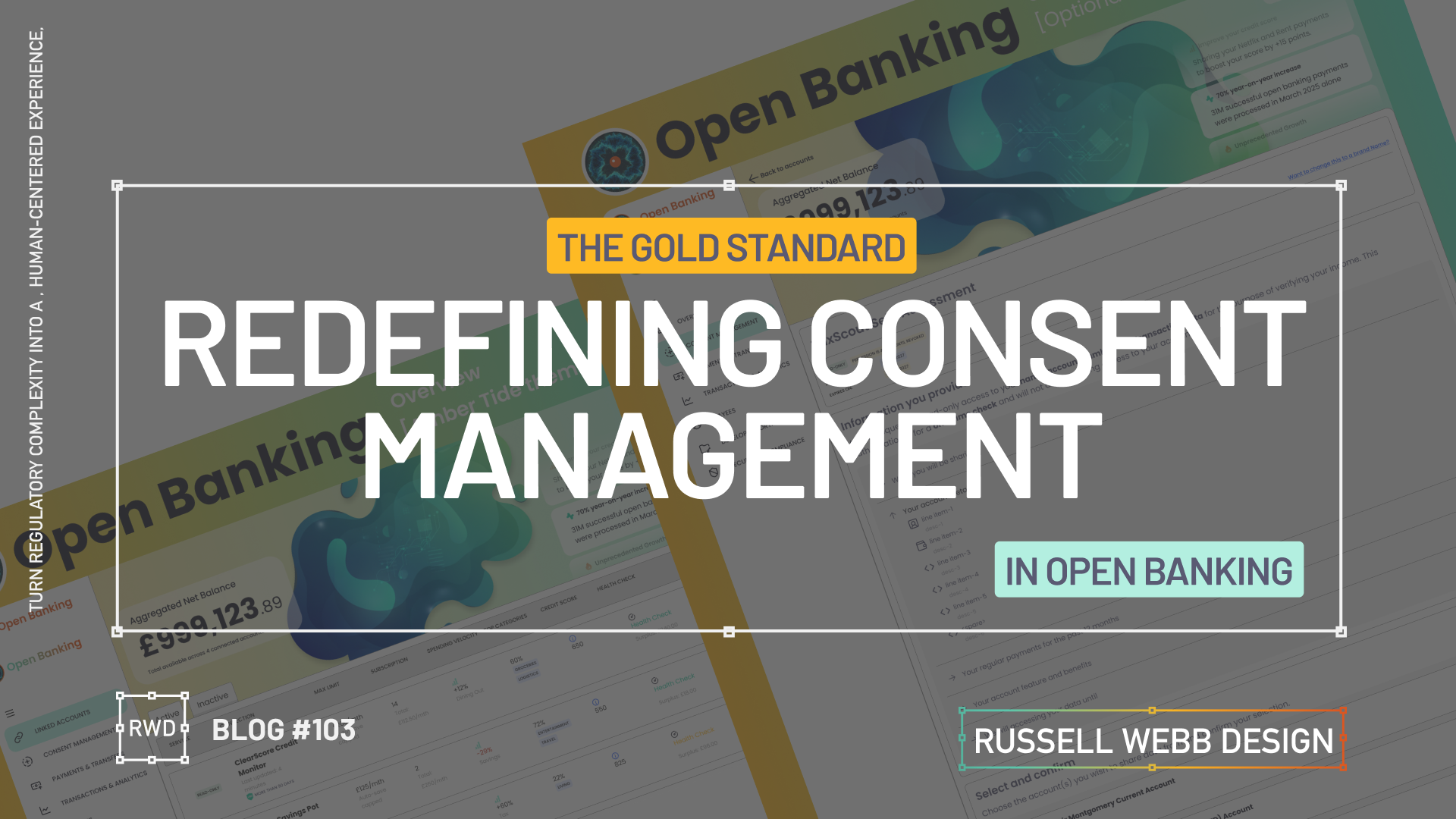
    Turn regulatory complexity into a human-centered experience, showing enterprise-level strategic thinking across three touch points.

    The Challenge

    Section 1

    Dashboard UX

    Front End UI

    Back End Data Systems

    Take a cluttered data dump and re-org with applied IA principles to prioritise key metrics.

    Understand API constraints and latency through the developers eyes, ensuring the UI is designed gracefully while loading large datasets.

    Goal 

    Implement the Account Information Service Provider (AISP) flow for Open Banking on desktop. Provide users with aggregated financial insights within a complex data Dashboard from multiple sources.

    Secondary Goal: Demonstrate strong understanding of FE interactive design solutions for BE data systems.

    The Problem

    Open Banking consent is inherently complex and intimidating, leading to high drop-off rates and regulatory fines.

    Strategic Opportunity: Design a Consent Management Dashboard that not only meets legal requirements (i.e. PSD2, CMA) but also builds trust, by making the flow transparent and effortless.


    Business & User Goals

    User Success Metric: Allow users to manage their third-party connections with confidence and clarity.

    Gathering the principal players

    This case study hinges on transforming a fragmented jigsaw of data into cohesive, high-trust UX that fosters familiarity and security.

    UX Writing

    AI UX Designer

    Data Points

    Thinking entity to symbolise Open Banking

    This AI-UX designer employs the hybrid model:

    Human

    Journey designing, API and BE driven integrations, and user needs

    A simple AI prompt

    Create an abstract amorphous image, a ‘thinking’ entity for a financial dashboard using gradient blues and green

    Navigation

    An action-oriented, collapsible side nav needs to balance financial utilities (i.e. linked accounts and permission-driven consent) while managing who has access to what.

    To respect confidentiality agreements, the branding and specific naming have been modified. This product is currently live and serving 6k users

    Defining the Gold Standard Row Content

    API > Actionable

    Prompt; Nano Banana

    Shift the data from static information to high-trust insights. By balancing security indicators (timestamps, verified credit boost), the interface transforms complex Open Banking API calls into a true financial dashboard.

    To respect confidentiality agreements, the branding and specific naming have been modified. This product is currently live and serving 10K plus HNW users.

    Lessons Learnt & Outcomes

    Section 3

    DATA retention

    Human-readable insight

    The Just-in-Time Model

    Cognitive overload

    Data retention

    Revocation & Renewal

    The Takeaway: The “Off-Ramp” (revocation) is just as important for trust as the “On-Ramp” (onboarding). A Progressive Disclosure model for revoking permissions prevents information overload.

    • Outcome: A two-step confirmation modal for revocation.
    • Opportunity: Separating expired consents (< 90 days) from older data (> 90 days) could better inform users about long-term data retention policies.

    High-Trust UX

    Dashboard UX

    Security

    Using IA to instil trust

    The Takeaway: Consent shouldn’t feel like a legal hurdle. It should feel like a security feature. By moving away from a data dump to applied IA, the complexity of PSD2/CMA requirements is rebranded as a transparency benefit.

    • Outcome: Gold Standard Row Content model that translates technical API calls into human-readable insights.
    • Opportunity: Logical Chunking can reduces cognitive friction, adding a I do not recognise flow with Fraud warning capability goes that extra step.

    Component variants: Designing a data-rich responsive Figma table row and cell components with auto-layout should be set-up with component variants, giving the flexibility to swap in complementary formats for differing data points.

    Cell Design: For the ultimate flexibility, component cells should be stacked in a vertical AL column, set to (W) Fill.

    Outcomes

    The project proved that prioritising transparency and control in regulatory design is the highest leverage move. Focus on clear FE design, BE clarity, and the details (i.e. 90 day consents) to transform a legal requirement into a trust-building feature.

  • Solving complex user problems

    Solving complex user problems

    💳 This Case Study focuses on Payments.

    🧠 This Case Study uses AI: For corrective grammatical tasks, to verify facts and corroborate Journey Mapping insights.

    🔒 Details are protected by NDAs – Customer outputs have been disguised. UX best practices remains.


    My E2E Design Process

    ENTERPRISE

    automny

    🚀 From Discovery to Design and Solution

    01Problem Statement: Create a user-friendly and simplified mobile journey that helps seniors mitigate their fraud anxiety, meet financial regulatory standards and ultimately manage their finances to make informed financial decisions within the ecosystem of UK Payments (i.e. improve their financial wellness).

    02 Segmentation: Identify distinct segments within the “aging parent” demographic (e.g., healthy retirees, chronic conditions, single parents). Target a segment that can most benefit from a mobile journey, particularly the UK Payment process.

    03 Research & Strategy: Use quantitative data with qualitative insights to inform a Customer Journey Map. Visualise the financial and emotional challenges faced by each segment, across a given scenario.

    04 Wire framing Design Decisions: Making trade-offs and delivering a justified UX solution.

    05Conclusion & Outcomes – Key takeouts on why this case study successfully translated a complex real-world business problem into an initiative UX wireframe and Final UI flow.


    Problem & Challenge

    01.01

    Complex

    Regulatory

    Senior user groups face significant barriers to mobile adoption, especially with the complexities of a Payment flow.

    Obstacles: Fear of fraud | High cognitive load | Digital literacy gaps.


    Design challenge: Create a simplified and intuitive Payment journey, incorporating robust security and multi-steps required to meet regulatory standards.

    Current flow: High transaction abandonment and increased financial stress.

    Low-anxiety mobile payment

    01.02

    Financial Fears

    1. Map out a diverse range of seniors’ on a specific financial journey.
    2. Identify recurring frustrations and unmet needs to form themes.
    3. Design System: Execute a learned solution to solving senior financial wellness for this highly complex task.

    My experience consistently highlights that fear of fraud, cognitive load and digital literacy are major barriers to successful task completion for seniors. These fears are amplified during critical tasks like payments with multiple cognitive and security demands.

    Teams struggle to create a mobile payment flow that simultaneously meets modern security standards (e.g. multi-factor authentication, biometric prompts, COP) that minimises transaction abandonment, locked accounts, and user financial anxiety.

    Business problem | Design challenge

    01.03

    Robust

    Multi Step

    Unclear Alerts

    Balancing the need for a simplified flow, with the need for a robust, secure multi-step flow – required to mitigate fraud anxiety and meet industry standards – is the biggest challenge

    • Simplify complex tasks 
    • Prioritises key information while safeguarding users from fraud
    • Offers context-sensitive, proactive (not crisis-driven) support tools

    Pain points: Unintuitive interfaces, difficulty with small text/controls, fear of scams/fraud, loss of control, and lack of support, unclear fraud alerts, and difficulties with two-factor or biometric authentication. 

    👉 Complex flows increase cognitive load


    Segmentation

    PERSONAS

    🧠 These Personas use AI: To qualify primary and personal experience, to generate profile photography and clarify vocabulary.

    To respect confidentiality agreements, the branding and specific naming have been modified. This product is currently live and serving 6k users

    Tech-Savvy

    02.01

    Retired professor of English Literature

    “I’m not afraid of technology, but I want it to be simple and intuitive. I shouldn’t have to read a manual to figure out how to use something basic.”

    Tech-Wary

    02.02

    Retired accountant

    I’m old-fashioned. I don’t need all these fancy gadgets. I get by just fine with what I have.”

    High-Net-Worth

    02.03

    Focus: User-friendly interface, advanced features like budgeting tools, investment tracking, and retirement planning calculators.

    Caregiver-Dependent

    02.04

    Focus: Features that enable family members or caregivers to assist with financial management, such as shared access, bill pay assistance, and alerts for suspicious activity.

    Single-Senior

    02.05

    Characteristics: May face unique financial challenges such as navigating retirement income on a single income, planning for long-term care, and estate planning.

    “Sandwich Generation”

    02.06

    Characteristics: Still providing financial support to adult children while managing their own retirement needs.

    Personas Take-outs: 

    • Accessibility: Visual impairments, cognitive decline, and physical limitations. i.e larger fonts, high-contrast colours, and voice-activated controls.
    • Personalisation: Adapt to individual needs and preferences.
    • Security: Prioritise security and privacy, protecting seniors’ sensitive financial information. i.e. reduce anxiety
    • Promote financial wellness and stress management: Offer tools and resources to help the Sandwich Generation manage stress and prioritise their own financial well-being.

    Research & Strategy

    Journey Mapping User Profile

    03.01

    Explore the specific scenario for a Tech-Wary senior, with a lack of support, and simple banking needs:

    Journey Mapping Scenario: She receives a paper bill in the mail. She has a basic current account with a local bank branch, but prefers to handle her finances in person. However, the nearest branch is now closed, and she has limited access to reliable internet.


    ‘Make a payment’ Journey Map

    03.02

    Cognitive decline

    Reduced steps

    Fraud anxiety

    To respect confidentiality agreements, the branding and specific naming have been modified. This product is currently live and serving 10K plus HNW users.

    Design Decisions

    Making trade-offs and delivering a justified UX solution.

    04.01

    Peronalisation

    Agile mindset

    Make a Payment

    UX designers are re-writing their playbook when creating the UK Payment digital experiences. Using native mobile patterns that provide a white glove experience, reacting to task-orientated user needs.

    1. The Accessibility-First Mindset

    Inclusive Design from the Start: Not just meeting legal standards incl. WCAG, but ensuring it’s a shared team responsibility to implement descriptive alt text for images and proper and strong visual cues (colour, icons, etc) for assistive technologies.

    2. ‘Hand-Holding’ experience

    Mobile patterns are evolving, guiding users through their tasks with minimal friction, Personalisation and Progressive Disclosure all reduce the cognitive load.

    3. Task-Oriented Patterns

    The goal is to help users complete their objectives as efficiently and effortlessly as possible. Push-back on nice-to-haves

    The ‘Make a Payment’ Journey, simplified

    04.02

    Business logic

    Data

    From 13-Steps;

    1. Start – Presenting the primary task. Establish task focus.
    2. Select payment type – Define the transaction context to enable contextual filtering.
    3. To > From – Source and destination mapping.
    4. Existing or New Beneficiary – Slightly prioritise recall (existing payee) over data entry (new payee) to reduce user effort.
    5. Confirmations of Payee – Critical security check. Provides reassurance.
    6. Payment details – Ensure the payment’s purpose is accurately communicated.
    7. Scheduled – For future payments as a secondary payment path.
    8. Fraud Warnings – UX mechanism to initiate a Reason for payment.
    9. Review – Single-screen summary allowing the user to execute the F-pattern check.
    10. Authorisation – A strong authentication layer (e.g., biometric, PIN) to prevent fraud.

    To 4-steps;

    1. The What – Initiation and Context
    2. The Who – Beneficiary and Destination
    3. How Much – Transaction Details and Customisation
    4. The Final Check – Execution Preparation

    Wire Framing Design Decisions

    04.03

    From 13 > 4

    Customer Journey Mapping: Visualise the financial and emotional challenges faced by each segment across their lifespan.
    Simplified: The “What” – Initiation and Context | The “Who” – Beneficiary and Destination | “How Much” – Transaction Details and Customisation | The Final Check – Execution

    Wireframes opportunities

    One Action Per Screen

    04.04

    DEVELOPMENT ALIGNMENT

    To avoid overwhelming the user, limit a screen to have a single, clear primary action only. This approach reduces cognitive load.

    Input fields with dual functionality

    04.05

    DUAL FUNCTIONLITY

    While active, focused and error states are expected these components should be default for both Existing Beneficiary and New Beneficiary reducing two mini journeys to one i.e. no read-only state for Existing Beneficiary.

    04.05

    SNEAK PREVIEW


    To respect confidentiality agreements, the branding and specific naming have been modified. This product is currently live and serving 6k users

    Conclusion & Outcomes

    This case study successfully translated a complex real-world business problem into an initiative UX wireframe and Final UI flow.

    By using research and design tools to uncover critical pain points, I designed an E2E ‘Make a Payment’ journey with feature parity, respect to development needs with native patterns integration within a comprehensive Design System, balancing security standards with essential user simplicity.

    05.01

    Enterprise UX UI

    Delivered in 3 Mths

    • Key stakeholders audience established 2-months before proposed Sprint through workshopping and client relationships.
    • Pain points highlighted early, including CoP, Secondary payment reference and scope (i.e Feed and FX was descoped)
    • Cross platform UX and UI for Alpha release delivered and demo’d in 3-months
    • Developer and BA handover scheduled early for estimation and to provide clarity
    • Design System integrated and UX Copy Check signed-off
    • No deadlines missed 🙂
  • Blank Canvas to Digital Playground

    Blank Canvas to Digital Playground

    A Designer’s AI Experiment

    As a UX designer, I’m always looking for ways to streamline my workflow and push creative boundaries. So when I heard about Figma’s new AI capabilities ‘Make’, I had to see it in action. Can a tool quickly prototype a complete, narrative-driven landing page from scratch? I decided to put it to the test, and the results were more than I expected.

    From Uninspired to Unstoppable

    My goal was to create a modern, experimental landing page for a creative digital business. The AI prompt was simple yet specific:

    "Design a landing page for a creative digital business with an emphasis on design experimentation, digital visuals, and technology."

    What happened next was a fascinating look into the future of design.

    AI PROCESS

    The AI at Work

    From a blank canvas, the AI started to work its magic.

    Ignite Your Imagination: Transform Your Blank Canvas into a Digital Playground

    After a few more minutes, the result was a fully designed, visually rich landing page.

    Breathe Life into Pixels: Watch Your Digital Playground Emerge from a Blank Canvas

    The AI interpreted my prompt and delivered a bold hero section with eye-catching gradients, a featured work gallery with interactive cards, and sections dedicated to services and industry trends.

    Responsiveness

    Seeing the Design in Action

    The AI handled responsiveness very impressively. A mobile-first approach today is essential, the tool automatically created a transition for different screen sizes, providing solutions for interactive elements and flawless responsiveness.

    The Big Question

    Validation or Innovation?

    After seeing the final product, I’m left with a profound question: Did this tool save time, or did it save me from a necessary part of the creative process?

    There’s no doubt that the AI delivered a solid foundation, tackling about 60% of the work with remarkable speed. It created a baseline of good UX patterns and clean code.

    However, as a designer who lives and breathes this work, I have to ask: Are our (human) base-level patterns enough, or should it challenge us to push web design further?

    Stop Dreaming, Start Building: The AI managed to capture responsive versioning too.

    Powerful, but…

    While this technology is powerful, it comes with a few caveats:

    • It’s currently an Enterprise-level feature, locked behind a paywall.
    • The feature must be enabled by an administrator. There is cost, and a credit count

    For now, these tools can save us from the mundane, repetitive tasks. But the real magic of design, the element that makes a project truly stand out is the unique human perspective. It’s the storytelling, the subtle emotional cues, and the a-ha moments that only a human designer can bring.

    So, while AI can build the foundation, I believe our role is to continue pushing the boundaries, ensuring that every design tells a meaningful story.

    What do you think? Is this the future of design, or just a powerful new tool in our creative arsenal?

    Discover high-impact UX case studies

    Portfolio case studies describing design, my UX process, and business impact.

    From boosting user adoption in fintech, to improving trust with responsible gambling through to retaining Millennials in the world of ‘digital lotteries UX’ to leveraging key USPs for mobile healthcare.

  • Raising the bar for customer-facing support UX

    Raising the bar for customer-facing support UX

    TLDR: An AI-Powered Customer Service Revolution – AI is transforming customer service by offering personalised solutions, and UX plays a crucial role in creating intuitive and engaging CX.

    Revolutionising Customer Service

    AI-Powered Solutions for Financial Institutions

    AI revolutions

    Personalisation

    Discover how AI is transforming customer service in the financial industry. Learn about personalised knowledge bases, integrated chatbots, and unified customer histories that enhance customer satisfaction and operational efficiency.
    To respect confidentiality agreements, the branding and specific naming have been modified. This product is currently live and serving 6k users

    Imagine a world where customer service is not just efficient but truly personalised.

    The Challenge: In today’s fast-paced digital age, financial institutions face the challenge of providing exceptional customer support while maintaining operational efficiency.

    Traditional customer service UX often falls short in meeting the diverse needs and expectations of modern customers.

    The Solution: This case study explores how AI can revolutionise customer service by creating seamless support and behind-the-scenes tools that put people and businesses in control of their money.

    User research and UX Design

    Ability <> Access <> TIME

    Quick

    Facts

    HIstory

    What the product needs to accomplish.

    Evidence informs that Customer Service Representative (CSR) typically operate on multiple panes of glass. Extracting snippets of information to help customers, within the guardrails of their abilities, their access and a timeframe (a phone call). How can this be combined, for the CSR, and potentially for self-serving customers?

    Three persona-types, three outputs;

    1. Mr ‘Self-service’; They need a tool highlighting quick-and-easy answers to their questions, without having to contact a CSR.

    CSR can also provide support and is able to troubleshoot issues and resolve customer problems to deeper issues.

    2. Mrs ‘To-the-point’; Some customers want only the facts, escalating issues to a human CSR when necessary.

    3. Mr ‘Analytical’; CSRs need to have a complete understanding of a customer’s history in order to provide effective support.

    Developing a user centred mode

    To respect confidentiality agreements, the branding and specific naming have been modified. This product is currently live and serving 6k users

    Machine learning

    Self-Service

    knowledge Hub

    Chatbot

    Chatbot

    Personalised recommendations, automating routine tasks, (like FAQs) and predictive analytics are just some of the benefits Machine Learning has in the field of UX Customer Service.

    It was clear for this project there was no one silver bullet. Providing a suite of support from self-service to employing Natural Language Processing (NLP) can all contribute to improving the overall customer experience. Understanding the wealth of possibilities Artificial Intelligence can provide, there was a focussed on three key areas: 

    1. Personalised Knowledge Base

    An AI-powered knowledge base that proactively suggests relevant articles or FAQs based on the customer’s specific query. More about ‘Proactive Suggestion’ later.

    2. Integrated Chatbots with Human Handoff

    Allowing the AI to analyse customer sentiment enables the bot and the CSR to tailor their responses to better meet customer needs and improve satisfaction.

    3. Unified Customer History

    A centralised platform that provides agents with a complete view of a customer’s interactions, including past inquiries, support cases, proactively alerts, and account history.

    History

    Trends

    knowledge Hub

    Proactive Suggestion

    AI can anticipate customer needs and offer solutions before the customer even asks through machine learning algorithms (customer’s history, product information and industry trends ) to predict proactively.

    For example: recommending accessories to recently purchased items, offering troubleshooting tips if a customer has contacted support multiple times, etc. 

    Here the AI recognises this customer has recently been the victim of fraud (see Account Overview note). The right sidebar offers a platform for the UI to proactively generate helpful links to the CSR before they have even asked.


    Self service

    conversational UI

    Unified History

    Process and Impact

    Refined wireframes, optimise self-service and conversational AI

    Starting with several wire-framed directions, then through osmosis filtered down concepts to self-service, a conversational UI and omnichannel integration within the form of a centralised platform. Based on experience and number of assumptions, wireframes were generated to bolster clarification.

    Variants evolved in parallel that merged into a winning model for all three proposals;

    Self Service and Hyper-Personalisation 

    Proactively suggestion, relevant articles and FAQs

    A Personalised Knowledge Base empowers customers to self-serve, with dual-function to help CSR agents to provide targeted support. Aligned to business objectives, these external and internal tools thrive on individual customer data, preferences and behaviour.

    A Personalised Knowledge Base empowers customers to self-serve, with dual-function to help CSR agents to provide support.
    The Customer

    Customers are presented with a user-friendly interface to reduce wait times. Empowered customers can self-serve by searching for documents, tutorials (or anything), related to their query. They have prompted categories to help with Discovery and personalised topics that are trending today. 

    On login, the user is greeted with an app-like interface. This contemporary approach guides them through top-level categories, i.e. Personal and Business finance, then using a navigation as a signpost they are able to drill-down on an Account Overview and User Guide. Tailored topics are surfaced (based on search and account history) within the sidebar quick links.

    The interface has push-points throughout all sections both introduce AI recommendations and provide personalised AI financial insight.

    The CSR

    Using the same B2C interface, CSR agents can access and add-to content, generate most frequently asked self-service tutorials and use the Knowledge Base to improve their own skills.

    Conversational Interface with Human Handoff

    Human-AI Hybrid 

    A smooth transition from AI chatbot, with ‘sentiment analysis’ baked-in, to a human agent 

    An AI chatbot that can handle simple inquiries but seamlessly transitions to a human agent when the conversation becomes complex or requires personalised assistance. This hand-over reduces agent workload for routine queries which improves customer satisfaction with faster responses, but also ensures a smooth transition to human support when needed.

    Chatbot Journey

    From Start through Engagement to Conclusion 

    Natural Language Processing (NLP)

    Gauge customer emotions from an AI-Chatbot that uses sentiment analysis baked-in.

    Properly trained, the AI can recognise the underlying intent behind customer queries, even if expressed differently and provide the right hand-off to the right CSR.

    Unified Customer History

    360˚ View

    A centralised platform | An assistant that proactively spot patterns to anticipate customer needs

    A centralised platform that provides agents with a complete view of a customer’s interactions, including past inquiries, support cases, account history and proactively alerts. For example, if a customer is nearing their contract expiration and has a high purchase frequency, the platform could proactively offer renewal terms or upsell opportunities.

    A single platform to access all customer interaction data: 

    • Reduces the need for customers to repeat information 
    • Enables agents to provide personalised and informed assistance
    • Spot patterns and insights that might inform business decisions
    • Anticipate customer needs and provide timely solutions with proactive support
    To respect confidentiality agreements, the branding and specific naming have been modified. This product is currently live and serving 6k users

    Reduce workload

    Data Insight

    Personalisation

    360˚

    Outcomes, split by discipline

    It is clear that AI enhances personalisation, efficiency, and problem-solving. But how can UX leverage these to create a more human experience.

    Business Outcomes:

    • Operational Efficiency: AI streamlines processes and reduces agent workload.
    • Data-Driven Insights: AI provides valuable customer data for informed decisions.
    • Cost Reduction: AI automates tasks and reduces operational costs.

    UX Outcomes:

    • Personalisation: AI can tailor the Self-Service experience, and brings Hyper-Personalisation to individual needs.
    • Seamlessness: AI integrates chatbots and provides a unified customer view.
    • Proactive Support: AI anticipates customer needs to find answers fast and can provide that 360 view at-a-glance.

    UX & AI | Future-proof partners

    Overall, UX and AI empowers businesses to deliver exceptional customer experiences, improve efficiency, and gain that competitive edge.

    Empowering users with the financial tools they deserve. From Mastering Design Theory and Lean Agile, Solve big problems, fast to How delight and speed are rewriting our UX playbooks. See more Case Studies.

    Empowering users with the financial tools they deserve

    • Mastering Design Theory and Lean Agile
    • Solve big problems, fast.
    • How delight and speed are rewriting our UX playbooks

    More Fintech Case Studies

  • Pt I – Money Management App UX Challenges Explained

    Pt I – Money Management App UX Challenges Explained

    A two-part deep-dive focussing on mobile UX design targeting seasoned designer-types, mastering Design Theory, and navigating lean Agile challenges.


    Hard Skills:

    Journey Mapping

    Research

    Visual Design

    Soft Skills:

    Empathy

    Collaboration

    Critical Thinking

    Full List →


    Welcome to Pt I

    Real-world app design challenges by persona

    This two-part case study will be exploring UX design challenges within the financial ecosystem that different flavours of UX designers can face. Part I focuses on why wealth management apps are becoming super relevant and how certain UX designers experience different challenges.

    Along the journey, I will also be supercharging the project objectives;

    • Catch-up feature parity
    • Prioritising critical features
    • Stakeholder education (Design Systems)

    Let’s kick off by asking ‘What type of UX-er are you?’

    Silvr Bank – Europe’s Best Digital Bank*

    *Silvr Bank is a fictitious organisation but these are real-world challenges I have experienced in real-world projects with real-world clients.

    The overarching goal with Silver Bank* is to design an interface for a thriving Generation X user group, with an emphasis on growing the fledgling millennial users – i.e mobile-first. The C-level were looking to expand and improve their digital offer.

    3,000 employees | 85 branches | 2nd biggest player in its market

    What type of UX-er are you?

    UX Designer types – How UX designers approach their challenges depends on many factors. Experience, background and where a designer is on their journey are all influencing characteristics.. 

    The challenges are many, so to focus this case study and depending on where you are in your UX journey, both as an individual and within a team, I have split these challenges in to three typical UX professional personas;

    • Mr ‘UX-design-is-completely-theoretical’ Designer
    • The brainstorming UX Designer
    • The UX Consultant on-a-mission

    In this post, let’s drill-down on challenges faced by our first persona;

    Mr ‘UX-design-is-completely-theoretical’ designer 

    This designer is at the beginning of their journey. They are a sponge, soaking up the design thinking processes and navigating their way through YouTube UX tutorials. Along the way they do need to get their hands dirty and experiment. To push back on theories, effects and laws. Learn to go with their gut and develop that inner self, that inner individual designer.

    Laser Focussed on Design Systems and Best Practices

    Design Systems from Hell – The benefits of a fully functional Design System are clear. Consistency. Speed. Best Practice. Collaboration. But when there isn’t a dedicated team or individual maintaining Component and updates. This is when the theoretical designer falls down and you get four bottom sheet options for iOS.

    Maintenance of a fully functioning Design System has its own set of challenges. Inevitable non-creatives will ask;

    1. For a ‘Design System’, where are the outcomes for non-creatives? 
    2. Who and how is it maintained (and who pays for it)?  

    Product teams will inevitably be looking for final deliverables they can understand (and charge for). This typically manifests itself as desktop and mobile UI screens. So while your designer is focused on perfecting their Design Token Figma file, the rest of the team are simply waiting for consistent UI.

    Get you hands dirty… then give-back

    Experienced designers learn their trade. The rest gain practical knowledge while learning the theoretical way. So experiment, make mistakes, try again, share your experiences, and then give these lessons back to the design community as an experienced designer. [For example, this post]

    (Too much) user experience psychology

    Which option matches which theory. The real skill comes for a UX designer to cut through the noise and go with the science. I have my opinion – Do you?

    Theories and Laws can become overwhelming;

    • Retention Theory – Proportion of the information vs. time spent on a page
    • Serial-Position Effect – Recollection of the first and the last in a list of words
    • Hick’s Law – Response to multiple stimuli is delayed forcing user to ‘stay longer’ 
    • The Schema Theory – Human brains like to organise knowledge into meaningful units, or schematas 

    … I could go on, (my go-to is personally Gestalt Principle). From another perspective, and another theory:

    Humans are fickle creatures, they don’t follow the rules.

    These theories alone can help with design decisions, but there is no ABC, no tried-and-tested foolproof formula. So make the intelligent choice, be brave and go with your instincts.


    Explore other perspectives on money management challenges

    You now have a snapshot on why these management apps are so prevalent from one designer type perspective. But what challenges do other UX designer types face, see Pt II – Money Management App UX Challenges to explore how experience and perspective can influence the challenges and solutions you may face as a certain designer type.

    RussellWebbDesign: Get your fill of UX trends, case studies and best practice
  • Part 1; How being more consultative can sooth the UX process – COVID Special

    Part 1; How being more consultative can sooth the UX process – COVID Special

    TL;DR; Boost your workflow without breaking a Zoom sweat in this COVID-friendly remote special.

    Simplify KO’s, pinpoint problems, and find your perfect toolset—faster than a remote ping. Discover the limits of your daily grind. Then, unleash the life-saving power of Dual Track UX Delivery as a consultative designer. ‍ 


    Hard Skills:

    Journey Mapping

    Research

    Visual Design

    Soft Skills:

    Empathy

    Collaboration

    Critical Thinking

    Full List →


    This is Part 1 of a two-part article looking at improved Ways of Working from a consultative UX perspective. I will be concentrating on;

    Jump forward to Part II, I will be deep-diving into;

    • Real world examples
    • Ways of Working
    • Dual track UX
    • Signposting
    • Conclusion
    • My Top 9 Take-aways
    (more…)