Category: Graphic Design

Graphic design surpasses aesthetics, igniting ideas, forging connections, and driving action. This collaborative process, involving clients, designers, and producers, crafts impactful visuals that resonate and inspire. It’s about understanding, influencing, and ultimately, sparking action through the power of visual communication.

  • 5 Radical Google Font Pairings

    5 Radical Google Font Pairings

    5 Radical Google Font Pairings for Creative Portfolios (That Actually Work)

    …for Creative Portfolios

    Typography is the closest thing digital design has to a physical texture. 

    It sets the temperature of a website before a user even bothers to read the copy. Yet, a quick browse through most online portfolios or creative brand identity kits reveals a sea of the same corporate safety nets: polite, clean, and entirely forgettable sans-serifs.

    If you’re designing a creative web portfolio or shaping a fresh digital brand identity, playing it safe is a one-way ticket to blending in. You need typography that brings a distinct vibe—something tactile, human, and unapologetically bold.

    But here’s the rub for digital product teams

    How do you inject raw, avant-garde personality into a website without completely tanking your accessibility?

    The secret lies in the friction between display and utility. You use a high-energy, radical font to establish the brand’s vibe in your headings, then anchor it with an incredibly stable, highly legible typeface for the body text.

    This lets you smash the design mould while maintaining the proper contrast ratios, semantic heading structures, and effortless readability that screen readers (and search engines) love.

    Here are five radical, high-contrast serif and sans-serif Google Font combinations built to give your next digital project an instant edge.

    1. The High-Fashion Brutalist

    Syne + Fraunces

    • The Vibe: Art-direction heavy, avant-garde, and structural.
    • Why it works for Digital Teams: Syne (especially in its Extra Bold weight) is aggressively wide. It acts like a structural beam on the screen, which naturally forces you to write short, punchy headlines—brilliant for keeping a webpage scannable.
    • The Accessibility Anchor: Underneath that heavy geometry, Fraunces steps in as a contemporary, slightly “wonky” serif. While it has beautiful organic details at large sizes, its regular weight at 16px provides crisp contrast and brilliant x-height readability, ensuring long-form text remains completely accessible.
    Fraunces [Headline]Syne [Body]

    Verdict

    Fraunces as a headline font, especially in bold is a winner. DIgigital Designer by its nature is grounded on screens and associated with technology, the future. Pivoting this to embrace traditional printing press technology, represented by the serif of the letter shape.  

    While Syne is an effective body font, the slightly elongated lower case letterforms do give the impression to the uneducated eye that they have been manipulated. The ‘loops’ are not perfectly circular, especially in the italic mode. This is a personal choice, but this purposeful imperfection doesn’t sit well with me. Let’s move on..

    2. The Liquid Acid & Editorial 

    Climate Crisis + Instrument Serif

    • The Vibe: Kinetic, fluid, and heavily expressive. Brilliant for digital studios focused on motion or interactive design.
    • Why it works for Digital Teams: Climate Crisis is an asymmetrical, melted variable display font. It functions almost like a graphic shape on the canvas rather than plain text, instantly changing the mood of a landing page.
    • The Accessibility Anchor: Pairing a melted font with a chaotic body font is a usability nightmare. Instead, ground the page with Instrument Serif—an elegant, razor-sharp, traditional serif. The extreme contrast between the fluid headline and the ultra-refined text body gives you that high-end editorial feel without sacrificing screen-reader navigation.
    Climate Crisis [Headline]Instrument Serif [Body]

    Verdic

    Climate Crisis is successful as a display font, but also is rooted in counterculture, youth rebellion and expanded the definition of personal freedom. If this is your aesthetic, then it works well. Stick to max 3 words, explaining your message in the subtitle.

    Retaining and traditional headline font (Fraunces) and pairing it the the Instrument Serif immediately shouts class. One is taken back to a time when The TImes was the single source and the newspaper of choice, when reading was a privilege and serif fonts were de rigueur. As a readable font and provide a smart alternative to the digital mass that is out there.

    3. The Neo-Grotesque Punk

    Germania One + Space Grotesk

    • The Vibe: Raw, industrial, and sub-cultural. Equal parts Bauhaus and digital zine.
    • Why it works for Digital Teams: Germania One is a radical hybrid of traditional blackletter and clean geometric shapes. It brings an instant street-level authenticity to a creative brand kit.
    • The Accessibility Anchor: To make this punk aesthetic actually work on the modern web, pair it with Space Grotesk. It’s a stark, wide, highly legible sans-serif with just enough subtle, quirky tech accents to mirror the headline’s attitude, while keeping the open counter-spaces needed for comfortable reading on mobile screens.
    Germania One [Headline]Space Grotesk [Body]

    Verdict

    Typefaces can also represent certain movements, and can be very symbolic. Germania One has this connotation, unfortunately for the wrong reason. Although very stylish, with strong (on purpose) letterforms, the link to the National Socialists renders this font unusable – for me.

    4. The Chiseled Cyber-Classic

    Cinzel Decorative + Bricolage Grotesque

    • The Vibe: Over-the-top drama meets modern code aesthetics.
    • Why it works for Digital Teams: Cinzel Decorative brings sweeping, mythological flourishes and extended terminals to the screen. It is loud, theatrical, and intensely cinematic.
    • The Accessibility Anchor: Balance the theatricality by anchoring the paragraphs with Bricolage Grotesque. This highly contemporary sans-serif features compressed counters and a robust, modern structure. It keeps your layout grounded and legible, proving that high drama can still play nicely with inclusive web design.
    Cinzel Decorative [Headline]Bricolage Grotesque [Body]

    Verdict

    Bricolage Grotesque is a solid choice and it has an admirable pedigree. The stumbling block arises when a designer wants to portray professionalism, but the headline font Cinzel Decorative pushes its Art and Craft decorative past too much. Sweeping uppercase mantles combined with expressive tail sweeps as characters descend below the lower baseline can contradict that professional edge. If you are looking to be ironic, or make an alternative statement – you should use it..

    4. The Max-Contrast Screen Impact

    Oi! + DM Mono

    • The Vibe: Loud, pop-art, and unapologetically bold.
    • Why it works for Digital Teams: Oi! is a twisted, ultra-fat slab serif that refuses to be ignored. It acts as an instant focal point on a landing page, making it a brilliant tool for statement brand identities.
    • The Accessibility Anchor: Because the headline is so heavy, the eye desperately needs breathing room to process the rest of the information. Pairing it with a clean, lightweight, mechanical monospaced font like DM Mono creates the perfect functional offset. Monospaced fonts provide a distinct “maker” aesthetic while keeping text layout completely predictable and readable for users with visual or cognitive processing differences.
    Oi! [Headline]DM Mono [Body]

    Verdict

    Oi! is an interesting ultra-fat slab serif contender. It is very striking, but conversely this can also lacks eligibility. It is very pop-art and communicates a strong visible message, less so as a headline of a design / business problem.

    The Golden Rule for Web Typography 

    Creative personality lives in your <h1> and <h2> tags; accessibility thrives in the <p> tag. 

    By letting your display fonts handle the brand’s raw energy while your body text handles the heavy lifting of legibility, you can build digital experiences that are both breathtakingly creative and effortlessly usable for everyone.

  • Raising the bar for customer-facing support UX

    Raising the bar for customer-facing support UX

    TLDR: An AI-Powered Customer Service Revolution – AI is transforming customer service by offering personalised solutions, and UX plays a crucial role in creating intuitive and engaging CX.

    Revolutionising Customer Service

    AI-Powered Solutions for Financial Institutions

    AI revolutions

    Personalisation

    Discover how AI is transforming customer service in the financial industry. Learn about personalised knowledge bases, integrated chatbots, and unified customer histories that enhance customer satisfaction and operational efficiency.
    To respect confidentiality agreements, the branding and specific naming have been modified. This product is currently live and serving 6k users

    Imagine a world where customer service is not just efficient but truly personalised.

    The Challenge: In today’s fast-paced digital age, financial institutions face the challenge of providing exceptional customer support while maintaining operational efficiency.

    Traditional customer service UX often falls short in meeting the diverse needs and expectations of modern customers.

    The Solution: This case study explores how AI can revolutionise customer service by creating seamless support and behind-the-scenes tools that put people and businesses in control of their money.

    User research and UX Design

    Ability <> Access <> TIME

    Quick

    Facts

    HIstory

    What the product needs to accomplish.

    Evidence informs that Customer Service Representative (CSR) typically operate on multiple panes of glass. Extracting snippets of information to help customers, within the guardrails of their abilities, their access and a timeframe (a phone call). How can this be combined, for the CSR, and potentially for self-serving customers?

    Three persona-types, three outputs;

    1. Mr ‘Self-service’; They need a tool highlighting quick-and-easy answers to their questions, without having to contact a CSR.

    CSR can also provide support and is able to troubleshoot issues and resolve customer problems to deeper issues.

    2. Mrs ‘To-the-point’; Some customers want only the facts, escalating issues to a human CSR when necessary.

    3. Mr ‘Analytical’; CSRs need to have a complete understanding of a customer’s history in order to provide effective support.

    Developing a user centred mode

    To respect confidentiality agreements, the branding and specific naming have been modified. This product is currently live and serving 6k users

    Machine learning

    Self-Service

    knowledge Hub

    Chatbot

    Chatbot

    Personalised recommendations, automating routine tasks, (like FAQs) and predictive analytics are just some of the benefits Machine Learning has in the field of UX Customer Service.

    It was clear for this project there was no one silver bullet. Providing a suite of support from self-service to employing Natural Language Processing (NLP) can all contribute to improving the overall customer experience. Understanding the wealth of possibilities Artificial Intelligence can provide, there was a focussed on three key areas: 

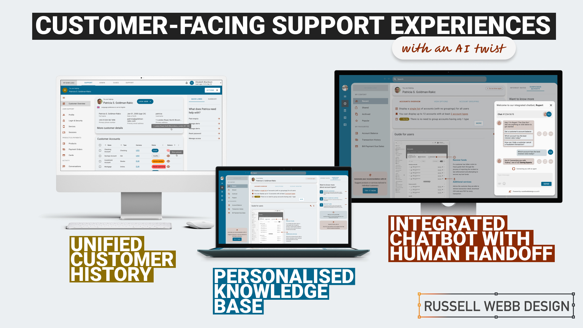
    1. Personalised Knowledge Base

    An AI-powered knowledge base that proactively suggests relevant articles or FAQs based on the customer’s specific query. More about ‘Proactive Suggestion’ later.

    2. Integrated Chatbots with Human Handoff

    Allowing the AI to analyse customer sentiment enables the bot and the CSR to tailor their responses to better meet customer needs and improve satisfaction.

    3. Unified Customer History

    A centralised platform that provides agents with a complete view of a customer’s interactions, including past inquiries, support cases, proactively alerts, and account history.

    History

    Trends

    knowledge Hub

    Proactive Suggestion

    AI can anticipate customer needs and offer solutions before the customer even asks through machine learning algorithms (customer’s history, product information and industry trends ) to predict proactively.

    For example: recommending accessories to recently purchased items, offering troubleshooting tips if a customer has contacted support multiple times, etc. 

    Here the AI recognises this customer has recently been the victim of fraud (see Account Overview note). The right sidebar offers a platform for the UI to proactively generate helpful links to the CSR before they have even asked.


    Self service

    conversational UI

    Unified History

    Process and Impact

    Refined wireframes, optimise self-service and conversational AI

    Starting with several wire-framed directions, then through osmosis filtered down concepts to self-service, a conversational UI and omnichannel integration within the form of a centralised platform. Based on experience and number of assumptions, wireframes were generated to bolster clarification.

    Variants evolved in parallel that merged into a winning model for all three proposals;

    Self Service and Hyper-Personalisation 

    Proactively suggestion, relevant articles and FAQs

    A Personalised Knowledge Base empowers customers to self-serve, with dual-function to help CSR agents to provide targeted support. Aligned to business objectives, these external and internal tools thrive on individual customer data, preferences and behaviour.

    A Personalised Knowledge Base empowers customers to self-serve, with dual-function to help CSR agents to provide support.
    The Customer

    Customers are presented with a user-friendly interface to reduce wait times. Empowered customers can self-serve by searching for documents, tutorials (or anything), related to their query. They have prompted categories to help with Discovery and personalised topics that are trending today. 

    On login, the user is greeted with an app-like interface. This contemporary approach guides them through top-level categories, i.e. Personal and Business finance, then using a navigation as a signpost they are able to drill-down on an Account Overview and User Guide. Tailored topics are surfaced (based on search and account history) within the sidebar quick links.

    The interface has push-points throughout all sections both introduce AI recommendations and provide personalised AI financial insight.

    The CSR

    Using the same B2C interface, CSR agents can access and add-to content, generate most frequently asked self-service tutorials and use the Knowledge Base to improve their own skills.

    Conversational Interface with Human Handoff

    Human-AI Hybrid 

    A smooth transition from AI chatbot, with ‘sentiment analysis’ baked-in, to a human agent 

    An AI chatbot that can handle simple inquiries but seamlessly transitions to a human agent when the conversation becomes complex or requires personalised assistance. This hand-over reduces agent workload for routine queries which improves customer satisfaction with faster responses, but also ensures a smooth transition to human support when needed.

    Chatbot Journey

    From Start through Engagement to Conclusion 

    Natural Language Processing (NLP)

    Gauge customer emotions from an AI-Chatbot that uses sentiment analysis baked-in.

    Properly trained, the AI can recognise the underlying intent behind customer queries, even if expressed differently and provide the right hand-off to the right CSR.

    Unified Customer History

    360˚ View

    A centralised platform | An assistant that proactively spot patterns to anticipate customer needs

    A centralised platform that provides agents with a complete view of a customer’s interactions, including past inquiries, support cases, account history and proactively alerts. For example, if a customer is nearing their contract expiration and has a high purchase frequency, the platform could proactively offer renewal terms or upsell opportunities.

    A single platform to access all customer interaction data: 

    • Reduces the need for customers to repeat information 
    • Enables agents to provide personalised and informed assistance
    • Spot patterns and insights that might inform business decisions
    • Anticipate customer needs and provide timely solutions with proactive support
    To respect confidentiality agreements, the branding and specific naming have been modified. This product is currently live and serving 6k users

    Reduce workload

    Data Insight

    Personalisation

    360˚

    Outcomes, split by discipline

    It is clear that AI enhances personalisation, efficiency, and problem-solving. But how can UX leverage these to create a more human experience.

    Business Outcomes:

    • Operational Efficiency: AI streamlines processes and reduces agent workload.
    • Data-Driven Insights: AI provides valuable customer data for informed decisions.
    • Cost Reduction: AI automates tasks and reduces operational costs.

    UX Outcomes:

    • Personalisation: AI can tailor the Self-Service experience, and brings Hyper-Personalisation to individual needs.
    • Seamlessness: AI integrates chatbots and provides a unified customer view.
    • Proactive Support: AI anticipates customer needs to find answers fast and can provide that 360 view at-a-glance.

    UX & AI | Future-proof partners

    Overall, UX and AI empowers businesses to deliver exceptional customer experiences, improve efficiency, and gain that competitive edge.

    Empowering users with the financial tools they deserve. From Mastering Design Theory and Lean Agile, Solve big problems, fast to How delight and speed are rewriting our UX playbooks. See more Case Studies.

    Empowering users with the financial tools they deserve

    • Mastering Design Theory and Lean Agile
    • Solve big problems, fast.
    • How delight and speed are rewriting our UX playbooks

    More Fintech Case Studies

  • Protected: Portfolio Gallery

    This content is password-protected. To view it, please enter the password below.

  • Using Experience Maps to plot your Customer Journeys

    Using Experience Maps to plot your Customer Journeys

    TLDR: Understanding your users through persona building and experience mapping helps uncover critical user needs across the customer lifecycle.

    This is a continuation from the article ‘Digging deeper to understand your users‘, I urge to read this to gain a better understanding on the UX process and concepts within this post.

    (more…)
  • 10 considerations when designing for mobile

    This is the first 10 steps to take your mobile design skills to the next level

     Watch the animated version here

    10 Considerations For Mobile DesignWhen designing for the desktop you can consider the end-user environment, when designing for print you can picture where the magazine will be read but when design for mobile the end-user scenarios are so varied and so far ranging that todays savvy mobile designer needs to develop an entirely different skill set.

    Mobile Meet Up - Glassblowers in London's SohoThis is the edited version of a presentation I gave at Mobile Meet Up on Tues 27th Sept about ‘10 key considerations when designing for mobile.  I must stress this doesn’t mean there are only 10, in fact it’s the opposite, there are many more considerations. But here are my top 10:

    1. Real Estate


    10 key considerations when designing for mobile

    Whether you coming from a desktop background or from advertising the canvas size you have to pay with is drastically reduced on the mobile environment.

    Over the years the relative screen size difference has increased. The difference between the smallest (128 x 128) and the largest (800 x 480) is now a factor of 23. That means the largest screen is 23 times bigger than the smallest one.

    2. Design with distraction front-of-mind


    10 key considerations when designing for mobile
    (more…)
  • Our vision for Shopping on Mobile Web

    TLDR: El Corte Inglés, a retail giant, needs a mobile app refresh to captivate customers and boost sales. Create a seamless shopping experience with: intuitive navigation, media-rich content, that is mobile-optimised Features and has a streamlined checkout to transform their UX into a powerful sales driver.

    Contents

    Coverpage

    Overview

    El Corte Inglés S.A. (English: The English Cut as in tailor’s cut), headquartered in Madrid, is the biggest department store group in Europe and ranks 4 worldwide. El Corte Inglés is Spain’s only remaining department store chain, as well as owner of several associated businesses, such as supermarket chains Hipercor, Supercor & Opencor, fashion chain Sfera as well as a travel agency (Viajes El Corte Ingles) and telephone provider (Telecor).

    Brief

    Incorporating a nav search, a store finder with the traditional basket top right design a media rich experience for shopping on  your phone. By captivating a customer and therefore increasing spend, design a system of sub navigation that is convincing and compelling. Drilling deeper into the experience, screens can display products with the the added mobile features of sort and zoom.  Product Info and descriptions, including ‘Add to Basket’ and ‘Wish List’ functionality plus the ability to share your purchase are all important consideration.