
The commercial mindset of a UX designer ensures outputs aren’t just blue-sky, but shippable. Here I demonstrate how complexity is a daily occurrence, how a proven track record in parallel industries handling multi-layered data and regulatory standards can translate.
With 15+ yrs exp. I showcase technical fluency with Design Systems, with developer handovers, and platform-specific patterns. Lets dive in…>
Contents
What I personally designed
Shifting the focus from what I’ve built to how I think:
Shipped product design work
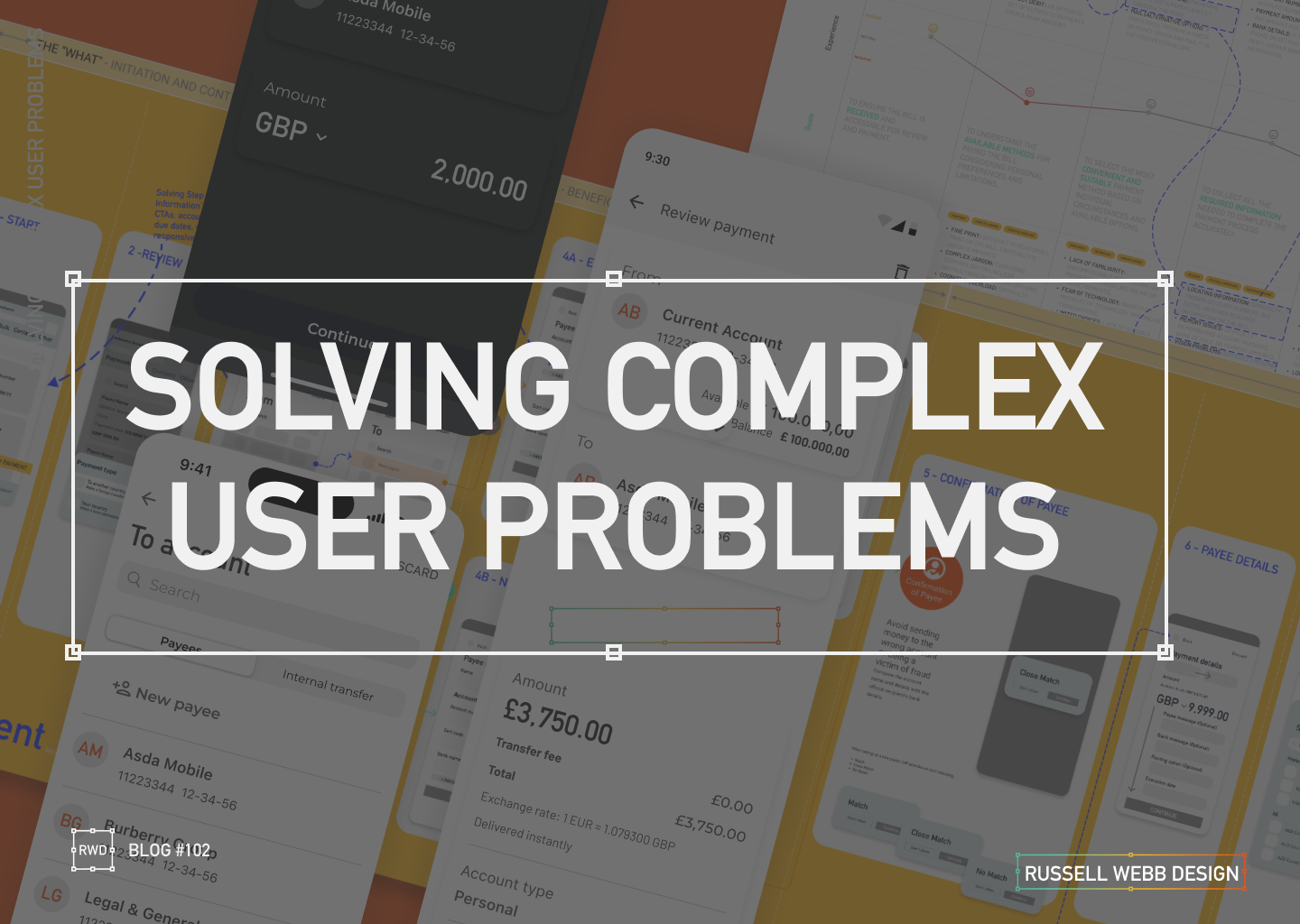
what I personally designed.
- Problem & Challenge: Senior user groups face significant barriers to mobile adoption, esp. with Payment flows.
- Obstacles: Fear of fraud | High cognitive load | Digital literacy gaps.
- What I personally designed: Complete mobile framework, from multi-use Figma DS components within the
List View(iOS & Android, Light and Dark) through to: Transaction parameters i.e the amount to and from, date inputs, source account(s), and other dynamic fields. - Mobile native components follow their OS.
Realising the final UI
- Transfer To – Searchable with swappable source functionality, configurable icons and/or avatar in a scrollable list
- Payment details – To and From Card UI, configurable currency incl. ISO 3-letter currency identifier
- Review – Available Balance, Current Balance (uncleared funds), Transfer fees typical for Intl. Payments, Business Calendar integration and CoP
Transfer to

Destination of the funds.
Payments Details

Primarily the amount to and from.
Review

Summary screen.
To respect confidentiality agreements, the branding and specific naming have been modified. This product is currently live and serving 10K plus HNW users.
A Portfolio of Reality
messy
unclear
complex Problems
constraints
Post release updates
While defining a real-world business problem, I was able to use UX tools to uncover pain points to inform an initiative UX wireframe flow that in turn, informed the final UI.
🚀 From Discovery to Design and Solution
01 Problem Statement: Create a user-friendly and simplified mobile journey that helps seniors mitigate their fraud anxiety, meet financial regulatory standards and ultimately manage their finances i.e. improve their financial wellness.
This was further expanded with the study into;
- Low-anxiety mobile payment – Seniors face challenges with mobile payments due to fear of fraud, cognitive load, and digital literacy. Designing a system that addresses these concerns while maintaining security is crucial.
- Business problem | Design challenge – The challenge is balancing a simplified flow with a robust, secure multi-step flow to mitigate fraud anxiety and meet industry standards.
02 Segmentation: Identify distinct segments within the aging parent demographic. Target a segment that can most benefit from the UK Payment process. Accessibility, personalisation, security, and financial wellness are key considerations.
03 Research & Strategy: Use quantitative data with qualitative insights to inform a Customer Journey Map. Visualise the financial and emotional challenges faced by each segment, across a given scenario.
I prioritised accessibility and task-oriented patterns. Personalised guidance, and minimising cognitive load were also key considerations..
04 Wire framing Design Decisions: Making trade-offs and delivering a justified UX solution. Simplified to the “What”, the “Who” and “How Much” before a final check then execution. I limited one screen to have one single, clear primary action. Components were dual functioning for Existing Beneficiary and New Beneficiary reducing two mini journeys to one.
05 Conclusion & Outcomes: How my decision’s successfully translate a complex real-world business problem into an initiative UX wireframe and Final UI flow.
Key highlight
- Key stakeholders audience established 2-months before proposed Sprint through workshopping and client relationships.
- Pain points highlighted early, including CoP, Secondary payment reference and scope (i.e Feed and FX was descoped)
- Cross platform UX and UI for Alpha release delivered and demo’d in 3-months
- Developer and BA handover, Design System integration scheduled early for estimation and to provide clarity
- Design System integrated and UX Copy Check signed-off
- No deadlines missed 🙂
Engineering Constraints and Design Trade-offs
engineering constraints
Technical realities
trade-offs
final outcome
International Payments
International payments is a complex animal. There is a fine line between delivering pixel-perfect cross-platform consistent UI and balancing that against commercial and technician reality. Recently I was in Bug Triage to get this sophisticated and geographically dependent piece of functionality across the line. Lets dive-in ->
SWIFT/BIC, when connected to an API returns a Bank name, think of it as a post code. While the end-user has the ability to edit this code for new payees, they cannot edit the bank name [engineering constraint]. For a more harmonise UX, new and existing payees should be displayed in a consistent and non-jarring format. So I made the decision to use input fields throughout, in various states.
My design then changes From > To :


AI generated: For NDA reasons, I have fast-tracked these Input Fields to rapidly visualise these engineering constraints.
The Trade-Off
This manifested itself from an arguably more elegant From execution, to the multi-platform but feature parity To solution following both a trade-off contributing to a non-jarring, smoother, and Input field led consistency experience.
To give context, this attention to detail was part of a much wider delivery. For NDA reasons, the forms in its full extent (1 of 3), have been altered.

To respect confidentiality agreements, the branding and specific naming have been modified. This product is currently live and serving 10K plus HNW users.
The Data-Informed Designer
Design intuition
qualitative or quantitative signals
Post launch
Retrospective improvments
How I value results just as much as pixels.
Dashboard UX to business UI
Catering for demanding clients requesting instant advice, competitive quotes and investment strategies requires tailored tools, especially within a sensitive client-data environment – Welcome to the a Customer Meeting App Dashboard
Through team interviews, ad-hoc surveys and gorilla research I defined three “must-have” features early on, so pre-launch the business needs and UX goals were transparent;
- Single point of access for disparate data – Five-second insight
- Broad overview with drill-down capabilities – Inverted pyramid
- Fill other process gaps easier and faster – Champion the brand | DS achievability
Problem and Opportunity
The existing offering had become redundant. Integrating data from third-party repositories was a priority, to achieve an improved user journey. This presented an opportunity to re-imagine the complete ‘Create a Customer Meeting’ user journey.
There was another further top-level requirement; Funding.
People management point: When competent business executives are supported by UX leaders who articulate good design, bridging the gap between vision and execution, this can build confidence across the entire team to get product delivery across the line.
Reimagining Client Meetings
Step 1
Start with the user needs
Streamlining the preparation of a meeting, and principally future proofing the Create a Meeting process with a scalable UI that can seamlessly integrate new data repositories, ensuring long-term flexibility.
Step 2
Segment in to ‘zones’
The on-screen real estate delivers a quick look experience prioritising top from bottom.
Step 3
Test and Challenge through Prototyping
Visualising up to 12 users’ journeys leads to better understanding and smoother development. Boxed development will not impact working code.
Early sketches reveal the potential of a dashboard, emphasising hierarchy through top-down, LTR user scanning patterns, pushing a hierarchical arrangement that guides the user’s eye. Data is prioritised with glance-access to preview Meeting Name top-of-mind expanding and collapsing information depending what is scope.
A conceptual dashboard with multiple layers
The final solution solved both the scalability problem, providing easy access to account numbers, the ability to add other account numbers, visibility on the meeting date and time, and the meeting status and who is the meeting organiser. Complete transparency on meeting detail, including location, meeting language and notes format with extra features like Meeting Packs.

Quantitative Signals
The quantitative metric as a single-source-of-truth of unifying insights speak volumes: 56% iPad growth in just 1.5 years over 100K client meetings in 40 countries with approximately half of their approx 85 offices in western Europe,
From business problem to an Enterprise-level, real-time data dashboard from multiple sources, instantly accessed, no more hunting.
Qualitative Design Trade-Offs
On reflection post launch, one key factor in the development (and acceptance) of this new radical design was achievability. Funding is also a key developmental constraint so designing with business realities is key. This inevitably constrains blue-sky thinking, a real change outside of budget and possibly a missed opportunity was to re-pitch this design for responsively iPad (landscape and portrait) or to expand on the ‘mini’ and ‘maxi’ concept from full disclosure down to dashboard snippets. Maybe in Phase 2!
Career Growth within Design Teams
management style
Improved Performance
tangible results
Scaling & Mentoring
Hybrid working has its pros and cons. For remote teams often populising your name and skills sets is a challenge. While leading a small creative pod of 1 junior and 1 middleweight designer at Sportingbet, I introduced a global initiative to assess the visibility of UX initiatives. I set broad battleplan headlines, including defining a visibility index, what surveys and Focus Groups could look like, then allowed the individual to gather and analyse results and set targets.
This was an initiative to allow junior and middleweight designers to step-up, to formulate action plans and drive improvement strategies. This was coupled with a growth theme, for the individual to demonstrate they could deliver with autonomy and without clear structure but define specific long-term and short-term objectives.
Outcomes
This resulted in very positive improvements in quality, improved attention and adherence to written instructions, and was backed-up by positive feedback from the stakeholders engaged in the initiative (surveys, focus groups and workshop).
Finally, this set the consistency bar very high enabling individuals to take full ownership and leadership with a process they define.

How to hook new customers
Ambiguity
Ownership
Resourcefulness
When customers make a product selection there is a lot going on behind the scenes. Desktop new product onboarding carries a lot of functional weight, it is a prime candidate to wireframe. Capturing a large selection of unique steps requires enterprise-level wire framing skills.
Defining the Problem
Imagine a new or existing customer discovering your product. The onboarding process can often feel like a daunting maze. This is where detailed wireframes step-up, transforming a journey into a smooth, secure and clear experience. Early decisions were made to leverage a pre-existing Design System. High fidelity wireframes became the way forward with Figma as the wire-framing tool of choice.
Onboarding Flow & Development Preparation
Process flow diagrams were thin on the ground, little research was available and there was a lot of ambiguity. This was an opportunity! I took it on myself to deeply understand how personal details were collected, how email and SMS validation data flows worked, understand business goals and success metrics, so the technical team can move forward. This was a calculated risk!
Segmenting the UX Wire-framing Process
1 – Guiding the First Steps
Personal details
Pre-registration
The process begins the moment a product ID is entered as the customer clicks a product. These wireframes propose a gentle walk-through, hand-holding the customer and setting clear expectations. As personal details are collected, the system identifies pre-registrations, streamlining the experience. For unrecognised products, the UI gracefully handles the situation, preventing frustration.

2 – Building Trust and Security
KYC process
Tax jurisdiction
GDPR
IDV
Next, the validation screen requests a unique member ID, followed by a secure OTP process. This includes both email and mobile verification, paving the way for a robust KYC process.

The customer identifies their tax jurisdiction, providing identification proof, as part of a seamless IDV (Identity Verification) experience. To ensure compliance with regional regulations, the system also gathers marketing and accessibility permissions, adhering to GDPR guidelines.
3 – Personalisation Meets Regulation
Investment pledge
NI (UK)
This joined-up onboarding process seamlessly transitions the customer from initial product selection to specifying their investment pledge. Furthermore, their National Insurance ID is verified, ensuring 360˚ compliance.
4 – A Smooth Conclusion
Confirm Message
Next steps
UAT Testing
Prototyping
Finally, once all data is collected, it’s securely transmitted to the BE. The FE then provides clear messaging, confirming a successful onboarding experience. This leaves the customer feeling confident and ready for next steps. Wires were shared for feedback across the team, including stakeholder, technical leads and PO’s.
Fine tune the results
Sneak preview of the final delivered User Interface (UI)


The process is still fresh, typically next steps are Usability Testing and Heuristic Evaluation. Prototyping, with QAs on standby, is another option to verify and test stakeholder feedback.
Conclusion and Impact
Ambiguity
Clarity
These wireframes don’t just showcase a process; they tell a simple story of a complex customer experience.
By prioritising clarity (onboarding steps) and security (verification and OTP) this onboarding journey fosters trust and loyalty from the very first click.


