Category: +Featured

Featured content shines a spotlight on the cutting-edge and most innovative projects making waves in the world of UX. These projects delve into the exciting frontiers of UX and UI design, showcasing my versatility across diverse industries, from fintech and healthcare to fast-transactional gambling and recruitment technology.

  • Raising the bar for customer-facing support UX

    Raising the bar for customer-facing support UX

    TLDR: An AI-Powered Customer Service Revolution – AI is transforming customer service by offering personalised solutions, and UX plays a crucial role in creating intuitive and engaging CX.

    Revolutionising Customer Service

    AI-Powered Solutions for Financial Institutions

    AI revolutions

    Personalisation

    Discover how AI is transforming customer service in the financial industry. Learn about personalised knowledge bases, integrated chatbots, and unified customer histories that enhance customer satisfaction and operational efficiency.
    To respect confidentiality agreements, the branding and specific naming have been modified. This product is currently live and serving 6k users

    Imagine a world where customer service is not just efficient but truly personalised.

    The Challenge: In today’s fast-paced digital age, financial institutions face the challenge of providing exceptional customer support while maintaining operational efficiency.

    Traditional customer service UX often falls short in meeting the diverse needs and expectations of modern customers.

    The Solution: This case study explores how AI can revolutionise customer service by creating seamless support and behind-the-scenes tools that put people and businesses in control of their money.

    User research and UX Design

    Ability <> Access <> TIME

    Quick

    Facts

    HIstory

    What the product needs to accomplish.

    Evidence informs that Customer Service Representative (CSR) typically operate on multiple panes of glass. Extracting snippets of information to help customers, within the guardrails of their abilities, their access and a timeframe (a phone call). How can this be combined, for the CSR, and potentially for self-serving customers?

    Three persona-types, three outputs;

    1. Mr ‘Self-service’; They need a tool highlighting quick-and-easy answers to their questions, without having to contact a CSR.

    CSR can also provide support and is able to troubleshoot issues and resolve customer problems to deeper issues.

    2. Mrs ‘To-the-point’; Some customers want only the facts, escalating issues to a human CSR when necessary.

    3. Mr ‘Analytical’; CSRs need to have a complete understanding of a customer’s history in order to provide effective support.

    Developing a user centred mode

    To respect confidentiality agreements, the branding and specific naming have been modified. This product is currently live and serving 6k users

    Machine learning

    Self-Service

    knowledge Hub

    Chatbot

    Chatbot

    Personalised recommendations, automating routine tasks, (like FAQs) and predictive analytics are just some of the benefits Machine Learning has in the field of UX Customer Service.

    It was clear for this project there was no one silver bullet. Providing a suite of support from self-service to employing Natural Language Processing (NLP) can all contribute to improving the overall customer experience. Understanding the wealth of possibilities Artificial Intelligence can provide, there was a focussed on three key areas: 

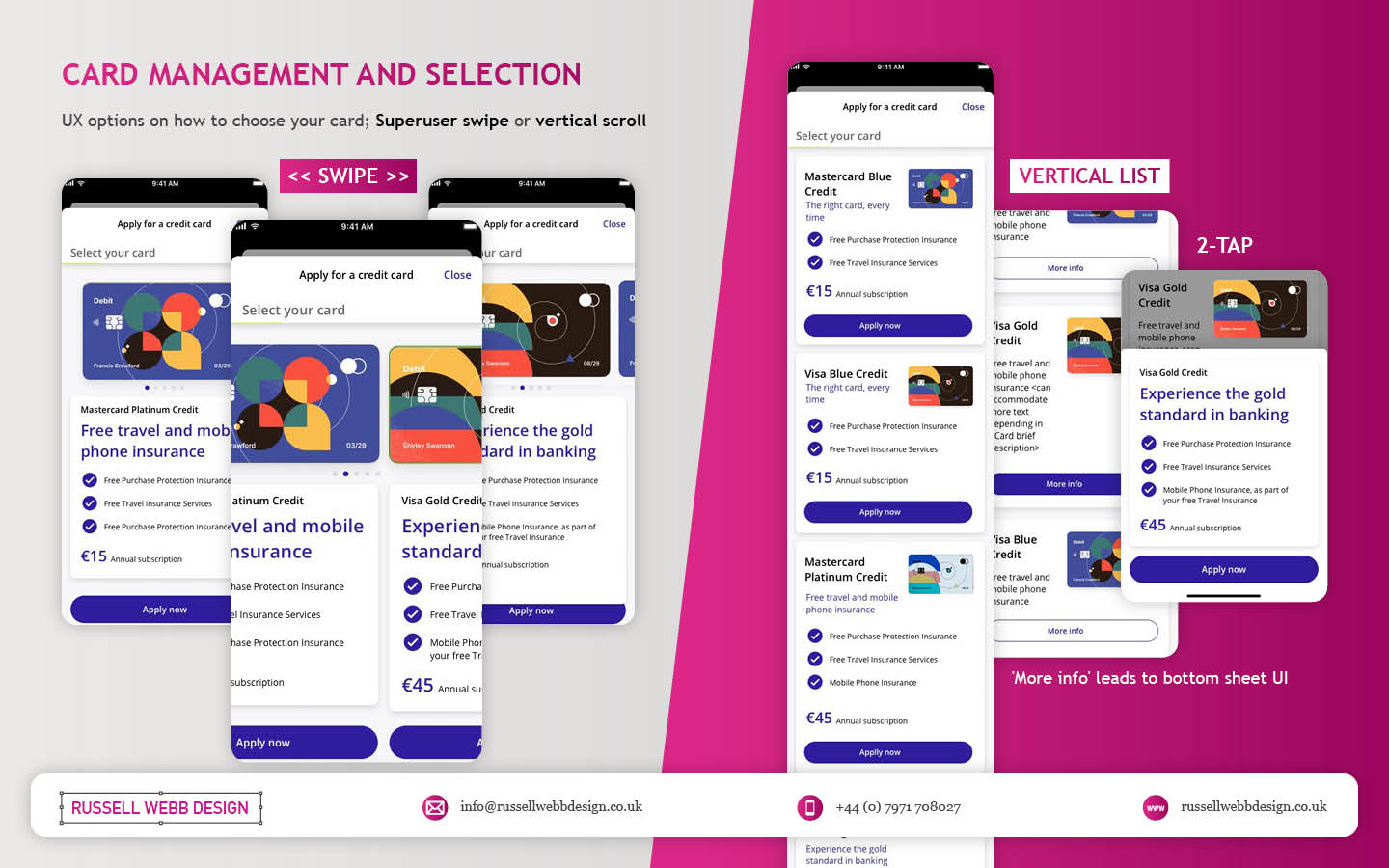
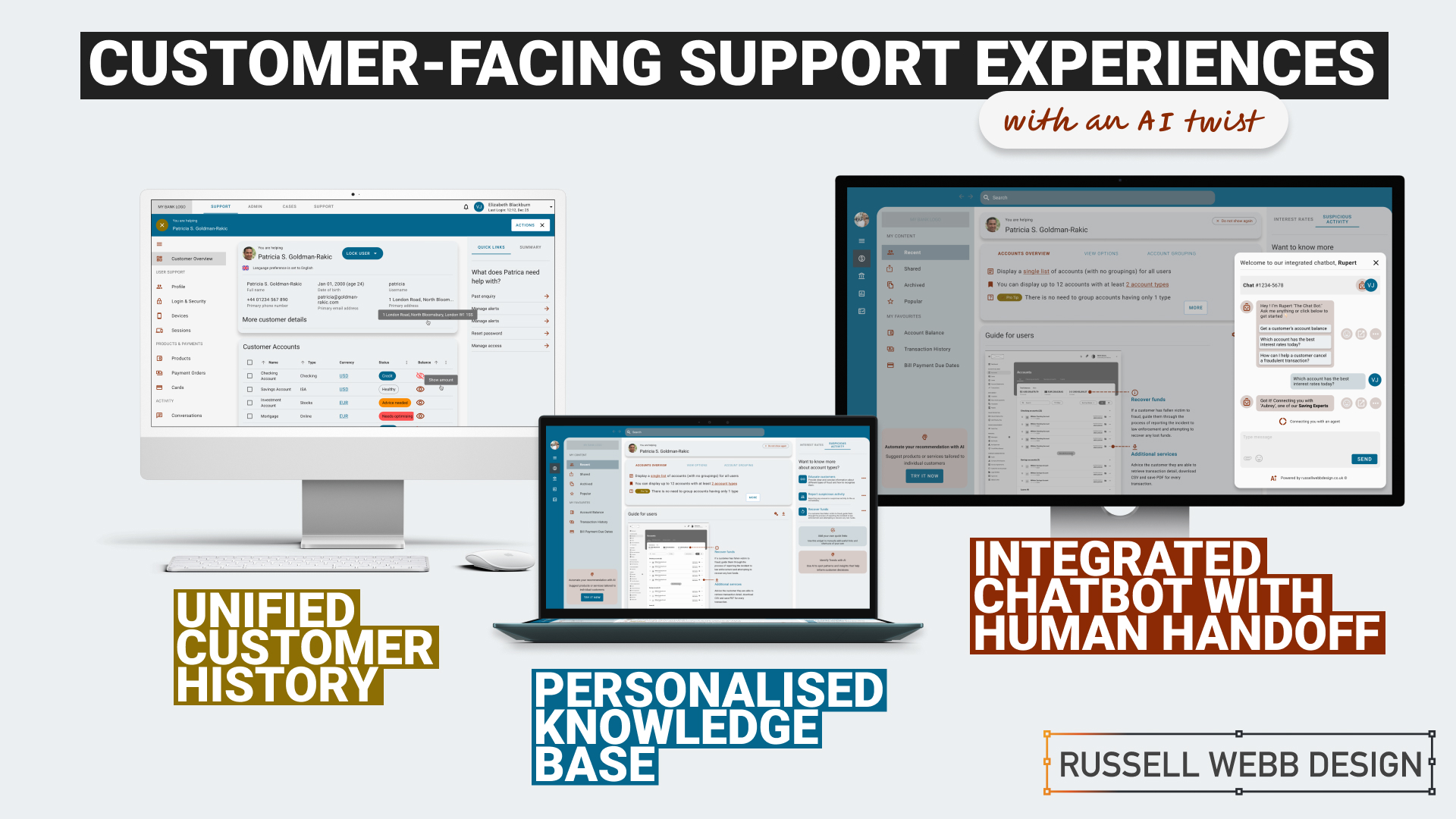
    1. Personalised Knowledge Base

    An AI-powered knowledge base that proactively suggests relevant articles or FAQs based on the customer’s specific query. More about ‘Proactive Suggestion’ later.

    2. Integrated Chatbots with Human Handoff

    Allowing the AI to analyse customer sentiment enables the bot and the CSR to tailor their responses to better meet customer needs and improve satisfaction.

    3. Unified Customer History

    A centralised platform that provides agents with a complete view of a customer’s interactions, including past inquiries, support cases, proactively alerts, and account history.

    History

    Trends

    knowledge Hub

    Proactive Suggestion

    AI can anticipate customer needs and offer solutions before the customer even asks through machine learning algorithms (customer’s history, product information and industry trends ) to predict proactively.

    For example: recommending accessories to recently purchased items, offering troubleshooting tips if a customer has contacted support multiple times, etc. 

    Here the AI recognises this customer has recently been the victim of fraud (see Account Overview note). The right sidebar offers a platform for the UI to proactively generate helpful links to the CSR before they have even asked.


    Self service

    conversational UI

    Unified History

    Process and Impact

    Refined wireframes, optimise self-service and conversational AI

    Starting with several wire-framed directions, then through osmosis filtered down concepts to self-service, a conversational UI and omnichannel integration within the form of a centralised platform. Based on experience and number of assumptions, wireframes were generated to bolster clarification.

    Variants evolved in parallel that merged into a winning model for all three proposals;

    Self Service and Hyper-Personalisation 

    Proactively suggestion, relevant articles and FAQs

    A Personalised Knowledge Base empowers customers to self-serve, with dual-function to help CSR agents to provide targeted support. Aligned to business objectives, these external and internal tools thrive on individual customer data, preferences and behaviour.

    A Personalised Knowledge Base empowers customers to self-serve, with dual-function to help CSR agents to provide support.
    The Customer

    Customers are presented with a user-friendly interface to reduce wait times. Empowered customers can self-serve by searching for documents, tutorials (or anything), related to their query. They have prompted categories to help with Discovery and personalised topics that are trending today. 

    On login, the user is greeted with an app-like interface. This contemporary approach guides them through top-level categories, i.e. Personal and Business finance, then using a navigation as a signpost they are able to drill-down on an Account Overview and User Guide. Tailored topics are surfaced (based on search and account history) within the sidebar quick links.

    The interface has push-points throughout all sections both introduce AI recommendations and provide personalised AI financial insight.

    The CSR

    Using the same B2C interface, CSR agents can access and add-to content, generate most frequently asked self-service tutorials and use the Knowledge Base to improve their own skills.

    Conversational Interface with Human Handoff

    Human-AI Hybrid 

    A smooth transition from AI chatbot, with ‘sentiment analysis’ baked-in, to a human agent 

    An AI chatbot that can handle simple inquiries but seamlessly transitions to a human agent when the conversation becomes complex or requires personalised assistance. This hand-over reduces agent workload for routine queries which improves customer satisfaction with faster responses, but also ensures a smooth transition to human support when needed.

    Chatbot Journey

    From Start through Engagement to Conclusion 

    Natural Language Processing (NLP)

    Gauge customer emotions from an AI-Chatbot that uses sentiment analysis baked-in.

    Properly trained, the AI can recognise the underlying intent behind customer queries, even if expressed differently and provide the right hand-off to the right CSR.

    Unified Customer History

    360˚ View

    A centralised platform | An assistant that proactively spot patterns to anticipate customer needs

    A centralised platform that provides agents with a complete view of a customer’s interactions, including past inquiries, support cases, account history and proactively alerts. For example, if a customer is nearing their contract expiration and has a high purchase frequency, the platform could proactively offer renewal terms or upsell opportunities.

    A single platform to access all customer interaction data: 

    • Reduces the need for customers to repeat information 
    • Enables agents to provide personalised and informed assistance
    • Spot patterns and insights that might inform business decisions
    • Anticipate customer needs and provide timely solutions with proactive support
    To respect confidentiality agreements, the branding and specific naming have been modified. This product is currently live and serving 6k users

    Reduce workload

    Data Insight

    Personalisation

    360˚

    Outcomes, split by discipline

    It is clear that AI enhances personalisation, efficiency, and problem-solving. But how can UX leverage these to create a more human experience.

    Business Outcomes:

    • Operational Efficiency: AI streamlines processes and reduces agent workload.
    • Data-Driven Insights: AI provides valuable customer data for informed decisions.
    • Cost Reduction: AI automates tasks and reduces operational costs.

    UX Outcomes:

    • Personalisation: AI can tailor the Self-Service experience, and brings Hyper-Personalisation to individual needs.
    • Seamlessness: AI integrates chatbots and provides a unified customer view.
    • Proactive Support: AI anticipates customer needs to find answers fast and can provide that 360 view at-a-glance.

    UX & AI | Future-proof partners

    Overall, UX and AI empowers businesses to deliver exceptional customer experiences, improve efficiency, and gain that competitive edge.

    Empowering users with the financial tools they deserve. From Mastering Design Theory and Lean Agile, Solve big problems, fast to How delight and speed are rewriting our UX playbooks. See more Case Studies.

    Empowering users with the financial tools they deserve

    • Mastering Design Theory and Lean Agile
    • Solve big problems, fast.
    • How delight and speed are rewriting our UX playbooks

    More Fintech Case Studies

  • A Frictionless Wireframe Onboarding Journey

    A Frictionless Wireframe Onboarding Journey

    TL;DR: Customers faced a confusing onboarding maze. Detailed UX wireframes transformed it into a frictionless journey, getting users invested.

    OUTCOME: Secure, and personalised onboarding process building loyalty from the first click.

    UX Wire-Framing

    Multiple Interactions

    Design Thinking

    Enterprise

    How to hook new customers

    Detailed wireframes mapping a user-centred flow that included clear guidance, robust security, and personalisation resulting in a better customer experience, more efficient development, and strong team alignment..

    Backend to Frontend

    When customers make a product selection there is a lot going on behind the scenes. 

    The desktop new product onboarding experience is a complex animal, a prime candidate to wireframe. Capturing a large selection of unique steps and indicating the interaction design is a Design Thinking challenge and requires enterprise-level wire framing skills

    A Frictionless Wireframe Onboarding Journey
    A Frictionless Wireframe Onboarding Journey
    • Clarity and Understanding A central pillar in UCD
    • Take advantage of existing Design System component reuse 
    • Team alignment (from BAs to Dev to client)

    … let’s dive in


    Defining the Problem

    Security

    Hi-Fidelity

    A Frictionless Wireframe Onboarding Journey

    Imagine a new or existing customer discovering your product

    The onboarding process can often feel like a daunting maze. This is where detailed wireframes step-up, transforming a journey into a smooth and secure experience. Early decisions were made to leverage a pre-existing Design System, so high fidelity wireframes (Hi-Fi) became the way forward with Figma as the wire-framing tool of choice. 

    Development Preparation

    Pre-development tech checks

    Process flow diagrams

    A Frictionless Wireframe Onboarding Journey
    A Frictionless Wireframe Onboarding Journey

    The first goal in a wireframing process is technical. The objective is to integrate a robust data gathering mechanism into the onboarding process to streamline technical development. Understanding the terms and conditions, personal details collection, and email and SMS validation data flows and aligning these all to API calls was top-of-mind. 

    This early technical scoping ensures efficient API integration and data management solutions, so the team can move forward and then collaborate with BAs and then UX.

    Onboarding Flow and Requirement Gathering

    Goals

    Objectives

    Functional requirements

    Shared understanding

    A Frictionless Wireframe Onboarding Journey

    Images are blurred for client confidentiality reasons

    BA Requirements Gathering

    To provide a solid foundation, to limit rework and foster communication between stakeholders (users, developers, designers) a Business Analyst will typically conduct user and stakeholder interviews to understand business goals and success metrics, write user stories and generate Use Case Diagrams indicating functional requirements to create a shared understanding before wireframes begin.

    1 – Guiding the First Steps

    Personal details

    Pre-registration

    A Case Study in Wireframing Success

    The process begins the moment a product ID is entered as the customer clicks a product. These wireframes propose a gentle walk-through, hand-holding the customer and setting clear expectations. As personal details are collected, the system identifies pre-registrations, streamlining the experience. For unrecognised products, the UI gracefully handles the situation, preventing frustration.

    A Case Study in Wireframing Success
    Wireframes: From Investment Pledge (Source of Funds) to National Insurance (NI)

    Behance – A FRICTIONLESS WIREFRAME ONBOARDING JOURNEY

    A Frictionless Wireframe Onboarding Journey

    Fine tune the results

    UAT Testing

    Prototyping

    Sneak preview of the final delivered User Interface (UI) 

    The interface has been altered for client confidentiality reasons 

    The process is still fresh, typically these will go through Usability Testing and Heuristic Evaluation. Prototyping, with QAs on standard, is another option to verify and test stakeholder feedback.

    Conclusion and Impact

    Clarify ambiguity

    trust

    Tailored

    These wireframes don’t just showcase a process; they tell a simple story of a complex customer experience. By prioritising clarity, security, and personalisation, even with a level of ambiguity, this onboarding journey fosters trust and loyalty from the very first click.

    Empowering users with the financial tools they deserve. From Mastering Design Theory and Lean Agile, Solve big problems, fast to How delight and speed are rewriting our UX playbooks. See more Case Studies.

    Empowering users with the financial tools they deserve

    • Mastering Design Theory and Lean Agile
    • Solve big problems, fast.
    • How delight and speed are rewriting our UX playbooks

    More Fintech Case Studies

  • Discovery Workshop to Roadmap in 3 days

    Discovery Workshop to Roadmap in 3 days

    TLDR; Navigating Ambiguity
    Using workshop techniques I validated personas to surface a UI that promoted next steps for a Candidate Portal.

    Solving 3 big problems in 3 days; Aligning the target audiences through journey mapping, defining a Value Proposition and building a draft Product Roadmap.


    Hard Skills:

    Journey Mapping

    Research

    Visual Design

    Goal-oriented Roadmap

    Soft Skills:

    Empathy

    Collaboration

    Critical Thinking

    Full List →


    How to facilitate an ideation workshop around solving problems, understanding through ideation, knowledge sharing (based on agreed on personas)
    How to facilitate an ideation workshop around solving problems, understanding through ideation and knowledge sharing (based on agreed on personas)

    Help clients solve big problems, fast

    This user-centred and business workshop focussed on;

    • Business Problem Statement – The What
    • Value Proposition Statement – How to excite users / customers
    • Product Roadmap – Action/Next Steps

    What we set out to achieve

    Recently I was leading the Discovery phase for a multinational publishing, education & recruitment company. My prime objective was to facilitate the generation of a Value Proposition within a collaborative workshop environment based around three hypotheses;

    • Understand‘Getting the right idea’ and ‘getting the idea right’
    • Ideate – Align the team | Get creative
    • Roadmap – Present, prioritise and theme

    Defining Vision, setting scope

    How to facilitate an ideation workshop around solving problems, understanding through ideation, knowledge sharing (based on agreed on personas) and then attributing those personas, via SMEs validation, to surfacing UI to promote next steps plotted on a goal-oriented roadmap.
    How to facilitate an ideation workshop around solving problems, understanding through ideation, knowledge sharing (based on agreed on personas)

    Persona Playback, Value Propositions and Knowledge Sharing

    Validating Personas proved crucial. Early ‘Understand’ sessions proved invaluable in terms of getting to know the client’s ecosystem and getting closer to the overall workshop goals. Goals included personas improvements using a Value Proposition Canvas to expose misunderstandings, define Jobs To Be Done (JTBD) and Pains and Gains – more importantly it identifying key themes and services that would appeal to these personas. This ensured any misalignment did not cascade down to the Journey Maps on Day 2

    What we were trying to achieve using ‘Ask the experts’. Early touch points included attracting educational establishments and employers using baked-in services, plus having the ability to grow the market was paramount for particular personas. The client had the raw building blocks and the workflow for their ‘niche product for a niche market’, communicating that vision was the challenge.

    Customer Journey Mapping – Make the best hiring decision

    How to facilitate an ideation workshop around solving problems, understanding through ideation, knowledge sharing (based on agreed on personas) and then attributing those personas, via SMEs validation, to surfacing UI to promote next steps plotted on a goal-oriented roadmap.
    How to facilitate an ideation workshop around solving problems, understanding through ideation, knowledge sharing (based on agreed on personas)

    Gaining alignment across stakeholders on what making the ‘Best hiring decision’ journey looked like. Creating a visual representation of every experience a key persona(s) had with the client helped to tell a story, more importantly this led to a prioritised ideation list (visual solutions).

    Making the Best Hiring Decision

    • Initial stages – Planning and approval
    • Intermittent stage – Profile building, search and selection tools
    • Final stage – Interview, agreement and follow-on activities

    The exercise also highlighted a level of anxiousness, through to excitement and eventual relief. A truly valuable activity that presented opportunities that were eventually clustered and presented to the group as an adaptive Crazy 8 activity.

    Ideation and Roadmap

    Finally, this led on the most challenging section of the workshop, the Ideation Sessions. This resulted in 4 concept areas to prioritise on the road map and populate a timeline.

    Sketching can be scary!

    Demonstrate the steps to avoid a cold start.

    Push back on judgement calls and champion quantity over quality. All participants should take advantage of the knowledge in the room, bounce ideas off each other and improve through collaboration. A process of silent note taking, constrained to a page/large Post-It note, resulted in 4 principal concepts.

    Value: shorter tests, improve the UX

    Value: Personalisation. Summary driven.. 

    Value: candidate self-improvement.

     Value: better decision = better employees.

    Boosting Engagement

    Shortcuts to Success

    Shortcuts to Success

    • * Faster, more reliable tests: Reduce testing time and increase reliability
    • Personalised engagement: Tailor tests to individual needs, leading to higher engagement and lower churn.
    • Business-focused UX: Align testing with business goals by leveraging KPIs; Targeted feature development.
    Supercharge Testing

    Impactful Tests

    • Reduced client churn: Shorter, feedback-driven tests foster client satisfaction and retention.
    • Diversity in hiring: Objective, efficient testing helps attract diverse talent and improve hiring decisions.
    • * Shared Data; All backed up by a global database
    Boost diversity & retention

    Innovation for Early Adopters

    • * Modernise testing: Introduce innovative concepts too early adopters only.
    • Candidate quality and validity: Prioritise attracting the best candidates. Ensure test results are accurate and reliable.
    • Goal-oriented roadmap: Leverage learnings to craft a clear roadmap for continuous improvement.
    Better candidates | More valid results

    Goal-oriented roadmap

    Setting standards with a development Roadmap

    Solving big problems and setting milestones through a draft roadmap contributed to accelerating development across the current period and the next. Raise their internal products up to today’s standards was a priority. This roadmap was a significant step closer to this.

    3 big problems in 3 days

    Align the target audiences 

    We did this across the group early on through a deep-dive personas playback session. This proved essential both to enable the journey map but also assigning value in the KPI session.

    Define the Pains and Gains

    This was accomplished with a Value Proposition Canvas. A useful business tool to surface Pains and Gains and Jobs-To-Be-Done

    Build a draft Product Roadmap 

    This acted as a our North Star and as a high-level visual summary of the workshop outcomes; Two development streams; Two principal personas.


    As a value-add, a UX / UI Report consolidating all data was generated, highlighting the groups new findings and areas for improvements to inform future Timelines and Roadmaps.

    RussellWebbDesign: Get your fill of UX trends, case studies and best practice

    Discover high-impact UX case studies

    Portfolio case studies describing design, my UX process, and business impact.

    From boosting user adoption in fintech, to improving trust with responsible gambling through to retaining Millennials in the world of ‘digital lotteries UX’ to leveraging key USPs for mobile healthcare.

  • Dashboard UX to Business UI

    Dashboard UX to Business UI

    Enterprise-level, real-time data from multiple sources, instantly accessed, no more hunting.

    A single-source-of-truth of unifying insights speak volumes: 56% iPad growth in just 1.5 years over 100K client meetings

    The Problem Statement

    Problem framing

    Best practices

    Design principles

    To respect confidentiality agreements, the branding and specific naming have been modified. This product is currently live and serving 6k users

    Within a strictly regulated financial environment my clients use dashboards data every day.

    Users

    Advice

    Quotes

    Investment

    As the world’s largest wealth manager, catering to affluent clients requires exclusive online services like advice, quotes and investment strategies, delivered digitally. Internal systems application empower the two principal user groups;

    • Customer Consultant Associates
    • Customer Consultant* (CCA’s/CC’s),

    Assembling these customer meetings takes time, accessing strictly private data to provide a complete, competitive and professional service requires a tailored and specialised tool – of which the Customer Meeting App* is the bank’s primary channel.

    What are the driving factors for developing a dashboard?

    Strategic insights

    Information architecture

    Single source

    Imagine client meetings where crucial information is instantly accessible, scattered data unified, and time spent hunting replaced by strategic insights. This is the potentially transformative power of the Customer Meeting App’s dashboard, built around three “must-have” features:

    1. Single point of access for disparate data
      Instead of opening various applications, interfaces, or online databases, the CCA’s/CC’s have a real-time dashboard.
    2. Broad overview with drill down capabilities
      A dynamic dashboard, digital documentation and secure access.
    3. Easier, faster, sign source of truth
      Consolidated statistic, statues displays, contextual information, and ‘Edit’ functionality placed intelligently for quick consumption.

    Achieving speed, clarity, and brand harmony

    Journey

    Processes

    Re-imagine

    Problem and Opportunity

    The existing offering had become redundant, with processes and previous ways of working no longer relevant or appropriate. The client required the seamless integration of data from third-party repositories and a significantly improved user journey. This presented a clear opportunity to re-imagine the complete ‘Create a Customer Meeting’ user journey.

    Dashboard design best practice

    There are 3 dashboard design principles that are drove decisions and are considered best practice:

    1. Five-second insight

    Funding was a principal driver for this project. Empowering a more intuitive process to adding customer data (account numbers, quote links, investment profile links, and upcoming future services) at a glance was key to the baseline UX.

    2. Inverted pyramid layout

    The inverted triangle displays the most significant insights on the top, trends in the middle, and granular details towards the bottom.

    3. Brand champion and ensure DS achievability

    Championing UCD principles for both organisation’s values and consistency was a challenge. Without a dedicated UX stakeholder, negotiating a new global Design System, within budget and development constraints proved demanding.

    Reimagining Client Meetings

    Scalability

    Visual Hierarchy

    Visual Design

    To respect confidentiality agreements, the branding and specific naming have been modified. This product is currently live and serving 10K plus HNW users.

    To reiterate the design process, I went through the following:

    1. Step 1 – Start with the user needs
      The foundation of successful design. Streamlining the preparation of a meeting, and principally future proofing the Create a Meeting process with a scalable UI that can seamlessly integrate new data repositories, ensuring long-term flexibility.
    2. Step 2 – Segment the experience in to ‘zones’
      The on-screen real estate delivers a quick look experience prioritising top from bottom.
    3. Step 3 – Test and Challenge through Prototyping
      Visualising up to 12 users’ journeys leads for better understanding and smoother development. Developers also need reassurance that this would be a boxed development and will not impact working code.

    Driving Discovery UX within a challenging Agile environment

    Hierarchy

    F-Pattern

    Low-fidelity prototyping

    Early sketches are crucial: They reveal the potential of a dashboard, emphasising hierarchy through top-down, left-to-right user scanning patterns. Grouping key data, utilising white space, and enabling light touch drill-down are key drivers.

    Scope and hierarchy: Initial sketches focus on what’s important, pushing a hierarchical arrangement that guides the user’s eye. Data is prioritised with ‘glance-access’ to preview Meeting Name at the top, followed by Last Modified and owner information.

    Chain of command flow: Expanding on the ‘Mini’ concept, this ‘Maxi’ Dashboard version offers the full experience. Enabling the CCA’s/CC’s to very quickly assess top level meeting status and drill-down to Privacy Setting, customer ID photos, and Mode of Contact.

    Sketching a tailored experience

    What is in scope: These initial sketches start to show the power of a dashboard. Pushing the hierarchical arrangement, the user’s eyes organically concentrate from top to bottom, left to right. We have the data, so embracing the Meeting Name and grouping the Last Modified through to the Meeting Owner data just makes sense.

    Estimation sketches 

    In Agile, pre-estimation is an important ceremony before sprinting. An efficient method of conveying your UI is to sketch and quickly map out the flow, the user interactions and where the final CTAs might be..

    Realising a final solution

    To respect confidentiality agreements, the branding and specific naming have been modified. This product is currently live and serving 6k users

    A conceptual dashboard with multiple layers.

    The final solution solved both the scalability problem, providing easy access to account numbers, the ability to add other account numbers, visibility on the meeting date and time, and the meeting status and who is the meeting organiser, all there front-of-stall for the user. Complete transparency on meeting detail, including location, meeting language an whether the meeting has typed notes and freehand notes plus special features including packaging the meeting contents ready to send the customer and associating the meeting with a customer ID.

    A new dashboard suite is here;

    • Highly Readable
    • Inherently Scalable
    • Data-Driven

    Design Trade-Offs

    Business Reality

    ROI

    Inverted Pyramid

    One key factor in the development (and acceptance) of this new radical design was ‘achievability’. Funding in a key developmental constraint with financial services, without it a project will not leave the ground – designing with business realities is a UX key skill. 

    Account number drill-down

    The UX was sold into the business as streamlining the ‘Create a Meeting’ user flow at a single glance, adding value at the advisory level.

    There are four (4) account numbers associated with this meeting. The user is able to hover, edit or launch a pop-over dialog box to create an account specific meeting from this functionality.

    Hierarchical details

    Providing a tiered ‘inverted triangle’ proved to be an excellent facilitator for the single-point of truth concept. Employing hover state ‘tooltip’ functionality allowed for a broad overview with drill-down capabilities.

    Global Digital Shift

    Adoption

    Impact

    Massive UX Reach

    To respect confidentiality agreements, the branding and specific naming have been modified. This product is currently live and serving 6k users

    40

    Countries

    190

    Offices

    100k

    100,000 Meetings

    48%

    8% to 56% Worldwide Growth

    The bank is present in more than 40 countries with approximately half of their 190 offices are in western Europe, where half of the Customer Meeting App meetings are delivered on the iPad. This is a phenomenal growth from 8% to 56% worldwide in the last 18 months.

    100,000 meetings prepared and delivered via the application each year. A true revolution!

    *Names changed to protect the innocent

  • Pt II – Money Management App UX Challenges Explained

    Pt II – Money Management App UX Challenges Explained

    TLDR; The second on a two-part deep-dive focussing on mobile UX design targeting seasoned designer-types, mastering Design Theory, and navigating lean Agile challenges.


    Hard Skills:

    Journey Mapping

    Research

    Visual Design

    Soft Skills:

    Empathy

    Collaboration

    Critical Thinking

    Full List →


    Welcome to Pt II

    Real-world app design challenges, by persona

    In my previous post (01 Welcome to Pt I; Real-world app design challenges by persona) I detailed why wealth management apps are becoming super relevant and how certain UX designers types experience certain user experience challenges. Let’s move on to our second persona;

    Silvr Bank – Europe’s Best Digital Bank*

    The overarching goal with Silver Bank* is to design an interface for a thriving Generation X, with an emphasis on growing the fledgling millennial users base i.e mobile-first. The C-level were looking to expand and improve their digital offer on these foundations

    3,000 employees | 85 branches | 2nd biggest player in its market

    The brainstorming UX Designer

    At the kickoff stages this designer is focusing on the ‘what if’, they live their life in the fast lane of UX Discovery workshops and are typically very creative.

    Blindly Following a Predefined UX Process

    Every design team (or team or chapter) will have their flavour, probably with different names. The skill is to take these stages and adapt the outcomes so your creative and non-creative teams will understand and respond.

    The point is, tailor the UX process according to project needs which comprise staple elements such as research, design, prototyping, and testing (validation).

    Not Following the Iterative Design Process to Resolve Issues

    It is crucial and all kick-off stages with all new teams to pivot towards an MVP mindset. Here is my take in the ‘Three must-haves’;

    • Clients must have an understanding of the iterative process 
    • Clients must understand developing software within Scrum is not typical to a design agency. No Big-Bang please.
    • A strong UX-er must be able to push-back on customisations that hold little value and only slow down the Scrum Train.

    Designing within Scrum has its own challenges, but one of the clear benefits is the ability to ‘go fast’. This speed is only maintained if the core team are synced and understand that fast decision making, a complete understanding of the iterative process and grasping an MVP mindset must all be entrenched.

    Confusing signposting – Crazy pop-ups and misunderstood empty states.

    If you don’t understand the flow, how do you expect your users to?

    Do not implement multiple pop-ups on your landing page. Do guide user with short concise phrases that give state, progress and system status (See: Usability Heuristics: #1 Visibility of system status)

    The pop-up frequency, relevance, and placement are key factors that make or break your UX;

    • Don’t show multiple pop-ups at once or one after another.
    • Ensure the empty state tone of voice is relevant to the audience and brand.
    • Your pop-ups shouldn’t cover the entire screen. On mobile, your full screen empty state should.

    Give your users breathing space to explore. You can then set suitable triggers for pop-ups to appear at the right time under certain conditions.

    The UX Consultant on-a-mission

    A seasoned veteran

    This flavour of UX designer has earned their stripes both at the sharp end running in-house UX teams and blazing a trail as a freelancer. They are typically driven, organised and looking for clients to be the same – so education is centre stage (which brings its own set of problems – see Not Following the Iterative Design Process to Resolve Issues below).

    Retail Banking Services

    Banks and FI are increasingly integrating money management functionality into their mobile and desktop apps. There is a clear directive to push their customers to use their products, including Card Management and Selection, more actively.

    In the western world, 76% of people use mobile banking services. Differentiation, whether that be through the quality of financial advice or expertise of financial service, has to be clear.

    Creative font selection can derail already strong UX

    Unless you have a solid reason to use a particular font type, stick with web-safe fonts. This is a common misunderstanding when implementing an out-the-box or white label product, as they allow your client to go crazy either with their brand font or one that simply doesn’t work online (or both).

    Use your other UX tools to differentiate and stuck with the main players below;

    1. Arial (sans-serif)
    2. Georgia (serif)
    3. Verdana (sans-serif)
    4. Trebuchet MS (sans-serif)
    5. Garamond (serif)
    6. Tahoma (sans serif)
    7. Courier New (monospace)
    8. Times New Roman (serif)

    Know Your Users. Know your competition

    It would be a mistake to believe that money management applications are exclusively relevant for older adults. In reality, the target demographic for such applications is growing younger. Keep an eye out for millennials who, according to CBInsights, will inherit the largest share of the wealth of any generation – so mobile is absolutely key.

    Be conscious of the challenger banks that are making waves and be distinct or what your differentiation actually is, and mobile is leading this charge.

    My conclusion on app challenges

    It’s clear the challenges are many. Whether you’re be UX junior looking to soak-up the World Wide Web of experience or a seasoned veteran looking to fine-tune your UX skills, the key challenges when designing financial money management apps** are;

    Not Following the Iterative Design Process to Resolve Issues

    Laser Focussed on Design Systems and Best Practices

    Blindly Following a Predefined UX Process

    **Can be attributed to other domains, of course.

    RussellWebbDesign: Get your fill of UX trends, case studies and best practice
  • Power up your designs with dark mode trend front-of-mind

    Power up your designs with dark mode trend front-of-mind

    Delight, speed and satisfaction are rewriting our UX playbooks in finance. While at the bleeding edge of this digital transformation, a modern UX-er has rapidly emerged, changing the rules of the game.


    Hard Skills:

    Journey Mapping

    Research

    Visual Design

    Soft Skills:

    Empathy

    Collaboration

    Critical Thinking

    Full List →


    Strong UX has taken modern banking to the next level

    Designing an ecosystem that can scale to deliver multiple connected products is really the ultimate UX/UI case study. Part of that skill-set is the new must-have that is dark mode.

    Here is my take on this new visual aesthetic.

    MYBANK* Europe – 3.8 million retail banking clients

    This case study is based on MYBANK*. As part of a broader digital transformation, I led full-throttle Discovery sessions laying the UX foundations for this region’s third-largest banking group, with total assets at CHF 229 billion;

    • 120-person strong team
    • 1-2-1 Leapfrog Workshop
    • A demanding 3rd party agency

    Goals and How-to retool

    The goal here is to give back to the design community a mindset for transitioning handcrafted light-mode UI, to the dark side. As this mode has become the new black, UX / UI designers need to re-tool themselves with the skills to set effective palettes, to design in context and to know the rules or at least know how to break them.

    Using dark mode as default

    Designing with a predominantly dark palette, swapping out light backgrounds, lightning text and icons has more recently become a non-negotiable design requirement with today’s clients. For mobile I get it, all apps should have both light and dark UI — or day and night themes that switch automatically. But what happens when your users are purposely choosing dark mode – all the time?

    How dark mode has crept up on us

    Early computer systems were always in dark-mode as characters were inverted. The Mac brought WYSIWYG and what we now know as light mode, or ‘printed paper’ mode. This became the default, with designers rarely even thinking about other colour palettes.

    Although prevalent in certain digital environments, ‘dials-and-lights’ interfaces (car dashboards spring to mind) have always been dark, controls and readouts follow established dark patterns.

    An app with a dark palette consumes as much as 90% less energy, especially with AMOLED screens. For battery saving reasons there is enough justification for your clients to build in design capacity for this mode. Be mindful of your users’ environment, a bright rectangle glaring at them in a dim room is not good.

    Most streaming-video services default to dark mode as users do much of their viewing at night. This is why TV have dark bezels – right? Dark backgrounds reduce the overall brightness of the display, so can be used in any lighting condition. A typical dark-mode page is five times less bright than exactly the same content in light mode.

    Defining a dark colour palette 

    Designers have been reducing contrast in light-mode for years.

    Black text is rarely black anymore
    (and not just disabled text)

    Note the emphasis is on contrast. The term colour contrast is misleading. To give context, let’s map out a mini deep-dive on colour theory.

    Quick recap on colour theory

    • Hue—The spectrum on which a colour appears.
    • Saturation—How intense a hue appears.
    • Brightness—The amount of black or white that is added to a colour.

    To most designers, developers, and product managers—the term colour means the hue part only. Red or green, for example. Contrast implies that contrast relates to hue, but it does not. Contrast indicates the difference in brightness levels of two elements. 

    Small differences equal low contrast, large differences high contrast – so contrast is a comparison.

    Contrast in Dark Mode

    When dark-mode palettes are implemented properly, their low overall output should provide extremely high contrast, without anyone on a project team worrying that the display is too harsh.

    But you still need to keep the contrast as high as possible, which trips up a lot of designers. Dark-mode design suggestions, guidelines and inspiration sites too often throw away everything we know about colour theory, especially; 

    • Contrast
    • Visibility
    • Readability
    • Universal design

    Don’t start with a black palette

    A quick, easy way to start creating a dark palette is to create shades and tints of all your colours.

    Keep the hue and saturation, change the brightness.

    Colour theory tip

    • Shade = adding black to the colour.
    • Tint = adding white i.e, pink is a tint of red.

    How-to build a powerful dark colour palette

    1. Choose another dark colour from the palette as a background (or make a shade of one)
    2. Create shades of all your colours i.e. adding black to the colour.
    3. Use a number of dark hues for backgrounds making branded elements pop.
    4. Instead of just using lines or grayscale, use various dark shades of the brand’s principal colour to set-off sections.
    5. Finally, check contrast in a dark room with real users.

    Even Google suggests very dark, highly saturated accent colours, but with lots of very low-contrast, grey backgrounds. Discarding simple lines around card edges and replacing them with dark-grey backgrounds doesn’t solve the contrast argument. Of course, this is just one opinion (albeit the worlds’ largest search company)white key-lines can work as well.

    Grey is not the only fruit!

    Hollow icons for available tabs and solid icons for the selected tabs, while not a colour theory issue, is an effective way to differentiate them. Using simple text for tabs, in grey or red is an issue for the colourblind, not acclimated to night or glare.

    Bad contrast impairs readability and users become confused when part of the page scrolls, but other parts do not. Contrast and differentiation is not just text and icons but the entire experience.

    Conclusions on dark mode UX

    Enable iteration by employing a high-impact Design System with global reach

    Personalising a gold-standard, multi faceted, flexible Design System, empowering over 220 global organisations, employing a 6 sections, over 500+ components, catering for 3 industry-standard digital platform

    From foundational elements like typography, to light and dark colour mode across all tokens, icons and logo, a rich library of icons to container, cover and sheets, to selectors components, drop downs, empty states, models, navigational and informational elements.

    Modern UX designers should champion dark mode as the default option for mobile apps. Embracing this trend not only aligns with user preferences but also enhances the app’s visual appeal and overall user experience;

    Not just about style

    Design choices such as a colour palette have enormous implications around usability and perception.

    Design basics

    Size, spacing, and contrast in dark-mode are still critical.

    Test, test and test again

    Don’t forget to test your solution in a real-world environment (i.e a dark room). Try to understand how people would use your product, and make sure you’re designing for their context and their needs.

    RussellWebbDesign: Get your fill of UX trends, case studies and best practice