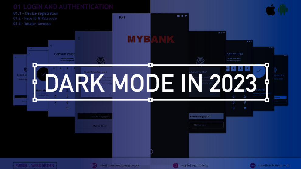
TLDR; The second on a two-part deep-dive focussing on mobile UX design targeting seasoned designer-types, mastering Design Theory, and navigating lean Agile challenges.
Hard Skills:
Journey Mapping
Research
Visual Design
Soft Skills:
Empathy
Collaboration
Critical Thinking
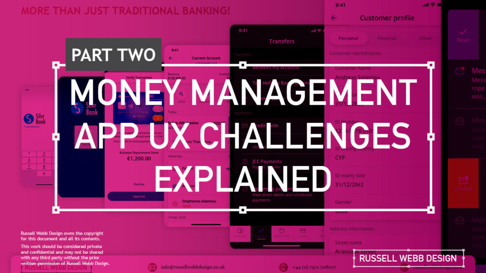
Welcome to Pt II
Real-world app design challenges, by persona
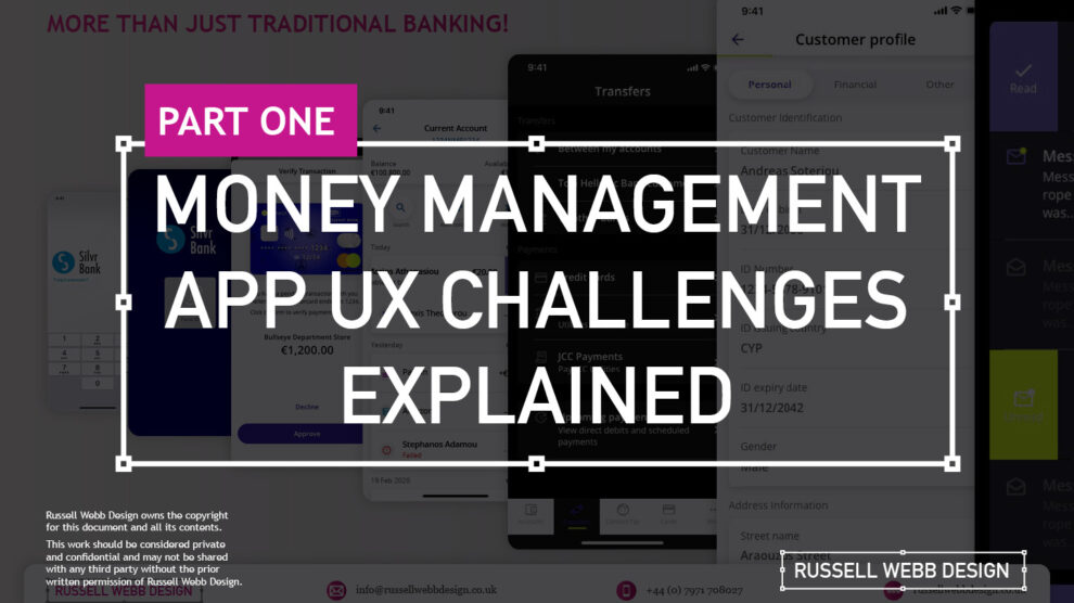
In my previous post (01 Welcome to Pt I; Real-world app design challenges by persona) I detailed why wealth management apps are becoming super relevant and how certain UX designers types experience certain user experience challenges. Let’s move on to our second persona;
Silvr Bank – Europe’s Best Digital Bank*

The overarching goal with Silver Bank* is to design an interface for a thriving Generation X, with an emphasis on growing the fledgling millennial users base – i.e mobile-first. The C-level were looking to expand and improve their digital offer on these foundations
3,000 employees | 85 branches | 2nd biggest player in its market
The brainstorming UX Designer
At the kickoff stages this designer is focusing on the ‘what if’, they live their life in the fast lane of UX Discovery workshops and are typically very creative.
Blindly Following a Predefined UX Process
Every design team (or team or chapter) will have their flavour, probably with different names. The skill is to take these stages and adapt the outcomes so your creative and non-creative teams will understand and respond.

The point is, tailor the UX process according to project needs which comprise staple elements such as research, design, prototyping, and testing (validation).
Not Following the Iterative Design Process to Resolve Issues

It is crucial and all kick-off stages with all new teams to pivot towards an MVP mindset. Here is my take in the ‘Three must-haves’;
- Clients must have an understanding of the iterative process
- Clients must understand developing software within Scrum is not typical to a design agency. No Big-Bang please.
- A strong UX-er must be able to push-back on customisations that hold little value and only slow down the Scrum Train.
Designing within Scrum has its own challenges, but one of the clear benefits is the ability to ‘go fast’. This speed is only maintained if the core team are synced and understand that fast decision making, a complete understanding of the iterative process and grasping an MVP mindset must all be entrenched.
Confusing signposting – Crazy pop-ups and misunderstood empty states.
If you don’t understand the flow, how do you expect your users to?
Do not implement multiple pop-ups on your landing page. Do guide user with short concise phrases that give state, progress and system status (See: Usability Heuristics: #1 Visibility of system status)

The pop-up frequency, relevance, and placement are key factors that make or break your UX;
- Don’t show multiple pop-ups at once or one after another.
- Ensure the empty state tone of voice is relevant to the audience and brand.
- Your pop-ups shouldn’t cover the entire screen. On mobile, your full screen empty state should.
Give your users breathing space to explore. You can then set suitable triggers for pop-ups to appear at the right time under certain conditions.
The UX Consultant on-a-mission
A seasoned veteran
This flavour of UX designer has earned their stripes both at the sharp end running in-house UX teams and blazing a trail as a freelancer. They are typically driven, organised and looking for clients to be the same – so education is centre stage (which brings its own set of problems – see Not Following the Iterative Design Process to Resolve Issues below).
Retail Banking Services
Banks and FI are increasingly integrating money management functionality into their mobile and desktop apps. There is a clear directive to push their customers to use their products, including Card Management and Selection, more actively.
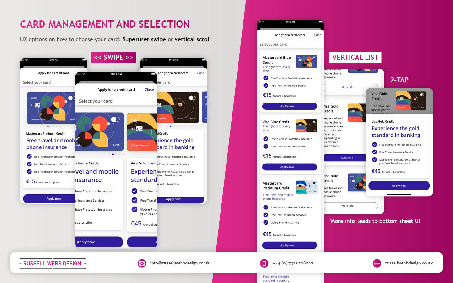
In the western world, 76% of people use mobile banking services. Differentiation, whether that be through the quality of financial advice or expertise of financial service, has to be clear.
Creative font selection can derail already strong UX
Unless you have a solid reason to use a particular font type, stick with web-safe fonts. This is a common misunderstanding when implementing an out-the-box or white label product, as they allow your client to go crazy either with their brand font or one that simply doesn’t work online (or both).
Use your other UX tools to differentiate and stuck with the main players below;
- Arial (sans-serif)
- Georgia (serif)
- Verdana (sans-serif)
- Trebuchet MS (sans-serif)
- Garamond (serif)
- Tahoma (sans serif)
- Courier New (monospace)
- Times New Roman (serif)
Know Your Users. Know your competition
It would be a mistake to believe that money management applications are exclusively relevant for older adults. In reality, the target demographic for such applications is growing younger. Keep an eye out for millennials who, according to CBInsights, will inherit the largest share of the wealth of any generation – so mobile is absolutely key.
Be conscious of the challenger banks that are making waves and be distinct or what your differentiation actually is, and mobile is leading this charge.

My conclusion on app challenges
It’s clear the challenges are many. Whether you’re be UX junior looking to soak-up the World Wide Web of experience or a seasoned veteran looking to fine-tune your UX skills, the key challenges when designing financial money management apps** are;

Not Following the Iterative Design Process to Resolve Issues
Clients must have an understanding of the iterative process and an Agile mindset. No Big-Bang please. Accept this and then you and your team can then ‘go fast’.

Laser Focussed on Design Systems and Best Practices
Non UX-ers need their outcomes. Without maintenance, allocation and expertise, a Design System that doesn’t rock, will impact UI delivery.

Blindly Following a Predefined UX Process
Adapting the Design Thinking process to suit. When implementing a white label product out-of-the-box, prototyping and testing default patterns will yield little value, focus on what makes your offer unique.
**Can be attributed to other domains, of course.

Pique’d your interest?
This is but part of a selection of design information russellwebbdesign generated for the creative community out there. Please contact me further to discuss how your brand can benefit from the new channel: info@russellwebbdesign.co.uk
If something has peaked your interest. Please leave a comment below.