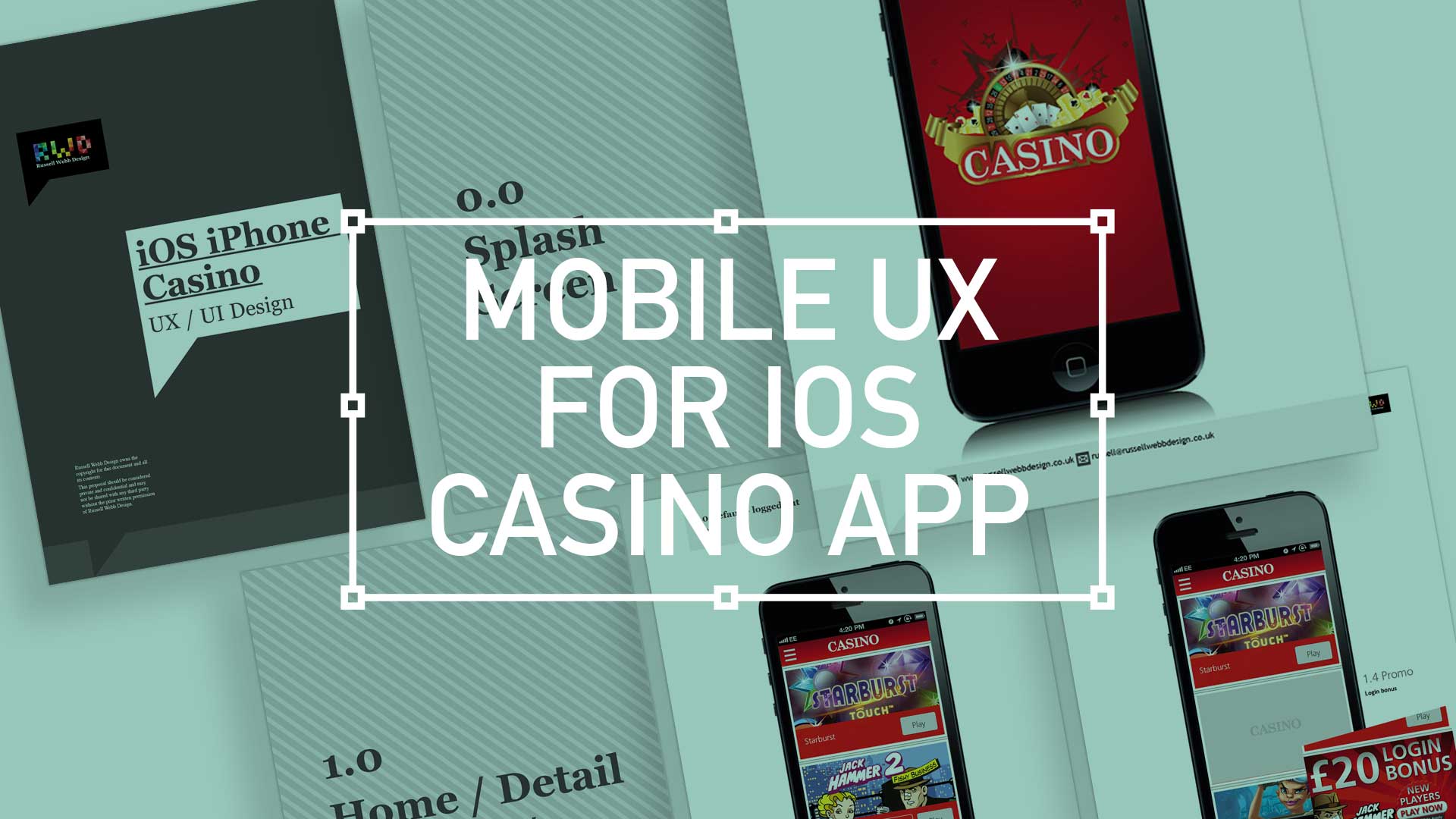
TL;DR; While the gambling industry continues to boom despite global financial woes, a reliance solely on branding through splash screens has its limitations. This post dives into why your home screen deserves more attention. Showcase promortaionl content, search (as navigation maybe?) and Quick Links as crucial building blocks, including introducing the popular hamburger icon for primary navigation and transform your home screen into landing page(s) into a powerhouse of usability and brand identity.
Brief
Next to essentials like food and water, one of the only other industries not effected by the world financial situation is gambling. In fact the industry is booming. There are many UX challenges in designing the perfect game play experience, catering for the green fingered punter all the way through to the seasoned veteran is a difficult balancing act.
Plus, as mentioned, in these more straighten times, to be conscious of not forcing the gambling experience on to the more vulnerable.
Splash screen
Modern smartphone don’t need 2-3 seconds to start up, so the original notion of the start-up or splash screen is now redundant. But brands love to position their logo ‘front of stall’ so for this reason, this screen is important. Keep it simple and remember, if you can’t get your brand message over in 2-3 seconds, think about a re-design.
Home
This is the heart of the application, the place to show off what you have to offer – the ‘showcase‘ if you like. So make it impressive, make it big and try your best to impress.
Promotions

Providing a mechanism for the Product Management team to regular update with promotional content was an important requirement. Although not a full CMS, there was a way to build into the release cycle this mechanism.
Product (game) detail
A universal approach was always the going to be the best solution here. Much the way one would design a retail site, with navigation to products groups and then linear concentration through to the actual product, the same would be appropriate for a Casino App. Just replace the actual product with a game.
Search
Sometimes, and only sometimes, search can replace traditional navigation. Take Gmail for example, do you really need to delete unsolicited emails? Do people really use folders? Or is this functionality just legacy? With the world biggest search company behind it, you just filter by keyword. So for this release, search was built-in as a primary requirement, one day you might only need this and no navigation eh?
Header treatment
Providing navigation to the ‘back office’ of the App proved a challenge. There was a simple requirement to access and Login, Withdraw and Deposit in true iOS style. I was always conscious of iOS7, and also influenced by what Google’s UX team were pushing towards – that is a more cleaner and flatter use of colour.
So this became my key visual que

Error handling
Sometimes things go wrong.
This can be the users fault, a connection issue, battery problems or a multitude of other errors. Part of your UX skill should be to provide a graceful way of handling this, both in a beautiful manner and in nine different languages (and the problems that brings with word length).
Login / Registration / Account Management
Being able to log on, or even registrar with ease is a top priority. Where possible use native navigation, it’s what people are used to. And make it faster, use ‘Save my password’ functionality for example.
Gameplay / Quick links
Phones are primary portrait. But gameplay has an association with landscape mode. So within the Apps primary nav the user benefits from usual portrait UI. But within gameplay, there is a facility to ‘quick link‘ to other games, an important requirement.


Summary
The objective on this project was ‘speed and convenience’. Two other factors drove the interface design decisions;
- Assets – already designed for the iPad version
- Functionality that was already agreed on
Added value came via the new introduction of the new found popular sidebar or Hamburger icon as primary navigation. All-in-all the complete package for your casino game play needs.

CASE STUDIES
Design with the dark mode trend front-of-mind
Delight, speed and satisfaction are rewriting our UX playbooks in finance
Get in touch
15 Years Experience | Workshop Wizard | Design System Ninja
Finance | Gambling | Healthcare | Recruitment
Or just leave a comment below.


Comments
2 responses to “iOS Casino App for the iphone”
[…] I’m doing stuff I feel proud off, in the field of UX/UI, I thought it worthwhile to see if I could mirror the process these great […]
[…] I’m doing stuff I feel proud off, in the field of UX/UI, I thought it worthwhile to see if I could mirror the process these great […]