Category: Corporate ID

A corporate identity is the “persona” of a corporation which is designed to accord with and facilitate the attainment of business objectives. It is visibly manifested by way of branding and the use of trademarks.

  • Using proto-personas to Know your user – Pt I

    Using proto-personas to Know your user – Pt I

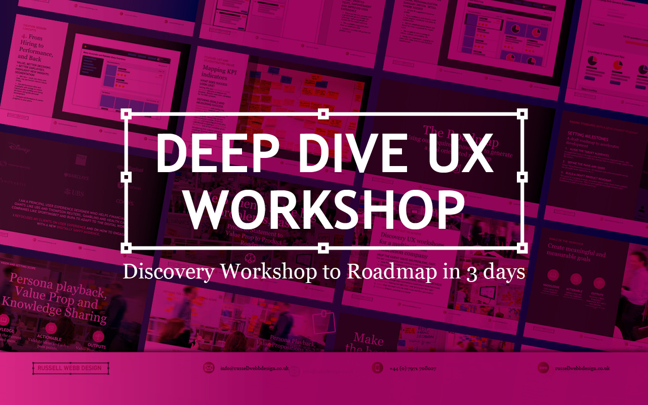
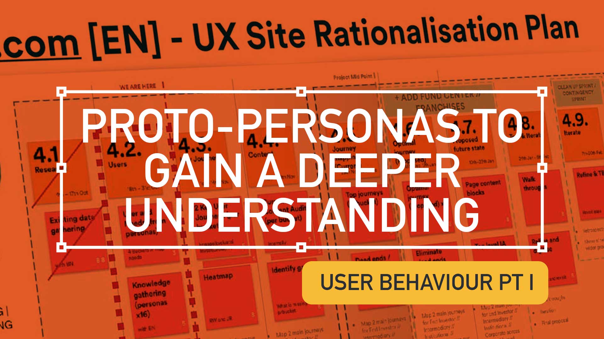
    Execute a Content Audit using proto-personas to gain a deeper understanding of user needs. Consolidate personas, communicate findings, to achieve a deeper understanding of all users.
    Empower UX to move forward with experience maps to uncover user behaviour and emotions.

    Please note; for client confidentiality sensitive parts of all imagery has been pixelated. All work is copyright ©RussellWebbDesign 2024


    Hard Skills:

    Design Process

    Service Blueprint

    Proto-Personas

    Soft Skills:

    Service Design

    Journey Mapping

    Customer Experience Design

    Full List →


    Despite resource limitations, this Content Audit project successfully utilised proto-personas to gain a deeper understanding of user needs. By consolidating and refining persona data into meaningful ‘chunks’, and effectively communicating findings to stakeholders, all lead to a deeper comprehension of users for all involved. This empowered us to move forward with the next stage – using experience maps to uncover user behaviour and emotions.

    Limited Data, Maximum Impact

    Delivering with resource constraints and tight timeline, this Content Audit / Inventory Battle Plan leverages the power of proto-personas as the primary intel.

    Gather the troops

    Assemble all content audit data

    Regulated design environments are often constrained – it is important to offer agility and be resourceful. This level of Service Design would benefit from ;

    • Customer surveys
    • Stakeholder interviews
    • Analytics (rationalised down into meaningful chunks)

    …and additional data. For this UX project the starting point was an extended collection of unverified proto-personas. These were then rationalised in to bucketed or grouped personas.

    Navigating the complexity of proto-personas

    Despite resource limitations, this Content Audit project successfully utilised proto-personas to gain a deeper understanding of user needs. By consolidating and refining persona data into meaningful ‘chunks’, and effectively communicating findings to stakeholders, all lead to a deeper comprehension of users for all involved. This empowered us to move forward with the next stage – using experience maps to uncover user behaviour and emotions.
    Proto-personas: Adaptability in the face of organisational inertia and provide clarity to maintain stakeholder engagement.

    Adapt UX to audience and personas

    Larger organisations, often new agile methodologies, may still be in the early stages of embracing lean UX, so adapt your approach to your audience is a key skill.

    When personas are agreed and validated as the only ‘source of truth’ – there also must be alignment that these refine and adapt personas over time, ensuring that they remain relevant.

    Despite resource limitations, this Content Audit project successfully utilised proto-personas to gain a deeper understanding of user needs. By consolidating and refining persona data into meaningful ‘chunks’, and effectively communicating findings to stakeholders, all lead to a deeper comprehension of users for all involved. This empowered us to move forward with the next stage – using experience maps to uncover user behaviour and emotions.
    Overly detailed personas can dilute effectiveness, especially for large organisations. This task focused on consolidating personas for greater clarity.

    Focussed personas work well. Larger organisations multiply these audience types and their impact is reduced. This task looked at grouping and sorting by commonalities

    Conduct extensive desk research to develop a deep understanding

    Despite resource limitations, this Content Audit project successfully utilised proto-personas to gain a deeper understanding of user needs. By consolidating and refining persona data into meaningful ‘chunks’, and effectively communicating findings to stakeholders, all lead to a deeper comprehension of users for all involved. This empowered us to move forward with the next stage – using experience maps to uncover user behaviour and emotions.
    Embark on a deep dive of user research to become the brand’s go-to expert on your target audience.

    Absorb insights

    Take the time to listen and absorb – Become the brand’s knowledge hub.

    Absorbing insights and data is vital. Time spent at this stage of your research is key for informing a future IA.

    Dig deeper to understand your users problems, needs and goals

    Despite resource limitations, this Content Audit project successfully utilised proto-personas to gain a deeper understanding of user needs. By consolidating and refining persona data into meaningful ‘chunks’, and effectively communicating findings to stakeholders, all lead to a deeper comprehension of users for all involved. This empowered us to move forward with the next stage – using experience maps to uncover user behaviour and emotions.
    Experience maps are your tools to excavate the nuances of user behaviour, emotions, and motivations. Use this to win over their hearts and minds.

    Empathy-driven UX; Personas and experience maps

    By delving into the emotional landscape of proto-personas, designers can gain a deeper user understanding. This insight fuelled the development of a clear and empathetic experience map.

    Understand your audience types ; Their needs, aspirations, and behaviours. Commonalities and patterns will surface.

    Common Thread and Outcomes

    Despite resource limitations, this Content Audit project successfully utilised proto-personas to gain a deeper understanding of user needs. By consolidating and refining persona data into meaningful ‘chunks’, and effectively communicating findings to stakeholders, all lead to a deeper comprehension of users for all involved. This empowered us to move forward with the next stage – using experience maps to uncover user behaviour and emotions.
    By selecting the most crucial key phrases from the workshop discussions, I was able to distil the essence of each audience type and crafted them into a call-to-arms that galvanised the mapping stage

    Next steps

    By consolidating vast amounts of data into prototype persona groups, this Service Design approach conveys insights for stakeholders to digest, leading to deeper user understanding for all involved. This then informs the next stage, ‘Using Experience Maps to uncover user behaviour and emotions.’

    Please note; for client confidentiality sensitive parts of all imagery has been pixelated. All work is copyright ©RussellWebbDesign 2024

    RussellWebbDesign: Get your fill of UX trends, case studies and best practice
    Building a Wealth Management Super App

    CASE STUDIES

    Design with the dark mode trend front-of-mind

    Delight, speed and satisfaction are rewriting our UX playbooks in finance

  • Discovery Workshop to Roadmap in 3 days

    Discovery Workshop to Roadmap in 3 days

    TLDR; Navigating Ambiguity
    Using workshop techniques I validated personas to surface a UI that promoted next steps for a Candidate Portal.

    Solving 3 big problems in 3 days; Aligning the target audiences through journey mapping, defining a Value Proposition and building a draft Product Roadmap.


    Hard Skills:

    Journey Mapping

    Research

    Visual Design

    Goal-oriented Roadmap

    Soft Skills:

    Empathy

    Collaboration

    Critical Thinking

    Full List →


    How to facilitate an ideation workshop around solving problems, understanding through ideation, knowledge sharing (based on agreed on personas)
    How to facilitate an ideation workshop around solving problems, understanding through ideation and knowledge sharing (based on agreed on personas)

    Help clients solve big problems, fast

    This user-centred and business workshop focussed on;

    • Business Problem Statement – The What
    • Value Proposition Statement – How to excite users / customers
    • Product Roadmap – Action/Next Steps

    What we set out to achieve

    Recently I was leading the Discovery phase for a multinational publishing, education & recruitment company. My prime objective was to facilitate the generation of a Value Proposition within a collaborative workshop environment based around three hypotheses;

    • Understand‘Getting the right idea’ and ‘getting the idea right’
    • Ideate – Align the team | Get creative
    • Roadmap – Present, prioritise and theme

    Defining Vision, setting scope

    How to facilitate an ideation workshop around solving problems, understanding through ideation, knowledge sharing (based on agreed on personas) and then attributing those personas, via SMEs validation, to surfacing UI to promote next steps plotted on a goal-oriented roadmap.
    How to facilitate an ideation workshop around solving problems, understanding through ideation, knowledge sharing (based on agreed on personas)

    Persona Playback, Value Propositions and Knowledge Sharing

    Validating Personas proved crucial. Early ‘Understand’ sessions proved invaluable in terms of getting to know the client’s ecosystem and getting closer to the overall workshop goals. Goals included personas improvements using a Value Proposition Canvas to expose misunderstandings, define Jobs To Be Done (JTBD) and Pains and Gains – more importantly it identifying key themes and services that would appeal to these personas. This ensured any misalignment did not cascade down to the Journey Maps on Day 2

    What we were trying to achieve using ‘Ask the experts’. Early touch points included attracting educational establishments and employers using baked-in services, plus having the ability to grow the market was paramount for particular personas. The client had the raw building blocks and the workflow for their ‘niche product for a niche market’, communicating that vision was the challenge.

    Customer Journey Mapping – Make the best hiring decision

    How to facilitate an ideation workshop around solving problems, understanding through ideation, knowledge sharing (based on agreed on personas) and then attributing those personas, via SMEs validation, to surfacing UI to promote next steps plotted on a goal-oriented roadmap.
    How to facilitate an ideation workshop around solving problems, understanding through ideation, knowledge sharing (based on agreed on personas)

    Gaining alignment across stakeholders on what making the ‘Best hiring decision’ journey looked like. Creating a visual representation of every experience a key persona(s) had with the client helped to tell a story, more importantly this led to a prioritised ideation list (visual solutions).

    Making the Best Hiring Decision

    • Initial stages – Planning and approval
    • Intermittent stage – Profile building, search and selection tools
    • Final stage – Interview, agreement and follow-on activities

    The exercise also highlighted a level of anxiousness, through to excitement and eventual relief. A truly valuable activity that presented opportunities that were eventually clustered and presented to the group as an adaptive Crazy 8 activity.

    Ideation and Roadmap

    Finally, this led on the most challenging section of the workshop, the Ideation Sessions. This resulted in 4 concept areas to prioritise on the road map and populate a timeline.

    Sketching can be scary!

    Demonstrate the steps to avoid a cold start.

    Push back on judgement calls and champion quantity over quality. All participants should take advantage of the knowledge in the room, bounce ideas off each other and improve through collaboration. A process of silent note taking, constrained to a page/large Post-It note, resulted in 4 principal concepts.

    Value: shorter tests, improve the UX

    Value: Personalisation. Summary driven.. 

    Value: candidate self-improvement.

     Value: better decision = better employees.

    Boosting Engagement

    Shortcuts to Success

    Shortcuts to Success

    • * Faster, more reliable tests: Reduce testing time and increase reliability
    • Personalised engagement: Tailor tests to individual needs, leading to higher engagement and lower churn.
    • Business-focused UX: Align testing with business goals by leveraging KPIs; Targeted feature development.
    Supercharge Testing

    Impactful Tests

    • Reduced client churn: Shorter, feedback-driven tests foster client satisfaction and retention.
    • Diversity in hiring: Objective, efficient testing helps attract diverse talent and improve hiring decisions.
    • * Shared Data; All backed up by a global database
    Boost diversity & retention

    Innovation for Early Adopters

    • * Modernise testing: Introduce innovative concepts too early adopters only.
    • Candidate quality and validity: Prioritise attracting the best candidates. Ensure test results are accurate and reliable.
    • Goal-oriented roadmap: Leverage learnings to craft a clear roadmap for continuous improvement.
    Better candidates | More valid results

    Goal-oriented roadmap

    Setting standards with a development Roadmap

    Solving big problems and setting milestones through a draft roadmap contributed to accelerating development across the current period and the next. Raise their internal products up to today’s standards was a priority. This roadmap was a significant step closer to this.

    3 big problems in 3 days

    Align the target audiences 

    We did this across the group early on through a deep-dive personas playback session. This proved essential both to enable the journey map but also assigning value in the KPI session.

    Define the Pains and Gains

    This was accomplished with a Value Proposition Canvas. A useful business tool to surface Pains and Gains and Jobs-To-Be-Done

    Build a draft Product Roadmap 

    This acted as a our North Star and as a high-level visual summary of the workshop outcomes; Two development streams; Two principal personas.


    As a value-add, a UX / UI Report consolidating all data was generated, highlighting the groups new findings and areas for improvements to inform future Timelines and Roadmaps.

    RussellWebbDesign: Get your fill of UX trends, case studies and best practice

    Discover high-impact UX case studies

    Portfolio case studies describing design, my UX process, and business impact.

    From boosting user adoption in fintech, to improving trust with responsible gambling through to retaining Millennials in the world of ‘digital lotteries UX’ to leveraging key USPs for mobile healthcare.

  • Dashboard UX to Business UI

    Dashboard UX to Business UI

    Enterprise-level, real-time data from multiple sources, instantly accessed, no more hunting.

    A single-source-of-truth of unifying insights speak volumes: 56% iPad growth in just 1.5 years over 100K client meetings

    The Problem Statement

    Problem framing

    Best practices

    Design principles

    To respect confidentiality agreements, the branding and specific naming have been modified. This product is currently live and serving 6k users

    Within a strictly regulated financial environment my clients use dashboards data every day.

    Users

    Advice

    Quotes

    Investment

    As the world’s largest wealth manager, catering to affluent clients requires exclusive online services like advice, quotes and investment strategies, delivered digitally. Internal systems application empower the two principal user groups;

    • Customer Consultant Associates
    • Customer Consultant* (CCA’s/CC’s),

    Assembling these customer meetings takes time, accessing strictly private data to provide a complete, competitive and professional service requires a tailored and specialised tool – of which the Customer Meeting App* is the bank’s primary channel.

    What are the driving factors for developing a dashboard?

    Strategic insights

    Information architecture

    Single source

    Imagine client meetings where crucial information is instantly accessible, scattered data unified, and time spent hunting replaced by strategic insights. This is the potentially transformative power of the Customer Meeting App’s dashboard, built around three “must-have” features:

    1. Single point of access for disparate data
      Instead of opening various applications, interfaces, or online databases, the CCA’s/CC’s have a real-time dashboard.
    2. Broad overview with drill down capabilities
      A dynamic dashboard, digital documentation and secure access.
    3. Easier, faster, sign source of truth
      Consolidated statistic, statues displays, contextual information, and ‘Edit’ functionality placed intelligently for quick consumption.

    Achieving speed, clarity, and brand harmony

    Journey

    Processes

    Re-imagine

    Problem and Opportunity

    The existing offering had become redundant, with processes and previous ways of working no longer relevant or appropriate. The client required the seamless integration of data from third-party repositories and a significantly improved user journey. This presented a clear opportunity to re-imagine the complete ‘Create a Customer Meeting’ user journey.

    Dashboard design best practice

    There are 3 dashboard design principles that are drove decisions and are considered best practice:

    1. Five-second insight

    Funding was a principal driver for this project. Empowering a more intuitive process to adding customer data (account numbers, quote links, investment profile links, and upcoming future services) at a glance was key to the baseline UX.

    2. Inverted pyramid layout

    The inverted triangle displays the most significant insights on the top, trends in the middle, and granular details towards the bottom.

    3. Brand champion and ensure DS achievability

    Championing UCD principles for both organisation’s values and consistency was a challenge. Without a dedicated UX stakeholder, negotiating a new global Design System, within budget and development constraints proved demanding.

    Reimagining Client Meetings

    Scalability

    Visual Hierarchy

    Visual Design

    To respect confidentiality agreements, the branding and specific naming have been modified. This product is currently live and serving 10K plus HNW users.

    To reiterate the design process, I went through the following:

    1. Step 1 – Start with the user needs
      The foundation of successful design. Streamlining the preparation of a meeting, and principally future proofing the Create a Meeting process with a scalable UI that can seamlessly integrate new data repositories, ensuring long-term flexibility.
    2. Step 2 – Segment the experience in to ‘zones’
      The on-screen real estate delivers a quick look experience prioritising top from bottom.
    3. Step 3 – Test and Challenge through Prototyping
      Visualising up to 12 users’ journeys leads for better understanding and smoother development. Developers also need reassurance that this would be a boxed development and will not impact working code.

    Driving Discovery UX within a challenging Agile environment

    Hierarchy

    F-Pattern

    Low-fidelity prototyping

    Early sketches are crucial: They reveal the potential of a dashboard, emphasising hierarchy through top-down, left-to-right user scanning patterns. Grouping key data, utilising white space, and enabling light touch drill-down are key drivers.

    Scope and hierarchy: Initial sketches focus on what’s important, pushing a hierarchical arrangement that guides the user’s eye. Data is prioritised with ‘glance-access’ to preview Meeting Name at the top, followed by Last Modified and owner information.

    Chain of command flow: Expanding on the ‘Mini’ concept, this ‘Maxi’ Dashboard version offers the full experience. Enabling the CCA’s/CC’s to very quickly assess top level meeting status and drill-down to Privacy Setting, customer ID photos, and Mode of Contact.

    Sketching a tailored experience

    What is in scope: These initial sketches start to show the power of a dashboard. Pushing the hierarchical arrangement, the user’s eyes organically concentrate from top to bottom, left to right. We have the data, so embracing the Meeting Name and grouping the Last Modified through to the Meeting Owner data just makes sense.

    Estimation sketches 

    In Agile, pre-estimation is an important ceremony before sprinting. An efficient method of conveying your UI is to sketch and quickly map out the flow, the user interactions and where the final CTAs might be..

    Realising a final solution

    To respect confidentiality agreements, the branding and specific naming have been modified. This product is currently live and serving 6k users

    A conceptual dashboard with multiple layers.

    The final solution solved both the scalability problem, providing easy access to account numbers, the ability to add other account numbers, visibility on the meeting date and time, and the meeting status and who is the meeting organiser, all there front-of-stall for the user. Complete transparency on meeting detail, including location, meeting language an whether the meeting has typed notes and freehand notes plus special features including packaging the meeting contents ready to send the customer and associating the meeting with a customer ID.

    A new dashboard suite is here;

    • Highly Readable
    • Inherently Scalable
    • Data-Driven

    Design Trade-Offs

    Business Reality

    ROI

    Inverted Pyramid

    One key factor in the development (and acceptance) of this new radical design was ‘achievability’. Funding in a key developmental constraint with financial services, without it a project will not leave the ground – designing with business realities is a UX key skill. 

    Account number drill-down

    The UX was sold into the business as streamlining the ‘Create a Meeting’ user flow at a single glance, adding value at the advisory level.

    There are four (4) account numbers associated with this meeting. The user is able to hover, edit or launch a pop-over dialog box to create an account specific meeting from this functionality.

    Hierarchical details

    Providing a tiered ‘inverted triangle’ proved to be an excellent facilitator for the single-point of truth concept. Employing hover state ‘tooltip’ functionality allowed for a broad overview with drill-down capabilities.

    Global Digital Shift

    Adoption

    Impact

    Massive UX Reach

    To respect confidentiality agreements, the branding and specific naming have been modified. This product is currently live and serving 6k users

    40

    Countries

    190

    Offices

    100k

    100,000 Meetings

    48%

    8% to 56% Worldwide Growth

    The bank is present in more than 40 countries with approximately half of their 190 offices are in western Europe, where half of the Customer Meeting App meetings are delivered on the iPad. This is a phenomenal growth from 8% to 56% worldwide in the last 18 months.

    100,000 meetings prepared and delivered via the application each year. A true revolution!

    *Names changed to protect the innocent

  • Design habits – Tip your hat to your design heroes

    TLDR: Inspired by design masters, this can aide your creative process: User first through to competition analysis, (innovation nit imitation), to
    familiarity and then focus on value then finally beautiful execution

    As a junior designer, way back when, I visited our local design museum (I studied in London, UK, so my local design museum was fortunately the rather impressive Design Museum in Shad Thames) and fantasied over how great it would of been to be involved in, say, designing a Charles and Ray Eames leather recliner, or Dysons Cyclone Vacuum cleaner.

    Now I’m doing stuff I feel proud off, in the field of UX/UI, I thought it worthwhile to see if I could mirror the process these great designers took and document it from a UXers perspective. So, here we go. I started with the following criteria:

    • Give users choice.
    • Competition Analysis
    • Design with familiarity in mind
    • Prioritise features that add value – the “Magic Moment”
    • Beautiful execution
    • Todays’ Brave New World
    (more…)