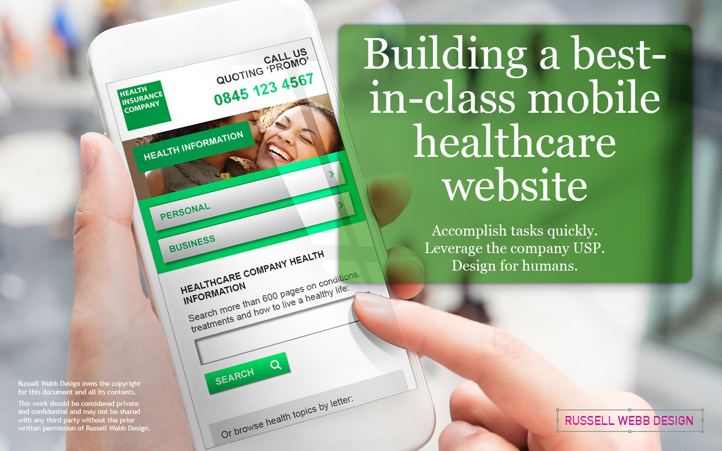
TL;DR; The process of designing a mobile-only website for a leading healthcare company, focusing on task efficiency and leveraging the company’s unique selling proposition (USP) of a world-class medical health database. With insights into stakeholder management, design principles, navigation strategies, typography tips, and conclusions on prioritising the human experience over internal politics.

Accomplish tasks quickly | Leverage Company USP | Design for humans
Setting the scene
As an agency lead designer, I spearheaded the design of this mobile site for the UK’s leading healthcare company, by assembling an exceptional team. Bringing together external and internal creatives, I forged a collaborative venture, leveraging the collective expertise of both parties to achieve a shared vision.
Building on the companies USP

The ultimate objective of a mobile user is to complete their task (wherever they are) efficiently and effortlessly.
The first step in the design process was to understand the company’s USP (unique selling proposition). In this case, the USP was the company’s case studies, which are a valuable resource in both the Personal and Business private medical insurance (PMI) customer journeys, even though their needs were different.

600+ Case Studies database forms the bedrock of this organisation
For a personal user, holding a baby in one hand, and casually scrolling the companies case studies in another – was very typical behaviour. As designers, we were very keen to encourage and play on this USP
Stakeholder management and leveraging a USP
The home page of the site was designed to be a central hub for users. It provides clear navigation options for both personal and business users, and it also highlights the company’s case studies (more lessons learnt on this in my conclusions).
As lead designer this was our biggest challenge – as managing stakeholder and defining how distinct these journeys needed to be, all with the end use front-of-mind. Irrelevant functionality is disabled so that the user is guided by just a handful of clearly labelled journeys, one of which is the companies USP; their Case Studies.

Case Studies and stories from members; How to take control of your personal conditions with the company supporting them.
Case Studies: We took the opportunity to call-out the quality and depth of these case studies with language like ‘Search more than 600 page on conditions, treatments and to to live a healthy life’
Fresh content
Fresh content is delivered via the company’s twitter feed. This form of brand reinforcement, (i.e. directly with the user and directly with a trusted reliable knowledge centre) cemented the fact that their digital offer should be grounded 600+ Case Studies database that forms the bedrock of this organisation
Two CTA; Two Sign-Posts

Valuable copy and engaging navigation is already at work here, guiding users to with well written UX copy and then, politely asking for more information – this is a common UX pattern. Demonstrate how your offer is both valuable and engaging before users are committed to a sign-up process, or impart any personal information.
Reading top to bottom, a personal customer is informed, followed directly after by the CTA ‘Get Diagnosed’. Inform then action – this pattern, positioning throughout the experience, provided the blueprint in both Business and Personal, from early hand holding to product details (coming up)

Anticipating your user needs
An intuitive interface, one that anticipates, became a ‘design rationale’ as the project progressed. Personal users were typically looking for tailored dental plans and competitive travel insurance – so the design team pushed for this within the Personal Health Insurance site pages.
Database management generates ‘Related Content’ widgets to reinforce the task completion; ‘Get the job done’ was a driving design principle.

Business / All Products
Progressive disclosure allows for controlled call-backs for three main sections; Protect, Prevention and Support. The same ‘Inform then action’ UX is adopted for these sections and sign posts cap each section with clear CTAs; ‘Call Us’, ‘Share’ or navigation ‘Top’ or ‘Home’. Consistency in spacing, in formatting and in copy all contributed to defining the business and personal PMI user journeys.
Get Product Guidance with ‘Meta’ onboarding
Simple tasks inside the experience to help users overcome the cold-start problem.

Ask questions, re-order content or confirm metrics
Onboarding has many flavours, from product tours to in-app guidance, tooltips to trigger alerts; Here we use ‘meta’ onboarding, a selection of simple tasks inside the experience to help users overcome the cold-start problem. Meta onboarding can be super-effective—it engages new users immediately, grabs their attention with a few quick wins, and leaves the impression that your product will be easy to use.

Typography Tips for better mobile design
Contrast and legibility are guiding principles in UX and typography, especially in the mobile space. One size fits all; Throughout this site all font sizes are consistent, in fact I have only used one size throughout, all from the same family. You will notice variation exists with case sensitivity, weight and colour.
Word count and font size
As a general rule of thumb, design for approx 45-75 characters per line. The mobile design community recommends that text size on mobile apps should be at least 16 – 18 pt and where possible, use system fonts, not bespoke.
Contrast and legibility rule the roost, especially in the mobile space. Throughout this site all font size is consistent, in fact I have only used one size throughout. You will notice variation only exists dependent on case sensitivity, weight and colour.
Too much contrast can be difficult for dyslexic readers to view, so black is set to #333333 to make reading more pleasant. This conforms to WCAG 2 guidelines.
Business Health

Using trust and existing content to build a human story.
As mentioned, mobile case studies were the company’s USP. Users trusted this case study database to explain medical procedures, highlight causes and provide tools to self-diagnose their personal symptoms from their most personal device; their mobile.
It was clear from the onset that UX decisions should use this hook. It became less critical to either business and personal PMI journeys, and more important that both user groups are all human. So a human story built on trust, on useful information and on content the company already possessed was always going to be a founding design principle.
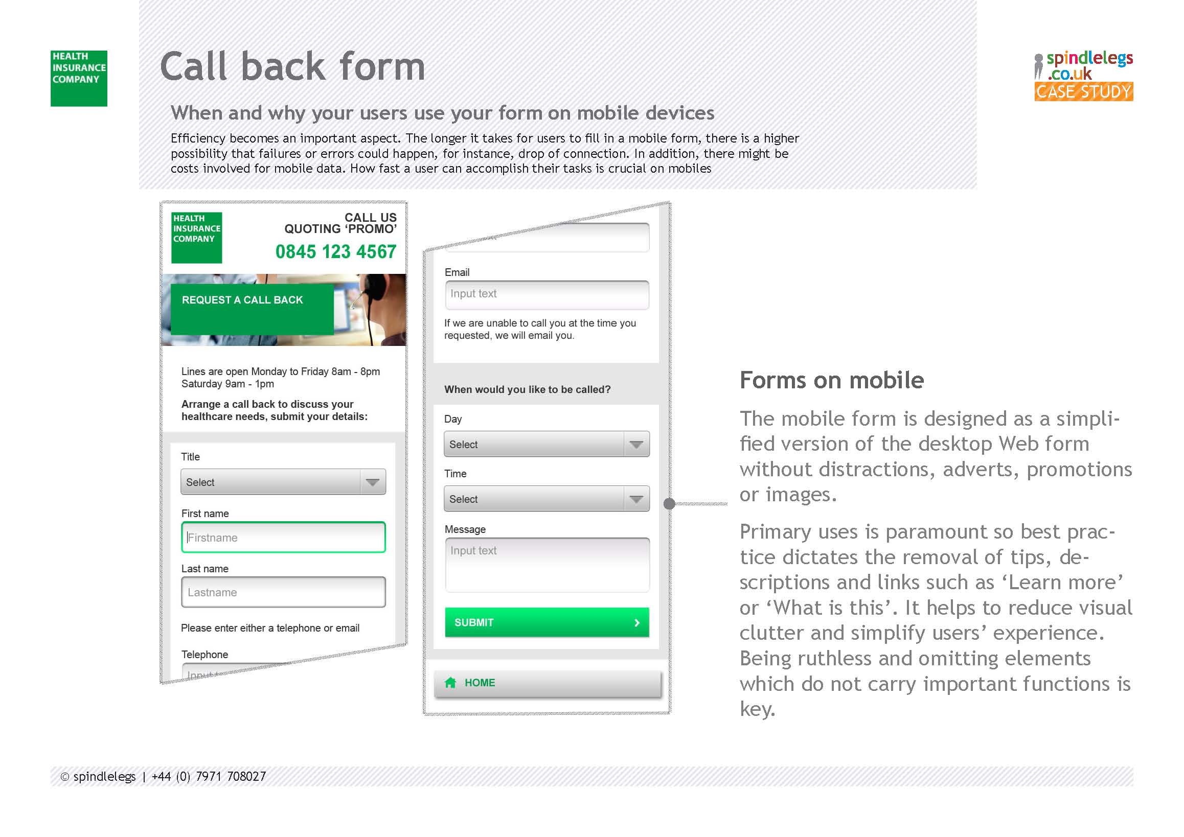
Always there, always present

The primary task of performing a medical diagnosis on mobile contact forms was paramount. The longer it takes for users to fill in a form, the higher probability of failures or errors. Mobile data costs, connection drops and task completion suddenly become your priorities with designing on the smaller screen.
Forms on mobile
The mobile form is designed as a simplified version (and can be argued, a better version therefore!) of the desktop web form without distractions, adverts, promotions or images.
Best practice dictates the removal of tips, descriptions and links such as ‘Learn more’ or ‘What is this’. Be ruthless; This helps to reduce visual clutter by omitting elements that impede the user’s task.
My conclusions

Accomplishing tasks quickly
Task completion, especially on mobile and especially in the healthcare space were driving factors behind that is redesign of this mobile site
Typography
One size font throughout And provide variety with font weight and colour but within the guidelines set by the mobile design community and WCAG
‘Meta’ Onboarding
Adapt ‘Meta’ onboarding techniques and help user overcome the cold-start problem
Leverage the companies USP
Early stakeholder meetings emphasised the need to differentiate the user flows for personal and business users, but this became a false start as all users trusted the company’s USP: their case studies.
Two navigational signposts | Two CTAs
This satisfied the business and personal user-flows and their requirement – but didn’t define the design from a top level. This was always going to be the end user, remember; Design for humans
From a UX perspective my North Star became less about internal business politics and more about the human end-user; A fundamental UX philosophy that designers can adopt for the majority of their projects.
Get in touch
15+ years UX experience | Finance | Gambling | Healthcare | Figma Ninja | Design System Guru
Download and keep
CV
Workshops to stakeholder mngt and much more
Or just leave a comment below.

Pique’d your interest?
This is but part of a selection of design information russellwebbdesign generated for the creative community out there. Please contact me further to discuss how your brand can benefit from the new channel: info@russellwebbdesign.co.uk
If something has peaked your interest. Please leave a comment below.