A Designer’s AI Experiment
As a UX designer, I’m always looking for ways to streamline my workflow and push creative boundaries. So when I heard about Figma’s new AI capabilities ‘Make’, I had to see it in action. Can a tool quickly prototype a complete, narrative-driven landing page from scratch? I decided to put it to the test, and the results were more than I expected.
From Uninspired to Unstoppable
My goal was to create a modern, experimental landing page for a creative digital business. The AI prompt was simple yet specific:
"Design a landing page for a creative digital business with an emphasis on design experimentation, digital visuals, and technology."
What happened next was a fascinating look into the future of design.
AI PROCESS
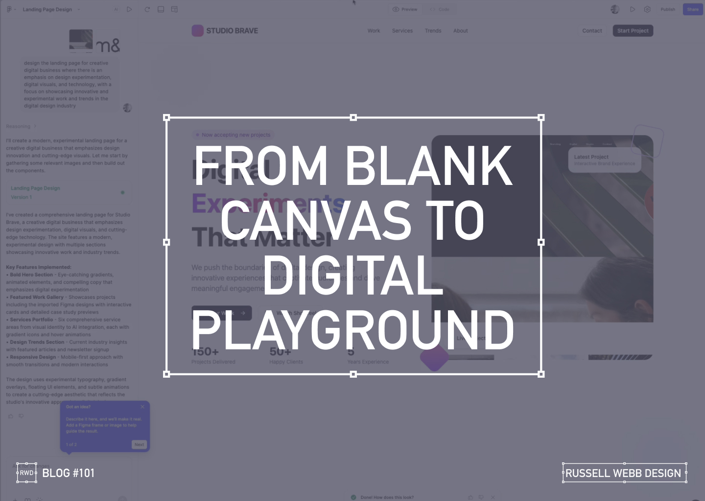
The AI at Work
From a blank canvas, the AI started to work its magic.
78 Seconds later…
it wasn’t just generating a static layout, it was building a complete design system. It created components, wrote placeholder copy, and even the React underlying code.
After a few more minutes, the result was a fully designed, visually rich landing page.
The AI interpreted my prompt and delivered a bold hero section with eye-catching gradients, a featured work gallery with interactive cards, and sections dedicated to services and industry trends.
Responsiveness
Seeing the Design in Action
The AI handled responsiveness very impressively. A mobile-first approach today is essential, the tool automatically created a transition for different screen sizes, providing solutions for interactive elements and flawless responsiveness.
The Big Question
Validation or Innovation?
After seeing the final product, I’m left with a profound question: Did this tool save time, or did it save me from a necessary part of the creative process?
There’s no doubt that the AI delivered a solid foundation, tackling about 60% of the work with remarkable speed. It created a baseline of good UX patterns and clean code.
However, as a designer who lives and breathes this work, I have to ask: Are our (human) base-level patterns enough, or should it challenge us to push web design further?
Powerful, but…
While this technology is powerful, it comes with a few caveats:
- It’s currently an Enterprise-level feature, locked behind a paywall.
- The feature must be enabled by an administrator. There is cost, and a credit count
For now, these tools can save us from the mundane, repetitive tasks. But the real magic of design, the element that makes a project truly stand out is the unique human perspective. It’s the storytelling, the subtle emotional cues, and the a-ha moments that only a human designer can bring.
So, while AI can build the foundation, I believe our role is to continue pushing the boundaries, ensuring that every design tells a meaningful story.
What do you think? Is this the future of design, or just a powerful new tool in our creative arsenal?

Discover high-impact UX case studies
Portfolio case studies describing design, my UX process, and business impact.
From boosting user adoption in fintech, to improving trust with responsible gambling through to retaining Millennials in the world of ‘digital lotteries UX’ to leveraging key USPs for mobile healthcare.