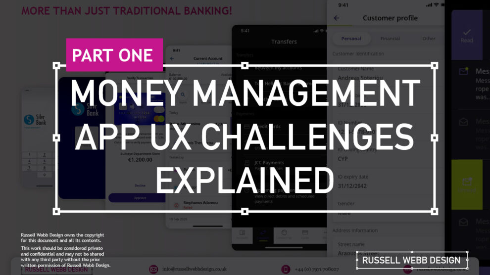
A two-part deep-dive focussing on mobile UX design targeting seasoned designer-types, mastering Design Theory, and navigating lean Agile challenges.
Hard Skills:
Journey Mapping
Research
Visual Design
Soft Skills:
Empathy
Collaboration
Critical Thinking
Welcome to Pt I
Real-world app design challenges by persona
This two-part case study will be exploring UX design challenges within the financial ecosystem that different flavours of UX designers can face. Part I focuses on why wealth management apps are becoming super relevant and how certain UX designers experience different challenges.
Along the journey, I will also be supercharging the project objectives;
- Catch-up feature parity
- Prioritising critical features
- Stakeholder education (Design Systems)
Let’s kick off by asking ‘What type of UX-er are you?’
Silvr Bank – Europe’s Best Digital Bank*
The overarching goal with Silver Bank* is to design an interface for a thriving Generation X user group, with an emphasis on growing the fledgling millennial users – i.e mobile-first. The C-level were looking to expand and improve their digital offer.
3,000 employees | 85 branches | 2nd biggest player in its market
What type of UX-er are you?
The challenges are many, so to focus this case study and depending on where you are in your UX journey, both as an individual and within a team, I have split these challenges in to three typical UX professional personas;
- Mr ‘UX-design-is-completely-theoretical’ Designer
- The brainstorming UX Designer
- The UX Consultant on-a-mission
In this post, let’s drill-down on challenges faced by our first persona;
Mr ‘UX-design-is-completely-theoretical’ designer
This designer is at the beginning of their journey. They are a sponge, soaking up the design thinking processes and navigating their way through YouTube UX tutorials. Along the way they do need to get their hands dirty and experiment. To push back on theories, effects and laws. Learn to go with their gut and develop that inner self, that inner individual designer.
Laser Focussed on Design Systems and Best Practices
Maintenance of a fully functioning Design System has its own set of challenges. Inevitable non-creatives will ask;
- For a ‘Design System’, where are the outcomes for non-creatives?
- Who and how is it maintained (and who pays for it)?
Product teams will inevitably be looking for final deliverables they can understand (and charge for). This typically manifests itself as desktop and mobile UI screens. So while your designer is focused on perfecting their Design Token Figma file, the rest of the team are simply waiting for consistent UI.
Get you hands dirty… then give-back
Experienced designers learn their trade. The rest gain practical knowledge while learning the theoretical way. So experiment, make mistakes, try again, share your experiences, and then give these lessons back to the design community as an experienced designer. [For example, this post]
(Too much) user experience psychology
Theories and Laws can become overwhelming;
- Retention Theory – Proportion of the information vs. time spent on a page
- Serial-Position Effect – Recollection of the first and the last in a list of words
- Hick’s Law – Response to multiple stimuli is delayed forcing user to ‘stay longer’
- The Schema Theory – Human brains like to organise knowledge into meaningful units, or schematas
… I could go on, (my go-to is personally Gestalt Principle). From another perspective, and another theory:
Humans are fickle creatures, they don’t follow the rules.
These theories alone can help with design decisions, but there is no ABC, no tried-and-tested foolproof formula. So make the intelligent choice, be brave and go with your instincts.
Explore other perspectives on money management challenges
You now have a snapshot on why these management apps are so prevalent from one designer type perspective. But what challenges do other UX designer types face, see Pt II – Money Management App UX Challenges to explore how experience and perspective can influence the challenges and solutions you may face as a certain designer type.

Pique’d your interest?
This is but part of a selection of design information russellwebbdesign generated for the creative community out there. Please contact me further to discuss how your brand can benefit from the new channel: info@russellwebbdesign.co.uk
If something has peaked your interest. Please leave a comment below.
