Author: Pure UX

  • Dashboard UX to Business UI

    Dashboard UX to Business UI

    Enterprise-level, real-time data from multiple sources, instantly accessed, no more hunting.

    A single-source-of-truth of unifying insights speak volumes: 56% iPad growth in just 1.5 years over 100K client meetings

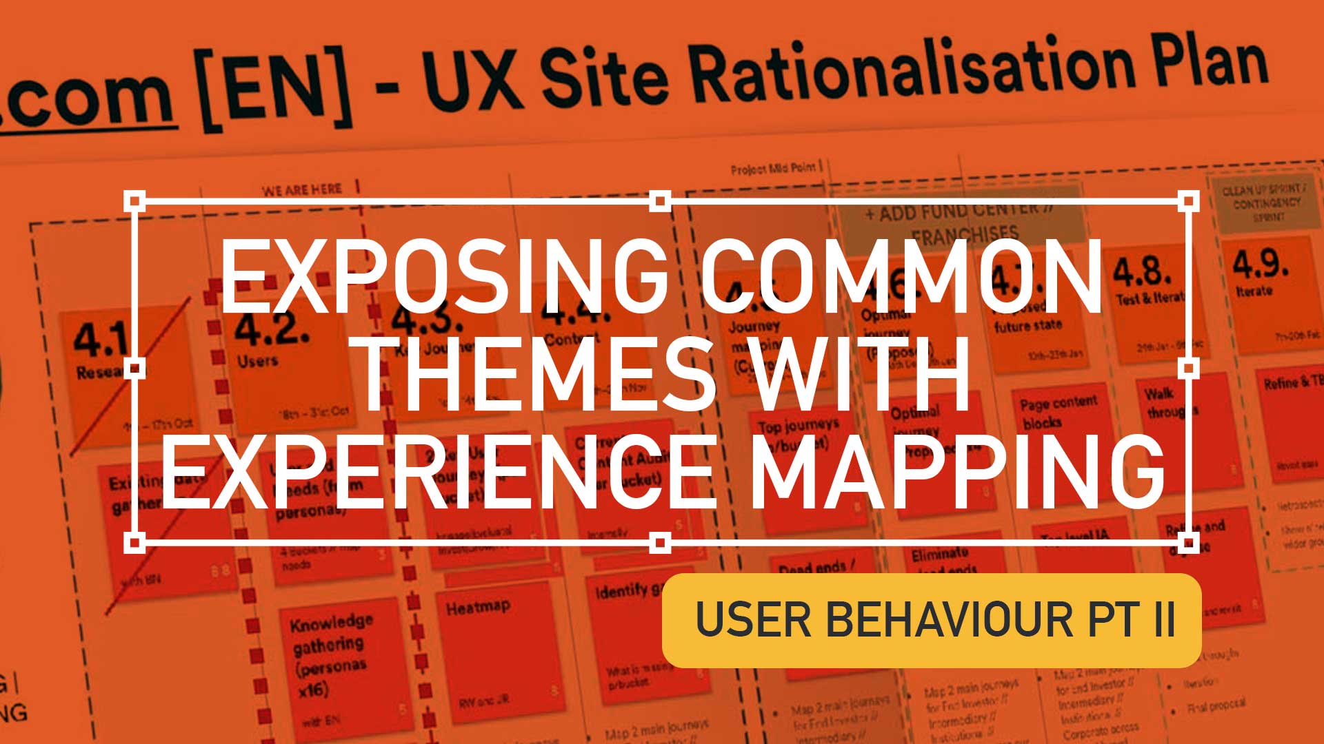
    The Problem Statement

    Problem framing

    Best practices

    Design principles

    To respect confidentiality agreements, the branding and specific naming have been modified. This product is currently live and serving 6k users

    Within a strictly regulated financial environment my clients use dashboards data every day.

    Users

    Advice

    Quotes

    Investment

    As the world’s largest wealth manager, catering to affluent clients requires exclusive online services like advice, quotes and investment strategies, delivered digitally. Internal systems application empower the two principal user groups;

    • Customer Consultant Associates
    • Customer Consultant* (CCA’s/CC’s),

    Assembling these customer meetings takes time, accessing strictly private data to provide a complete, competitive and professional service requires a tailored and specialised tool – of which the Customer Meeting App* is the bank’s primary channel.

    What are the driving factors for developing a dashboard?

    Strategic insights

    Information architecture

    Single source

    Imagine client meetings where crucial information is instantly accessible, scattered data unified, and time spent hunting replaced by strategic insights. This is the potentially transformative power of the Customer Meeting App’s dashboard, built around three “must-have” features:

    1. Single point of access for disparate data
      Instead of opening various applications, interfaces, or online databases, the CCA’s/CC’s have a real-time dashboard.
    2. Broad overview with drill down capabilities
      A dynamic dashboard, digital documentation and secure access.
    3. Easier, faster, sign source of truth
      Consolidated statistic, statues displays, contextual information, and ‘Edit’ functionality placed intelligently for quick consumption.

    Achieving speed, clarity, and brand harmony

    Journey

    Processes

    Re-imagine

    Problem and Opportunity

    The existing offering had become redundant, with processes and previous ways of working no longer relevant or appropriate. The client required the seamless integration of data from third-party repositories and a significantly improved user journey. This presented a clear opportunity to re-imagine the complete ‘Create a Customer Meeting’ user journey.

    Dashboard design best practice

    There are 3 dashboard design principles that are drove decisions and are considered best practice:

    1. Five-second insight

    Funding was a principal driver for this project. Empowering a more intuitive process to adding customer data (account numbers, quote links, investment profile links, and upcoming future services) at a glance was key to the baseline UX.

    2. Inverted pyramid layout

    The inverted triangle displays the most significant insights on the top, trends in the middle, and granular details towards the bottom.

    3. Brand champion and ensure DS achievability

    Championing UCD principles for both organisation’s values and consistency was a challenge. Without a dedicated UX stakeholder, negotiating a new global Design System, within budget and development constraints proved demanding.

    Reimagining Client Meetings

    Scalability

    Visual Hierarchy

    Visual Design

    To respect confidentiality agreements, the branding and specific naming have been modified. This product is currently live and serving 10K plus HNW users.

    To reiterate the design process, I went through the following:

    1. Step 1 – Start with the user needs
      The foundation of successful design. Streamlining the preparation of a meeting, and principally future proofing the Create a Meeting process with a scalable UI that can seamlessly integrate new data repositories, ensuring long-term flexibility.
    2. Step 2 – Segment the experience in to ‘zones’
      The on-screen real estate delivers a quick look experience prioritising top from bottom.
    3. Step 3 – Test and Challenge through Prototyping
      Visualising up to 12 users’ journeys leads for better understanding and smoother development. Developers also need reassurance that this would be a boxed development and will not impact working code.

    Driving Discovery UX within a challenging Agile environment

    Hierarchy

    F-Pattern

    Low-fidelity prototyping

    Early sketches are crucial: They reveal the potential of a dashboard, emphasising hierarchy through top-down, left-to-right user scanning patterns. Grouping key data, utilising white space, and enabling light touch drill-down are key drivers.

    Scope and hierarchy: Initial sketches focus on what’s important, pushing a hierarchical arrangement that guides the user’s eye. Data is prioritised with ‘glance-access’ to preview Meeting Name at the top, followed by Last Modified and owner information.

    Chain of command flow: Expanding on the ‘Mini’ concept, this ‘Maxi’ Dashboard version offers the full experience. Enabling the CCA’s/CC’s to very quickly assess top level meeting status and drill-down to Privacy Setting, customer ID photos, and Mode of Contact.

    Sketching a tailored experience

    What is in scope: These initial sketches start to show the power of a dashboard. Pushing the hierarchical arrangement, the user’s eyes organically concentrate from top to bottom, left to right. We have the data, so embracing the Meeting Name and grouping the Last Modified through to the Meeting Owner data just makes sense.

    Estimation sketches 

    In Agile, pre-estimation is an important ceremony before sprinting. An efficient method of conveying your UI is to sketch and quickly map out the flow, the user interactions and where the final CTAs might be..

    Realising a final solution

    To respect confidentiality agreements, the branding and specific naming have been modified. This product is currently live and serving 6k users

    A conceptual dashboard with multiple layers.

    The final solution solved both the scalability problem, providing easy access to account numbers, the ability to add other account numbers, visibility on the meeting date and time, and the meeting status and who is the meeting organiser, all there front-of-stall for the user. Complete transparency on meeting detail, including location, meeting language an whether the meeting has typed notes and freehand notes plus special features including packaging the meeting contents ready to send the customer and associating the meeting with a customer ID.

    A new dashboard suite is here;

    • Highly Readable
    • Inherently Scalable
    • Data-Driven

    Design Trade-Offs

    Business Reality

    ROI

    Inverted Pyramid

    One key factor in the development (and acceptance) of this new radical design was ‘achievability’. Funding in a key developmental constraint with financial services, without it a project will not leave the ground – designing with business realities is a UX key skill. 

    Account number drill-down

    The UX was sold into the business as streamlining the ‘Create a Meeting’ user flow at a single glance, adding value at the advisory level.

    There are four (4) account numbers associated with this meeting. The user is able to hover, edit or launch a pop-over dialog box to create an account specific meeting from this functionality.

    Hierarchical details

    Providing a tiered ‘inverted triangle’ proved to be an excellent facilitator for the single-point of truth concept. Employing hover state ‘tooltip’ functionality allowed for a broad overview with drill-down capabilities.

    Global Digital Shift

    Adoption

    Impact

    Massive UX Reach

    To respect confidentiality agreements, the branding and specific naming have been modified. This product is currently live and serving 6k users

    40

    Countries

    190

    Offices

    100k

    100,000 Meetings

    48%

    8% to 56% Worldwide Growth

    The bank is present in more than 40 countries with approximately half of their 190 offices are in western Europe, where half of the Customer Meeting App meetings are delivered on the iPad. This is a phenomenal growth from 8% to 56% worldwide in the last 18 months.

    100,000 meetings prepared and delivered via the application each year. A true revolution!

    *Names changed to protect the innocent

  • Pt II – Money Management App UX Challenges Explained

    Pt II – Money Management App UX Challenges Explained

    TLDR; The second on a two-part deep-dive focussing on mobile UX design targeting seasoned designer-types, mastering Design Theory, and navigating lean Agile challenges.


    Hard Skills:

    Journey Mapping

    Research

    Visual Design

    Soft Skills:

    Empathy

    Collaboration

    Critical Thinking

    Full List →


    Welcome to Pt II

    Real-world app design challenges, by persona

    In my previous post (01 Welcome to Pt I; Real-world app design challenges by persona) I detailed why wealth management apps are becoming super relevant and how certain UX designers types experience certain user experience challenges. Let’s move on to our second persona;

    Silvr Bank – Europe’s Best Digital Bank*

    The overarching goal with Silver Bank* is to design an interface for a thriving Generation X, with an emphasis on growing the fledgling millennial users base i.e mobile-first. The C-level were looking to expand and improve their digital offer on these foundations

    3,000 employees | 85 branches | 2nd biggest player in its market

    The brainstorming UX Designer

    At the kickoff stages this designer is focusing on the ‘what if’, they live their life in the fast lane of UX Discovery workshops and are typically very creative.

    Blindly Following a Predefined UX Process

    Every design team (or team or chapter) will have their flavour, probably with different names. The skill is to take these stages and adapt the outcomes so your creative and non-creative teams will understand and respond.

    The point is, tailor the UX process according to project needs which comprise staple elements such as research, design, prototyping, and testing (validation).

    Not Following the Iterative Design Process to Resolve Issues

    It is crucial and all kick-off stages with all new teams to pivot towards an MVP mindset. Here is my take in the ‘Three must-haves’;

    • Clients must have an understanding of the iterative process 
    • Clients must understand developing software within Scrum is not typical to a design agency. No Big-Bang please.
    • A strong UX-er must be able to push-back on customisations that hold little value and only slow down the Scrum Train.

    Designing within Scrum has its own challenges, but one of the clear benefits is the ability to ‘go fast’. This speed is only maintained if the core team are synced and understand that fast decision making, a complete understanding of the iterative process and grasping an MVP mindset must all be entrenched.

    Confusing signposting – Crazy pop-ups and misunderstood empty states.

    If you don’t understand the flow, how do you expect your users to?

    Do not implement multiple pop-ups on your landing page. Do guide user with short concise phrases that give state, progress and system status (See: Usability Heuristics: #1 Visibility of system status)

    The pop-up frequency, relevance, and placement are key factors that make or break your UX;

    • Don’t show multiple pop-ups at once or one after another.
    • Ensure the empty state tone of voice is relevant to the audience and brand.
    • Your pop-ups shouldn’t cover the entire screen. On mobile, your full screen empty state should.

    Give your users breathing space to explore. You can then set suitable triggers for pop-ups to appear at the right time under certain conditions.

    The UX Consultant on-a-mission

    A seasoned veteran

    This flavour of UX designer has earned their stripes both at the sharp end running in-house UX teams and blazing a trail as a freelancer. They are typically driven, organised and looking for clients to be the same – so education is centre stage (which brings its own set of problems – see Not Following the Iterative Design Process to Resolve Issues below).

    Retail Banking Services

    Banks and FI are increasingly integrating money management functionality into their mobile and desktop apps. There is a clear directive to push their customers to use their products, including Card Management and Selection, more actively.

    In the western world, 76% of people use mobile banking services. Differentiation, whether that be through the quality of financial advice or expertise of financial service, has to be clear.

    Creative font selection can derail already strong UX

    Unless you have a solid reason to use a particular font type, stick with web-safe fonts. This is a common misunderstanding when implementing an out-the-box or white label product, as they allow your client to go crazy either with their brand font or one that simply doesn’t work online (or both).

    Use your other UX tools to differentiate and stuck with the main players below;

    1. Arial (sans-serif)
    2. Georgia (serif)
    3. Verdana (sans-serif)
    4. Trebuchet MS (sans-serif)
    5. Garamond (serif)
    6. Tahoma (sans serif)
    7. Courier New (monospace)
    8. Times New Roman (serif)

    Know Your Users. Know your competition

    It would be a mistake to believe that money management applications are exclusively relevant for older adults. In reality, the target demographic for such applications is growing younger. Keep an eye out for millennials who, according to CBInsights, will inherit the largest share of the wealth of any generation – so mobile is absolutely key.

    Be conscious of the challenger banks that are making waves and be distinct or what your differentiation actually is, and mobile is leading this charge.

    My conclusion on app challenges

    It’s clear the challenges are many. Whether you’re be UX junior looking to soak-up the World Wide Web of experience or a seasoned veteran looking to fine-tune your UX skills, the key challenges when designing financial money management apps** are;

    Not Following the Iterative Design Process to Resolve Issues

    Laser Focussed on Design Systems and Best Practices

    Blindly Following a Predefined UX Process

    **Can be attributed to other domains, of course.

    RussellWebbDesign: Get your fill of UX trends, case studies and best practice
  • Power up your designs with dark mode trend front-of-mind

    Power up your designs with dark mode trend front-of-mind

    Delight, speed and satisfaction are rewriting our UX playbooks in finance. While at the bleeding edge of this digital transformation, a modern UX-er has rapidly emerged, changing the rules of the game.


    Hard Skills:

    Journey Mapping

    Research

    Visual Design

    Soft Skills:

    Empathy

    Collaboration

    Critical Thinking

    Full List →


    Strong UX has taken modern banking to the next level

    Designing an ecosystem that can scale to deliver multiple connected products is really the ultimate UX/UI case study. Part of that skill-set is the new must-have that is dark mode.

    Here is my take on this new visual aesthetic.

    MYBANK* Europe – 3.8 million retail banking clients

    This case study is based on MYBANK*. As part of a broader digital transformation, I led full-throttle Discovery sessions laying the UX foundations for this region’s third-largest banking group, with total assets at CHF 229 billion;

    • 120-person strong team
    • 1-2-1 Leapfrog Workshop
    • A demanding 3rd party agency

    Goals and How-to retool

    The goal here is to give back to the design community a mindset for transitioning handcrafted light-mode UI, to the dark side. As this mode has become the new black, UX / UI designers need to re-tool themselves with the skills to set effective palettes, to design in context and to know the rules or at least know how to break them.

    Using dark mode as default

    Designing with a predominantly dark palette, swapping out light backgrounds, lightning text and icons has more recently become a non-negotiable design requirement with today’s clients. For mobile I get it, all apps should have both light and dark UI — or day and night themes that switch automatically. But what happens when your users are purposely choosing dark mode – all the time?

    How dark mode has crept up on us

    Early computer systems were always in dark-mode as characters were inverted. The Mac brought WYSIWYG and what we now know as light mode, or ‘printed paper’ mode. This became the default, with designers rarely even thinking about other colour palettes.

    Although prevalent in certain digital environments, ‘dials-and-lights’ interfaces (car dashboards spring to mind) have always been dark, controls and readouts follow established dark patterns.

    An app with a dark palette consumes as much as 90% less energy, especially with AMOLED screens. For battery saving reasons there is enough justification for your clients to build in design capacity for this mode. Be mindful of your users’ environment, a bright rectangle glaring at them in a dim room is not good.

    Most streaming-video services default to dark mode as users do much of their viewing at night. This is why TV have dark bezels – right? Dark backgrounds reduce the overall brightness of the display, so can be used in any lighting condition. A typical dark-mode page is five times less bright than exactly the same content in light mode.

    Defining a dark colour palette 

    Designers have been reducing contrast in light-mode for years.

    Black text is rarely black anymore
    (and not just disabled text)

    Note the emphasis is on contrast. The term colour contrast is misleading. To give context, let’s map out a mini deep-dive on colour theory.

    Quick recap on colour theory

    • Hue—The spectrum on which a colour appears.
    • Saturation—How intense a hue appears.
    • Brightness—The amount of black or white that is added to a colour.

    To most designers, developers, and product managers—the term colour means the hue part only. Red or green, for example. Contrast implies that contrast relates to hue, but it does not. Contrast indicates the difference in brightness levels of two elements. 

    Small differences equal low contrast, large differences high contrast – so contrast is a comparison.

    Contrast in Dark Mode

    When dark-mode palettes are implemented properly, their low overall output should provide extremely high contrast, without anyone on a project team worrying that the display is too harsh.

    But you still need to keep the contrast as high as possible, which trips up a lot of designers. Dark-mode design suggestions, guidelines and inspiration sites too often throw away everything we know about colour theory, especially; 

    • Contrast
    • Visibility
    • Readability
    • Universal design

    Don’t start with a black palette

    A quick, easy way to start creating a dark palette is to create shades and tints of all your colours.

    Keep the hue and saturation, change the brightness.

    Colour theory tip

    • Shade = adding black to the colour.
    • Tint = adding white i.e, pink is a tint of red.

    How-to build a powerful dark colour palette

    1. Choose another dark colour from the palette as a background (or make a shade of one)
    2. Create shades of all your colours i.e. adding black to the colour.
    3. Use a number of dark hues for backgrounds making branded elements pop.
    4. Instead of just using lines or grayscale, use various dark shades of the brand’s principal colour to set-off sections.
    5. Finally, check contrast in a dark room with real users.

    Even Google suggests very dark, highly saturated accent colours, but with lots of very low-contrast, grey backgrounds. Discarding simple lines around card edges and replacing them with dark-grey backgrounds doesn’t solve the contrast argument. Of course, this is just one opinion (albeit the worlds’ largest search company)white key-lines can work as well.

    Grey is not the only fruit!

    Hollow icons for available tabs and solid icons for the selected tabs, while not a colour theory issue, is an effective way to differentiate them. Using simple text for tabs, in grey or red is an issue for the colourblind, not acclimated to night or glare.

    Bad contrast impairs readability and users become confused when part of the page scrolls, but other parts do not. Contrast and differentiation is not just text and icons but the entire experience.

    Conclusions on dark mode UX

    Enable iteration by employing a high-impact Design System with global reach

    Personalising a gold-standard, multi faceted, flexible Design System, empowering over 220 global organisations, employing a 6 sections, over 500+ components, catering for 3 industry-standard digital platform

    From foundational elements like typography, to light and dark colour mode across all tokens, icons and logo, a rich library of icons to container, cover and sheets, to selectors components, drop downs, empty states, models, navigational and informational elements.

    Modern UX designers should champion dark mode as the default option for mobile apps. Embracing this trend not only aligns with user preferences but also enhances the app’s visual appeal and overall user experience;

    Not just about style

    Design choices such as a colour palette have enormous implications around usability and perception.

    Design basics

    Size, spacing, and contrast in dark-mode are still critical.

    Test, test and test again

    Don’t forget to test your solution in a real-world environment (i.e a dark room). Try to understand how people would use your product, and make sure you’re designing for their context and their needs.

    RussellWebbDesign: Get your fill of UX trends, case studies and best practice
  • Pt I – Money Management App UX Challenges Explained

    Pt I – Money Management App UX Challenges Explained

    A two-part deep-dive focussing on mobile UX design targeting seasoned designer-types, mastering Design Theory, and navigating lean Agile challenges.


    Hard Skills:

    Journey Mapping

    Research

    Visual Design

    Soft Skills:

    Empathy

    Collaboration

    Critical Thinking

    Full List →


    Welcome to Pt I

    Real-world app design challenges by persona

    This two-part case study will be exploring UX design challenges within the financial ecosystem that different flavours of UX designers can face. Part I focuses on why wealth management apps are becoming super relevant and how certain UX designers experience different challenges.

    Along the journey, I will also be supercharging the project objectives;

    • Catch-up feature parity
    • Prioritising critical features
    • Stakeholder education (Design Systems)

    Let’s kick off by asking ‘What type of UX-er are you?’

    Silvr Bank – Europe’s Best Digital Bank*

    *Silvr Bank is a fictitious organisation but these are real-world challenges I have experienced in real-world projects with real-world clients.

    The overarching goal with Silver Bank* is to design an interface for a thriving Generation X user group, with an emphasis on growing the fledgling millennial users – i.e mobile-first. The C-level were looking to expand and improve their digital offer.

    3,000 employees | 85 branches | 2nd biggest player in its market

    What type of UX-er are you?

    UX Designer types – How UX designers approach their challenges depends on many factors. Experience, background and where a designer is on their journey are all influencing characteristics.. 

    The challenges are many, so to focus this case study and depending on where you are in your UX journey, both as an individual and within a team, I have split these challenges in to three typical UX professional personas;

    • Mr ‘UX-design-is-completely-theoretical’ Designer
    • The brainstorming UX Designer
    • The UX Consultant on-a-mission

    In this post, let’s drill-down on challenges faced by our first persona;

    Mr ‘UX-design-is-completely-theoretical’ designer 

    This designer is at the beginning of their journey. They are a sponge, soaking up the design thinking processes and navigating their way through YouTube UX tutorials. Along the way they do need to get their hands dirty and experiment. To push back on theories, effects and laws. Learn to go with their gut and develop that inner self, that inner individual designer.

    Laser Focussed on Design Systems and Best Practices

    Design Systems from Hell – The benefits of a fully functional Design System are clear. Consistency. Speed. Best Practice. Collaboration. But when there isn’t a dedicated team or individual maintaining Component and updates. This is when the theoretical designer falls down and you get four bottom sheet options for iOS.

    Maintenance of a fully functioning Design System has its own set of challenges. Inevitable non-creatives will ask;

    1. For a ‘Design System’, where are the outcomes for non-creatives? 
    2. Who and how is it maintained (and who pays for it)?  

    Product teams will inevitably be looking for final deliverables they can understand (and charge for). This typically manifests itself as desktop and mobile UI screens. So while your designer is focused on perfecting their Design Token Figma file, the rest of the team are simply waiting for consistent UI.

    Get you hands dirty… then give-back

    Experienced designers learn their trade. The rest gain practical knowledge while learning the theoretical way. So experiment, make mistakes, try again, share your experiences, and then give these lessons back to the design community as an experienced designer. [For example, this post]

    (Too much) user experience psychology

    Which option matches which theory. The real skill comes for a UX designer to cut through the noise and go with the science. I have my opinion – Do you?

    Theories and Laws can become overwhelming;

    • Retention Theory – Proportion of the information vs. time spent on a page
    • Serial-Position Effect – Recollection of the first and the last in a list of words
    • Hick’s Law – Response to multiple stimuli is delayed forcing user to ‘stay longer’ 
    • The Schema Theory – Human brains like to organise knowledge into meaningful units, or schematas 

    … I could go on, (my go-to is personally Gestalt Principle). From another perspective, and another theory:

    Humans are fickle creatures, they don’t follow the rules.

    These theories alone can help with design decisions, but there is no ABC, no tried-and-tested foolproof formula. So make the intelligent choice, be brave and go with your instincts.


    Explore other perspectives on money management challenges

    You now have a snapshot on why these management apps are so prevalent from one designer type perspective. But what challenges do other UX designer types face, see Pt II – Money Management App UX Challenges to explore how experience and perspective can influence the challenges and solutions you may face as a certain designer type.

    RussellWebbDesign: Get your fill of UX trends, case studies and best practice
  • Using Experience Maps to uncover user behaviour Pt II

    Using Experience Maps to uncover user behaviour Pt II

    TLDR: Reveal a tapestry of needs and motivations that shape financial decisions. Using Experience Mapping to uncover insights into the customer lifecycle and expose common threads.

    Contents


    Hard Skills:

    Journey Mapping

    Research

    Visual Design

    Soft Skills:

    Empathy

    Collaboration

    Critical Thinking

    Full List →


    Please note; for client confidentiality sensitive parts of all imagery has been pixelated. All work is copyright ©RussellWebbDesign 2023

    This article builds upon the previous post ‘Get to know your users better‘. For a more comprehensive understanding of the UX and Service Design process that led to this point, I encourage readers to refer back.

    Visualise the Journey

    From Common Themes to Experience Mapping

    You should now really begin to unravel the who, what and why that define your target audience. Now there is an opportunity to unearth the common themes that weave through their experiences, transforming them into actionable insights through experience mapping.

    Generic heat map, or Experience Maps showing user needs, problems and goals. Transform these themes into actionable insights that will guide the design process to resonate with the needs of your users.
    Generic heat map, or Experience Maps showing user needs, problems and goals. Transform these themes into actionable insights that will guide the design process to resonate with the needs of your users.

    Applying mapping techniques to personas types

    Shifting the traditional application of an experience map and focussing on the customer lifecycle particular to this financial services customer, more insight and understanding was surfaced by categorising the needs, problems, and goals distinct to an informed personas-type actioning a focussed single, representative task. These were segmented into emotions and motivations.

    In the details with Investor Type #1

    Plot what emotions a particular segmented persona was experiencing across a single representative task
    Plot what emotions a particular segmented persona was experiencing across a single representative task

    Investor type #1 persona – “I want to quickly get to the details of a fund” categorised how they were orientated through the digital experience and uncovered how to attract, engage, orient, and retain this specific persona. 

    The mindset of Investor Type #2

    By analysing how well the current design met these needs, we uncovered opportunities to attract, engage, and retain this valuable persona.
    Analysing the current design and uncover opportunities to attract, engage, and retain this valuable persona.

    Investor type #2 personaEasily justify that a fund is performing also followed the control. Beginning with Orientation, linked to defined buckets and evaluating needs around investment philosophy, financial storytelling and model portfolios, for example. Identify what Attract mechanism drew them in and if ease-of-access to data influenced their decision-making process.

    Empowering Investor Type #3 with Confidence

    The 'Retain' narrative: Develop a more comprehensive understanding of investor needs and motivations, paving the way for a more tailored and effective digital experience.
    The ‘Retain’ narrative: Develop a more comprehensive understanding of investor needs and motivations, paving the way for a more tailored and effective digital experience.

    Investor type #3 personaGuide me and make me feel in control when investing builds on the Retain narrative, examining how the digital experience addresses their need for support and guidance. From an Invest and Help perspective, how Risk is demonstrated and how to cultivate Trust empowering them to navigate the investment landscape with confidence.

    Type #4; The insider scoop

    Identifying opportunities to enhance the "Help" and "Invest" narratives, providing clear guidance, personalised recommendations, and transparent risk information.
    Identifying opportunities to enhance the “Help” and “Invest” narratives, providing clear guidance, personalised recommendations, and transparent risk information.

    Investor type #4 persona had the need to “Provide easily accessible information to reassure my position” as a corporate user. Touch points pushed to ’encouraged a long term time investment,’ and ‘establishing the real truth was behind the marketing efforts’. The needs and wants of this user all stemmed from cutting through the noise and showing insider industry knowledge for trends and success.

    The combined heat map

    Combined heat map: Highlighting the priority needs and common themes included storytelling, transparency and easy-to-understand content
    Combined heat map: Highlighting the priority needs and common themes included storytelling, transparency and easy-to-understand content

    Unifying insights to prioritise needs

    The combined heat map elevated the investor experience and fostered stronger relationships with clients and customers, empowering them to achieve their financial goals.

    Priority touch points

    This highlighted insight from the proto-persona grouped to Thinking and Doing actions during the activity; How our audience behaved within each section of the customer lifecycle.

    User needs by lifecycle

    By further analysing the results reveal traffic light priorities. Here I have only shown one persona group.

    By aligning content with user needs and ensuring stakeholder buy-in, this organisation can create a more impactful content strategy that drives business growth and enhances user experience.

    Next steps

    By aligning content with user needs and ensuring stakeholder buy-in, this organisation can create a more impactful content strategy that drives business growth and enhances user experience.

    Please note; for client confidentiality sensitive parts of all imagery has been pixelated. All work is copyright © RussellWebbDesign 2023

  • Part II; How being more consultative can sooth the UX process – COVID Special

    Part II; How being more consultative can sooth the UX process – COVID Special

    TLDR; Boost your workflow without breaking a Zoom sweat in this COVID-friendly remote special. Simplify KO’s, pinpoint problems, and find your perfect toolset. Unleash the life-saving power of Dual Track UX Delivery. ‍ 

    This is Part II of a two-part article looking at improved Ways of Working from a consultative UX perspective. Please visit Part I: How being more consultative can sooth the UX process – COVID Special to where I focused on;

    • Simplifying the KO process
    • Defining problems to solve
    • Tools and their limits

    Real world examples

    Product inconsistencies

    Moving on from the KO process and tool limits (see Part I). Part II drills down on real world ‘quick wins’, tracking tasks and signposting. Conclusions will sum up.

    Labelling and Buttons

    Focus on your speciality, and reach out when you need help
    Focus on your speciality, and reach out when you need help.

    ‘Quick wins’, including consistency like tracking labelling decisions (with accountability) and pressing the right primary (or secondary) buttons should be your focus as a consultative UX designer.

    This visual how confusion over two descriptions. Custom mapping within DBS is a complicated animal so learn on your front-end developer who has the skills to explain payment endpoints much better than any creative.

    When mental models don’t align

    Identical terminology should be used in prompts, menus, and help screens; and consistent colour, layout, capitalisation, fonts, and so on, should be employed throughout.
    Use the Gestalt ‘Law of Similarity’ principle and keep parallel screens similar.

    The “Law of Similarity” states that elements tend to be perceived into groups, if they are similar to each other. Meaning if you have elements with the same functionality, meanings and hierarchy, they should be visually similar. 

    (more…)