Tag: fonts

  • 5 Radical Google Font Pairings

    5 Radical Google Font Pairings

    5 Radical Google Font Pairings for Creative Portfolios (That Actually Work)

    …for Creative Portfolios

    Typography is the closest thing digital design has to a physical texture. 

    It sets the temperature of a website before a user even bothers to read the copy. Yet, a quick browse through most online portfolios or creative brand identity kits reveals a sea of the same corporate safety nets: polite, clean, and entirely forgettable sans-serifs.

    If you’re designing a creative web portfolio or shaping a fresh digital brand identity, playing it safe is a one-way ticket to blending in. You need typography that brings a distinct vibe—something tactile, human, and unapologetically bold.

    But here’s the rub for digital product teams

    How do you inject raw, avant-garde personality into a website without completely tanking your accessibility?

    The secret lies in the friction between display and utility. You use a high-energy, radical font to establish the brand’s vibe in your headings, then anchor it with an incredibly stable, highly legible typeface for the body text.

    This lets you smash the design mould while maintaining the proper contrast ratios, semantic heading structures, and effortless readability that screen readers (and search engines) love.

    Here are five radical, high-contrast serif and sans-serif Google Font combinations built to give your next digital project an instant edge.

    1. The High-Fashion Brutalist

    Syne + Fraunces

    • The Vibe: Art-direction heavy, avant-garde, and structural.
    • Why it works for Digital Teams: Syne (especially in its Extra Bold weight) is aggressively wide. It acts like a structural beam on the screen, which naturally forces you to write short, punchy headlines—brilliant for keeping a webpage scannable.
    • The Accessibility Anchor: Underneath that heavy geometry, Fraunces steps in as a contemporary, slightly “wonky” serif. While it has beautiful organic details at large sizes, its regular weight at 16px provides crisp contrast and brilliant x-height readability, ensuring long-form text remains completely accessible.
    Fraunces [Headline]Syne [Body]

    Verdict

    Fraunces as a headline font, especially in bold is a winner. DIgigital Designer by its nature is grounded on screens and associated with technology, the future. Pivoting this to embrace traditional printing press technology, represented by the serif of the letter shape.  

    While Syne is an effective body font, the slightly elongated lower case letterforms do give the impression to the uneducated eye that they have been manipulated. The ‘loops’ are not perfectly circular, especially in the italic mode. This is a personal choice, but this purposeful imperfection doesn’t sit well with me. Let’s move on..

    2. The Liquid Acid & Editorial 

    Climate Crisis + Instrument Serif

    • The Vibe: Kinetic, fluid, and heavily expressive. Brilliant for digital studios focused on motion or interactive design.
    • Why it works for Digital Teams: Climate Crisis is an asymmetrical, melted variable display font. It functions almost like a graphic shape on the canvas rather than plain text, instantly changing the mood of a landing page.
    • The Accessibility Anchor: Pairing a melted font with a chaotic body font is a usability nightmare. Instead, ground the page with Instrument Serif—an elegant, razor-sharp, traditional serif. The extreme contrast between the fluid headline and the ultra-refined text body gives you that high-end editorial feel without sacrificing screen-reader navigation.
    Climate Crisis [Headline]Instrument Serif [Body]

    Verdic

    Climate Crisis is successful as a display font, but also is rooted in counterculture, youth rebellion and expanded the definition of personal freedom. If this is your aesthetic, then it works well. Stick to max 3 words, explaining your message in the subtitle.

    Retaining and traditional headline font (Fraunces) and pairing it the the Instrument Serif immediately shouts class. One is taken back to a time when The TImes was the single source and the newspaper of choice, when reading was a privilege and serif fonts were de rigueur. As a readable font and provide a smart alternative to the digital mass that is out there.

    3. The Neo-Grotesque Punk

    Germania One + Space Grotesk

    • The Vibe: Raw, industrial, and sub-cultural. Equal parts Bauhaus and digital zine.
    • Why it works for Digital Teams: Germania One is a radical hybrid of traditional blackletter and clean geometric shapes. It brings an instant street-level authenticity to a creative brand kit.
    • The Accessibility Anchor: To make this punk aesthetic actually work on the modern web, pair it with Space Grotesk. It’s a stark, wide, highly legible sans-serif with just enough subtle, quirky tech accents to mirror the headline’s attitude, while keeping the open counter-spaces needed for comfortable reading on mobile screens.
    Germania One [Headline]Space Grotesk [Body]

    Verdict

    Typefaces can also represent certain movements, and can be very symbolic. Germania One has this connotation, unfortunately for the wrong reason. Although very stylish, with strong (on purpose) letterforms, the link to the National Socialists renders this font unusable – for me.

    4. The Chiseled Cyber-Classic

    Cinzel Decorative + Bricolage Grotesque

    • The Vibe: Over-the-top drama meets modern code aesthetics.
    • Why it works for Digital Teams: Cinzel Decorative brings sweeping, mythological flourishes and extended terminals to the screen. It is loud, theatrical, and intensely cinematic.
    • The Accessibility Anchor: Balance the theatricality by anchoring the paragraphs with Bricolage Grotesque. This highly contemporary sans-serif features compressed counters and a robust, modern structure. It keeps your layout grounded and legible, proving that high drama can still play nicely with inclusive web design.
    Cinzel Decorative [Headline]Bricolage Grotesque [Body]

    Verdict

    Bricolage Grotesque is a solid choice and it has an admirable pedigree. The stumbling block arises when a designer wants to portray professionalism, but the headline font Cinzel Decorative pushes its Art and Craft decorative past too much. Sweeping uppercase mantles combined with expressive tail sweeps as characters descend below the lower baseline can contradict that professional edge. If you are looking to be ironic, or make an alternative statement – you should use it..

    4. The Max-Contrast Screen Impact

    Oi! + DM Mono

    • The Vibe: Loud, pop-art, and unapologetically bold.
    • Why it works for Digital Teams: Oi! is a twisted, ultra-fat slab serif that refuses to be ignored. It acts as an instant focal point on a landing page, making it a brilliant tool for statement brand identities.
    • The Accessibility Anchor: Because the headline is so heavy, the eye desperately needs breathing room to process the rest of the information. Pairing it with a clean, lightweight, mechanical monospaced font like DM Mono creates the perfect functional offset. Monospaced fonts provide a distinct “maker” aesthetic while keeping text layout completely predictable and readable for users with visual or cognitive processing differences.
    Oi! [Headline]DM Mono [Body]

    Verdict

    Oi! is an interesting ultra-fat slab serif contender. It is very striking, but conversely this can also lacks eligibility. It is very pop-art and communicates a strong visible message, less so as a headline of a design / business problem.

    The Golden Rule for Web Typography 

    Creative personality lives in your <h1> and <h2> tags; accessibility thrives in the <p> tag. 

    By letting your display fonts handle the brand’s raw energy while your body text handles the heavy lifting of legibility, you can build digital experiences that are both breathtakingly creative and effortlessly usable for everyone.

  • Pt II – Money Management App UX Challenges Explained

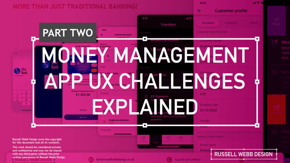
    Pt II – Money Management App UX Challenges Explained

    TLDR; The second on a two-part deep-dive focussing on mobile UX design targeting seasoned designer-types, mastering Design Theory, and navigating lean Agile challenges.


    Hard Skills:

    Journey Mapping

    Research

    Visual Design

    Soft Skills:

    Empathy

    Collaboration

    Critical Thinking

    Full List →


    Welcome to Pt II

    Real-world app design challenges, by persona

    In my previous post (01 Welcome to Pt I; Real-world app design challenges by persona) I detailed why wealth management apps are becoming super relevant and how certain UX designers types experience certain user experience challenges. Let’s move on to our second persona;

    Silvr Bank – Europe’s Best Digital Bank*

    The overarching goal with Silver Bank* is to design an interface for a thriving Generation X, with an emphasis on growing the fledgling millennial users base i.e mobile-first. The C-level were looking to expand and improve their digital offer on these foundations

    3,000 employees | 85 branches | 2nd biggest player in its market

    The brainstorming UX Designer

    At the kickoff stages this designer is focusing on the ‘what if’, they live their life in the fast lane of UX Discovery workshops and are typically very creative.

    Blindly Following a Predefined UX Process

    Every design team (or team or chapter) will have their flavour, probably with different names. The skill is to take these stages and adapt the outcomes so your creative and non-creative teams will understand and respond.

    The point is, tailor the UX process according to project needs which comprise staple elements such as research, design, prototyping, and testing (validation).

    Not Following the Iterative Design Process to Resolve Issues

    It is crucial and all kick-off stages with all new teams to pivot towards an MVP mindset. Here is my take in the ‘Three must-haves’;

    • Clients must have an understanding of the iterative process 
    • Clients must understand developing software within Scrum is not typical to a design agency. No Big-Bang please.
    • A strong UX-er must be able to push-back on customisations that hold little value and only slow down the Scrum Train.

    Designing within Scrum has its own challenges, but one of the clear benefits is the ability to ‘go fast’. This speed is only maintained if the core team are synced and understand that fast decision making, a complete understanding of the iterative process and grasping an MVP mindset must all be entrenched.

    Confusing signposting – Crazy pop-ups and misunderstood empty states.

    If you don’t understand the flow, how do you expect your users to?

    Do not implement multiple pop-ups on your landing page. Do guide user with short concise phrases that give state, progress and system status (See: Usability Heuristics: #1 Visibility of system status)

    The pop-up frequency, relevance, and placement are key factors that make or break your UX;

    • Don’t show multiple pop-ups at once or one after another.
    • Ensure the empty state tone of voice is relevant to the audience and brand.
    • Your pop-ups shouldn’t cover the entire screen. On mobile, your full screen empty state should.

    Give your users breathing space to explore. You can then set suitable triggers for pop-ups to appear at the right time under certain conditions.

    The UX Consultant on-a-mission

    A seasoned veteran

    This flavour of UX designer has earned their stripes both at the sharp end running in-house UX teams and blazing a trail as a freelancer. They are typically driven, organised and looking for clients to be the same – so education is centre stage (which brings its own set of problems – see Not Following the Iterative Design Process to Resolve Issues below).

    Retail Banking Services

    Banks and FI are increasingly integrating money management functionality into their mobile and desktop apps. There is a clear directive to push their customers to use their products, including Card Management and Selection, more actively.

    In the western world, 76% of people use mobile banking services. Differentiation, whether that be through the quality of financial advice or expertise of financial service, has to be clear.

    Creative font selection can derail already strong UX

    Unless you have a solid reason to use a particular font type, stick with web-safe fonts. This is a common misunderstanding when implementing an out-the-box or white label product, as they allow your client to go crazy either with their brand font or one that simply doesn’t work online (or both).

    Use your other UX tools to differentiate and stuck with the main players below;

    1. Arial (sans-serif)
    2. Georgia (serif)
    3. Verdana (sans-serif)
    4. Trebuchet MS (sans-serif)
    5. Garamond (serif)
    6. Tahoma (sans serif)
    7. Courier New (monospace)
    8. Times New Roman (serif)

    Know Your Users. Know your competition

    It would be a mistake to believe that money management applications are exclusively relevant for older adults. In reality, the target demographic for such applications is growing younger. Keep an eye out for millennials who, according to CBInsights, will inherit the largest share of the wealth of any generation – so mobile is absolutely key.

    Be conscious of the challenger banks that are making waves and be distinct or what your differentiation actually is, and mobile is leading this charge.

    My conclusion on app challenges

    It’s clear the challenges are many. Whether you’re be UX junior looking to soak-up the World Wide Web of experience or a seasoned veteran looking to fine-tune your UX skills, the key challenges when designing financial money management apps** are;

    Not Following the Iterative Design Process to Resolve Issues

    Laser Focussed on Design Systems and Best Practices

    Blindly Following a Predefined UX Process

    **Can be attributed to other domains, of course.

    RussellWebbDesign: Get your fill of UX trends, case studies and best practice
  • Pt I – Money Management App UX Challenges Explained

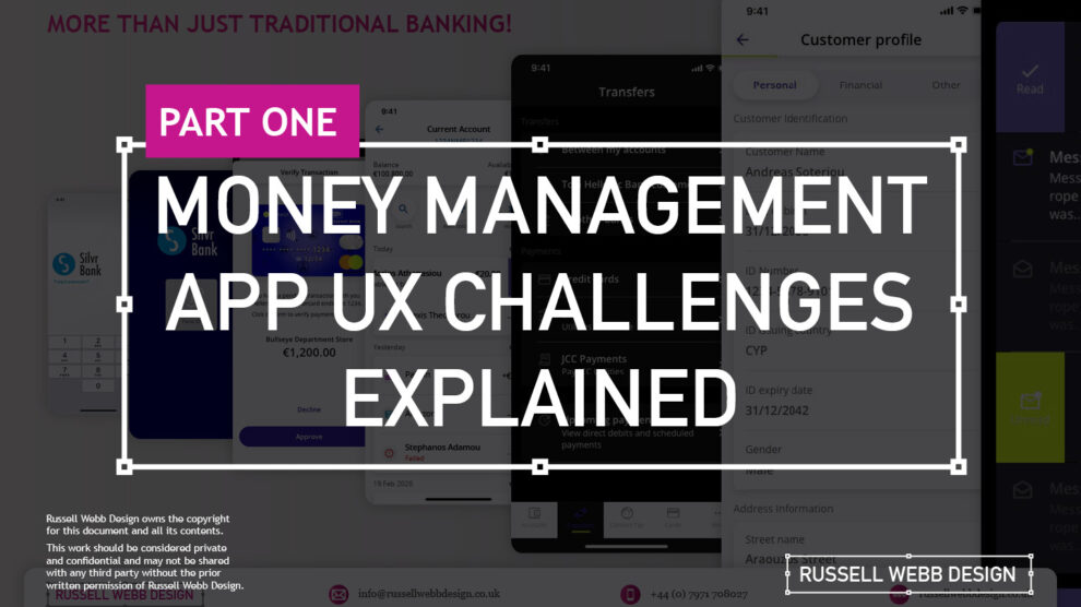
    Pt I – Money Management App UX Challenges Explained

    A two-part deep-dive focussing on mobile UX design targeting seasoned designer-types, mastering Design Theory, and navigating lean Agile challenges.


    Hard Skills:

    Journey Mapping

    Research

    Visual Design

    Soft Skills:

    Empathy

    Collaboration

    Critical Thinking

    Full List →


    Welcome to Pt I

    Real-world app design challenges by persona

    This two-part case study will be exploring UX design challenges within the financial ecosystem that different flavours of UX designers can face. Part I focuses on why wealth management apps are becoming super relevant and how certain UX designers experience different challenges.

    Along the journey, I will also be supercharging the project objectives;

    • Catch-up feature parity
    • Prioritising critical features
    • Stakeholder education (Design Systems)

    Let’s kick off by asking ‘What type of UX-er are you?’

    Silvr Bank – Europe’s Best Digital Bank*

    *Silvr Bank is a fictitious organisation but these are real-world challenges I have experienced in real-world projects with real-world clients.

    The overarching goal with Silver Bank* is to design an interface for a thriving Generation X user group, with an emphasis on growing the fledgling millennial users – i.e mobile-first. The C-level were looking to expand and improve their digital offer.

    3,000 employees | 85 branches | 2nd biggest player in its market

    What type of UX-er are you?

    UX Designer types – How UX designers approach their challenges depends on many factors. Experience, background and where a designer is on their journey are all influencing characteristics.. 

    The challenges are many, so to focus this case study and depending on where you are in your UX journey, both as an individual and within a team, I have split these challenges in to three typical UX professional personas;

    • Mr ‘UX-design-is-completely-theoretical’ Designer
    • The brainstorming UX Designer
    • The UX Consultant on-a-mission

    In this post, let’s drill-down on challenges faced by our first persona;

    Mr ‘UX-design-is-completely-theoretical’ designer 

    This designer is at the beginning of their journey. They are a sponge, soaking up the design thinking processes and navigating their way through YouTube UX tutorials. Along the way they do need to get their hands dirty and experiment. To push back on theories, effects and laws. Learn to go with their gut and develop that inner self, that inner individual designer.

    Laser Focussed on Design Systems and Best Practices

    Design Systems from Hell – The benefits of a fully functional Design System are clear. Consistency. Speed. Best Practice. Collaboration. But when there isn’t a dedicated team or individual maintaining Component and updates. This is when the theoretical designer falls down and you get four bottom sheet options for iOS.

    Maintenance of a fully functioning Design System has its own set of challenges. Inevitable non-creatives will ask;

    1. For a ‘Design System’, where are the outcomes for non-creatives? 
    2. Who and how is it maintained (and who pays for it)?  

    Product teams will inevitably be looking for final deliverables they can understand (and charge for). This typically manifests itself as desktop and mobile UI screens. So while your designer is focused on perfecting their Design Token Figma file, the rest of the team are simply waiting for consistent UI.

    Get you hands dirty… then give-back

    Experienced designers learn their trade. The rest gain practical knowledge while learning the theoretical way. So experiment, make mistakes, try again, share your experiences, and then give these lessons back to the design community as an experienced designer. [For example, this post]

    (Too much) user experience psychology

    Which option matches which theory. The real skill comes for a UX designer to cut through the noise and go with the science. I have my opinion – Do you?

    Theories and Laws can become overwhelming;

    • Retention Theory – Proportion of the information vs. time spent on a page
    • Serial-Position Effect – Recollection of the first and the last in a list of words
    • Hick’s Law – Response to multiple stimuli is delayed forcing user to ‘stay longer’ 
    • The Schema Theory – Human brains like to organise knowledge into meaningful units, or schematas 

    … I could go on, (my go-to is personally Gestalt Principle). From another perspective, and another theory:

    Humans are fickle creatures, they don’t follow the rules.

    These theories alone can help with design decisions, but there is no ABC, no tried-and-tested foolproof formula. So make the intelligent choice, be brave and go with your instincts.


    Explore other perspectives on money management challenges

    You now have a snapshot on why these management apps are so prevalent from one designer type perspective. But what challenges do other UX designer types face, see Pt II – Money Management App UX Challenges to explore how experience and perspective can influence the challenges and solutions you may face as a certain designer type.

    RussellWebbDesign: Get your fill of UX trends, case studies and best practice
  • Desktop User Registration

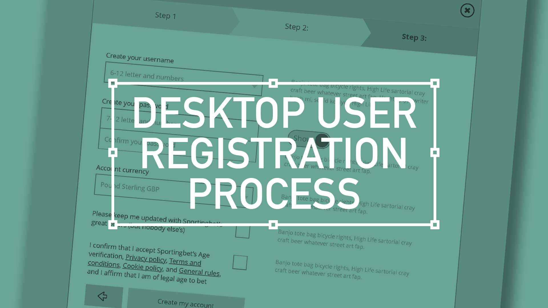
    Desktop User Registration

    TL;DR; Ask the right questions when requesting personal information. Advocate a staged registration process, comparing it to dating, and encourages keeping the registration form simple. Additionally, highlighting the significance of minimising the drop-off rate during the registration process and incorporating fun elements into the user experience.

    The art of the frictionless registration

    There are key considerations when it comes to asking strangers for their personal details. You have to ask the right way – to make each question relevant and necessary. You wouldn’t launch into your life story right away, so why assault them with a clunky, intimidating registration form? Remember to enhance your brand at every gateway; Positive UX will contribute to a positive brand perception

    Ask the right questions when requesting personal information. Advocate a staged registration process, comparing it to dating, and encourages keeping the registration form simple. Additionally, highlighting the significance of minimising the drop-off rate during the registration process and incorporating fun elements into the user experience.
    Ask the right questions when requesting personal information. Advocate a staged registration process, comparing it to dating, and encourages keeping the registration form simple.
    (more…)