Category: Brand Design

These principles can be observed in the work of the pioneers of the practice of visual brand identity design, such as Paul Rand, Chermayeff & Geismar and Saul Bass.

  • Design habits – Tip your hat to your design heroes

    TLDR: Inspired by design masters, this can aide your creative process: User first through to competition analysis, (innovation nit imitation), to
    familiarity and then focus on value then finally beautiful execution

    As a junior designer, way back when, I visited our local design museum (I studied in London, UK, so my local design museum was fortunately the rather impressive Design Museum in Shad Thames) and fantasied over how great it would of been to be involved in, say, designing a Charles and Ray Eames leather recliner, or Dysons Cyclone Vacuum cleaner.

    Now I’m doing stuff I feel proud off, in the field of UX/UI, I thought it worthwhile to see if I could mirror the process these great designers took and document it from a UXers perspective. So, here we go. I started with the following criteria:

    • Give users choice.
    • Competition Analysis
    • Design with familiarity in mind
    • Prioritise features that add value – the “Magic Moment”
    • Beautiful execution
    • Todays’ Brave New World
    (more…)
  • UK Household Retail Co – iPhone and Mobile Web Concepts

    TLDR: Propose an approach fro the The White Company to stay ahead of the curve and deliver an exceptional mobile shopping experience that aligns with their brand values.

    Insight

    In spite of its rapid growth, The White Company retains a firm grasp of its core values, identity and philosophy. It is consistently committed to supplying impeccably designed products that are of the finest quality and at outstanding value for money. In addition, levels of service (across every channel) are constantly monitored to provide a shopping experience that is second to none.

    This insight was taken to the next level with a series of inspirational iPhone App screen and Mobile Web visuals that formed part of a presentation on what these new channels can do you this business.

    * Please note

    These screens are just an indication of what we could do for you. Moving forward and after full scope many other options are available.

    ReferenceIntro pages

    (more…)
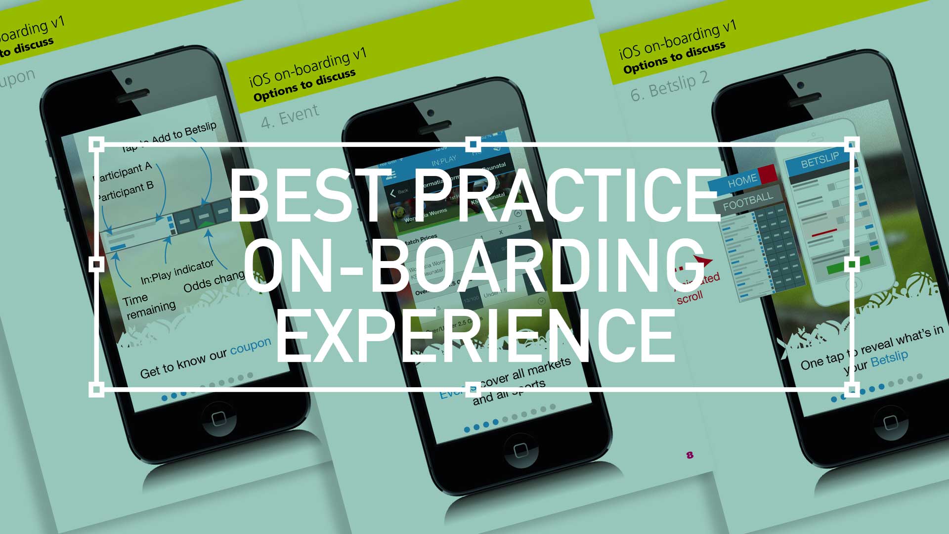
  • Best practice for your on-boarding experience

    Best practice for your on-boarding experience

    TL;DR; As a guided experience for new users simplifying your onboarding to prevent that overwhelmed feeling.

    Simplify your Onboarding; A UX Guide

    Getting new sign-ups is arguable the ultimate challenge, but the process of helping people get started, called on-boarding, can prevent many users from feeling lost, overwhelmed, and confused. It’s your responsibility, as a professional UXer, to shake their hand and show them the ropes and take them on that ‘first date’.

    Drilling-down on the detail of the betting coupon - on-boarding
    Drilling-down on the detail of the betting coupon – on-boarding

    The Do’s and Don’ts

    Downloading and jumping straight into an experience you’ve just heard about is one of the most exciting parts of UX design.

    When formulating this, be conscious not build further barriers as part of the on-boarding. The ‘Skip’ or ‘Tell me later’ and continuous Swipe is an important tool.

    (more…)
  • Design Principles #2; Experimenting with layout

    Design Principles #1; Experimenting with layout

    How layout influences our design (Part 2)

    Whether you are working in publishing, UI or advertising, the fundamental ideas (which may overlap) about the practice of good ‘layout’ composition will always form the basic structure of your design. The elements form the ‘vocabulary‘ of the design, while the principles constitute the broader aspects of its composition. Here I have compiled a second set of loose design principles that all revolve around the fundamentals of layout graphic design.

    This is Part 2 of a 2-Part series: To jump back to the first part please click here

    7. Pattern Design

    09_layout_Formats-Pattern
    Pattern Design

    Patterns always been a safe bet for the design arsenal. Repetitive shapes form the back bone of effective graphic design

    (more…)

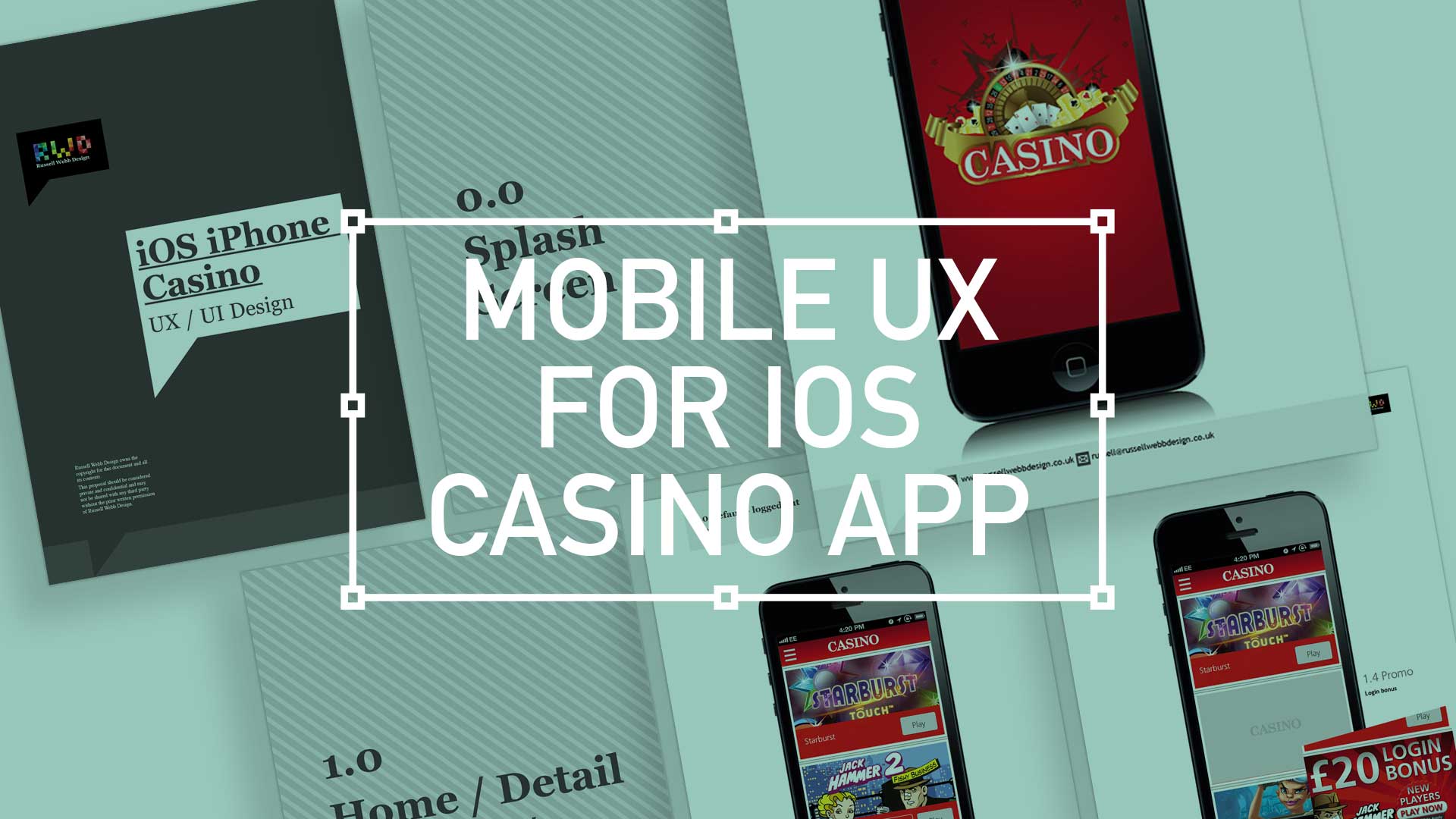
  • iOS Casino App for the iphone

    iOS Casino App for the iphone

    TL;DR; While the gambling industry continues to boom despite global financial woes, a reliance solely on branding through splash screens has its limitations. This post dives into why your home screen deserves more attention. Showcase promortaionl content, search (as navigation maybe?) and Quick Links as crucial building blocks, including introducing the popular hamburger icon for primary navigation and transform your home screen into landing page(s) into a powerhouse of usability and brand identity.

    Brief

    Next to essentials like food and water, one of the only other industries not effected by the world financial situation is gambling. In fact the industry is booming. There are many UX challenges in designing the perfect game play experience, catering for the green fingered punter all the way through to the seasoned veteran is a difficult balancing act.
    Plus, as mentioned, in these more straighten times, to be conscious of not forcing the gambling experience on to the more vulnerable.

    Splash screen

    Modern smartphone don’t need 2-3 seconds to start up, so the original notion of the start-up or splash screen is now redundant. But brands love to position their logo ‘front of stall’ so for this reason, this screen is important. Keep it simple and remember, if you can’t get your brand message over in 2-3 seconds, think about a re-design.
    iOS_iPhoneCasino3

    Home

    This is the heart of the application, the place to show off what you have to offer – the ‘showcase‘ if you like. So make it impressive, make it big and try your best to impress.

    (more…)
  • Branding a Russian Hedge Fund

    How brand identity works

    Integrated brand identify both help reputation and consumer awareness. I was tasked with conceptualising a strong brand identity for a new Russian hedge fund. This involves developing routes that generated the tone, style and flavor of the brand across a 2D and 3D environment. This includes, but is not limited to;

    • color
    • type
    • photography/imagery
    • logos
    • design grid
    • Signage

    Here is how I did it;

    (more…)