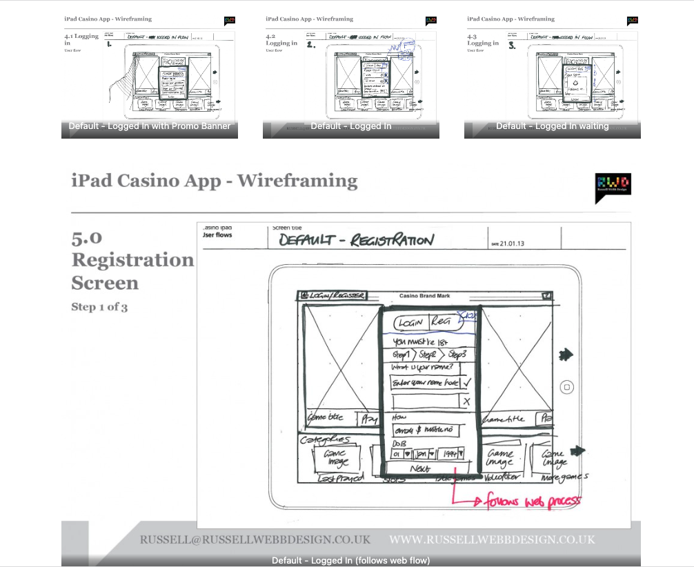
TLDR: Focusing on planning functionality and layout without design is the most efficient way of concentrating decision markers (especially business or product-owners) to agree on functionality without distraction. Think: function over form.
Personally I love to use traditional pen and paper for wireframing. How about you?
First launch feature areas
This is the main ‘shop window’ to your experience. On first launch, the user to launched in the gambling casino world. Pre-selected games adopt the ‘parallax scrolling’ technique and occupy the prime real estate. There is also functionality to drill down via category types. Account Management and Help are all ‘front-of-store’, as is the ability to push sign up and login promotions.

All important login and registration
Building a consistent experience is important. For that reason, these Login and Registration pages utilise the web-based process that other products within the company group also employ. These screens are ported in via web-view. They are mobile friendly, and suit the continuous flow concept I am trying to achieve.


iOS modal screens
Delivering information whilst keeping the user within his/her flow is also important That is were modal screens come into their own. Here, I have used this iOS function device for:
- Game Detail – Game icon and game description plus the added value of screen shits and where possible, movie files.
- Related games – The ‘related games’ section is on shown on request from the ‘Games detail’ page.
- Promo Detail – Depending on the promotion, this screen would show push markers to individual games or sign-up bonu


simple and clean account management process
Following best practise, the My Account section is activated when the user tapes their avatar. This allow acces to:
- Deposit
- Withdrawal
- Transactional history


Playing the game
Here, the iPads retina display proportionally fills the screen with the game. Top navigation remains via the header bar displaying game crucial information, including login status and account balance. Should the user wish to switch games then the Quick links are always visible at the foot of the screen.
Game play quick links – Ability to switch to other games while playing via bottom nav quick link bar
Providing a customer service
A standard modal window displays game setting and contact us information.


Pique’d your interest?
This is but part of a selection of design information russellwebbdesign generated for the creative community out there. Please contact me further to discuss how your brand can benefit from the new channel: info@russellwebbdesign.co.uk
If something has peaked your interest. Please leave a comment below.


