TLDR: Inspired by design masters, this can aide your creative process: User first through to competition analysis, (innovation nit imitation), to familiarity and then focus on value then finally beautiful execution
As a junior designer, way back when, I visited our local design museum (I studied in London, UK, so my local design museum was fortunately the rather impressive Design Museum in Shad Thames) and fantasied over how great it would of been to be involved in, say, designing a Charles and Ray Eames leather recliner, or Dysons Cyclone Vacuum cleaner.
Now I’m doing stuff I feel proud off, in the field of UX/UI, I thought it worthwhile to see if I could mirror the process these great designers took and document it from a UXers perspective. So, here we go. I started with the following criteria:
Give users choice.
Competition Analysis
Design with familiarity in mind
Prioritise features that add value – the “Magic Moment”
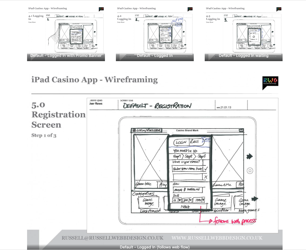
TLDR: Focusing on planning functionality and layout without design is the most efficient way of concentrating decision markers (especially business or product-owners) to agree on functionality without distraction. Think: function over form.
Personally I love to use traditional pen and paper for wireframing. How about you?
First launch feature areas
This is the main ‘shop window’ to your experience. On first launch, the user to launched in the gambling casino world. Pre-selected games adopt the ‘parallax scrolling’ technique and occupy the prime real estate. There is also functionality to drill down via category types. Account Management and Help are all ‘front-of-store’, as is the ability to push sign up and login promotions.
See ‘Barclays Bikes Android and iPhone App’ Video here
Create the perfect companion tool for the Barclays Cycle Hire scheme
Aims and objectives
Launch an application (on Android too) with better functionality and usability than all competitors.
Amplify Barclay’s dedication to innovation.
Make a positive contribution to London.
Promote active lives – and create business benefits from this.
Promote a sustainable and environmentally friendly mode of transport.
Differentiate the app through strong Barclay’s brand presence
From Boris bikes to Barclay’s bikes… ensure users are aware this is the official application and be the greatest Cycle Hire App ever
Barclay’s Cycle Superhighways are new cycle lanes into central London from outer London
Improve cycling conditions for people who already commute by bike
Encourage those who don’t to take to pedal power and keep fit
Help cut congestion
Relieve overcrowding on public transport
Reduce emissions.
Key ‘Must-Have’ features
Launch with iPhone and Android applications
Integrate cycle hire and cycle superhighways
A focus on enabling cyclists to ‘do and discover’
A focus on London as a cycling community
Core functionality around location and journeys
Additional functionality – a ‘must use’ application
Here are just a selection of Android screens
It was important that the growing Android community felt included as iOS is seen as the dominant player in this market. An entirely different UI was developed that benefited from Androids unique functionality. Widgets were developed and integrated features included to aid the experience.
Cycle Finder
Find the nearest docking station right now
Locate me (nearest docking stations)
2D Map view (Google maps)
Satellite map view (Google maps)
Augmented Reality view
List view
Superhighway
Barclay’s Cycle Superhighways (BCS) are cycle routes running from outer London into central London.
They give you safer, faster and more direct journeys into the city.
We’ve improved road surfaces and improved junctions for a more comfortable ride, and each Superhighway has a clear, unique identity, with blue surfaces to increase driver awareness.
See ‘Barclays Bikes Android and iPhone App’ Video here
This is but part of a larger proposal russellwebbdesign designed and conceptualised for Barclays Capital. In this case it was a complete App Design, from providing the creative at pitch level to final delivery. To discuss what your brand really wants from mobile, contact us on: info@russellwebbdesign.co.uk
For many businesses, Direct Mail (DM) is by far the most cost-effective form of marketing. It allows you to target customers with greater accuracy than any other method.
1. Target your design efforts
Products and services directly to the end-user
Careful preparation to get the response rates you want is the way forward. These design have been specifically designed to hit those key demographics that statistically afford you the return thats worth it.
2. Appeal to your target market
Highly effective in both business and consumer markets
DM is about hitting the right note, if you have a demographic that is heavily involved on the urban design and town p;anning make sure you create a series of compelling imagery around that subject matter. Here Architecture has been targeted, make sure your DM piece is effectively targeted too.
3. “Feel” DM as part of an integrated promotional strategy
Feel DM piece – 25,000 print run
Try a little variety with folded postcards and win your business more sales in the process. This is really how to crate a point of difference, a definite plus point in this tough market.
4. Feel DM for image library Corbis
Simple configuration of the fold provide that extra design resource
5. Make an impact with a strong headline and bold imagery.
Like reading a newspaper, the headline is the first thing people see before deciding to read the entire article or direct mail piece.
Once a designer understands the best practices of direct mail design, they have the opportunity to adjust elements and test what works best for their audience. Split the mailing list in half and always test something; one thing at a time (i.e. – headline only, offer only, positioning of images, etc). Be sure to have a strategy in place to measure responses.
This is but part of a selection of concept ideas. Please contact us further to discuss if your brand really wants to benefit from this immersive experience here: info@russellwebbdesign.co.uk
If this, or any other post has peaked your interest, please leave your comments below
Whether you are working in publishing, online or advertising, the fundamental ideas (which may overlap) about the practice of good ‘layout’ composition will always form the basic structure of your design. The elements form the ‘vocabulary‘ of the design, while the principles constitute the broader aspects of its composition. Here I have compiled a loose set of principles that all revolve around the fundamentals of layout graphic design.
This is Part 1 of a 2-Part series: To jump forward to this second part please click here
1. Spectrum of colour
The Colour Spectrum
If you find yourself searching for inspiration and you have a tight deadline (usual story!) you can always gather a choice selection of compelling images and apply this technique. Essentially you are creating with the creative, it’s an effective demonstration of imagery and a (relatively) easy application of technique – what client wouldn’t be happy with this exciting, *warm colour spectrum of ideas?
*Warm colors are a group of colors that consist of reds, yellows, and oranges.
2. Text Manipulation
Calender Promotion though text manipulatioin
Through the calender year designers have the luxury of using calender promotion to deliver a punchier design. Here Valentines Day is effectively used and it is the negative space that forms an important part of the layout. There are two types of this type of space: positive and negative space.
3. The Douple Page Stread (DPS) as a DPS
DPS as DPS
Elevating your design by including a homage to past layouts is a trusted and effective design principle. See he News of The World’s final edition for the ultimate example.
4. Subject Matter
Subject matter and design lead
Taking the subject matter of ‘Golf’, I have crafted a layout that touches a wide market appeal – this is a simple trick that draws in the fans of that subject.
5. Design for colour groups
Colur Groups
Having at your disposal an extensive range of images can definitely help with this principal. Here colour is used as a layout guide to help the potential end-user of these images realise an application. The relationship between these light and dark colour groups gives the layout depth and perception – this is also referred to as tone.
6. The youth of today
Youth of today
Demonstrating your quality and breath of photography using the designers classic CMYK technique is as popular as ever. As a principle, the repetition of familiar form provide graphic designers with another string to their bow.
This is two part examination of broad design principles russellwebbdesign generated for the design community. Please contact us further to discuss if your brand (ot it’s design) can really wants to benefit from effective communication and good graphic design: info@russellwebbdesign.co.uk
If this, or any other post has peaked your interest, please leave your comments below
Imagine being a senior executive at a UK company, suddenly tasked with understanding the intricate world of Android. Time is tight, and you need a crash course that cuts through the technical jargon and delivers the essence of this mobile platform. That’s where I stepped in.
For senior executives
My UK client were seeking a crash course in the world of Android, I crafted a top-down, user-experience-focused overview of its driving principles.
This quick-start guide wasn’t just about features and functionalities; it was about the why behind them. In essence, how Android shapes user interactions, from app design to navigation and information consumption.
Welcome to Android – An Open Operating SystemWelcome to Android – 70000_App and Counting
By focusing on the driving principles that underpin the Android experience, equipping the user with the knowledge to make informed decisions. Whether you’re evaluating potential development projects, understanding your target audience’s behaviour, or simply staying ahead of the curve, this guide provided a solid foundation.
Welcome to Android – How
Design for Humans
Welcome to Android – Widget_Functionality
Understanding the user experience isn’t just about technical specifications; it’s about grasping the human element that drives engagement and ultimately, success. This quick-start guide was designed to do just that, empowering you to navigate the world of Android with confidence and clarity.
Android Widgets: Tiny Tools, Big Impact
Think of Android widgets as miniature apps living on your home screen. They offer:
Quick Info: Weather, news, calendar events, and more at a glance.
Instant Actions: Play music, add events, control smart devices – all without opening the app.
Customization: Choose size, information, and even themes to fit your needs.
These handy tools boost your efficiency, personalize your experience, and keep you informed without opening full apps. Explore various types like simple info displays, scrollable lists, and interactive buttons to find the perfect fit for your needs.
Welcome to Android – Browser and Flash
The End of an Era
RIP Flash
Flash was designed for the desktop era. I have left this in as IT IS interesting to get an insight in UX 15-years-ago, but to clear: ANDROID DOES NOT USE FLASH NOW
Why?
Outdated tech: Flash wasn’t built for touchscreens. It will drain batteries and there is no native support.
Security sieve: Flash’s history of vulnerabilities made it a hacker magnet.
Adobe officially announced the end of Flash in 2017. Its inability to adapt to the changing landscape left it vulnerable to the more agile and secure alternatives that had taken center stage.
While Flash may hold a place in internet history, its reign in the mobile world was short-lived, ultimately succumbing to the demands of a faster, more secure, and user-centric mobile experience.
Welcome to Android – Thanks
Discover high-impact UX case studies
Portfolio case studies describing design, my UX process, and business impact.
From boosting user adoption in fintech, to improving trust with responsible gambling through to retaining Millennials in the world of ‘digital lotteries UX’ to leveraging key USPs for mobile healthcare.


