TD;LR; Good design is easy to digest—the brain shouldn’t have to expend a ton of energy to figure out what the heck it’s looking at. With any luck, people will just “get it” without needing a 6-section explanation.
KISS (Keep it simple Stupid)
For user accounts, the default user experience should be as elegant and as simple as possible. This UI animation below, goes some way to filtering down what was essentially the most simple mobile navigation I could get stockholders to agree on. As always, there will be compromises, (inline personal information editing. for example) but overall keep the Three Little Rules (scroll down) front and foremost.
Three little rules
Clarity
Balance
Simplicity

Acc Mngt Rules – Eliminate user guesswork, be usable and barrier less
Online accounts give users privacy, control and a personalised experience. Account management is a necessary evil. Except when it goes wrong, no user likes or cares about account management, they just want to access the service.
You can make account management less evil, follow these three little rules:
- Don’t make the user guess – Almost every service on the web handles account management slightly differently. As a result, you have to be explicit about the requirements for your service. Otherwise, you’re just being cruel.
- Balance security with usability – Often, security folk will insist on an approach that compromises the user experience. This is foolish, because poor usability will lead to workarounds, and workarounds in turn lead to weakened security. Instead, aim for a design that is both secure and usable.
- Keep it simple – Account management is one of your biggest potential barriers to usage. Make the barrier practically invisible through a simple, seamless, pain-free design.
Account Management
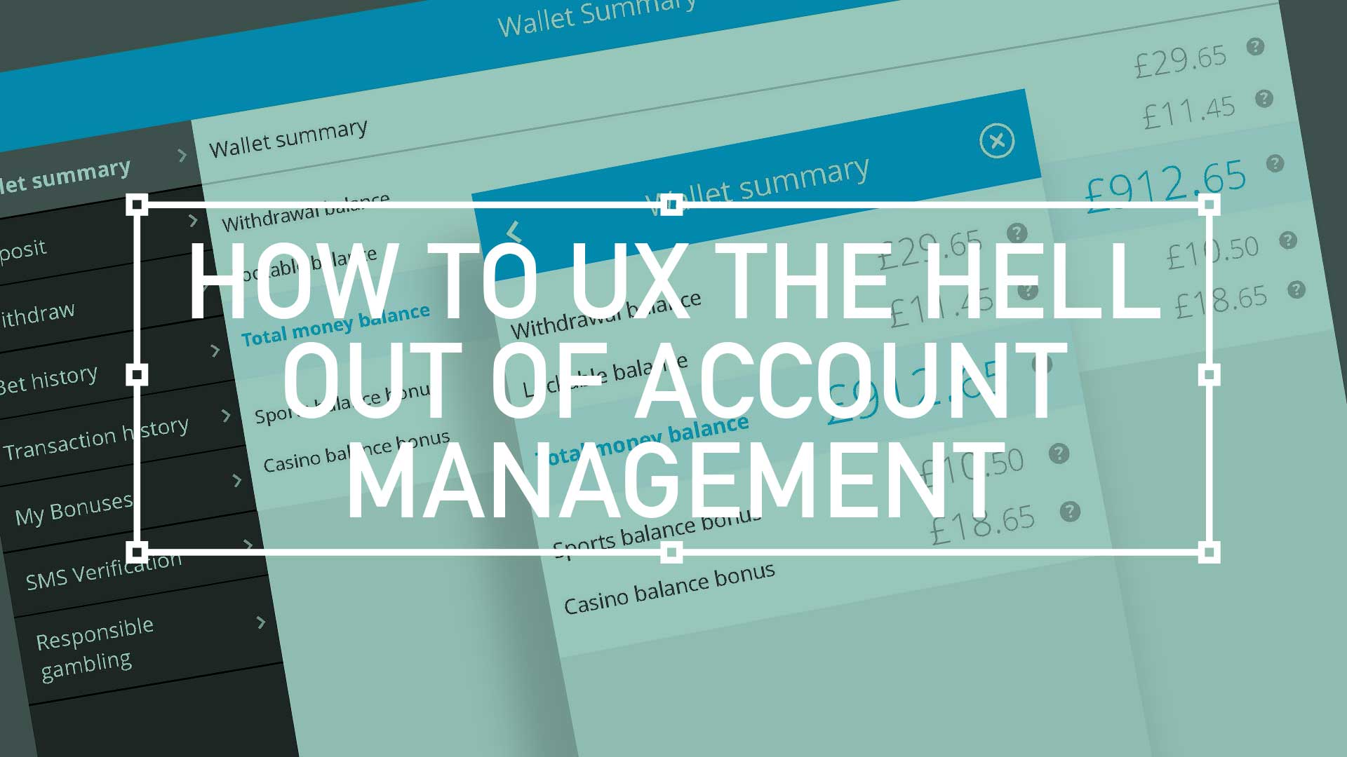
Responsive wireframes for Wallet Summary
Recently I have been involved in the UX for Account Management for a worldwide responsive gambling site with over £7M in transactions daily, and nearly 4M registered users;

Extra Large (XL) Desktop
1200px
Tailwind CSS
Bootstrap CSS
Large desktop monitors (e.g. 1920px monitors not running fullscreen)
Wallet Summary, What the hell is it?
A user account should provide the following static, user-specific content:
- Personal Information / Contact Information
- Security Information
- Links to members-only content areas
- Deposit and withdraw, bonuses and global settings
- A User’s history
Bet History UX – Tablet landscape – 1024px

Bet History UX – Mobile – 320px – 425px
My Bonuses best practice
Here’s a list of best practices (although not always possible!) that make user accounts more usable:
- Inline Editing
- Safe Editing (Undo features)
- Reading a users account information back to them later.
- Delete/Save/Export/Import Options
- Security Features
- Deposit and withdraw, bonuses and global settings
Conclusion
So now that we know some of the things that should go in a user account, how can we help users access their account?
Dedicate a link to the account. Most users expect to access their account information via the top right or top left corner of a website, with the preference being the top right. Here I used a “Hub and Spoke” architecture—a landing page that links out to individual sections.
Other options included a drop-down menu to give the user all of the choices at a glance. Align with your team, get stakeholders sign-off and good luck!
Pssst… here is sneak preview of the final UI

Pique’d your interest?
This is but part of a selection of design information russellwebbdesign generated for the creative community out there. Please contact me further to discuss how your brand can benefit from the new channel: info@russellwebbdesign.co.uk
If something has peaked your interest. Please leave a comment below.


