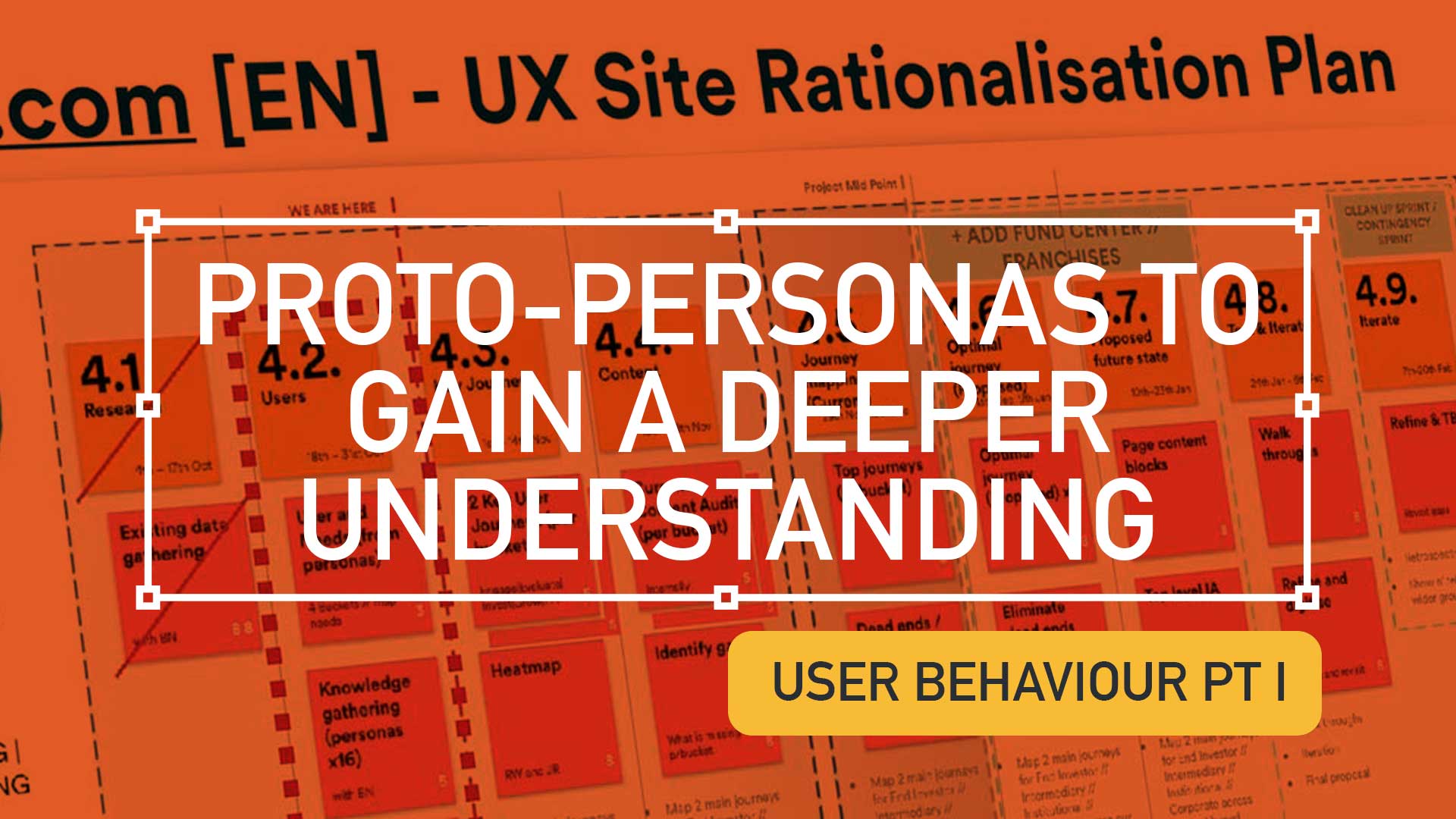
This is a continuation from the article ‘Digging deeper to understand your users‘, I urge to read this to gain a better understanding on the UX process and concepts within this post.
TD;LR; Good design is easy to digest—the brain shouldn’t have to expend a ton of energy to figure out what the heck it’s looking at. With any luck, people will just “get it” without needing a 6-section explanation.
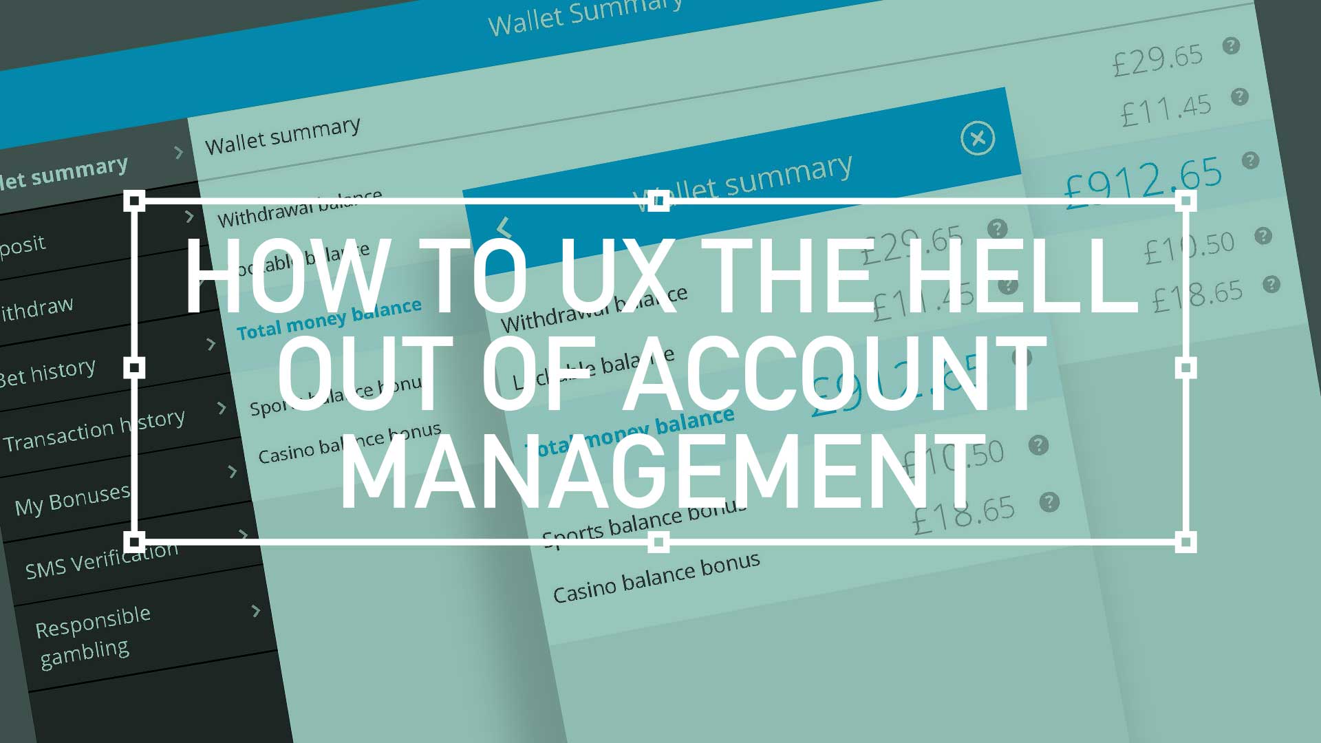
For user accounts, the default user experience should be as elegant and as simple as possible. This UI animation below, goes some way to filtering down what was essentially the most simple mobile navigation I could get stockholders to agree on. As always, there will be compromises, (inline personal information editing. for example) but overall keep the Three Little Rules (scroll down) front and foremost.
TLDR: Balancing demanding user needs, stakeholder expectations, and tight tech constraints is a challenge for every Lead UX. This project was no different. Read on to learn how to to seize opportunities to not only deliver, but also showcase key roadmap features, an improved overall experience, true to the Agile spirit.
Quick bet – Strong UX is the golden ticket to guiding users effortlessly through the signup process, browsing games, and placing bets, especially Quick bet. Allowing users to wager with a single tap while removing friction and boosting engagement is a challenge.
Over the last few months I was tasked with designing the ‘best-in-class’ ultimate mobile sportsbook and casino UX experience. A massive project, so I’ll guide you through it in bite-sized chunks. This is one of the more complex mobile programs I’ve been involved in so I’m going to attempt to split it up into manageable bite-size chunks.
First up: An overview
Home page – Welcome to the brand’s ambassador, a perfect balance of data and visual punch. As a gateway this design has to be the poster boy for the brand. Balancing user data and creative expression plays its part. While football generates 75% of revenue, should it dominate the design?(more…)