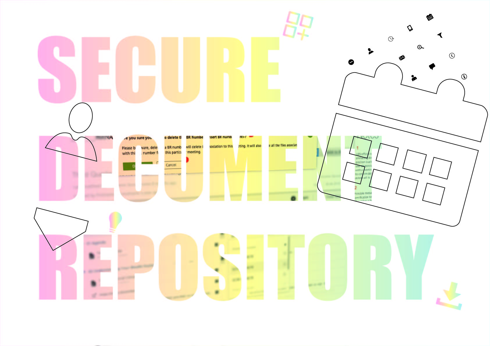
TLDR; Last month I posted Part I of how I designed a service integration project within the suit of financial apps for a large international retail bank and asset manager. Part II focuses on ‘My UCD Design Process’ and ‘Future Vision’ and ‘Design Systems’
TLDR; In the summer I was the lead UX designer in a time-boxed 3-month service integration project. Internally future-vision looked to position this product as the hero application within the suit of financial apps and services available at this large international retail bank and the worlds largest asset manager. This data integration would potentially push it front-of-stage.
TLDR: Recently, I had the privilege of leading a Design Thinking on-site 3-Day UX workshop for a global financial news organisation, a pioneering force in the industry. These workshops marked the launch of the discovery phase for a groundbreaking new product, and I was thrilled to guide the team through an immersive and productive experience.
Before I begin, let’s be clear, planning and preparation are you best friends. Be aware, planning creative sessions like these take time. Allow double the preparation time to the actual workshop time, so this three-day think tank translates to six days of dedicated planning. Having this knowledge is golden, don’t set yourself up to fail because you haven’t done your homework. Avoid the pitfalls of a hastily assembled workshop and set the stage for a truly groundbreaking experience.
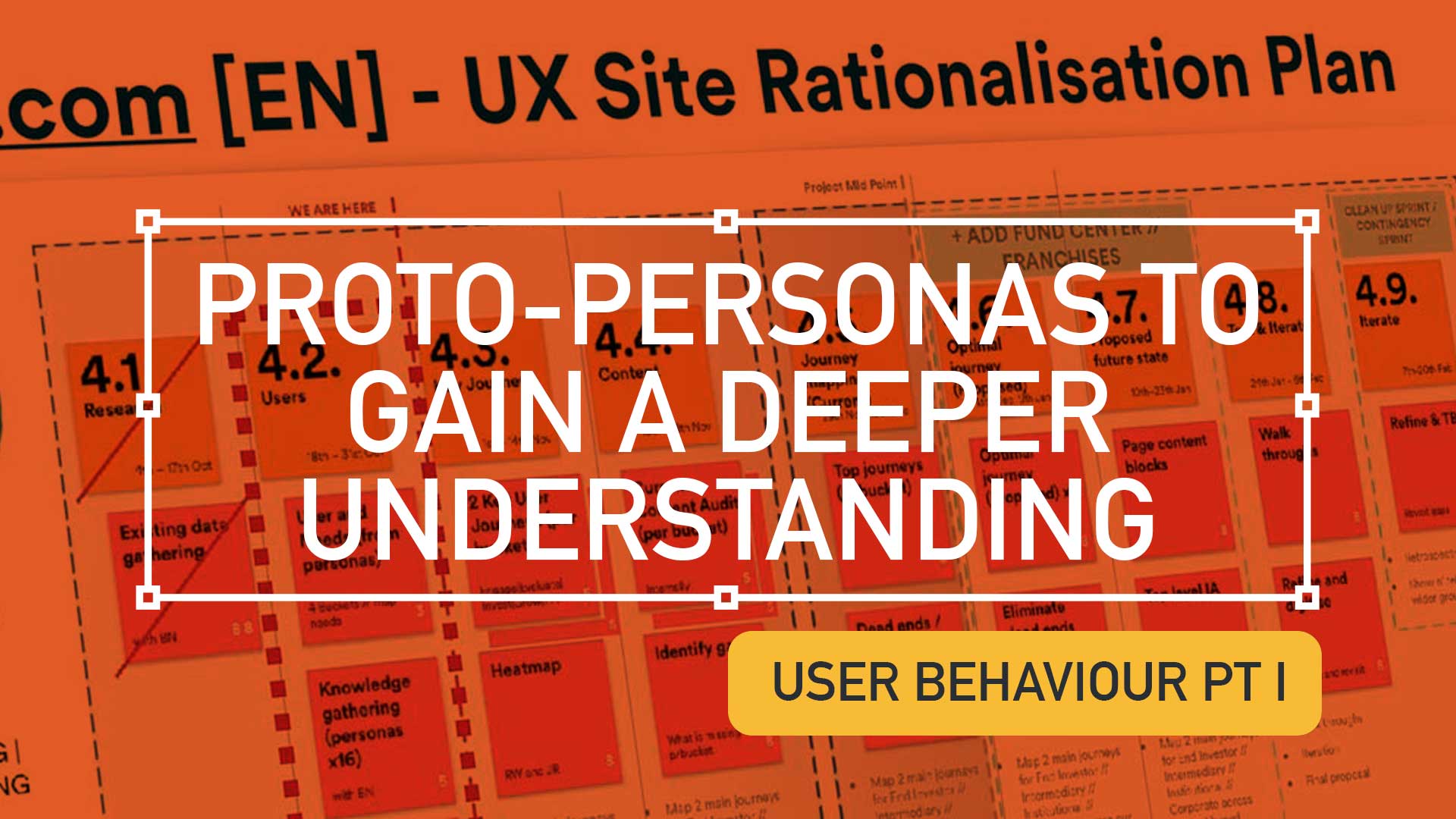
This is a continuation from the article ‘Digging deeper to understand your users‘, I urge to read this to gain a better understanding on the UX process and concepts within this post.
TL;DR; A large automotive client wanted to improve their dealer portal but the client needed guidance on understanding their audience’s needs and wants. Personas generation is a great to focus the team’s expectations and contributes to a better product and service.
I was recently asked to provide insight for a dealer portal for a very large automotive client. There was a definite opportunity in their market to improve their internal front end offering – but very early on it was clear there was a lack of understanding of who their audience was. How their needs and wants differed and what, as customers, they were looking for.
So, before deep-diving in the UX, I produced a selection of personas to focus down the teams expectations and unite the groups thinking. I’m taking for granted that we are all aware that personas represent a typical user, based on user research and incorporate user goals, needs, and interests. Here I created four (4) personas, Hilary, Gary, Donald and Bernie;
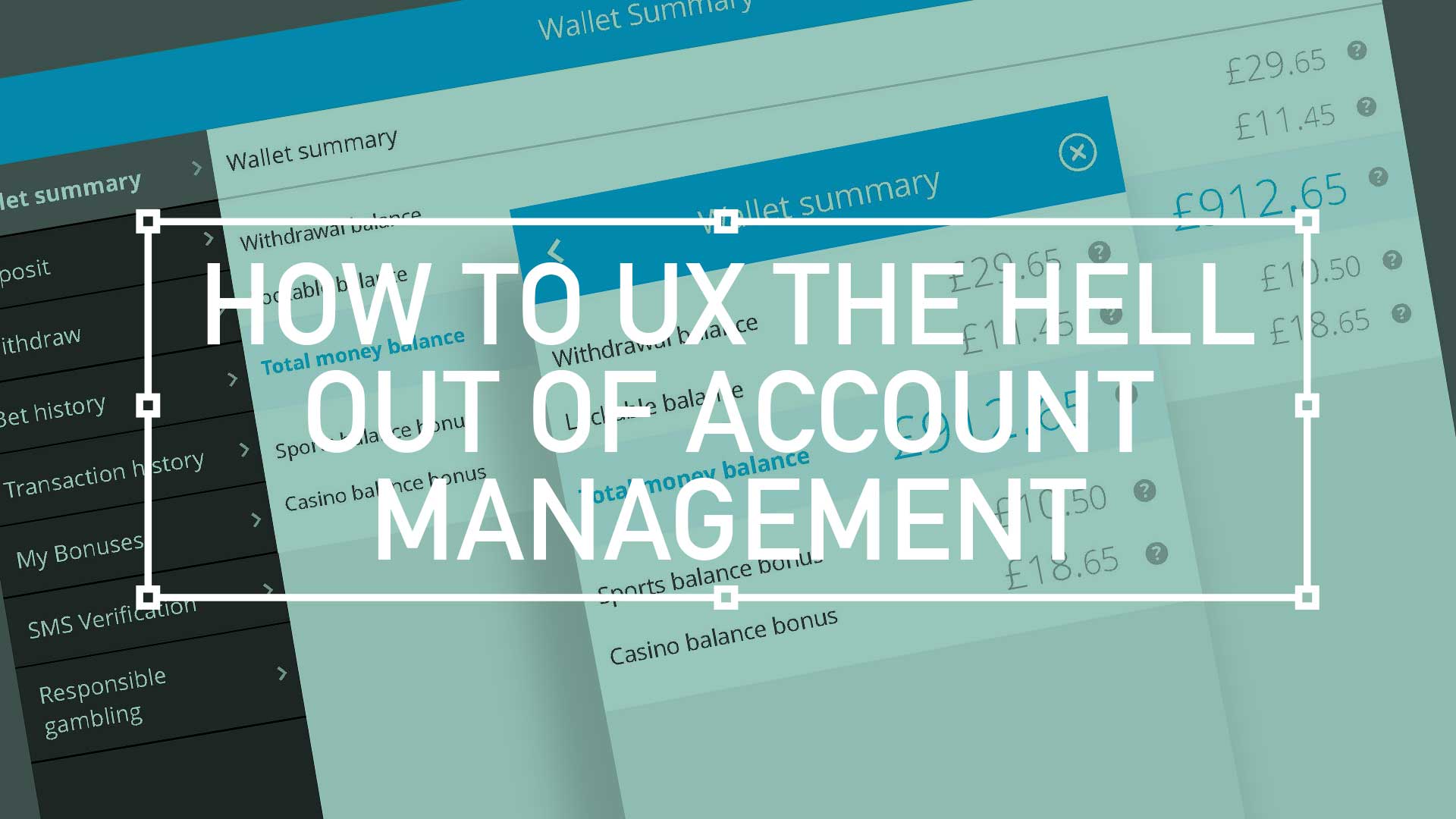
TD;LR; Good design is easy to digest—the brain shouldn’t have to expend a ton of energy to figure out what the heck it’s looking at. With any luck, people will just “get it” without needing a 6-section explanation.
For user accounts, the default user experience should be as elegant and as simple as possible. This UI animation below, goes some way to filtering down what was essentially the most simple mobile navigation I could get stockholders to agree on. As always, there will be compromises, (inline personal information editing. for example) but overall keep the Three Little Rules (scroll down) front and foremost.