TLDR; Boost your workflow without breaking a Zoom sweat in this COVID-friendly remote special. Simplify KO’s, pinpoint problems, and find your perfect toolset. Unleash the life-saving power of Dual Track UX Delivery.
Contents
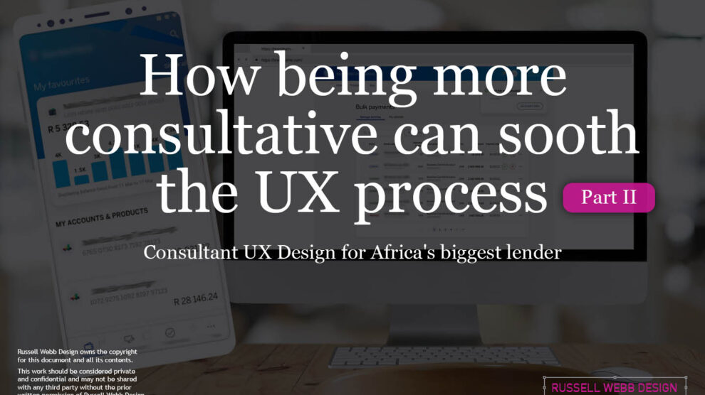
This is Part II of a two-part article looking at improved Ways of Working from a consultative UX perspective. Please visit Part I: How being more consultative can sooth the UX process – COVID Special to where I focused on;
- Simplifying the KO process
- Defining problems to solve
- Tools and their limits
Real world examples
Product inconsistencies
Moving on from the KO process and tool limits (see Part I). Part II drills down on real world ‘quick wins’, tracking tasks and signposting. Conclusions will sum up.
Labelling and Buttons

‘Quick wins’, including consistency like tracking labelling decisions (with accountability) and pressing the right primary (or secondary) buttons should be your focus as a consultative UX designer.
This visual how confusion over two descriptions. Custom mapping within DBS is a complicated animal so learn on your front-end developer who has the skills to explain payment endpoints much better than any creative.
When mental models don’t align

The “Law of Similarity” states that elements tend to be perceived into groups, if they are similar to each other. Meaning if you have elements with the same functionality, meanings and hierarchy, they should be visually similar.
Push the (right) button!

The client was able to highlight inconsistencies in the company’s out-of-the-box (OOTB) product. Technically it would have been a sprint blocker to remedy these. Allow the client to populate a feedback framework, using Identical terminology (menus, not navigation), so their efforts are not ignored.
When ISO Standards collide!

With or without commas. locally and through this bank’s continent, ISO standards indicate no first comma for currency. But this bank has an intentional presence, does its customers understand this paradigm?
Tracking text heavy changes
Text heavy, technical challenging applications need effective sign-posting… but mocking up every UI screen with constant text changes can be an issue.

I like black in the left ear, but I like white in the right
Two feedback platforms, with two differing sets of invested users. One from technical, looking to cut development costs, the others new to agile and the MVP mind-set and the ideal experience. something has to give.
See later for some new thinking in this area.
Primary v Secondary v Tertiary

Buttons design is the foundation of an interactive experience. Get them wrong and your users get frustrated
Always act iteratively, implementing UI as is, cataloging and documenting client concerns and highlighting that this is to be revisited in Phase II (PO dependant) as a positive way forward.
Ways of working
Appreciate existing processes but add value by offering improvements in a phased manner.

Designers love prototypes, developers love detail (Inspect). So, how to engage both camps? Providing clickable high-res prototypes is Invision’s forte, hand-off design items to the development teams is Zeplin.
So let’s use both?
Phased delivery with sanity checks;
- From the backlog, via company BA’s.
- In-house design team sign-off.
- Design system refinement.
- Developer sanity checks.
- In-house ux copywriting.

Dual track UX

The outstanding question is, how to document and provide ownership? Is another board the answer?
• One-stop-shop for UX / UI.
• Delegated ownership w/ consequences.
• Two-way transparency.
One solution;
Dual track is a process which aims to enable cross functional teams to design, validate and build collaboratively, with communication throughout.
Responding to feedback
Consultants can be seen as a threat. So how to build those bridges is not always plain sailing. To review the playing field, asking the wider-team for preferred WoW’ing is important.What they like and what they do not like. Then acting on those results to gives the team a sense of contribution.
Exactly what is Dual track UX?

This central hub will save your life as a designer managing multiple streams, multiple requests and multiple links to manage your comms. No reliance on siloed email, and private DMs – everything is transparent and focussed.
The dual-track (one dev, one UX) process also brings clarity for developers to the sometimes opaque creative process.
From overview, to detail, to swim lanes

Allocate responsibilities to Sub Tasks
Furthermore, within JIRA a UX-er can assign responsibilities to Design System, copy-writing experts or any other UX task for completion. This way, tasks are transparent and individual ownership is clear and delegated. This also generates care and interest in the product.
Simple how-to 5-step process

Share steps with the team following a face-to-face walk through
1. Log in the UX UI SBSA BB design board.
2. Select your task.
3. Click active sprints.
4. Complete the sub-task(s).
5. Provide a brief update.
Signposting
Is there a better way to use information design to locate UI from a Design System, to better understand software and for ‘handover’ designers to find inherited files?

As easy as 1.0, 1.2, 1.3…
Find designs and understand the product more
Understanding complex user-flows from an educated perspective, off-the-bat requires a steep learning curve. Providing guide ropes for designers, analysts and product owners with uniform naming conventions, numerical sequencing and better signposting for sectioning is critical to get all team members up-to-speed and on the same page.
Design application hygiene.
Working in consultancy in these COVID times, especially remote, requires that extra level of communication. Handover documents need to be fully spec’d, log in creds need to be valid and above all, avoiding ‘Project x_final_copy 3_version 4’ labelling for art-boards and layers is even more important. Old-school Photoshop file hygiene taught me to be as communicative as possible by simply getting into the habit of labelling everything – it improves your process and helps the team improve theirs.

Conclusions
Building better comm channels in the foundation of consultative UX
Whatever tool you use. Fine tune your libraries, realise platform limits, iterate on your solutions and provide guidelines for new processes – all with a can-do attitude.
Be both a strategic product thinker and a hands-on consultant

Highlight to your client what you can do, not what you can’t
With the Software Development Life Cycle (SDLC) there will always be impossibilities, add them to your ‘parking lot’ and focus on the ‘yes’. Trust comes from doing what you say, providing a mechanism for feedback and genuine good-spirited human interaction (post pandemic), remaining points in this article you can implement today. Setting guidelines, syncing up with regular meetings and providing a ‘space’ to hang everything off will soon reap rewards.
My Top 8 Take-Aways
I know… 8 is too many, right!

1. Define the key players
Integrate WoW into your workflow
Financial processes operate within a ‘walled garden’, so streamline your process to fit. Document with a UX Handover document, highlighting key players, project timelines and important links.

2. Understand scope
Streamline UI designs, messages and platforms.
With 100s of screens, no single-source and unmanageable libraries, housekeeping is key.

3. Control libraries
For multiple libraries consistency is king.
Without gold-standard labelling and spelling, a constant clean-up mind-set and superhero levels of file hygiene, libraries can go downhill.. fast. Red flag; ‘You should have used the other primary blue’!

5. Dual track UX board
One-stop-shop, with comments and swim lanes.
A small, cross-functional, collaborative team of empowered and accountable people. In short, one board, multiple responsibilities and “sign-off Fridays”.

7. As easy as 1.0, 1.2, 1.3…
Use signposting to help designers and aid understanding.
Providing guide ropes for designers, analysts and product owners;
• Uniform naming conventions.
• Numerical sequencing.
• Better signposting for sections.

4. Invision and Zeplin
Swim lanes that make sense to maintaining trust in a product
Managing multiple platforms with multiple messages has it’s limits. The Invision message centre has plenty of message tracking issues. A personal bug-bear is when your design file is pixel perfect, but Zeplin syncing isn’t.

6. Simple how-to 5-step process
Explain and share
1. Log in the UX design board.
2. Select your task.
3. Click active sprints.
4. Complete the sub-task(s).
5. Provide a brief update.

8. Label. Your. Artboards. Please.
“Visualdesign_v4.2_final2 copy” is not a useful file name
Working in remote consultancy requires that extra level of communication.
Get into the habit of labelling everything – improve your process and help the team improve theirs.
Define the problem, provide a feedback mechanism, share processes guidelines and sync-up regularly
Focus on the ‘Yes’
Get in touch
15 Years Experience | Workshop Wizard | Design System Ninja
Finance | Gambling | Healthcare | Recruitment
Download and keep
CV
Workshops to stakeholder mngt and much more
Or just leave a comment below.
Comments
One response to “Part II; How being more consultative can sooth the UX process – COVID Special”
[…] forward to Part II, I will be deep-diving […]