New media is a broad term that encompass the amalgamation of traditional media such as film, images, music, spoken and written word, with the interactive power of computer and communications technology, computer-enabled consumer devices and most importantly the Internet.
Every app needs an app icon and a launch image. This presentation concentrates on the all important Splash Screen
Sometimes you have to just stick on the headphones, crank up the tunes and grind through the dullest part of your iOS project. And that’s slavishly grind out the assets for all the iOS family, particularly the Splash Pages.
Here, for the splash screens I have broken down as follows:
Size for iPhone 5 and iPod touch (5th generation)
Size for high-resolution iPhone and iPod touch
Size for iPhone and iPod touch
Size for high-resolution iPad
Size for iPad
For your iPhone
There is basically three sizes for portrait mode, for the most recent iPhone 5 or iPod Touch 5th Generation (as of present 2013), for the iPhone 4 and 4S users out there and for you laggards, the iPhone 3 users.
Mobile gambling, if you’ve watched any live commercial sporting event, is big business. Mobile gambling is at the forefront, keep my Top 10 points in your UX Playbook when designing for this sector
Recently, I have been both at the coal-face and negotiating with stakeholders to define what makes a great gambling offer. Here is my Top 10 tips on improving your mobile gambling offer.
1.0 Make it beautiful
Implement design rules is also a top tip. For example, instituting a one-size fits all font size policy across your offer can not only eliminate lengthy design discussion each time a new element is introduced but also guarantee legibility on the small screen.
TL;DR; Redesigning a unique bid auction site: From concept to creation, the goal was to build a competitive platform with a modern aesthetics, seamless navigation and from a mobile-first mindset
Conceptualising the Look and Feel of a Lowest Unique Bid Action Site
When designing a lowest unique bid action site, it is essential to create a visually appealing and intuitive interface that engages users and encourages them to participate. In this article, I will explore the design rationale and discuss responsive design best practices for such a site.
Design Rationale
The design of a lowest unique bid action site should align with the concept of bidding and competition while ensuring a seamless user experience. Here are some key design considerations:
Colour Palette: Choose a color scheme that evokes excitement and competition. i.e red, orange, and green convey a sense of urgency.
Typography: Legible and visually appealing gives modern and engaging feel to the site.
Visual Elements: Incorporate relevant visual elements such as icons, illustrations, or images to enhance the overall design. These elements can help convey the idea of bidding and create a visually appealing environment.
Clear Call-to-Action: Place a prominent and easily discernible call-to-action button to encourage users to participate in the bidding process. Use compelling language, such as “Place Your Bid Now,” to entice users to take action.
Intuitive Navigation: Design a clear and intuitive navigation system that allows users to easily explore different sections of the site. Implementing a well-structured menu and incorporating breadcrumbs can help users navigate seamlessly.
One Site, one-stop-shop
What is Responsive Design and how can it help me?
– 1440px to 375px
“As mobile devices are increasingly become the way to access online content, responsive design has emerged as a popular design strategy”
A good foundation and approach to web design is to craft an optimal viewing experience that is easy readable and has navigation with a minimum of resizing, panning, and scrolling across a wide range of devices (from desktop to mobile). New clients want this type of RWD , but it the default. I wish! For many websites, creating a website version for each resolution and new device would be a very big challenge, or at least impractical.
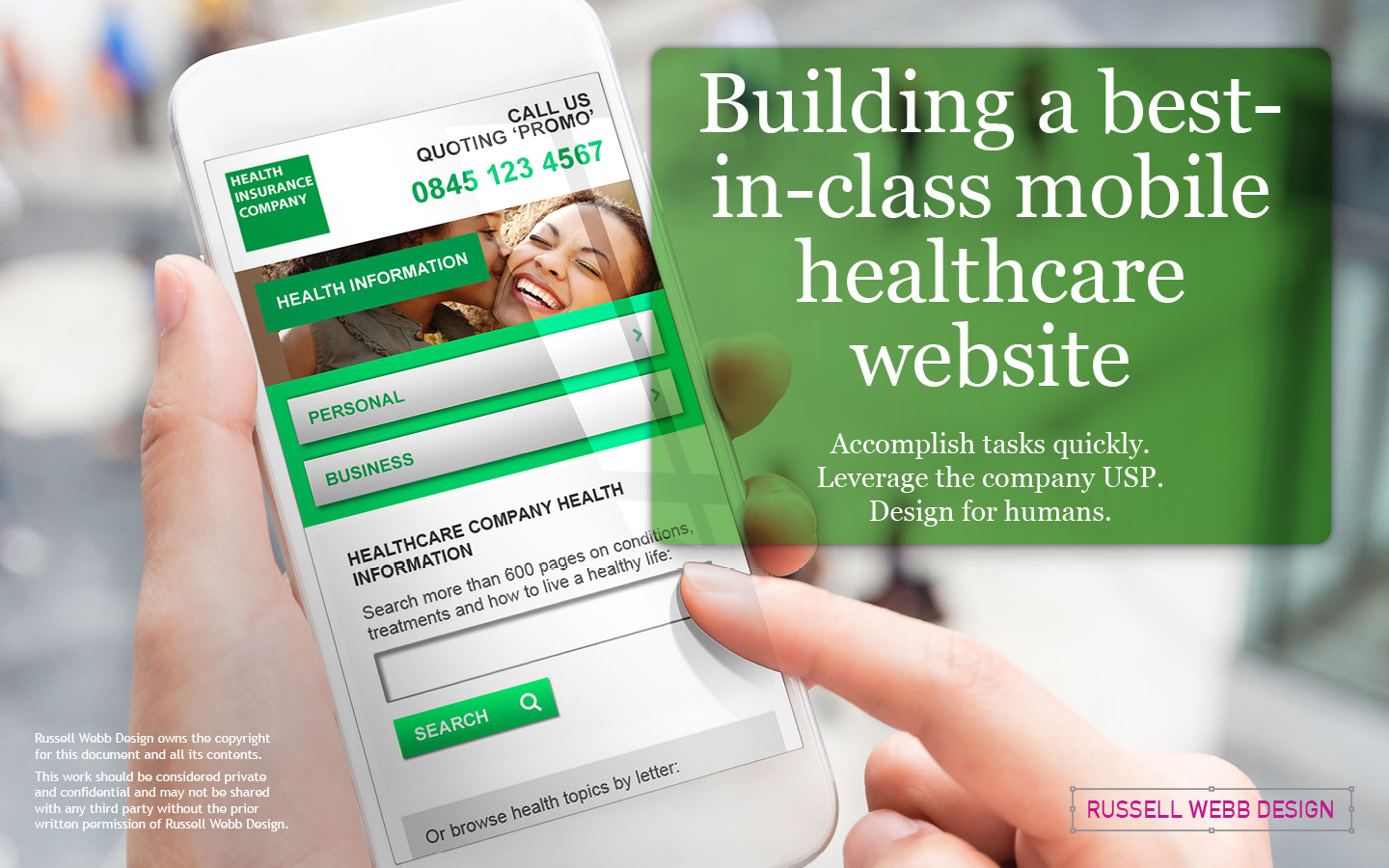
From task efficiency to leveraging the company’s USP. This E2E Case Study includes stakeholder management, design principles, navigation and typography strategies, while stressing the human experience over internal politics.
To respect confidentiality agreements, the branding and specific naming have been modified. This product is currently live and serving 10K plus HNW users.
Setting the scene
usability
Cognitive Load
🚀 Accomplish tasks quickly
From goal-oriented users looking for information to designers minimising friction points.
All leads to higher user retention and a positive user experience.
💎 Leverage Company USP
What makes this company’s product better than the competition?
To align with the brand promise and to build trust, the design and features mirror the company’s core value proposition.
👯♂️ Design for humans
Design within human limits. Make information easy-to-process, respecting memory, attention, and perception.
Design for those with diverse abilities and limited technical literacy. Design to evoke trust, delight, and confidence that leads to loyalty.
Project foundations
As an agency lead designer, I spearheaded the design of this mobile site for the UK’s leading healthcare company, by assembling an exceptional team. Bringing together external and internal creatives, I forged a collaborative venture, leveraging the collective expertise of all parties to achieve a shared vision.
 Watch the video here


