New media is a broad term that encompass the amalgamation of traditional media such as film, images, music, spoken and written word, with the interactive power of computer and communications technology, computer-enabled consumer devices and most importantly the Internet.
TLDR: Analyse competitor apps selling wedding cakes, you identified promotions and discount opportunities, bundles and samples to nudge customers towards Pre-made packages to increase premium sales.
I was recently challenged by a prominent UK-based high street retailer to conceptualise and design an App based upselling mechanic for wedding cakes, looking for an effective solution to drive sales to a more premium product.
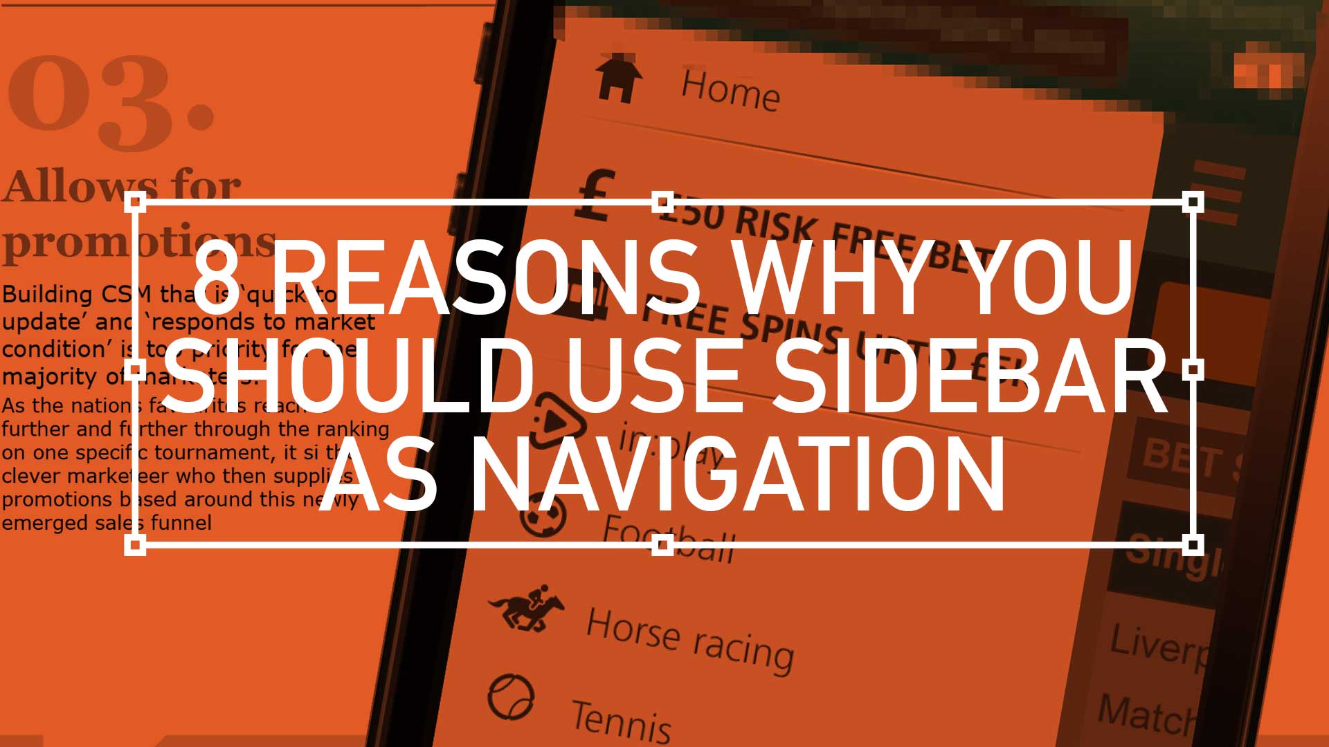
TL;DR; Why is this new style of popular navigation winning hands down against old-fashioned navigation methods? Well, here’s my take on why, in eight easy sound bites.
TLDR: Balancing demanding user needs, stakeholder expectations, and tight tech constraints is a challenge for every Lead UX. This project was no different. Read on to learn how to to seize opportunities to not only deliver, but also showcase key roadmap features, an improved overall experience, true to the Agile spirit.
Quick bet – Strong UX is the golden ticket to guiding users effortlessly through the signup process, browsing games, and placing bets, especially Quick bet. Allowing users to wager with a single tap while removing friction and boosting engagement is a challenge.
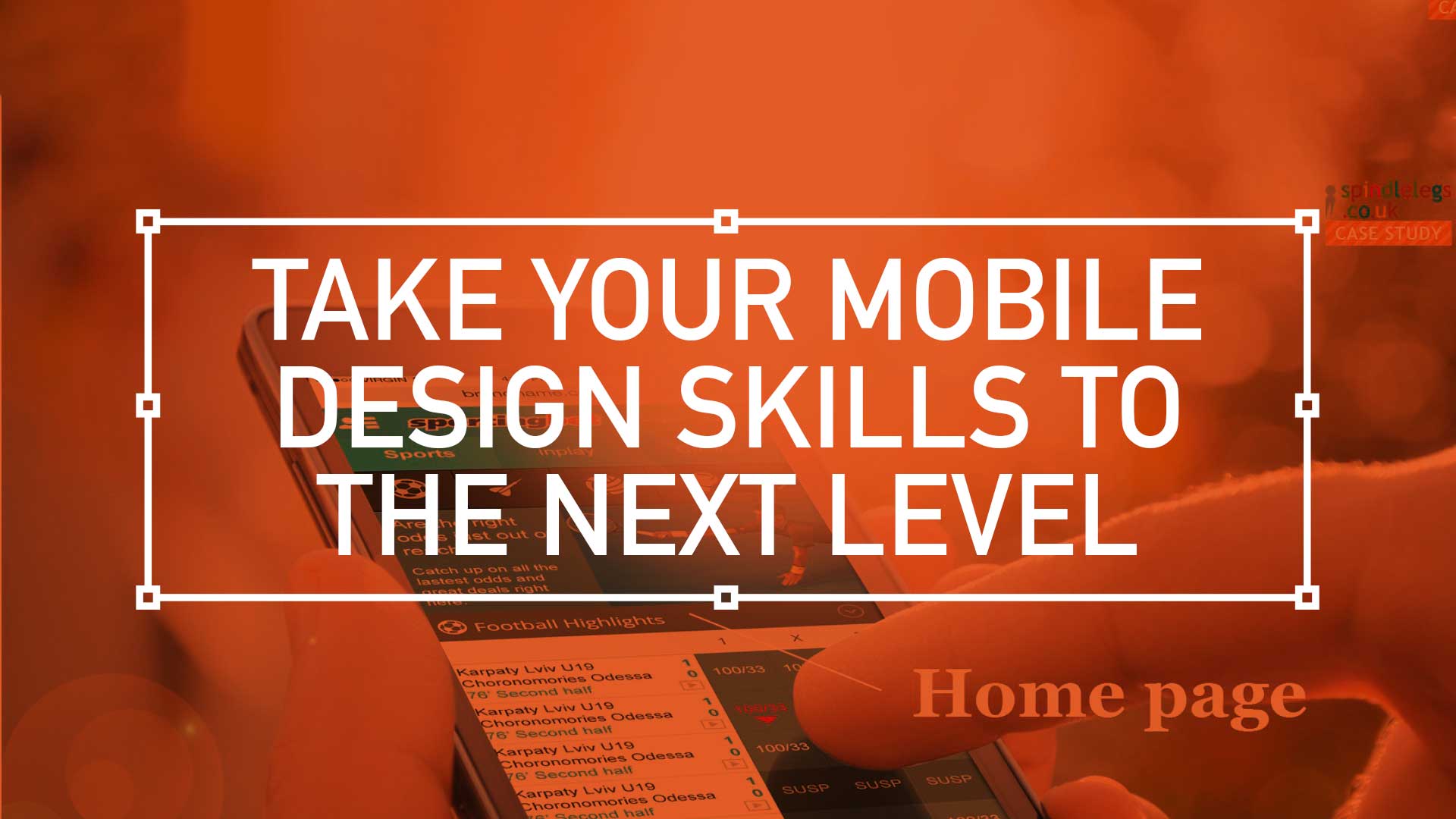
Over the last few months I was tasked with designing the ‘best-in-class’ ultimate mobile sportsbook and casino UX experience. A massive project, so I’ll guide you through it in bite-sized chunks. This is one of the more complex mobile programs I’ve been involved in so I’m going to attempt to split it up into manageable bite-size chunks.
First up: An overview
Home page – Welcome to the brand’s ambassador, a perfect balance of data and visual punch. As a gateway this design has to be the poster boy for the brand. Balancing user data and creative expression plays its part. While football generates 75% of revenue, should it dominate the design?(more…)
When designing for the desktop you can consider the end-user environment, when designing for print you can picture where the magazine will be read but when design for mobile the end-user scenarios are so varied and so far ranging that todays savvy mobile designer needs to develop an entirely different skill set.
This is the edited version of a presentation I gave at Mobile Meet Up on Tues 27th Sept about ‘10 key considerations when designing for mobile ‘. I must stress this doesn’t mean there are only 10, in fact it’s the opposite, there are many more considerations. But here are my top 10:
1. Real Estate
Whether you coming from a desktop background or from advertising the canvas size you have to pay with is drastically reduced on the mobile environment.
Over the years the relative screen size difference has increased. The difference between the smallest (128 x 128) and the largest (800 x 480) is now a factor of 23. That means the largest screen is 23 times bigger than the smallest one.
TLDR: El Corte Inglés, a retail giant, needs a mobile app refresh to captivate customers and boost sales. Create a seamless shopping experience with: intuitive navigation, media-rich content, that is mobile-optimised Features and has a streamlined checkout to transform their UX into a powerful sales driver.
El Corte Inglés S.A. (English: The English Cut as in tailor’s cut), headquartered in Madrid, is the biggest department store group in Europe and ranks 4 worldwide. El Corte Inglés is Spain’s only remaining department store chain, as well as owner of several associated businesses, such as supermarket chains Hipercor, Supercor & Opencor, fashion chain Sfera as well as a travel agency (Viajes El Corte Ingles) and telephone provider (Telecor).
Brief
Incorporating a nav search, a store finder with the traditional basket top right design a media rich experience for shopping on your phone. By captivating a customer and therefore increasing spend, design a system of sub navigation that is convincing and compelling. Drilling deeper into the experience, screens can display products with the the added mobile features of sort and zoom. Product Info and descriptions, including ‘Add to Basket’ and ‘Wish List’ functionality plus the ability to share your purchase are all important consideration.
TLDR: Inspired by design masters, this can aide your creative process: User first through to competition analysis, (innovation nit imitation), to familiarity and then focus on value then finally beautiful execution
As a junior designer, way back when, I visited our local design museum (I studied in London, UK, so my local design museum was fortunately the rather impressive Design Museum in Shad Thames) and fantasied over how great it would of been to be involved in, say, designing a Charles and Ray Eames leather recliner, or Dysons Cyclone Vacuum cleaner.
Now I’m doing stuff I feel proud off, in the field of UX/UI, I thought it worthwhile to see if I could mirror the process these great designers took and document it from a UXers perspective. So, here we go. I started with the following criteria:
Give users choice.
Competition Analysis
Design with familiarity in mind
Prioritise features that add value – the “Magic Moment”