TL;DR Open Banking unlocks a future where financial apps become indispensable partners. A power-shift to more convenience, better financial education and meaningful relationships. Read on to see What’s next in this new ecosystem?
Hard Skills:
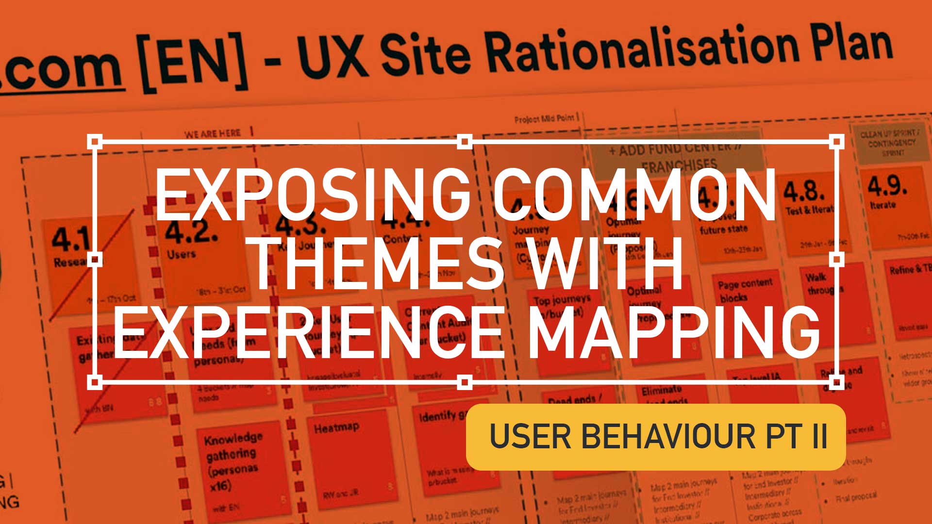
Journey Mapping
Research
Visual Design
Soft Skills:
Empathy
Collaboration
Critical Thinking
What is Open Banking
The role of open banking in the super app evolution is enormous, it is essential for creating a smoother user experience. Open banking is the core technology that allows these apps to draw financial data from multiple sources (APIs) and design products and services that speak to the needs and wants of the end-user.
Open Banking helps super-apps with:
- Personalisation: Gathering data to enhance recommendations, habits and trends based on the user’s behaviour.
- Centralisation: One app to rule-them-all, one roof and one umbrella. No need to switch apps to switch functionality (i.e.make payments, check portfolio performance, monitor transactions, etc).
- Open finance: Super apps and open banking are foundational pieces in the financial ecosystem jigsaw – mortgages, savings, pensions, insurance and credit, can all talk to each other.

Super app benefits for wealth management
The end-user now enjoys luxuries that a few decades ago would seem unimaginable. Wealth Management (WM) was dated and rigid, Financial Institute in pole position, controlling the action. The birth of the super app has tipped the balance of power to the investor, putting them in charge of their finances.

Convenience
The super app has evolved to give the consumer (and investment professionals) a one-stop shop for all their finances. Investors used to jump from website to website and from platform to app to check transactions, transfer money, pay bills, etc. Now within is single-pane-of-glass, user control their financial world.

Smarter decisions
Phone a banker, broker or accountant to see how their money is affected by fragmented financial knowledge; Financial decisions needed the experts.
- Did the expert always have your best interest at heart?
- How close and personal was that relationship with these experts to trust their recommendations
- How transparent were they?

The super app brought an dispassionate, clean, and precise approach to financial decision-making. It has trimmed-the-fat off the process, presenting users with the best viable option.
Enter the financial super app
A super app alleviates financial institutions from transaction processing, compiling data, building risk profiles and other traditional banking functions. It allows banking institutions to focus on building meaningful relationships with investors.
It centralises their attention and indirectly allows Portfolio Managers to tailor their campaigns for new products and services. Relationship Managers now know where their audience is; all they have to do is put the right thing in front of them.

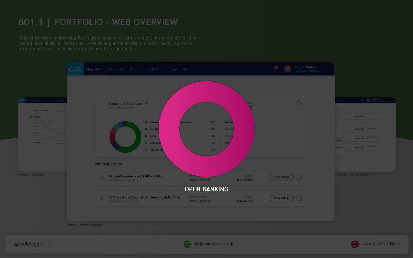
From viewing fund performances to the allocation of assets, to understanding these assets positions, to what transactions have been actioned and reviewing portfolio valuation.
The future for financial super apps?
Data management
Third parties, organisations and fintech companies need to understand
- Where the data is coming from
- How they store it
- How they use it
This is the way to build bulletproof information flows.
AI-driven Financial Coaching
Artificial intelligence in money management apps process data quickly and efficiently. By monitoring financial behaviour, AI can assist users in maintaining smart savings, refinancing, achieving financial goals, and even more*.
*With approval, of course
Get in touch
Want more?
Discover how FI’s can can offer all clients personalised advice, how UX can help investment firms stay relevant in our neobank world and how to build a *Financial Super App – One click at a time.
*NDA Case Study Walk-Thru

It truly is, a Brave New World!

Pique’d your interest?
This is but part of a selection of design information russellwebbdesign generated for the creative community out there. Please contact me further to discuss how your brand can benefit from the new channel: info@russellwebbdesign.co.uk
If something has peaked your interest. Please leave a comment below.