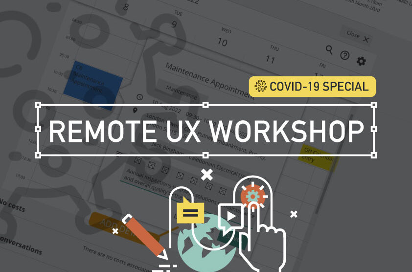
TLDR; Boost your workflow without breaking a Zoom sweat in this COVID-friendly remote special. Simplify KO’s, pinpoint problems, and find your perfect toolset. Unleash the life-saving power of Dual Track UX Delivery.
Moving on from the KO process and tool limits (see Part I). Part II drills down on real world ‘quick wins’, tracking tasks and signposting. Conclusions will sum up.
Labelling and Buttons
Focus on your speciality, and reach out when you need help.
‘Quick wins’, including consistency like tracking labelling decisions (with accountability) and pressing the right primary (or secondary) buttons should be your focus as a consultative UX designer.
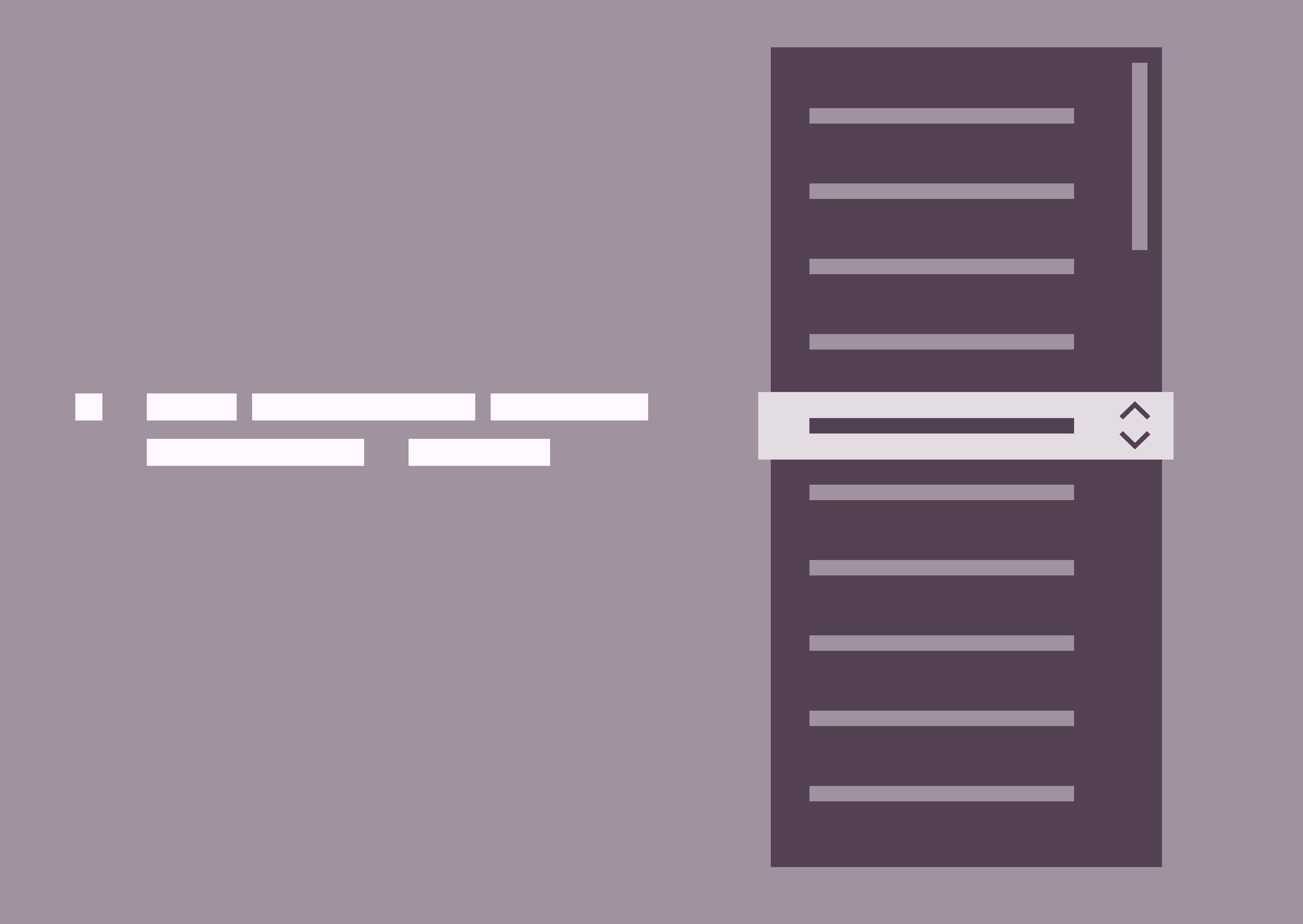
This visual how confusion over two descriptions. Custom mapping within DBS is a complicated animal so learn on your front-end developer who has the skills to explain payment endpoints much better than any creative.
When mental models don’t align
Use the Gestalt ‘Law of Similarity’ principle and keep parallel screens similar.
The “Law of Similarity” states that elements tend to be perceived into groups, if they are similar to each other. Meaning if you have elements with the same functionality, meanings and hierarchy, they should be visually similar.
TL;DR; Boost your workflow without breaking a Zoom sweat in this COVID-friendly remote special. — Simplify KO’s, pinpoint problems, and find your perfect toolset—faster than a remote ping. Discover the limits of your daily grind. Then, unleash the life-saving power of Dual Track UX Delivery as a consultative designer.
TLDR; Modern ux-ers need to skill-up, keep pushing best practice and do their homework when preparing for remote workshops. Adapt with more structured activities, beef-up the tech and deliver digitally with feedback and collaborative tools.
From the T-shaped designer to a online creative technologist
business
Technoligy
MArketing
Developemnt
As worldwide events are changing everyday life, so are the expectations of today’s experience designer. This designer is becoming more of a conduit between business and tech, between marketing and development. Linking these disciplines together is the UX expert, whether that be instituting Design Thinking or facilitating workshops, the bar is getting set higher and higher and today modern UX’er needs to be ready, and needs to be T-shaped.
For the past few years User-Centered Design (UCD) and Lean UX has been top of my agenda and prioritising the very best elements of those ideologies is a skill I’m fine-tuning everyday. UX Workshops, in their many different guises are designed to empathise, to understand and then lead on towards a POC or some flavour of a prototype. This has many benefits from collaborative thinking through to group alignment and collective contribution. Like ideation and journey mapping all in a face-to-face collaborative style.
Empathise to get a better understanding of the problem to be conquered. Use activities like ‘Ask the experts’ to gain insight into user needs – set aside personal assumptions and focus on defined problems. Ideate and generate logical ideas that lead to creating an inexpensive test product (prototyping). Fail early, iterate and make your product inherently better.
In these more challenging times, how do we design professionals help to facilitate that collaborative nature from behind a computer screen and without having that face-to-face connection? Build relationships with teams distributed across the country or globe and communicate the value of journey mapping while engaging people in the process is even more challenging, especially when those people can’t witness the actual activity. Ideation and mapping exercises over-the-wire is a challenge so here is my perspective following a recent remote workshop I chaired with a real estate client.
Pre workshop – Be like a boy scout
PREPARE
Agenda
Links
I’ve said in previous articles, you roughly need twice the presentation time for preparation and this is equally true when you’re delivering the remote flavour of a UX workshop. Leading from the front as a facilitator and as a creative technologist ultimately the success of a remote workshop does revolve around the technology you have to hand. Make no assumptions, if your connection is not strong enough or your cameras are not clear enough the success of your remote workshop is that risk.
Ensure you have a quiet, comfortable and illuminated room
Think about a headset with the microphone and also about the best video conferencing solution.
Ensure your default check boxes are all ticked here.
Setting the Stage
Include an agenda to manage expectations
Following intros, the ‘Product / Feature Vision’ is first up. ‘The Challenge’ preceeds a best practice master-class on the product or feature area. Another short intro into my UCD process I then asked ‘My five big questions’ followed by a personas session. Features leading to a genuine ‘Nice to have’ discussion also helps manage expectations. This leads perfectly into a Mapping and Ideation. Keep to your agenda, its important.
Unfortunately, you won’t have those two minutes pre-KO to ask about the weather and to build bridges, so make sure introductions are timetabled.
Keep the conversations flowing by including the Product Vision and The ChallengeDefinition as early pieces on your agenda. The remote nature of these first interactions are crucial, it’s important to allow all to contribute and keep the conversation flowing by re-iterating;
What has been done
What we are doing
What we will do.
Elevate the Baseline
Asking the right questions early helps set the stage. What problem are we trying to solve and can I have the big picture? Who are the User types and the Persona and what are their pains and gains. What are the project aims and how do we measure success? A good question to ask is why use this feature and not an alternative?
It’s important to gauge the creative intelligence on the people in the virtual room. This should come both from your research of the attendees pre workshop, and by calling out by name to promote engagement, asking people for their introduction at the top of the hour. My experience says go with the lowest denominator and bring everyone up to speed on process, on base level concepts behind Design Thinking and on how collaborative session usually work and ask the big questions.
What problem are we trying to solve and can I have the big picture?
Who are the User types and the Persona and what are their pains and gains.
What are the project aims and how do we measure success?
Why use this feature and not an alternative?
What is you question to the group?
Don’t forget to share pre-prepared documentation or links to aid further reading across your comms channel of preference.
Keep your process, but adapt
Personas
Journey Mapping
FEature list
Charting the steps through this journey begins with search and select, then the user can choose the time, with options for the users showing available spots in the next week. Booking information should all the information that the contractor needs and finally the journey ends with the confirmation email and/or a text message.
Activities like early hypotheses session, through to personas building, demo’s and deep dives into feature lists discussion all still have their place in the remote workshop scenario – they just tweaking to ease them through. Everyone must understand the purpose and the outcomes of your activities. For instance customer journey mapping; recognised as one of the more challenging workshop activities especially amongst debutante participants I recognised I had to most of the heavy-lifting myself.
My goal for this instance was to quickly understand the current journey within a limited time, involve as many internal stakeholders from bus dev, legal, CS to engineering.
Have at hand your collaboration doc, detailing activities with timings and outlining techniques. This acts a guide through all your calls and should be shared on screen and as a single point of truth when concluding the workshop. My take out here is keep it simple, use bullet points and subtle branding.
Google Docs is your friend here. It’s also a good idea to later move your visual findings to Mural and Miro (formerly RealTimeBoard)
Ideation, in a low fidelity way
SHARE BOARDS
CHAT & messenger apps
Initial first stage ideas from modal windows to small reveal to large reveal concepts. All helped lay the foundations in a low fidelity, if less collaborative, way.
When mostly everyone is remote, take advantage of Real-time board or Muraly or Sketchboard. Even splitting participants into columns on Google Sheets and allowing real-time contribution is a workable solution.
For instance, a spontaneously pencil sketch can be captured on your mobile and shared relativity instantly across Slack, great for what I call remote ideations. These can then be cataloged in your collaboration doc and / or uploaded to your Miro board.
Digital Prototyping from the Digital Experts
Taking the very best of concept #2 enabling the user to both see availability but also to drill-down and add must-have functionality. Also cherry picking elements from #4 and solving the visibility of contractor availability.
There is a benefit to being digital designers thinkers in a digital world. So take advantage of this when building and eventually sharing what is in most cases, a digital prototype. Use industry standard tools your clients should be familiar with that can aid both sharing and collaborating within a remote environment.
You should still be starting with low fidelity sketches from you Ideation Sessions (see earlier) but eventually this will lead to the big reveal. InVision is my weapon of choice here, it’s quick, it’s collaborative and it’s becoming the industry standard.
Post workshop wrap-up
Personal details
Pre-registration
Feedback and comments will help shape and strengthen future workshops.
In true 360 fashion and in the spirit of UCD from my remote perspective it is good practice to reach out to evaluate the effectiveness of the workshop. Ask for assistance in completing an evaluation and eave the door open to respond say within a limited time period to keep the data fresh.
There will always be pitfalls to this type of distance collaboration, my key take-outs are;
Reduce friction by introducing activities more appropriate
Tell your team what you are about to do
Tell them what has been done
Follow your script, set out in your collaborative doc
Finally, inform the team that there is a central repository (Dropbox or Miro or other cloud share is ideal for this) and ensure all have access; this becomes a great place to dump visuals, photos, text files or movies. This is also a great place for the collaboration doc which eventually evolves into your UX report.
So, have fun by keeping the dynamics high, reducing distractions don’t forget to learn yourself and document religiously. Ramp up your note-taking skills, you’re going to need them!
Appendix
Your remote toolbox*
Google Docs, Sheets and Slides – the go-to applications for collaboration.
Real Time Board — A remote whiteboard tool for stickies and comment
Go To Meeting / Zoom — Video conferencing that allows you to show slides and record screens.
Slack – Document your chats, and share group or personal videos.
uxpressia.com – Online journey maps and personas
* Please note this toolbox is by no exhaustive. This industry is was booming and pivoting every day.
TLDR: Traditional drop downs stifle UX in regulated financial software. They overload users with hidden options, hinder transparency, and increase cognitive load. But there are alternatives, prioritise immediacy, transparency, and champion user-centric solutions.
Recently I’ve been involved with implementing Design Thinking and best practice UX for a heavy technical suit of applications. Although I’m pushing collaboration and inclusivity, especially with the developers, I can recognise that look in their eye when I’m evangelising best practice and stressing user’s needs and wants.
It’s not their fault.
To give you a snapshot of this established and mature Agile team, we need to step back. Within a heavily regulated financial development environment, tech guys concentrate primarily on tech functionality. Task orientated user flow (UX) followed by aesthetics and that ‘delight’ moment (UI) very much take very a back seat.
When select menu has less than 7 options it suffers from a lack of up-front information.
So cycling back round to the title of this post, I get constantly asked “Please can we use a drop down here’. I’m not Mr Anti-Dropdown but I always ask why?
Let’s NOT use a drop-down
Drop-downs seems to be a one-stop shop killer solution for every developer’s requirement. We have a registration form to design, and there is a question about gender. M or F, ‘Lets use a drop-down’. A news article page within a CMS where an editor can choose a collection of background brand colours; ‘Lets use a drop-down’. A mobile home page with three sections, ‘Lets use a drop-down’. Although not so much with iOS developers, it seems this breed have a tighter aesthetic.
For a better UX experience, be transparent with your users. Show them their choices rather than hide them behind a drop-down.
The ‘why not’ revolves around these three simple points;
Hiding selection choices behind a drop-down isn’t best practice. Especially when there is the on-screen real estate available.
Displaying the user choices adds immediate vision and scope, reduces the cognitive load and allows the user to see their destination.
For consistency across platforms, would that mean a drop-down on iOS devices – now you Apple fan base out there love your Apple T-Shirts and the WWDC Conference, but it doesn’t dictate best practice UX? This would not be my recommendation – especially the ‘nasty’ native iOS touch drop down.
I can fully appreciate when you have a selection of more than say 6 – 8 items (this number varies) then you should default to drop downs. But the bigger question is; If you could provide an option for the user to click straight through, where they can see all their choices at a single glance, and you have the on-screen real estate the you should absolutely push for a more transparent solution.
The 100 option drop-down
Allow your users to starting typing to narrow their choices and then offer them a limited and tailored number of selections.
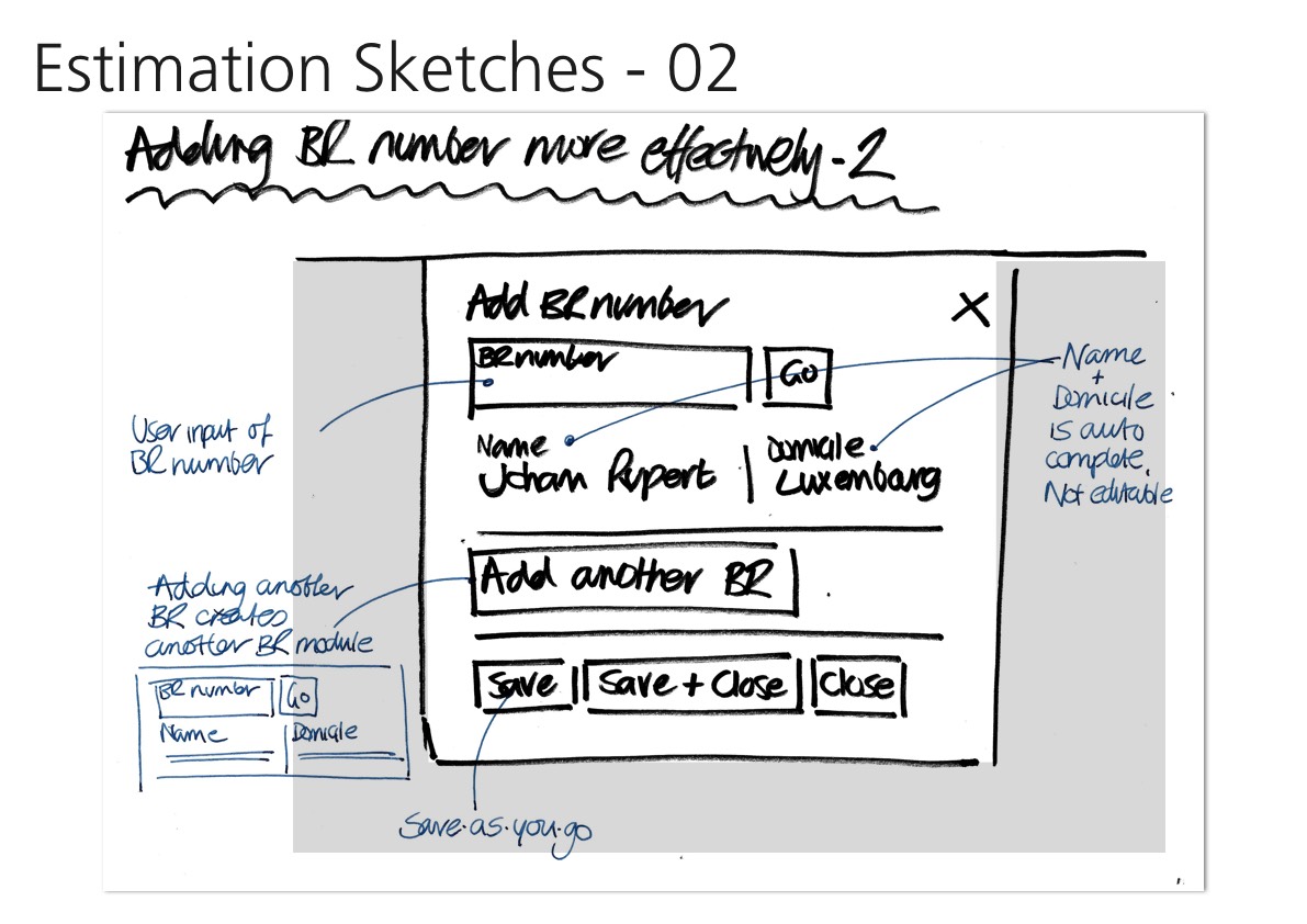
A classic example is the auspicious country-selector with it’s 100 options. There is no no quick and easy overview option. And those of you from an ‘United” country, well it is potluck whether you’ve been bumped to the top or your country is listed by one of its other names. My preferred choice is to use auto complete menu instead – need visual
When select menu has less than 7 options it suffers from a lack of up-front information. The user has to click in order to see the available options.
So what’s the definitive best practice answer then?
When to use on desktop
Use radio buttons for choices under 7
For web you should use radio buttons when choices under 7. Your users will be able immediately scan how many options they have and what each of those options are, without clicking (or typing) anything to reveal this information.
This is particularly true for the ‘Please select your gender question’. At the start for the 21st century there are definitely under 7 choices here, so please use radio buttons.
Use Mobile convenient add-ons to boost your productivity
Type “Af” and Afghanistan, Central African Republic and South Africa drop-down
User are discouraged by the perception of many taps. There is always the ‘fat finger’ issues, but more importantly today mobile savvy Gen X, Y or Z, who interact everyday with data driven (server side) continual validation apps. Always-on spell check, auto fill name and address field and real time dynamic delivery options for example. This is especially true on the smaller screen – speed, convenience and time are crucial factors when completing tasks.
Conclusion
Avoiding dropdown menus is a crucial design pattern on mobile platforms. Is there a faster alternative, better UX choice to reduce usage errors.
Experienced developers are a great resource. As a future thinking UX-er you should always challenge, ask the right questions and be the user; Does this control choice make my life easier?
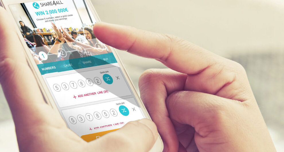
arget audience: Millennials who prioritise experiences over possessions. Innovation: Mobile-first web app emphasising social sharing, ‘good causes’ integration, and smooth number selection. Key features: Rapid number selection, seamless sharing, integrated charitable causes, user-friendly payment process, and engaging summary screen.
Recently I have been leading a small team, driving UX innovation and engagement to significantly boost player acquisition and retention rates for a digital lottery provider. A mobile-first project designed for millennials, focusing on sharing, social impact, and a smooth user experience.
My role involved pushing UX innovation and engagement to attract and retain players, while partnering with state lotteries and charitable organisations to build and enhance their digital lottery channels.
TLDR: Following on from my recent ‘How user personas can help crystallise the early stage design process’ post, here the focusses is on realising wireframes and responsively design. This post looks at providing a snapshot of how to visualise the findings and create an experience for both desktop and mobile.
The focus here is on strengthening the sales staff understanding, how to cross-sell and provide a tool to effectively push leads through to conversion.
Primary user goal
These wireframes concentrate on the lead generation in the automotive industry but these principles are clearly transferable.