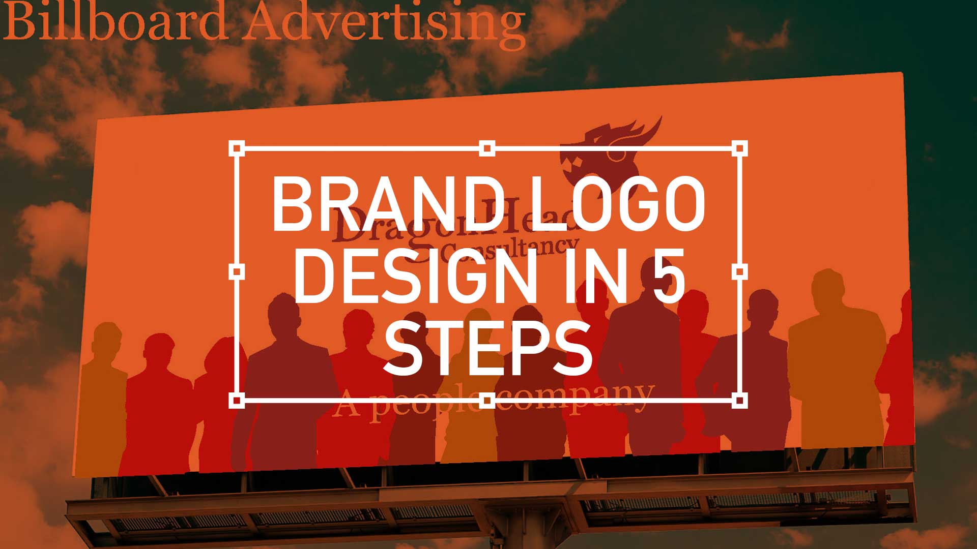
TL;DR; The branding exercise showcasing a need for a standout, flexible, unique, and impactful logo marque. From sketching, client involvement, standardising the colour palette to finessing the design into a fully-fledged product.
1. Lets get started with… R&D
I have recently been involved in a branding exercise for a company that has over over 20 years experience in consultancy, project management and business analysis. This isn’t a new sphere of business, there is plenty of competition out there so a stand out logo marque that was…
- Flexible
- Unique
- Impactful
… was essential. So I presented a limited selection of ideas as I feel, after a certain amount of years, I’m qualified not to waste the client’s time presenting numerous options. This is a concept shared by the likes of David Airey on his site logodesignlove.com

2. Now for the creative part, also called the Discovery Phase
My favourite part. Here a blank canvas is your friend – literally just start doddling. I find out-of-the-office is more productive… so on the bus, in front of the TV, anywhere with a sketchbook on your lap works.


Initial scamps with a small amount of ‘work-up’ was enough, at this stage , to give the client a suggested visual direction. Involvement at this stage is paramount – dont try, actually involve them in the development process. In my experience this is a by far a more successful approach than designing in a vacuum and then performing the big reveal.
3. Work it! Bring that brand alive with a Kit-of-Parts
Realising the brand is something branding designing do for living. But not everyone is a branding designer, or even has that creative eye – this is where the skill set you have developed over the years comes into play – by bring the brand alive. Here, I again limited it to three visual directions for chosen favourite from the Discovery Phase.
3.1. Overlay
Overlapping square became the inspiration for this direction – the great thing about this route was the flexibility, these squares could work anywhere


3.2. People
My advice, almost every brand needs a human touch. So, try and build this direction in for at least one of your routes.


3.3. Pattern
This was my preference, I felt the flat solid color treatment was very contemporary – and of today.


4. Wrap it up in the Delivery Phase
Again, after the favourite choice was selected from the Kit-of-Parts exercise, (you can see a pattern forming here, eh?) this is where you finesse the design. That means getting the product perfect, controlling your sweeps and standardising the colour palette. In summary, when your design become a fully fledged logo design. Welcome to the club!


5. New brand creative, not that easy eh?
So in summary, you’ve used your research skills to differentiate the brand, your sketching skills to flesh out concepts. From those concepts you’ve creatively brought that brand alive giving the client visual concepts and then you’ve finessed those decisions to a fully fledged product. Well done. Who said being a creative was just drawing pretty pictures?

Final presentation
Click below to see the final presentation – note the ‘storytelling’ method runs through and climaxes with the final look n’ feel.


CASE STUDIES
Design with the dark mode trend front-of-mind
Delight, speed and satisfaction are rewriting our UX playbooks in finance

Pique’d your interest?
This is but part of a selection of design information russellwebbdesign generated for the creative community out there. Please contact me further to discuss how your brand can benefit from the new channel: info@russellwebbdesign.co.uk
If something has peaked your interest. Please leave a comment below.

Comments
One response to “Brand logo design in 5 steps”
I like reading your blog. Anybody’s brand is not just their logo it’s a big list of many things like custom stationary, which includes pen, boards, note pads and other daily office thing. Then you have the broachers, the banners, the booklets, the business cards and magazines. To get a of the public you need both logo and brand design in UK.