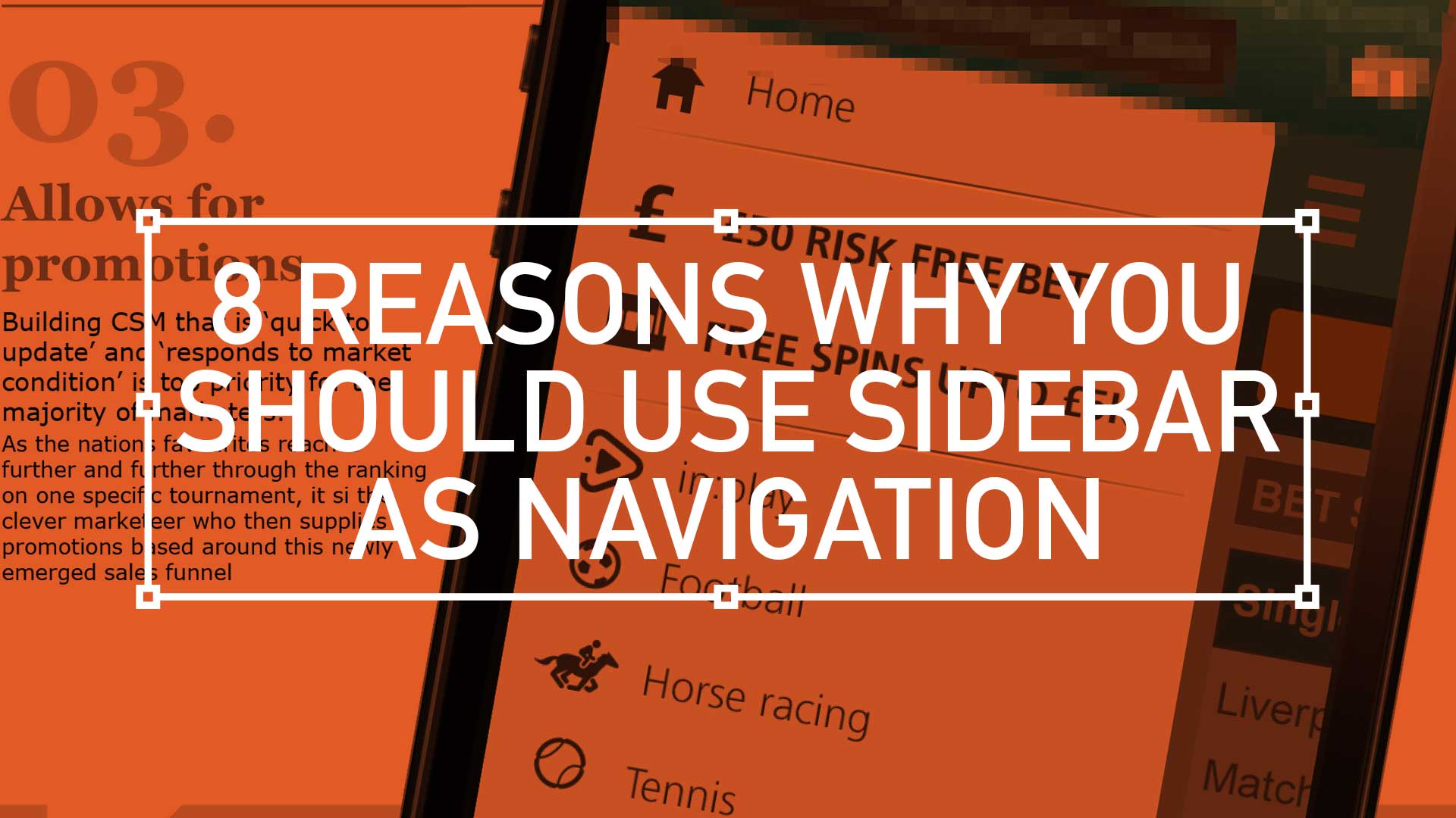
TL;DR; Why is this new style of popular navigation winning hands down against old-fashioned navigation methods? Well, here’s my take on why, in eight easy sound bites.
TD;LR; Good design is easy to digest—the brain shouldn’t have to expend a ton of energy to figure out what the heck it’s looking at. With any luck, people will just “get it” without needing a 6-section explanation.
For user accounts, the default user experience should be as elegant and as simple as possible. This UI animation below, goes some way to filtering down what was essentially the most simple mobile navigation I could get stockholders to agree on. As always, there will be compromises, (inline personal information editing. for example) but overall keep the Three Little Rules (scroll down) front and foremost.
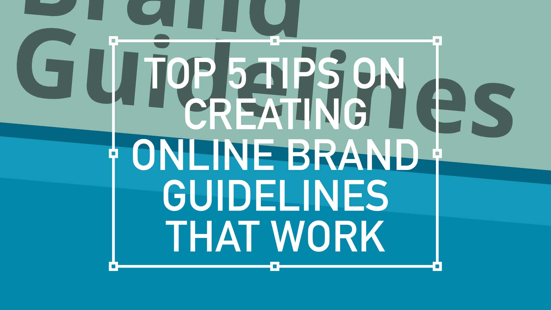
TL;DR; A set of helpful tips for creating effective online brand guidelines for a responsive website with dynamic content and multi-width navigation. To ensure adherence from all stakeholders provide template downloads or example files to effectively showcase the brand in a finished format.
My personal Top 5 tips on creating online brand guidelines.
Building guidelines is always a challenging task, building guidelines for a responsive website with rapidly changing dynamic content, easy-to-use multi-width navigation on a truly scalable and highly transactional website is a step up. From a CMO perspective you need it to be brand aware; a CEO would want guidelines to be useful tools for your brand ambassadors and the sales director would need you to highlight features while your product team wants details, detail, details… and what about multiple brands, don’t get me started?
Interactive PDF Clients are finding it increasingly beneficial to actually click or tap through a proposed user journey. With Adobe Acrobat and the UX Design Tool Omingraffle, here I create a clickable prototype. Simply download the PDF below, launch full screen in Acrobat either on your PC monitor or tablet for tailored interactivity.
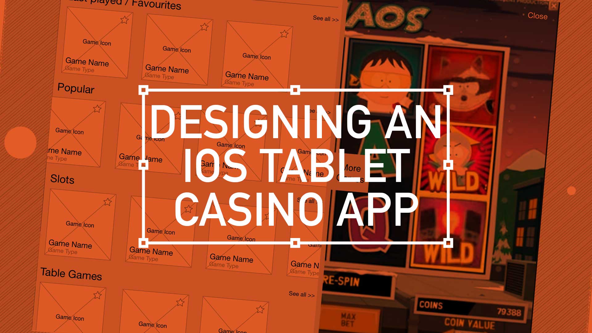
Contrary to popular belief, casino players are not the wildest bunch. Serious players are only interested in one thing, the game. The route to that game isn’t so important. Fancy UI, extravagant menu systems with all the bells and whistles are not the way forward. More and more white space and using bigger type sizes, hit areas and buttons not only help this type of user but are very touch friendly translate across-platform and avoid a lot of refactoring.
So, key drivers here were familiar menus, mass content and game play.
Handling Cross-Channel Consistency
As with every project, there is always some baggage. This one came in the form of its baby brother, the iOS mobile version. Although only on its infancy itself, there was a president already set for the UX.
Easy access to every game using an simple user journey
Treat your home page as a shop window
Using the ‘shop window’ metaphor, this was the place to exhibit your wares. To show off your new releases, latest promotion s and tour game categories. I have been using “Kiosk style” buttons more and more recently – i.e rather than present 4 radio buttons options, opt for the more visual display of text in rounded corner boxes (which actually aids in spatial recall and creates a bigger hit target)
Showcase your ‘Game page’
Immediate immersion vs laborious registration processes – this comes from the game design world where you follow with account info after someone’s “played” or interacted with you service.
Quick access with mini lobby functionality
In game access to all other games. Drop-down and slide out drawer options are currently en vogue. Load them with information and graphics with “minimal” styling – keep in mind greys or desaturated colours and use bright colours to draw attention..
Increased focus on intelligent and well placed legible typography. Consideration around extra long game title and of course, language translations are top of the UX list here.
On-Boarding
The users first interaction with your experience, so make a good first impression! Big type sizes, big hit areas and big buttons with plenty of white space – so that Web apps might also be touch friendly w/o a lot of refactoring.
Last Played / Favourites
What I’ll call “As you need it” functionality – instead of functionality being exposed by default, it’s presented in a series of sequenced moments (clicking on “add a comment” link or box turns into expanded box with more options, OR rating something exposes a comment field
Auto save functionality (vs big “Save” button)
Login and Open an Account
Inline expanding areas for additional information/actions and single column layouts – less distracting and mobile ready with friendly, conversational language around form elements. Here there is also a focus on content being given proper information design treatment font hierarchy and type sizes, caps and shading, etc. to aid in understanding, all wrapped in appropriate and well chosen typography.
Conclusion
Overall I was keen to push very subtle textures and draw lite contrasts that guides the eye through a page. Modern iOS screens can handle these delicacies better than the monitors I’m designing them on!
Keep things consistence, and keep them simple. Reflect back to sister applications and build some parallels. Appreciate pre-defined paradigms, and follow existing patterns to drop that cognitive load. Take a lead from retail, and exploit the ‘shop-window’ metaphor and finally, make your registration gradual and progressive. Slowly ease the user ‘through the casino doors’ by making login seamless.
A big ask I know – but this is the challenge of the modern-day UX-er.
Pique’d your interest?
This is but part of a selection of design information russellwebbdesign generated for the creative community out there. Please contact me further to discuss how your brand can benefit from the new channel: info@russellwebbdesign.co.uk
If something has peaked your interest. Please leave a comment below.
TLDR: Balancing demanding user needs, stakeholder expectations, and tight tech constraints is a challenge for every Lead UX. This project was no different. Read on to learn how to to seize opportunities to not only deliver, but also showcase key roadmap features, an improved overall experience, true to the Agile spirit.
Quick bet – Strong UX is the golden ticket to guiding users effortlessly through the signup process, browsing games, and placing bets, especially Quick bet. Allowing users to wager with a single tap while removing friction and boosting engagement is a challenge.
Over the last few months I was tasked with designing the ‘best-in-class’ ultimate mobile sportsbook and casino UX experience. A massive project, so I’ll guide you through it in bite-sized chunks. This is one of the more complex mobile programs I’ve been involved in so I’m going to attempt to split it up into manageable bite-size chunks.
First up: An overview
Home page – Welcome to the brand’s ambassador, a perfect balance of data and visual punch. As a gateway this design has to be the poster boy for the brand. Balancing user data and creative expression plays its part. While football generates 75% of revenue, should it dominate the design?(more…)


