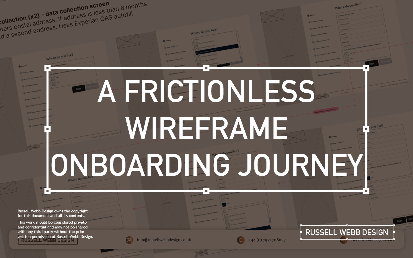
TL;DR: Customers faced a confusing onboarding maze. Detailed UX wireframes transformed it into a frictionless journey, getting users invested.
OUTCOME: Secure, and personalised onboarding process building loyalty from the first click.
UX Wire-Framing
Multiple Interactions
Design Thinking
Enterprise
How to hook new customers

Backend to Frontend
When customers make a product selection there is a lot going on behind the scenes.
The desktop new product onboarding experience is a complex animal, a prime candidate to wireframe. Capturing a large selection of unique steps and indicating the interaction design is a Design Thinking challenge and requires enterprise-level wire framing skills;


- Clarity and Understanding A central pillar in UCD
- Take advantage of existing Design System component reuse
- Team alignment (from BAs to Dev to client)
… let’s dive in
Defining the Problem
Security
Hi-Fidelity

Imagine a new or existing customer discovering your product.
The onboarding process can often feel like a daunting maze. This is where detailed wireframes step-up, transforming a journey into a smooth and secure experience. Early decisions were made to leverage a pre-existing Design System, so high fidelity wireframes (Hi-Fi) became the way forward with Figma as the wire-framing tool of choice.
Development Preparation
Pre-development tech checks
Process flow diagrams


The first goal in a wireframing process is technical. The objective is to integrate a robust data gathering mechanism into the onboarding process to streamline technical development. Understanding the terms and conditions, personal details collection, and email and SMS validation data flows and aligning these all to API calls was top-of-mind.
This early technical scoping ensures efficient API integration and data management solutions, so the team can move forward and then collaborate with BAs and then UX.
Onboarding Flow and Requirement Gathering
Goals
Objectives
Functional requirements
Shared understanding

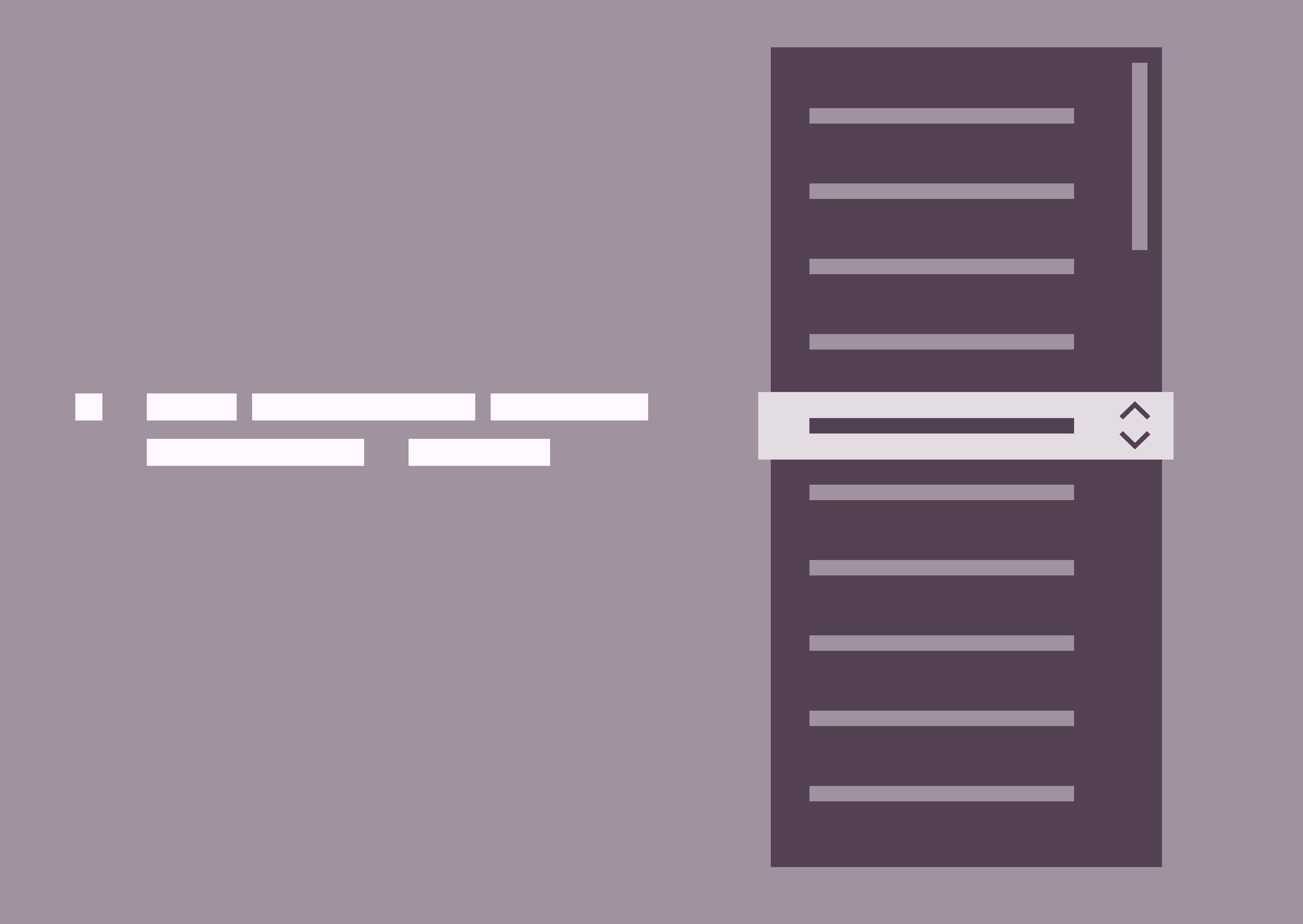
Images are blurred for client confidentiality reasons
BA Requirements Gathering
To provide a solid foundation, to limit rework and foster communication between stakeholders (users, developers, designers) a Business Analyst will typically conduct user and stakeholder interviews to understand business goals and success metrics, write user stories and generate Use Case Diagrams indicating functional requirements to create a shared understanding before wireframes begin.
Pre-development tech checks, and process flow diagrams were thin on the ground, little research was available and there was a lot of ambiguity.
This was an opportunity!
Segmenting the UX Wire-framing Process
From Product Spark to Secure Choice
1 – Guiding the First Steps
Personal details
Pre-registration

The process begins the moment a product ID is entered as the customer clicks a product. These wireframes propose a gentle walk-through, hand-holding the customer and setting clear expectations. As personal details are collected, the system identifies pre-registrations, streamlining the experience. For unrecognised products, the UI gracefully handles the situation, preventing frustration.
2 – Building Trust and Security
KYC process
tax jurisdiction
IDV
GDPR

Next, the validation screen requests a unique member ID, followed by a secure OTP process. This includes both email and mobile verification, paving the way for a robust KYC process.
The customer navigates through identifying their tax jurisdiction, providing identification images, as part of a seamless IDV (Identity Verification) experience. To ensure compliance with regional regulations, the system also gathers marketing and accessibility permissions, adhering to GDPR guidelines.
3 – Personalisation Meets Regulation
investment pledge
NI (UK)


This joined-up onboarding process seamlessly transitions the customer from initial product selection to specifying their investment pledge. Furthermore, their National Insurance ID is verified, ensuring complete compliance.
4 – A Smooth Conclusion
confirm Message
Next steps

Finally, once all data is collected, it’s securely transmitted to the backend. The front-end then provides clear and reassuring messaging, confirming a successful onboarding experience. This leaves the customer feeling confident and ready for next steps. Wires were shared for feedback across the team, and beyond. This included stakeholder, technical leads and Design System PO’s.
Fine tune the results
UAT Testing
Prototyping
Sneak preview of the final delivered User Interface (UI)
The interface has been altered for client confidentiality reasons


The process is still fresh, typically these will go through Usability Testing and Heuristic Evaluation. Prototyping, with QAs on standard, is another option to verify and test stakeholder feedback.
Conclusion and Impact
Clarify ambiguity
trust
Tailored

These wireframes don’t just showcase a process; they tell a simple story of a complex customer experience. By prioritising clarity, security, and personalisation, even with a level of ambiguity, this onboarding journey fosters trust and loyalty from the very first click.

Empowering users with the financial tools they deserve
- Mastering Design Theory and Lean Agile
- Solve big problems, fast.
- How delight and speed are rewriting our UX playbooks