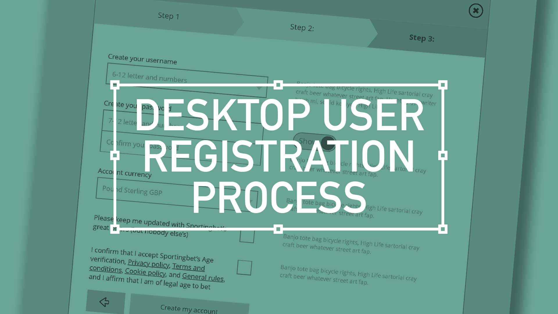
TL;DR; Ask the right questions when requesting personal information. Advocate a staged registration process, comparing it to dating, and encourages keeping the registration form simple. Additionally, highlighting the significance of minimising the drop-off rate during the registration process and incorporating fun elements into the user experience.
There are key considerations when it comes to asking strangers for their personal details. You have to ask the right way – to make each question relevant and necessary. You wouldn’t launch into your life story right away, so why assault them with a clunky, intimidating registration form? Remember to enhance your brand at every gateway; Positive UX will contribute to a positive brand perception
Ask the right questions when requesting personal information. Advocate a staged registration process, comparing it to dating, and encourages keeping the registration form simple.(more…)
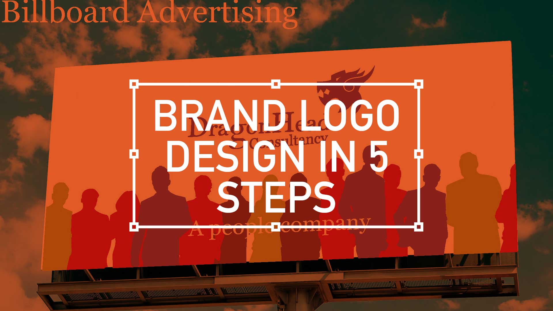
TL;DR; The branding exercise showcasing a need for a standout, flexible, unique, and impactful logo marque. From sketching, client involvement, standardising the colour palette to finessing the design into a fully-fledged product.
I have recently been involved in a branding exercise for a company that has over over 20 years experience in consultancy, project management and business analysis. This isn’t a new sphere of business, there is plenty of competition out there so a stand out logo marque that was…
Flexible
Unique
Impactful
… was essential. So I presented a limited selection of ideas as I feel, after a certain amount of years, I’m qualified not to waste the client’s time presenting numerous options. This is a concept shared by the likes of David Airey on his site logodesignlove.com
TD;LR; Good design is easy to digest—the brain shouldn’t have to expend a ton of energy to figure out what the heck it’s looking at. With any luck, people will just “get it” without needing a 6-section explanation.
For user accounts, the default user experience should be as elegant and as simple as possible. This UI animation below, goes some way to filtering down what was essentially the most simple mobile navigation I could get stockholders to agree on. As always, there will be compromises, (inline personal information editing. for example) but overall keep the Three Little Rules (scroll down) front and foremost.
Interactive PDF Clients are finding it increasingly beneficial to actually click or tap through a proposed user journey. With Adobe Acrobat and the UX Design Tool Omingraffle, here I create a clickable prototype. Simply download the PDF below, launch full screen in Acrobat either on your PC monitor or tablet for tailored interactivity.
Contrary to popular belief, casino players are not the wildest bunch. Serious players are only interested in one thing, the game. The route to that game isn’t so important. Fancy UI, extravagant menu systems with all the bells and whistles are not the way forward. More and more white space and using bigger type sizes, hit areas and buttons not only help this type of user but are very touch friendly translate across-platform and avoid a lot of refactoring.
So, key drivers here were familiar menus, mass content and game play.
Handling Cross-Channel Consistency
As with every project, there is always some baggage. This one came in the form of its baby brother, the iOS mobile version. Although only on its infancy itself, there was a president already set for the UX.
Easy access to every game using an simple user journey
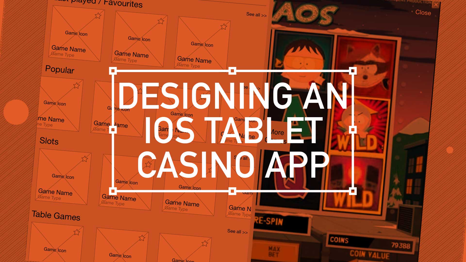
Treat your home page as a shop window
Using the ‘shop window’ metaphor, this was the place to exhibit your wares. To show off your new releases, latest promotion s and tour game categories. I have been using “Kiosk style” buttons more and more recently – i.e rather than present 4 radio buttons options, opt for the more visual display of text in rounded corner boxes (which actually aids in spatial recall and creates a bigger hit target)
Showcase your ‘Game page’
Immediate immersion vs laborious registration processes – this comes from the game design world where you follow with account info after someone’s “played” or interacted with you service.
Quick access with mini lobby functionality
In game access to all other games. Drop-down and slide out drawer options are currently en vogue. Load them with information and graphics with “minimal” styling – keep in mind greys or desaturated colours and use bright colours to draw attention..
Increased focus on intelligent and well placed legible typography. Consideration around extra long game title and of course, language translations are top of the UX list here.
On-Boarding
The users first interaction with your experience, so make a good first impression! Big type sizes, big hit areas and big buttons with plenty of white space – so that Web apps might also be touch friendly w/o a lot of refactoring.
Last Played / Favourites
What I’ll call “As you need it” functionality – instead of functionality being exposed by default, it’s presented in a series of sequenced moments (clicking on “add a comment” link or box turns into expanded box with more options, OR rating something exposes a comment field
Auto save functionality (vs big “Save” button)
Login and Open an Account
Inline expanding areas for additional information/actions and single column layouts – less distracting and mobile ready with friendly, conversational language around form elements. Here there is also a focus on content being given proper information design treatment font hierarchy and type sizes, caps and shading, etc. to aid in understanding, all wrapped in appropriate and well chosen typography.
Conclusion
Overall I was keen to push very subtle textures and draw lite contrasts that guides the eye through a page. Modern iOS screens can handle these delicacies better than the monitors I’m designing them on!
Keep things consistence, and keep them simple. Reflect back to sister applications and build some parallels. Appreciate pre-defined paradigms, and follow existing patterns to drop that cognitive load. Take a lead from retail, and exploit the ‘shop-window’ metaphor and finally, make your registration gradual and progressive. Slowly ease the user ‘through the casino doors’ by making login seamless.
A big ask I know – but this is the challenge of the modern-day UX-er.
Pique’d your interest?
This is but part of a selection of design information russellwebbdesign generated for the creative community out there. Please contact me further to discuss how your brand can benefit from the new channel: info@russellwebbdesign.co.uk
If something has peaked your interest. Please leave a comment below.
When designing for the desktop you can consider the end-user environment, when designing for print you can picture where the magazine will be read but when design for mobile the end-user scenarios are so varied and so far ranging that todays savvy mobile designer needs to develop an entirely different skill set.
This is the edited version of a presentation I gave at Mobile Meet Up on Tues 27th Sept about ‘10 key considerations when designing for mobile ‘. I must stress this doesn’t mean there are only 10, in fact it’s the opposite, there are many more considerations. But here are my top 10:
1. Real Estate
Whether you coming from a desktop background or from advertising the canvas size you have to pay with is drastically reduced on the mobile environment.
Over the years the relative screen size difference has increased. The difference between the smallest (128 x 128) and the largest (800 x 480) is now a factor of 23. That means the largest screen is 23 times bigger than the smallest one.


