<add summary>
How mobile payments will change your life
“A day in the life”
A day in the life for a modern consumer living their life through advanced mobile functionality experiences.
Check out my latest Case Study
<add summary>
A day in the life for a modern consumer living their life through advanced mobile functionality experiences.
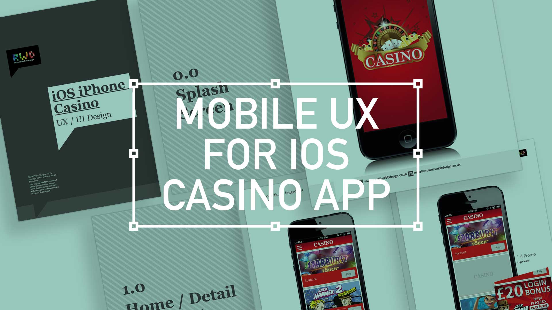
TL;DR; While the gambling industry continues to boom despite global financial woes, a reliance solely on branding through splash screens has its limitations. This post dives into why your home screen deserves more attention. Showcase promortaionl content, search (as navigation maybe?) and Quick Links as crucial building blocks, including introducing the popular hamburger icon for primary navigation and transform your home screen into landing page(s) into a powerhouse of usability and brand identity.
Next to essentials like food and water, one of the only other industries not effected by the world financial situation is gambling. In fact the industry is booming. There are many UX challenges in designing the perfect game play experience, catering for the green fingered punter all the way through to the seasoned veteran is a difficult balancing act.
Plus, as mentioned, in these more straighten times, to be conscious of not forcing the gambling experience on to the more vulnerable.
Modern smartphone don’t need 2-3 seconds to start up, so the original notion of the start-up or splash screen is now redundant. But brands love to position their logo ‘front of stall’ so for this reason, this screen is important. Keep it simple and remember, if you can’t get your brand message over in 2-3 seconds, think about a re-design.
This is the heart of the application, the place to show off what you have to offer – the ‘showcase‘ if you like. So make it impressive, make it big and try your best to impress.
(more…)
Very early on you begin to realise that you, as a UX designer answering to Business and shakeholders alike, should avoid providing a dry and labour-intensive solution to what is a tedious process. This will inevitable put off, or turn off, potential new customers from the start. So, as they walk through your virtual door, try to present a broken-down and achievable process where they can see the light at the end of the tunnel. Don’t forget : Break your offer into bite-sized chunks
Regulations possibly dictate that your customers will need to supply certain information. If so, have them supply that information up-front. That way you, as a caring and customer-centric company can temporally capture that info and call them back should they drop-off. Then you can ask ‘Is everything allright? Can we help you further with your registration?”

Whether for desktops, on a tablet or the this mythical idea of a mobile internet (there is only one web to experience – but that a different post!) the modern UX-er should be skilled in the art of wire-framing. The style you use should come from the answers to these three things:
Depending on the answers to these issues will depend on the wireframing style you deploy
Sometimes you have to just stick on the headphones, crank up the tunes and grind through the dullest part of your iOS project. And that’s slavishly grind out the assets for all the iOS family, particularly the Splash Pages.
Here, for the splash screens I have broken down as follows:
There is basically three sizes for portrait mode, for the most recent iPhone 5 or iPod Touch 5th Generation (as of present 2013), for the iPhone 4 and 4S users out there and for you laggards, the iPhone 3 users.

Mobile gambling, if you’ve watched any live commercial sporting event, is big business. Mobile gambling is at the forefront, keep my Top 10 points in your UX Playbook when designing for this sector
Hard Skills:
Journey Mapping
Research
Visual Design
Soft Skills:
Empathy
Collaboration
Critical Thinking
Recently, I have been both at the coal-face and negotiating with stakeholders to define what makes a great gambling offer. Here is my Top 10 tips on improving your mobile gambling offer.

Implement design rules is also a top tip. For example, instituting a one-size fits all font size policy across your offer can not only eliminate lengthy design discussion each time a new element is introduced but also guarantee legibility on the small screen.


