brand
-
Redefining Consent Mngt
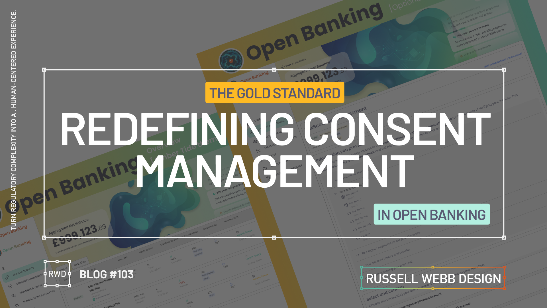
Turn regulatory complexity into a simple, human-centered experience, showing enterprise level strategic thinking
-

Take your mobile design skills to the next level
As Lead UX, it was my responsibility to satisfy specific user journey’s, demanding stakeholders and limits set by the tech Leads. I took this as an opportunity to showcase certain features, and from an Agile perspective – how they fitted both into the roadmap and overall experience.
-
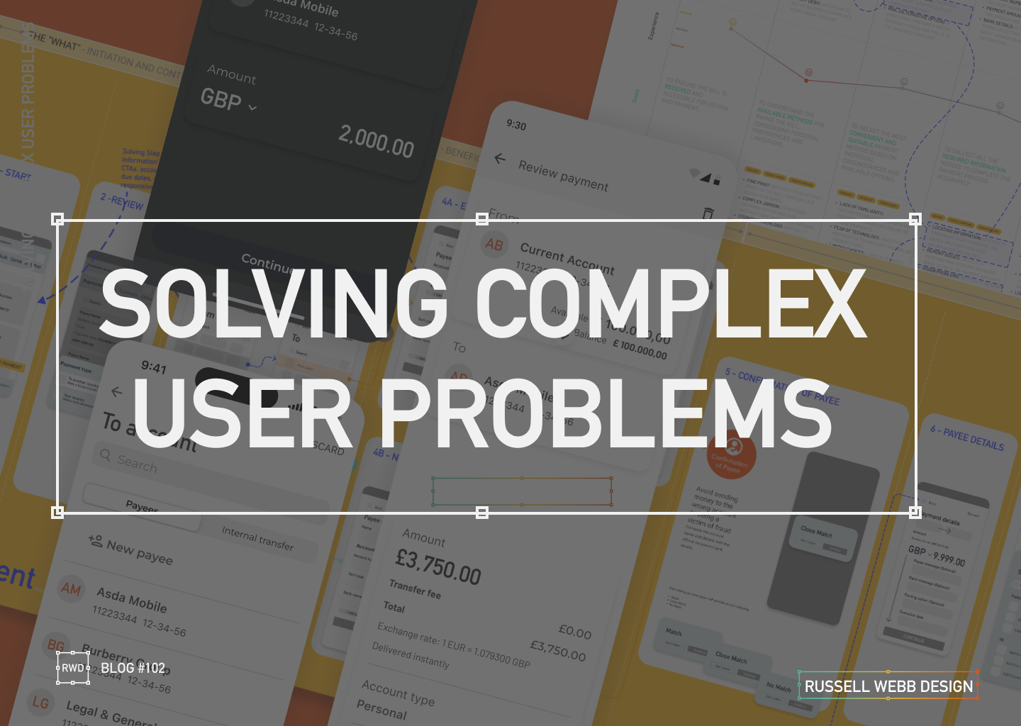
Solving complex user problems
This project successfully translated a complex real-world business problem into an initiative UX wireframe flow by using research and design tools to uncover and address critical touchpoints and pain points that led to a end-to-end (E2E) ‘Make a Payment’ journey with feature parity, respect to development Segmentation and the Integration of native and familiar patterns…
-
Redefining Consent Mngt
Turn regulatory complexity into a simple, human-centered experience, showing enterprise level strategic thinking
-
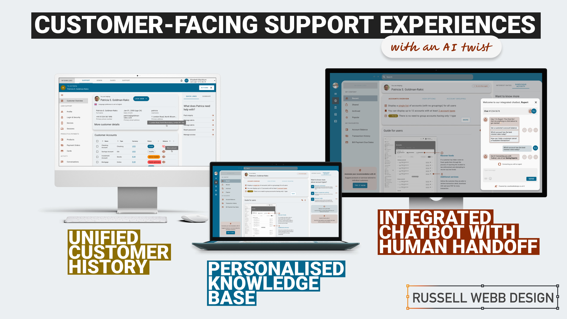
Raising the bar for customer-facing support UX
AI-Powered Customer Service Revolution – AI is transforming customer service by offering personalised solutions, and UX plays a crucial role in creating intuitive and engaging customer experiences. By leveraging AI and focusing on UX, businesses can create a more personalised, efficient, and satisfying customer experience.
Empowering users with the financial tools they deserve
- Mastering Design Theory and Lean Agile
- Solve big problems, fast.
- How delight and speed are rewriting our UX playbooks