arget audience: Millennials who prioritise experiences over possessions.
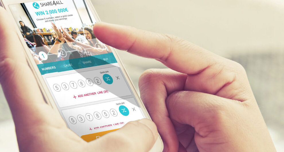
Innovation: Mobile-first web app emphasising social sharing, ‘good causes’ integration, and smooth number selection.
Key features: Rapid number selection, seamless sharing, integrated charitable causes, user-friendly payment process, and engaging summary screen.
Recently I have been leading a small team, driving UX innovation and engagement to significantly boost player acquisition and retention rates for a digital lottery provider. A mobile-first project designed for millennials, focusing on sharing, social impact, and a smooth user experience.
My role involved pushing UX innovation and engagement to attract and retain players, while partnering with state lotteries and charitable organisations to build and enhance their digital lottery channels.

Disrupted traditional lottery UX, setting a new standard for digital lottery channels.
Built trust and transparency through a user-centric lottery UX design, setting a new bar for the industry and making [the company] the go-to destination for a modern lottery experience
Millennials prefer experiences
As a product strategy gameplay, although important, was not the key driver for this new experience.
People young and old are opting for experiences over material possessions. These markers of success are no longer as meaningful as they once were. For millennials, the most important things in life are experiences and relationships instead of possessions.
65 % of millennials are currently saving money to travel
Key focus was on millennials and their aptitude for sharing and experiences. Employing both user group testing and rapid prototyping this mobile first web app enabled lottery number selection, ‘good cause’ selection and finally sharing.
This product, new to licensed lottery operators, concentrates on the gameplay for a potential lottery product, and builds on experiences user want. Both focus groups and recent gaming trends highlight this sea change.
Discovery

Initially revolving around a 3-day intense session of workshops and focusing on knowledge sharing, ideation and white-boarding, these formative sessions period brought all the players up to speed. These sessions effectually kick-started the creative process, around the general structure of collaboration with a ‘quantity over quality’ barnstorming mentality.
Step 1; Pick your numbers

The initial step here, following rounds of UX, was to introduce a mechanism to select six (6) lottery numbers. Focus groups fed back data that supported the millennial concept of living for experiences rather than playing lotteries for financial gain. So this mechanism had to be quick and simple. Almost as if the choice step should be automatic, hence the option to ‘autofill’ or another option to have pre-filled numbers in order to get quickly onto to the real gameplay – the share opportunity.
Step 2; Share with your peers


Millennials – as those born between 1980 and 2000 are popularly called are driving the growth of peer-to-peer platforms that provide access to shared goods and services across the globe. Sharing economy or collaborative consumption is the new normal. By 2025, the global sharing economy is expected to touch $335 billion. Right from transportation and accommodation to education and financial services, collaborative consumption is steadily disrupting almost every industry, including the Lottery Industry.
Source: https://www.entrepreneur.com/
Step 3 – Select a cause either near or relevant to you
Enhance familiarity with an intuitive user interface that seamlessly integrates lottery numbers, charitable causes, and the ability to share lottery experiences with friends. Utilise map integration to enable users to visually select their preferred charitable cause.

Leveraging location services, the real crux of the user experience unfolds as they delve into the Causes section. Beyond this, providing comprehensive information tailored to mobile devices ensures a seamless and impactful decision-making process.
Making payment less painful


Payment should be simple. Payment should be painless. Built-in smartphone functionality is streamlining this process, so in-app payment here would and should be fluid and seamless.
And you’re done!

The culmination of the digital experience arrives with a captivating summary screen, marking the completion of your lottery journey. Your chosen numbers are set, your preferred cause is selected, and you’ve shared the excitement with your cherished circle. Now, with bated breath, await the grand reveal and the chance to transform your dreams into reality.

Pique’d your interest?
This is but part of a selection of design information russellwebbdesign generated for the creative community out there. Please contact me further to discuss how your brand can benefit from the new channel: info@russellwebbdesign.co.uk
If something has peaked your interest. Please leave a comment below.

CASE STUDIES
Design with the dark mode trend front-of-mind
Delight, speed and satisfaction are rewriting our UX playbooks in finance


Comments
One response to “Digital. Social. Lottery.”
Hi,
We’re wondering if you’ve ever considered taking the content from russellwebbdesign.co.uk and converting it into videos to promote on Youtube using Content Samurai? You simply add the text and it converts it into scenes that make up a full video. No special skills are needed, and there’s access to over 1 million images/clips that can be used.
You can read more about the software here: https://turntextintovideo.com – there’s also a link to a totally free guide called the ‘Youtube SEO Cheat Sheet’, full of fantastic advice on how to help your site rank higher in Youtube and in Google.
Kind Regards,
Mose