Category: UX SPECIALITY

  • Wireframing an iPad Casino App

    Wireframing an iPad Casino App

    TLDR: Focusing on planning functionality and layout without design is the most efficient way of concentrating decision markers (especially business or product-owners) to agree on functionality without distraction. Think: function over form.

    Personally I love to use traditional pen and paper for wireframing. How about you?

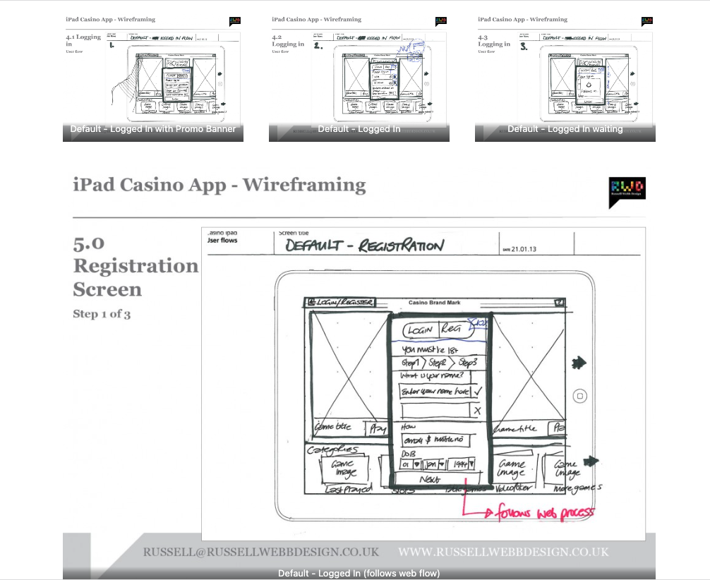
    First launch feature areas

    This is the main ‘shop window’ to your experience. On first launch, the user to launched in the gambling casino world. Pre-selected games adopt the ‘parallax scrolling’ technique and occupy the prime real estate. There is also functionality to drill down via category types. Account Management and Help are all ‘front-of-store’, as is the ability to push sign up and login promotions.

    CasinoApp_Wireframing3

    (more…)
  • Low fidelity prototypes

    TLDR: Skip the fancy prototypes! Low-fidelity sketches are fast, cheap, and encourage better feedback – perfect for early UX stages to focus on functionality before aesthetics.

    basic is still the best?

    I’ve made a few assumptions here, first… you work in UX. Second, you’re familiar with Agile and third, you haven’t much time so I’ll keep this brief. Straight to it, here is a couple of the main advantages of low fidelity prototyping:

    • Get better and more honest feedback
    • More involved collaboration
    • Make the cost of mistakes cheap, not expensive
    • Refine the page flow, not the pages
    • Figure out the interaction design rather than the visual design
    lowFidelity-VersionControl
    (more…)
  • Branding a Russian Hedge Fund

    How brand identity works

    Integrated brand identify both help reputation and consumer awareness. I was tasked with conceptualising a strong brand identity for a new Russian hedge fund. This involves developing routes that generated the tone, style and flavor of the brand across a 2D and 3D environment. This includes, but is not limited to;

    • color
    • type
    • photography/imagery
    • logos
    • design grid
    • Signage

    Here is how I did it;

    (more…)

  • What’s your favourite wire-framing style?

    wireframingMontage

    Pick your battles, know your styles

    Whether for desktops, on a tablet or the this mythical idea of a mobile internet (there is only one web to experience – but that a different post!) the modern UX-er should be skilled in the art of wire-framing. The style you use should come from the answers to these three things:

    • Process – From low-fidelity through to fully functioning prototypes is the sure-fire route to excellence. In reality, how often does this really happen. If you have enforce a process, I would insist on the sketching and on the final design stages.
    • Resources – I have sat in top-level boardroom meetings in the most stylish settings in the capital, tea and coffee from all over the world. Clearly, resources were not a factor here – so you would be expected to know Azure inside out and be expected to roll-out full functioning Fireworks prototypes. You may even get some business heads thinking your protoypes were so good , it’s a done job!
    • Quick turnaround – Picture the scenario, your stakeholder is looking for a quick – fix. You have fought your corner but there are no requirements, no analysis, no nothing. Always try to push for more than a few scribbles on the back of napkin but sometimes it is more productive just to get on with it.

    Depending on the answers to these issues will depend on the wireframing style you deploy

    responsiveEx
    (more…)

  • Russian Graphic Identity

    The branding ‘circle’

    Working alongside a complete design team can be very rewarding. Like-minded people, working together to inject new meaning into a tired or misleading brand. This project did exactly that.

    homeCreditRetailGraphics_Page_01

    The brand needed a new visual identity that would sit with the design developed by the interiors team. This is how I did it.

    (more…)
  • iOS Splash Pages – What’s the deal?

    Every app needs an app icon and a launch image. This presentation concentrates on the all important Splash Screen

    Sometimes you have to just stick on the headphones, crank up the tunes and grind through the dullest part of your iOS project. And that’s slavishly grind out the assets for all the iOS family, particularly the Splash Pages.

    Here, for the splash screens I have broken down as follows:

    • Size for iPhone 5 and iPod touch (5th generation)
    • Size for high-resolution iPhone and iPod touch
    • Size for iPhone and iPod touch
    • Size for high-resolution iPad
    • Size for iPad

    For your iPhone

    There is basically three sizes for portrait mode, for the most recent iPhone 5 or iPod Touch 5th Generation (as of present 2013), for the iPhone 4 and 4S users out there and for you laggards, the iPhone 3 users.

    iOS_splashScreens-RWD3

    (more…)