Category: UX SPECIALITY

  • Design habits – Tip your hat to your design heroes

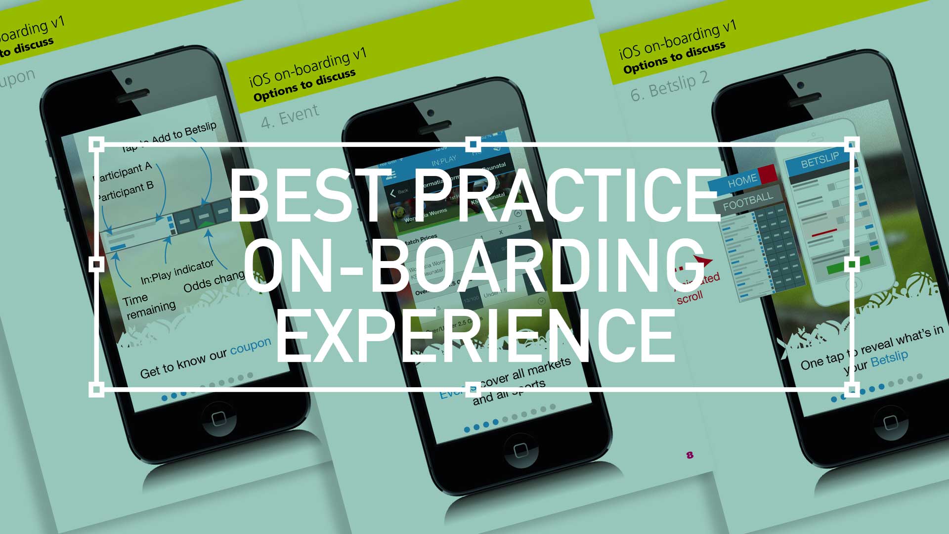
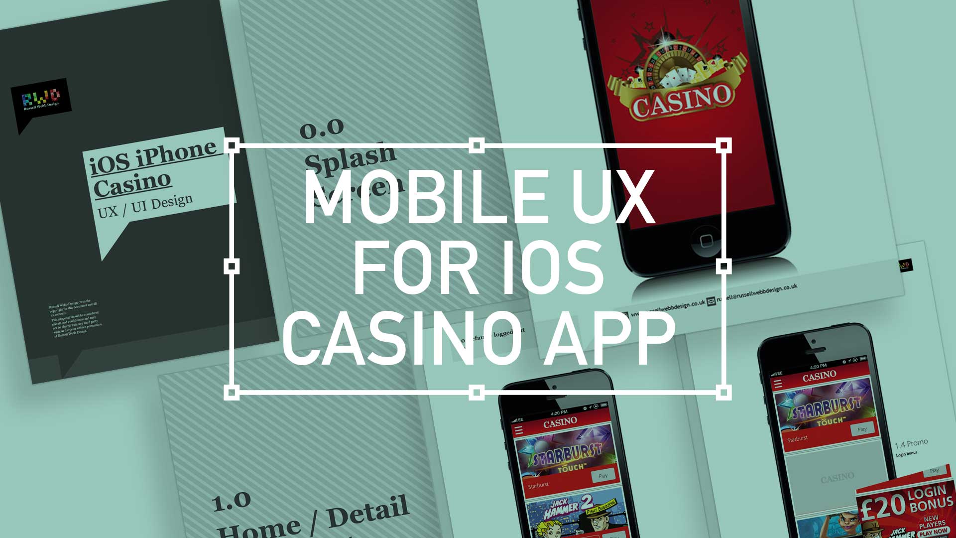
    TLDR: Inspired by design masters, this can aide your creative process: User first through to competition analysis, (innovation nit imitation), to
    familiarity and then focus on value then finally beautiful execution

    As a junior designer, way back when, I visited our local design museum (I studied in London, UK, so my local design museum was fortunately the rather impressive Design Museum in Shad Thames) and fantasied over how great it would of been to be involved in, say, designing a Charles and Ray Eames leather recliner, or Dysons Cyclone Vacuum cleaner.

    Now I’m doing stuff I feel proud off, in the field of UX/UI, I thought it worthwhile to see if I could mirror the process these great designers took and document it from a UXers perspective. So, here we go. I started with the following criteria:

    • Give users choice.
    • Competition Analysis
    • Design with familiarity in mind
    • Prioritise features that add value – the “Magic Moment”
    • Beautiful execution
    • Todays’ Brave New World
    (more…)
  • Best practice for your on-boarding experience

    Best practice for your on-boarding experience

    TL;DR; As a guided experience for new users simplifying your onboarding to prevent that overwhelmed feeling.

    Simplify your Onboarding; A UX Guide

    Getting new sign-ups is arguable the ultimate challenge, but the process of helping people get started, called on-boarding, can prevent many users from feeling lost, overwhelmed, and confused. It’s your responsibility, as a professional UXer, to shake their hand and show them the ropes and take them on that ‘first date’.

    Drilling-down on the detail of the betting coupon - on-boarding
    Drilling-down on the detail of the betting coupon – on-boarding

    The Do’s and Don’ts

    Downloading and jumping straight into an experience you’ve just heard about is one of the most exciting parts of UX design.

    When formulating this, be conscious not build further barriers as part of the on-boarding. The ‘Skip’ or ‘Tell me later’ and continuous Swipe is an important tool.

    (more…)
  • Wireframing an on-demand Internet streaming media service

    Wireframing an on-demand Internet streaming media service

    I have been recently working with a colleague on a private project around the world of media streaming. We had got to a level where the tech was getting up to scratch, but the UX was missing.

    So, here it is.

    Download here Download the PDF: OnDemandStreamingService-Mobile_Tablet

    Mobile

    Mobile

    On – screen blueprint representing the skeletal framework of the service. These provide an informed perspective to hit, or in this case, promote what will be business objective and a creative idea. As usual these lacks typographic style, colour, or graphics, as the main focus lies in functionality, behaviour, and priority of content.

    (more…)
  • Consumer experiences

    How mobile payments will change your life

    “A day in the life”

    A day in the life for a modern consumer living their life through advanced mobile functionality experiences.

  • Setting up Photoshop like a Pro UXer

    TLDR: Photoshop, the designers ‘must-have’ is such a flexible tool that there are many ways to set up your workflow.

    Layer Compas and Smart objects

    After some 20 years I have found these two to be the most efficient, most transferable within a team, and most manageable i.e. avoiding the dreaded spinning-wheel-of-death

    Visualisation-PShopUxer-LayerComps

    Layer comps

    Fickle as clients can be, I’ve come to realise that there will always be amendments. Version after version, where the client/stakeholder/CEO wanna-be-designer suggests colours or positioning changes. Simply switching on/off layers and groups and saving as a state was an ingenious ideas by Adobe. Big pat on the back.

    Visualisation-PShopUxer-Smart
    (more…)
  • iOS Casino App for the iphone

    iOS Casino App for the iphone

    TL;DR; While the gambling industry continues to boom despite global financial woes, a reliance solely on branding through splash screens has its limitations. This post dives into why your home screen deserves more attention. Showcase promortaionl content, search (as navigation maybe?) and Quick Links as crucial building blocks, including introducing the popular hamburger icon for primary navigation and transform your home screen into landing page(s) into a powerhouse of usability and brand identity.

    Brief

    Next to essentials like food and water, one of the only other industries not effected by the world financial situation is gambling. In fact the industry is booming. There are many UX challenges in designing the perfect game play experience, catering for the green fingered punter all the way through to the seasoned veteran is a difficult balancing act.
    Plus, as mentioned, in these more straighten times, to be conscious of not forcing the gambling experience on to the more vulnerable.

    Splash screen

    Modern smartphone don’t need 2-3 seconds to start up, so the original notion of the start-up or splash screen is now redundant. But brands love to position their logo ‘front of stall’ so for this reason, this screen is important. Keep it simple and remember, if you can’t get your brand message over in 2-3 seconds, think about a re-design.
    iOS_iPhoneCasino3

    Home

    This is the heart of the application, the place to show off what you have to offer – the ‘showcase‘ if you like. So make it impressive, make it big and try your best to impress.

    (more…)