Category: Mobile UX

Check these strategically designed, end-to-end user journeys focussed across native mobile applications. Key take-outs here are small-screen responsiveness, a mobile-first, user-centric approach and accessibility including find-ability.

  • Branding an iPad Casino App

    Branding an iPad Casino App

    1.0 Aims and Objectives

    To produce the best-in-class iPad and iPhone App for playing slots and table games.

    Recently I was involved in conceptualise and leading the UI for a iOS casino App for both iPhone and iPad.  I’m not going to detail all design decisions here but walk you through my perspective on why branding for this product is so important and why the decisions made differentiate it enough to stand-out in what is already a fiercely competitive and crowded marketplace.

    (more…)

  • Money Management App on Android

    TLDR: UX proposal for a “pre-baked” financial phone – a phone with built-in features to ditch your wallet. Android for finance with offer easy account management (balances, top-ups, statements), discover and track local deals, store tickets for travel and events, and even integrate with home screen widgets for instant access.

    Your phone as a wallet

    Over time, I have been involved in development for alternative mobile payment systems many times. Along with QR Codes and NFC and Face recognition, who knows which direction the public will eventually choose. This is a study into on possibly direction: Pre-baked branded financial phone, utilising the native rich functionality of the Android operating system.

    It was key to point the App towards five distinct touch points:

    1. Account Service
    2. Reward and Bonus
    3. Ticketing and Events
    4. Widgets
    5. Pop-ups

    Get Started

    Guiding the user through the start-up process is like taking them on their first date. By providing your customers with this gentle ‘hand-holding’ process you, as the UX designer, are reducing those barriers to entry and providing a step-by-step process that welcomes demographics from all levels.

    (more…)
  • Best practice for your on-boarding experience

    Best practice for your on-boarding experience

    TL;DR; As a guided experience for new users simplifying your onboarding to prevent that overwhelmed feeling.

    Simplify your Onboarding; A UX Guide

    Getting new sign-ups is arguable the ultimate challenge, but the process of helping people get started, called on-boarding, can prevent many users from feeling lost, overwhelmed, and confused. It’s your responsibility, as a professional UXer, to shake their hand and show them the ropes and take them on that ‘first date’.

    Drilling-down on the detail of the betting coupon - on-boarding
    Drilling-down on the detail of the betting coupon – on-boarding

    The Do’s and Don’ts

    Downloading and jumping straight into an experience you’ve just heard about is one of the most exciting parts of UX design.

    When formulating this, be conscious not build further barriers as part of the on-boarding. The ‘Skip’ or ‘Tell me later’ and continuous Swipe is an important tool.

    (more…)
  • Wireframing an on-demand Internet streaming media service

    Wireframing an on-demand Internet streaming media service

    I have been recently working with a colleague on a private project around the world of media streaming. We had got to a level where the tech was getting up to scratch, but the UX was missing.

    So, here it is.

    Download here Download the PDF: OnDemandStreamingService-Mobile_Tablet

    Mobile

    Mobile

    On – screen blueprint representing the skeletal framework of the service. These provide an informed perspective to hit, or in this case, promote what will be business objective and a creative idea. As usual these lacks typographic style, colour, or graphics, as the main focus lies in functionality, behaviour, and priority of content.

    (more…)
  • Consumer experiences

    How mobile payments will change your life

    “A day in the life”

    A day in the life for a modern consumer living their life through advanced mobile functionality experiences.

  • iOS Casino App for the iphone

    iOS Casino App for the iphone

    TL;DR; While the gambling industry continues to boom despite global financial woes, a reliance solely on branding through splash screens has its limitations. This post dives into why your home screen deserves more attention. Showcase promortaionl content, search (as navigation maybe?) and Quick Links as crucial building blocks, including introducing the popular hamburger icon for primary navigation and transform your home screen into landing page(s) into a powerhouse of usability and brand identity.

    Brief

    Next to essentials like food and water, one of the only other industries not effected by the world financial situation is gambling. In fact the industry is booming. There are many UX challenges in designing the perfect game play experience, catering for the green fingered punter all the way through to the seasoned veteran is a difficult balancing act.
    Plus, as mentioned, in these more straighten times, to be conscious of not forcing the gambling experience on to the more vulnerable.
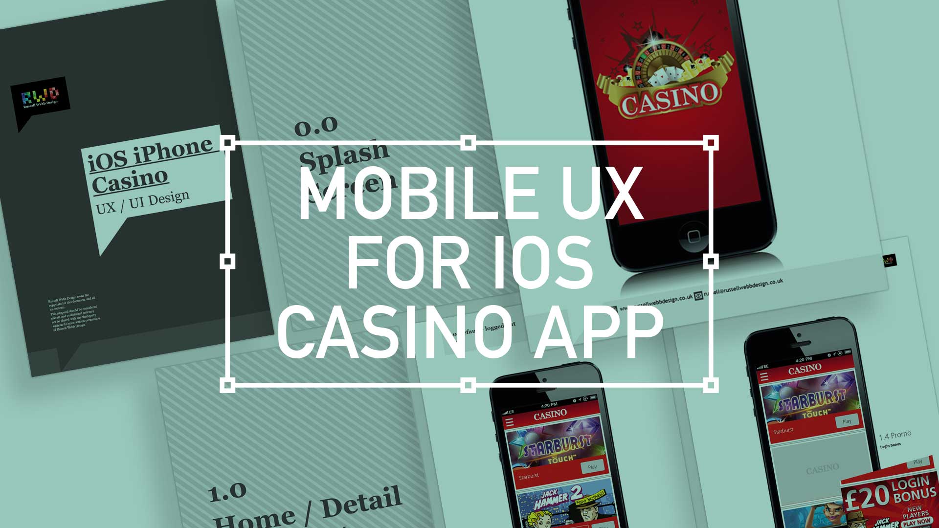
    Splash screen

    Modern smartphone don’t need 2-3 seconds to start up, so the original notion of the start-up or splash screen is now redundant. But brands love to position their logo ‘front of stall’ so for this reason, this screen is important. Keep it simple and remember, if you can’t get your brand message over in 2-3 seconds, think about a re-design.
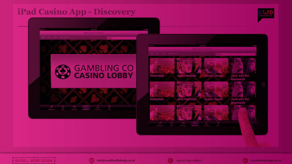
    iOS_iPhoneCasino3

    Home

    This is the heart of the application, the place to show off what you have to offer – the ‘showcase‘ if you like. So make it impressive, make it big and try your best to impress.

    (more…)