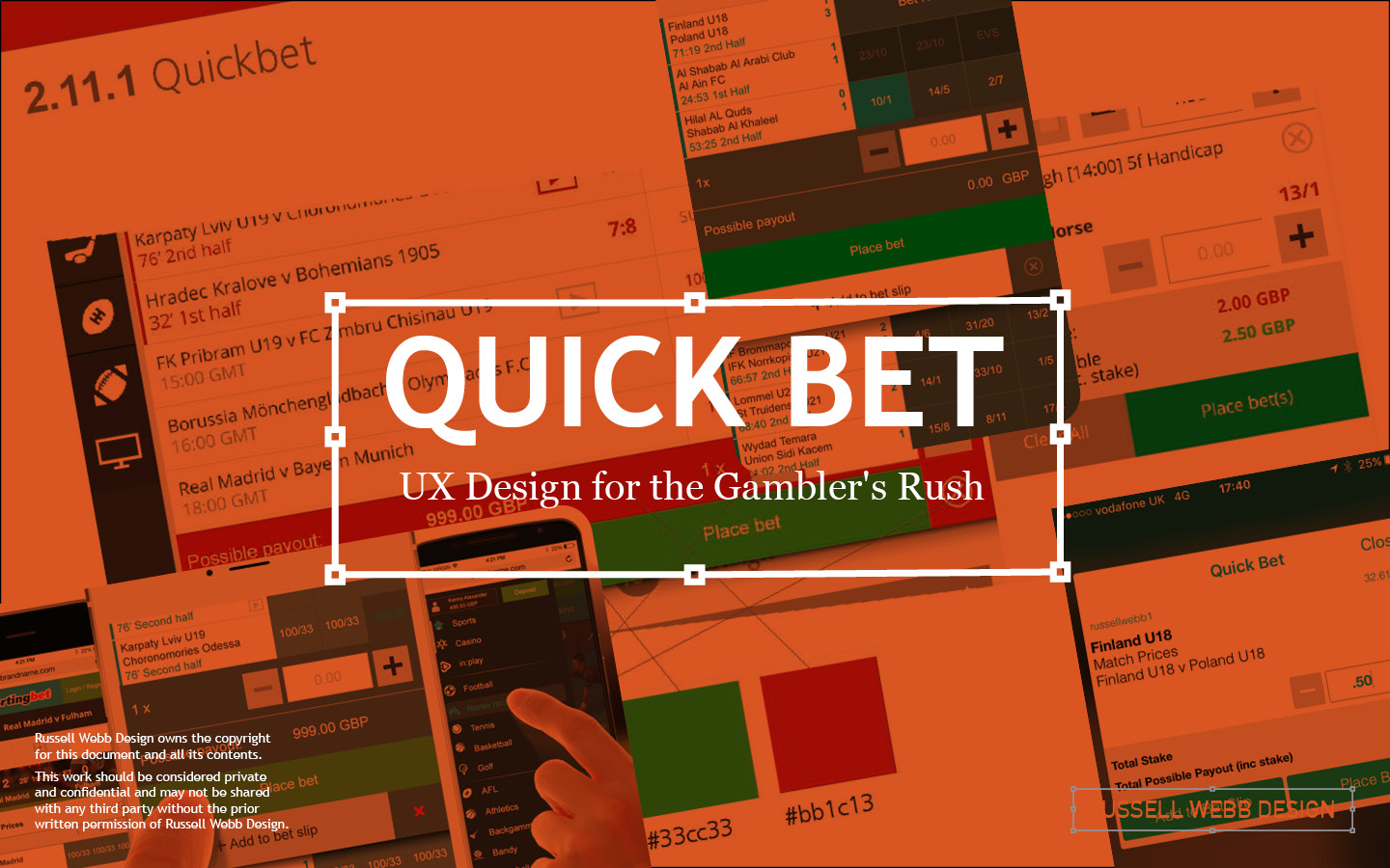
TL;DR; Quick Bet is a must-have for quickly placing bets on mobile devices. Strong UX handles price changes, suspensions and signal drops without delays.
How low-fidelity prototyping as a hands-on design approach can solve user problems.
UX Design for the Gambler’s Rush
The best feeling ever
price changes
suspensions
signal drops
penalties
in-play markets
signal drops

You know that one, you’ve got an instinct, but you need to place the bet quickly. This is where Quick Bet becomes a must-have functionality.
When speed is of the essence
You’ve just seen the race preview, your favourite horse is next off in two minutes, what to do? This is where Quick Bet becomes your hero. Simply open your small screen, and then ‘Make a selection’ or Quick Bet on your winning filly in a single tap.

Navigating seamless UX
Delightful
Gracefully
When your experience is seamless
On the Happy Path you quickly place that bet, you’ve got cash in your account and the bet is successfully cleared;
- No delays
- No price changes or fluctuations
- No suspensions
- No signal drop

Then the Success Message, a seamless victory. With strong UX, whatever the speed-bumps, your experience should always be a delightful
When your experience is not seamless
Fair and responsible betting. For gambling In-Play or live events, the customer is often informed that there has been a change. It can be a price change where the odds lengthen or shorten, it can be a suspension or an user error. The punter must be gracefully informed;

Gently, clearly, and with a touch of empathy.
Error handling that Builds trust
Immediate
Actionable
Pre-emptive
Smart Defaults*
Minimise errors with Smart Default* – Use a date picker instead of a text field for dates. Use a numerical keypad for bet amounts.

The user is (gracefully) informed that there has been either an info only error an alert error. On mobile this this is achieved through signposting and through colour.

Suspend the disbelief
Disabled states
Closed Markets
For football, all In-Play markets are suspended when there’s a red card, a penalty or a goal. For a red card or a goal, all bets currently up are cancelled. Markets are then re-opened. If a penalty is awarded the markets will be suspended. The challenge is how to indicate this to your customer.


Final tip
Straight from the horse’s mouth
As arguably the most complicated user flow for quick transitional gambling, this Case Study uses low-fidelity prototypes that are both instructional and rapid.
Using pen and paper;
- Collaboration – Your team will respond better to unfinished visuals. This low-stakes environment encourages more honest, critical, and constructive stakeholders feedback.
- Speed – By rapidly iterating, testing multiple directions, the focus is on the structure, information hierarchy, and user flow.
- Cost – The cheapest form of prototyping. An
- inclusive process that encourages participation.
This is the final mobile UI, this is high-stakes UX, done right.
Speed v Delight Trade-Offs
Minimal steps
pre-filled stake
display odds prominently
push notifications
bet history
deposit limits tools
timeouts
Reduces anxiety, build trust.

Seamless UX in live betting isn’t just technology – it’s empathy
Understand the thrill, the tension, the split-second decisions. Design for that heart-pounding moment, and place bets at the speed of light.
Get in touch
15 Years Experience | Workshop Wizard | Design System Ninja
Finance | Gambling | Healthcare | Recruitment
Or just leave a comment below.


Comments
One response to “Quick Bet UX”
[…] of error message is displayed. Remember graceful error handling is the preferred method – see here for examples. User can receive messages that […]