This is the 3rd part in a series of trends that I have witnessed in the design world. These trends andUX have now become best practice in mobile design and an essential skill-set for the experienced UIdesigner.
Test Your Design
Try out your designs on as many devices as possible but remember innovation is not generated from focus groups. It is more than probably your cherished design, while amazing on stellar devices like the iPhone4 will degrade particularly badly on the trusty old Motorola Razr. You should be testing also for security and usability.
Use emulators if you have too, but there is never a better substitute than using the device itself. So, use up your favours with your friend at the local phone shop and test your mobile web site one, twice and as many times as you can.
You can, of course, test through the iOS Developer Program both over-the-air and in realtime, as well as determining black and white questions like ‘Does it work’ you can also test your designs effectivens:
How easy is it to navigate through your designs?
Is it obvious to the user which actions are available?
Is the look-and-feel consistent from page to page, including font sizes and colors?
This is but part of an examination of broad design principles russellwebbdesign generated for the design community. Please contact us further to discuss if your brand (ot it’s design) can really wants to benefit from effective communication and good graphic design: info@russellwebbdesign.co.uk
If this, or any other post has peaked your interest, please leave your comments below
This is the 2nd part in a series of trends that I have witnessed in the design world. These trends and UX have now become best practice in mobile design and an essential skill-set for the experienced UI designer.
Progressive Disclosure
Progressive disclosure is an interaction design technique often used to help maintain the focus of a user’s attention by reducing clutter and confusion. This improves usability by presenting only the minimum data required for the task at hand. By disclosing information progressively, you reveal only the essentials and help the user manage the complexity of feature-rich sites.
From a designers perspective we should be using this technique when we feel the customer requires a level of hand-holding and is possibly unsure what they need to do.
For a full and extremely well documented explanation of the Progressive Disclosure see our friends at Wikipedia
This is but one part of a 12 point examination of the design principles russellwebbdesign generated for the mobile design community. Please contact us further to discuss if your brand (or it’s design) can really benefit from ‘best-in-class’ mobile design: info@russellwebbdesign.co.uk
If this, or any other post has peaked your interest, please leave your comments below
After only a few years the mobile landscape has generated a selection of trends and UX that have now become best practice in mobile design and an essential skill-set for the experienced UI designer. And as a UX designer you should be aware of these experiences and how best to incorporate them into your design decisions.
Essential Content
Mobile user have an absolutely different mind set to desktop. When you’re searching for that restaurant on your phone, the last thing you need delivered, in a heavy multimedia format, is the history of the company or the head chefs ethos on sustainable farming – you just need the address ( preferably linked to Maps ).
So, concentrate on location, focus on why would the user needs that information and therefore deliver it in the format best suited to the situation, like a phone number.
Design Trends For Mobile – Part 1 – Essential Content.pdf
This is but one part of a 12 point examination of the design principles russellwebbdesign generated for the mobile design community. Please contact us further to discuss if your brand (or it’s design) can really benefit from ‘best-in-class’ mobile design: info@russellwebbdesign.co.uk
If this, or any other post has peaked your interest, please leave your comments below
This is the first 12 steps to take your mobile design skills to the next level
Packed with Design Tips
This years edition is crammed full of the most inspirational and can do mobile design tips. Whether it be common sense or insider knowledge, this calendar is sure to inspire and teach you each and every day for the year in front of you.
Format
Planner Size Closed 210mm x 297mm
Full colour with Georgia, Handwriting Dakota and Gotham typeface
Available in in limited edition print of PDF download
2012 Mobile Design Tips
Mobile design is what YOU make it
The future of mobile design is what you make it. It can said it’s made up of more than 12 things. In fact, it’s all of these things so please get back to me with your Top 12 for mobile design.
This is but part of a selection of design resources russellwebbdesign generated for the mobile space out there. Please contact us further to discuss if your brand really wants to benefit from this new immersive experience here: info@russellwebbdesign.co.uk
An essential part of the UI designers job is to quickly and cleverly visuals client concepts. So, to all my fellow designers out there please feel free to download the vector, resolution-independent ‘PayPal button‘ Adobe Illustrator file package.
All I ask is you drop a comment if you used the file successfully
All I ask is you drop a comment if you used the file successfully
This is only part of the offer russellwebbdesign generated for my UX/UI designer buddies out there. Please contact us further to discuss if your brand really wants to benefit from this new immersive experience here:info@russellwebbdesign.co.uk
If this, or any other post has peaked your interest, please leave your comments below
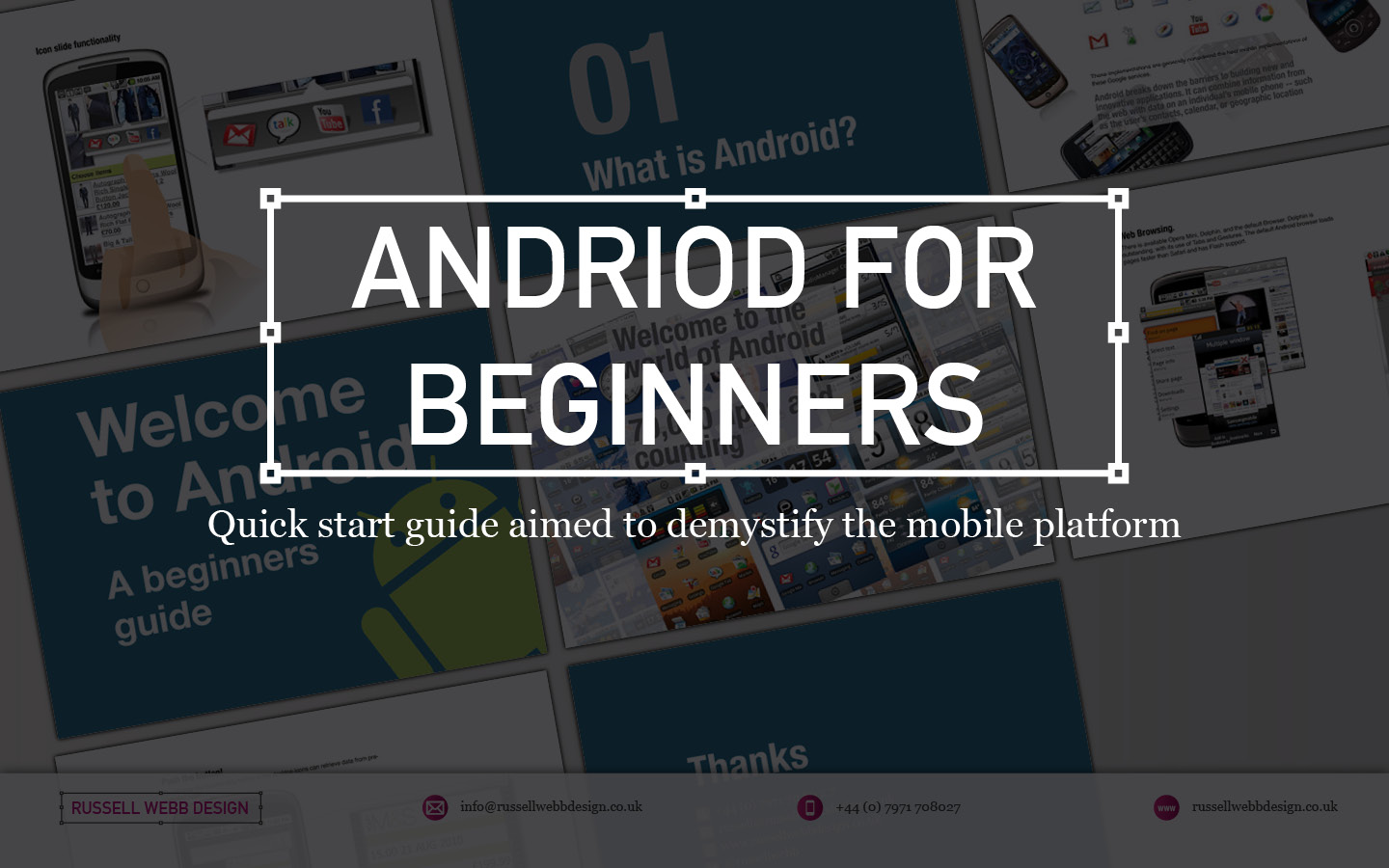
Imagine being a senior executive at a UK company, suddenly tasked with understanding the intricate world of Android. Time is tight, and you need a crash course that cuts through the technical jargon and delivers the essence of this mobile platform. That’s where I stepped in.
For senior executives
My UK client were seeking a crash course in the world of Android, I crafted a top-down, user-experience-focused overview of its driving principles.
This quick-start guide wasn’t just about features and functionalities; it was about the why behind them. In essence, how Android shapes user interactions, from app design to navigation and information consumption.
Welcome to Android – An Open Operating SystemWelcome to Android – 70000_App and Counting
By focusing on the driving principles that underpin the Android experience, equipping the user with the knowledge to make informed decisions. Whether you’re evaluating potential development projects, understanding your target audience’s behaviour, or simply staying ahead of the curve, this guide provided a solid foundation.
Welcome to Android – How
Design for Humans
Welcome to Android – Widget_Functionality
Understanding the user experience isn’t just about technical specifications; it’s about grasping the human element that drives engagement and ultimately, success. This quick-start guide was designed to do just that, empowering you to navigate the world of Android with confidence and clarity.
Android Widgets: Tiny Tools, Big Impact
Think of Android widgets as miniature apps living on your home screen. They offer:
Quick Info: Weather, news, calendar events, and more at a glance.
Instant Actions: Play music, add events, control smart devices – all without opening the app.
Customization: Choose size, information, and even themes to fit your needs.
These handy tools boost your efficiency, personalize your experience, and keep you informed without opening full apps. Explore various types like simple info displays, scrollable lists, and interactive buttons to find the perfect fit for your needs.
Welcome to Android – Browser and Flash
The End of an Era
RIP Flash
Flash was designed for the desktop era. I have left this in as IT IS interesting to get an insight in UX 15-years-ago, but to clear: ANDROID DOES NOT USE FLASH NOW
Why?
Outdated tech: Flash wasn’t built for touchscreens. It will drain batteries and there is no native support.
Security sieve: Flash’s history of vulnerabilities made it a hacker magnet.
Adobe officially announced the end of Flash in 2017. Its inability to adapt to the changing landscape left it vulnerable to the more agile and secure alternatives that had taken center stage.
While Flash may hold a place in internet history, its reign in the mobile world was short-lived, ultimately succumbing to the demands of a faster, more secure, and user-centric mobile experience.
Welcome to Android – Thanks
Discover high-impact UX case studies
Portfolio case studies describing design, my UX process, and business impact.
From boosting user adoption in fintech, to improving trust with responsible gambling through to retaining Millennials in the world of ‘digital lotteries UX’ to leveraging key USPs for mobile healthcare.

 Design Trends For Mobile – Part 3 – Test Your Design.pdf


