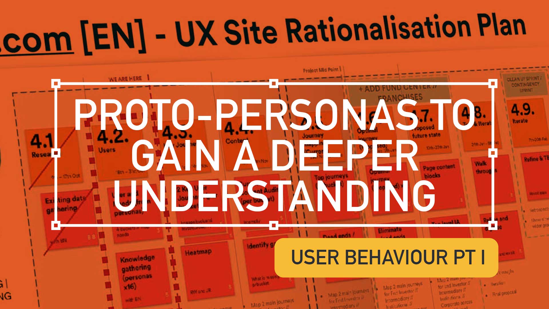
Execute a Content Audit using proto-personas to gain a deeper understanding of user needs. Consolidate personas, communicate findings, to achieve a deeper understanding of all users. Empower UX to move forward with experience maps to uncover user behaviour and emotions.
Delivering with resource constraints and tight timeline, this Content Audit / Inventory Battle Plan leverages the power of proto-personas as the primary intel.
Gather the troops
Assemble all content audit data
Regulated design environments are often constrained – it is important to offer agility and be resourceful. This level of Service Design would benefit from ;
Customer surveys
Stakeholder interviews
Analytics (rationalised down into meaningful chunks)
…and additional data. For this UX project the starting point was an extended collection of unverified proto-personas. These were then rationalised in to bucketed or grouped personas.
Navigating the complexity of proto-personas
Proto-personas: Adaptability in the face of organisational inertia and provide clarity to maintain stakeholder engagement.
Adapt UX to audience and personas
Larger organisations, often new agile methodologies, may still be in the early stages of embracing lean UX, so adapt your approach to your audience is a key skill.
When personas are agreed and validated as the only ‘source of truth’ – there also must be alignment that these refine and adapt personas over time, ensuring that they remain relevant.
Overly detailed personas can dilute effectiveness, especially for large organisations. This task focused on consolidating personas for greater clarity.
Focussed personas work well. Larger organisations multiply these audience types and their impact is reduced. This task looked at grouping and sorting by commonalities
Conduct extensive desk research to develop a deep understanding
Embark on a deep dive of user research to become the brand’s go-to expert on your target audience.
Absorb insights
Take the time to listen and absorb – Become the brand’s knowledge hub.
Absorbing insights and data is vital. Time spent at this stage of your research is key for informing a future IA.
Dig deeper to understand your users problems, needs and goals
Experience maps are your tools to excavate the nuances of user behaviour, emotions, and motivations. Use this to win over their hearts and minds.
Empathy-driven UX; Personas and experience maps
By delving into the emotional landscape of proto-personas, designers can gain a deeper user understanding. This insight fuelled the development of a clear and empathetic experience map.
Understand your audience types ; Their needs, aspirations, and behaviours. Commonalities and patterns will surface.
Common Thread and Outcomes
By selecting the most crucial key phrases from the workshop discussions, I was able to distil the essence of each audience type and crafted them into a call-to-arms that galvanised the mapping stage
Expertise within the team distilled the most essential insights (i.e. OUTCOMES), transforming them into powerful ‘calls to arms’ that served as the foundation for the mapping stage.
Next steps
By consolidating vast amounts of data into prototype persona groups, this Service Design approach conveys insights for stakeholders to digest, leading to deeper user understanding for all involved. This then informs the next stage,‘Using Experience Maps to uncover user behaviour and emotions.’
This is but part of a selection of design information russellwebbdesign generated for the creative community out there. Please contact me further to discuss how your brand can benefit from the new channel: info@russellwebbdesign.co.uk
If something has peaked your interest. Please leave a comment below.
CASE STUDIES
Design with the dark mode trend front-of-mind
Delight, speed and satisfaction are rewriting our UX playbooks in finance
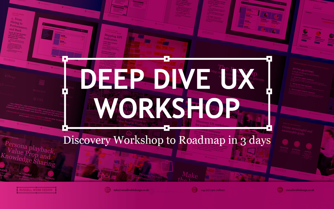
TLDR; Navigating Ambiguity Using workshop techniques I validated personas to surface a UI that promoted next steps for a Candidate Portal. — Solving 3 big problems in 3 days; Aligning the target audiences through journey mapping, defining a Value Proposition and building a draft Product Roadmap.
How to facilitate an ideation workshop around solving problems, understanding through ideation and knowledge sharing (based on agreed on personas)
Help clients solve big problems, fast
This user-centred and business workshop focussed on;
Business Problem Statement – TheWhat
Value Proposition Statement – How to excite users / customers
Product Roadmap – Action/Next Steps
What we set out to achieve
Recently I was leading the Discovery phase for a multinational publishing, education & recruitment company. My prime objective was to facilitate the generation of a Value Proposition within a collaborative workshop environment based around three hypotheses;
Understand – ‘Getting the right idea’ and ‘getting the idea right’
Ideate – Align the team | Get creative
Roadmap – Present, prioritise and theme
Defining Vision, setting scope
How to facilitate an ideation workshop around solving problems, understanding through ideation, knowledge sharing (based on agreed on personas)
Persona Playback, Value Propositions and Knowledge Sharing
Validating Personas proved crucial. Early ‘Understand’ sessions proved invaluable in terms of getting to know the client’s ecosystem and getting closer to the overall workshop goals. Goals included personas improvements using a Value Proposition Canvas to expose misunderstandings, define Jobs To Be Done (JTBD) and Pains and Gains – more importantly it identifying key themes and services that would appeal to these personas. This ensured any misalignment did not cascade down to the Journey Maps on Day 2
What we were trying to achieve using ‘Ask the experts’. Early touch points included attracting educational establishments and employers using baked-in services, plus having the ability to grow the market was paramount for particular personas. The client had the raw building blocks and the workflow for their ‘niche product for a niche market’, communicating that vision was the challenge.
Customer Journey Mapping – Make the best hiring decision
How to facilitate an ideation workshop around solving problems, understanding through ideation, knowledge sharing (based on agreed on personas)
Gaining alignment across stakeholders on what making the ‘Best hiring decision’ journey looked like. Creating a visual representation of every experience a key persona(s) had with the client helped to tell a story, more importantly this led to a prioritised ideation list (visual solutions).
Making the Best Hiring Decision
Initial stages – Planning and approval
Intermittent stage – Profile building, search and selection tools
Final stage – Interview, agreement and follow-on activities
The exercise also highlighted a level of anxiousness, through to excitement and eventual relief. A truly valuable activity that presented opportunities that were eventually clustered and presented to the group as an adaptive Crazy 8 activity.
Ideation and Roadmap
Finally, this led on the most challenging section of the workshop, the Ideation Sessions. This resulted in 4 concept areas to prioritise on the road map and populate a timeline.
Sketching can be scary!
Demonstrate the steps to avoid a cold start.
Push back on judgement calls and champion quantity over quality. All participants should take advantage of the knowledge in the room, bounce ideas off each other and improve through collaboration. A process of silent note taking, constrained to a page/large Post-It note, resulted in 4 principal concepts.
4 Principle Concepts
1. Data Driven Profile & Test Builder
Value: shorter tests, improve the UX
Add key indicators to job profile definition
Guided self-service model for selection, surfacing details for expert personas
Fit candidate suggestion tool from an employee pool
Connect to other API portals for greater value
2. Right Insights for the Right User
Value: Personalisation. Summary driven..
AI best fit suggestions based on profile.
Rate candidates with a media rich likelihood indicator.
Deliver <MORE> understandable expert insight
3. Candidate Experience & Value
Value: candidate self-improvement.
Shorter assessments, setting target thresholds
Candidate Reward with feedback, tips to improve or learn, job suggestions
Be fair & honest to the candidate on possible mismatch on values and culture
Store profiles, experiences, and test results
4. From Hiring to Performance, and Back
Value: better decision = better employees.
360˚ view – track new hires, top performers inform future hiring.
Performance data and employee self-ratings to inform future profile building and hiring decisions and guide personal development
Compare performance & career progress to your peers
Boosting Engagement
Shortcuts to Success
Shortcuts to Success
* Faster, more reliable tests: Reduce testing time and increase reliability
Personalised engagement: Tailor tests to individual needs, leading to higher engagement and lower churn.
Business-focused UX: Align testing with business goals by leveraging KPIs; Targeted feature development.
Diversity in hiring: Objective, efficient testing helps attract diverse talent and improve hiring decisions.
* Shared Data; All backed up by a global database
Boost diversity & retention
Innovation for Early Adopters
* Modernise testing: Introduce innovative concepts too early adopters only.
Candidate quality and validity: Prioritise attracting the best candidates. Ensure test results are accurate and reliable.
Goal-oriented roadmap: Leverage learnings to craft a clear roadmap for continuous improvement.
Better candidates | More valid results
Goal-oriented roadmap
Setting standards with a development Roadmap
Solving big problems and setting milestones through a draft roadmap contributed to accelerating development across the current period and the next. Raise their internal products up to today’s standards was a priority. This roadmap was a significant step closer to this.
3 big problems in 3 days
Align the target audiences
We did this across the group early on through a deep-dive personas playback session. This proved essential both to enable the journey map but also assigning value in the KPI session.
Define the Pains and Gains
This was accomplished with a Value Proposition Canvas. A useful business tool to surface Pains and Gains and Jobs-To-Be-Done
Build a draft Product Roadmap
This acted as a our North Star and as a high-level visual summary of the workshop outcomes; Two development streams; Two principal personas.
As a value-add, a UX / UI Report consolidating all data was generated, highlighting the groups new findings and areas for improvements to inform future Timelines and Roadmaps.
IN BRIEF; Problem Statement > Knowledge sharing and defining scope > Ideation (4 principal concepts) > Future Roadmap > In 3 days
Pique’d your interest?
This is but part of a selection of design information russellwebbdesign generated for the creative community out there. Please contact me further to discuss how your brand can benefit from the new channel: info@russellwebbdesign.co.uk
If something has peaked your interest. Please leave a comment below.
Discover high-impact UX case studies
Portfolio case studies describing design, my UX process, and business impact.
From boosting user adoption in fintech, to improving trust with responsible gambling through to retaining Millennials in the world of ‘digital lotteries UX’ to leveraging key USPs for mobile healthcare.
Enterprise-level, real-time data from multiple sources, instantly accessed, no more hunting. — A single-source-of-truth of unifying insights speak volumes: 56% iPad growth in just 1.5 years over 100K client meetings
To respect confidentiality agreements, the branding and specific naming have been modified. This product is currently live and serving 10K plus HNW users.
Within a strictly regulated financial environment my clients use dashboards data every day.
Users
Advice
Quotes
Investment
As the world’s largest wealth manager, catering to affluent clients requires exclusive online services like advice, quotes and investment strategies, delivered digitally. Internal systems application empower the two principal user groups;
Customer Consultant Associates
Customer Consultant* (CCA’s/CC’s),
Assembling these customer meetings takes time, accessing strictly private data to provide a complete, competitive and professional service requires a tailored and specialised tool – of which the Customer Meeting App* is the bank’s primary channel.
What are the driving factors for developing a dashboard?
Strategic insights
Information architecture
Single source
Imagine client meetings where crucial information is instantly accessible, scattered data unified, and time spent hunting replaced by strategic insights. This is the potentially transformative power of the Customer Meeting App’s dashboard, built around three “must-have” features:
Single point of access for disparate data Instead of opening various applications, interfaces, or online databases, the CCA’s/CC’s have a real-time dashboard.
Broad overview with drill down capabilities A dynamic dashboard, digital documentation and secure access.
Easier, faster, sign source of truth Consolidated statistic, statues displays, contextual information, and ‘Edit’ functionality placed intelligently for quick consumption.
Achieving speed, clarity, and brand harmony
Journey
Processes
Re-imagine
Problem and Opportunity
The existing offering had become redundant, with processes and previous ways of working no longer relevant or appropriate. The client required the seamless integration of data from third-party repositories and a significantly improved user journey. This presented a clear opportunity to re-imagine the complete ‘Create a Customer Meeting’ user journey.
Users do drive requirements, but in business there is another controlling factor. To sync the ‘Create a Customer Meeting’ , the ‘Adding account numbers’ journey there was a further requirement;.
Funding
Dashboard design best practice
There are 3 dashboard design principles that are drove decisions and are considered best practice:
Personalisation, speed and convenience will drive any functional improvement and this project was no exception
1. Five-second insight
Funding was a principal driver for this project. Empowering a more intuitive process to adding customer data (account numbers, quote links, investment profile links, and upcoming future services) at a glance was key to the baseline UX.
2. Inverted pyramid layout
The inverted triangle displays the most significant insights on the top, trends in the middle, and granular details towards the bottom.
3. Brand champion and ensure DS achievability
Championing UCD principles for both organisation’s values and consistency was a challenge. Without a dedicated UX stakeholder, negotiating a new global Design System, within budget and development constraints proved demanding.
Reimagining Client Meetings
Scalability
Visual Hierarchy
Visual Design
To reiterate the design process, I went through the following:
Step 1 – Start with the user needs The foundation of successful design. Streamlining the preparation of a meeting, and principally future proofing theCreate a Meeting process with a scalable UI that can seamlessly integrate new data repositories, ensuring long-term flexibility.
Step 2 – Segment the experience in to ‘zones’ The on-screen real estate delivers a quick look experience prioritising top from bottom.
Step 3 – Test and Challenge through Prototyping Visualising up to 12 users’ journeys leads for better understanding and smoother development. Developers also need reassurance that this would be a boxed development and will not impact working code.
Familiar web tab patterns are used as quick-links behind drop-down.
Driving Discovery UX within a challenging Agile environment
Hierarchy
F-Pattern
Low-fidelity prototyping
Early sketches are crucial: They reveal the potential of a dashboard, emphasising hierarchy through top-down, left-to-right user scanning patterns. Grouping key data, utilising white space, and enabling light touch drill-down are key drivers.
Scope and hierarchy: Initial sketches focus on what’s important, pushing a hierarchical arrangement that guides the user’s eye. Data is prioritised with ‘glance-access’ to preview Meeting Name at the top, followed by Last Modified and owner information.
Chain of command flow: Expanding on the ‘Mini’ concept, this ‘Maxi’ Dashboard version offers the full experience. Enabling the CCA’s/CC’s to very quickly assess top level meeting status and drill-down to Privacy Setting, customer ID photos, and Mode of Contact.
Sketching a tailored experience
Early sketches are invaluable when demonstrating the power of a dashboard. Hierarchy is brought to the forefront as we know users organically scan top-to-bottom, left-to-right, so grouping what’s important, employing white space and allowing light touch drill-down are all key drivers.
What is in scope: These initial sketches start to show the power of a dashboard. Pushing the hierarchical arrangement, the user’s eyes organically concentrate from top to bottom, left to right. We have the data, so embracing the Meeting Name and grouping the Last Modified through to the Meeting Owner data just makes sense.
Expanding on the ‘Mini’ concept, this ‘Maxi’ Dashboard version offers the full experience.
Estimation sketches
In Agile, pre-estimation is an important ceremony before sprinting. An efficient method of conveying your UI is to sketch and quickly map out the flow, the user interactions and where the final CTAs might be..
Great for conveying ideas, great for providing developers with top-level UI when it comes to their estimations
In Agile, pre-estimation is an important ceremony before sprinting.
Realising a final solution
To respect confidentiality agreements, the branding and specific naming have been modified. This product is currently live and serving 10K plus HNW users.
Here we can see a Customer Consultant Associates (CCA’s) in the later stages of processing the outcomes of the meeting ‘New Economy Efficiencies’. The status of the meeting is highlighted Published and ready to be sync’d with the customer advisors iPad.
A conceptual dashboard with multiple layers.
The final solution solved both the scalability problem, providing easy access to account numbers, the ability to add other account numbers, visibility on the meeting date and time, and the meeting status and who is the meeting organiser, all there front-of-stall for the user. Complete transparency on meeting detail, including location, meeting language an whether the meeting has typed notes and freehand notes plus special features including packaging the meeting contents ready to send the customer and associating the meeting with a customer ID.
A new dashboard suite is here;
Highly Readable
Inherently Scalable
Data-Driven
Conceptual dashboard design revolves a rationale of multiple layers, user actions reveal more or less of those layers depending on their needs and wants.
Design Trade-Offs
Business Reality
ROI
Inverted Pyramid
One key factor in the development (and acceptance) of this new radical design was ‘achievability’. Funding in a key developmental constraint with financial services, without it a project will not leave the ground – designing with business realities is a UX key skill.
Account number drill-down
Deal breaking UX: Leverage real-wold feedback and user needs from complex requirements to simple solutions: Multi-account number functionality
The UX was sold into the business as streamlining the ‘Create a Meeting’ user flow at a single glance, adding value at the advisory level.
There are four (4) account numbers associated with this meeting. The user is able to hover, edit or launch a pop-over dialog box to create an account specific meeting from this functionality.
Hierarchical details
From ‘inverted triangle’ concepts, to hover state ‘tooltip’ functionality.
Providing a tiered ‘inverted triangle’ proved to be an excellent facilitator for the single-point of truth concept. Employing hover state ‘tooltip’ functionality allowed for a broad overview with drill-down capabilities.
Global Digital Shift
Adoption
Impact
Massive UX Reach
To respect confidentiality agreements, the branding and specific naming have been modified. This product is currently live and serving 10K plus HNW users.
190 offices | Growth from 8% to 56% | 1.5 years
40
Countries
190
Offices
100k
100,000 Meetings
48%
8% to 56% WorldwideGrowth
The bank is present in more than 40 countries with approximately half of their 190 offices are in western Europe, where half of the Customer Meeting App meetings are delivered on the iPad. This is a phenomenal growth from 8% to 56% worldwide in the last 18 months.
100,000 meetings prepared and delivered via the application each year. A true revolution!
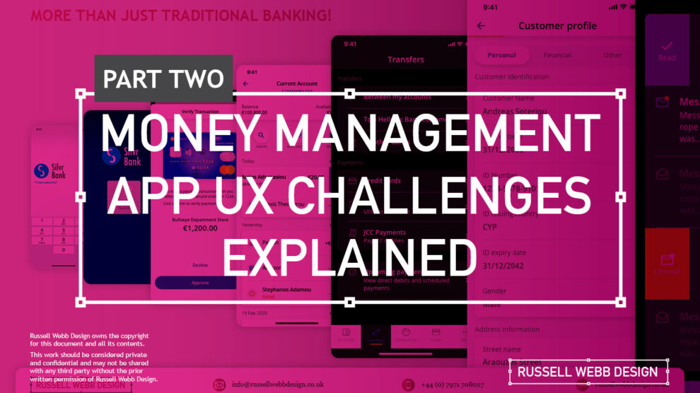
TLDR; The second on a two-part deep-dive focussing on mobile UX design targeting seasoned designer-types, mastering Design Theory, and navigating lean Agile challenges.
In my previous post (01 Welcome to Pt I; Real-world app design challenges by persona) I detailed why wealth management apps are becoming super relevant and how certain UX designers types experience certain user experience challenges. Let’s move on to our second persona;
Silvr Bank – Europe’s Best Digital Bank*
*Silvr Bank is a fictitious organisation but these are real-world challenges I have experienced in real-world projects with real-world clients.
The overarching goal with Silver Bank* is to design an interface for a thriving Generation X, with an emphasis on growing the fledgling millennial users base – i.e mobile-first. The C-level were looking to expand and improve their digital offer on these foundations
3,000 employees | 85 branches | 2nd biggest player in its market
The brainstorming UX Designer
At the kickoff stages this designer is focusing on the ‘what if’, they live their life in the fast lane of UX Discovery workshops and are typically very creative.
Blindly Following a Predefined UX Process
Every design team (or team or chapter) will have their flavour, probably with different names. The skill is to take these stages and adapt the outcomes so your creative and non-creative teams will understand and respond.
Design Thinking 101 – Research, Design, Prototyping, Testing and Measuring (validation) are default to the UX Designers. But do other team members understand or even need these outputs?
The point is, tailor the UX process according to project needs which comprise staple elements such as research, design, prototyping, and testing (validation).
Not Following the Iterative Design Process to Resolve Issues
Successful Agile Mindset – The ‘From’ and ‘To’ concept is familiar in banking UX Design. At MVP stage this pattern could be relatively dry. Using Agile to Iteratively improve the UI and improve the experience with new icons and micro animations to help deliver that delight moment for your users.
It is crucial and all kick-off stages with all new teams to pivot towards an MVP mindset. Here is my take in the ‘Three must-haves’;
Clients must have an understanding of the iterative process
Clients must understand developing software within Scrum is not typical to a design agency. No Big-Bang please.
A strong UX-er must be able to push-back on customisations that hold little value and only slow down the Scrum Train.
Designing within Scrum has its own challenges, but one of the clear benefits is the ability to ‘go fast’. This speed is only maintained if the core team are synced and understand that fast decision making, a complete understanding of the iterative process and grasping an MVP mindset must all be entrenched.
Confusing signposting – Crazy pop-ups and misunderstood empty states.
If you don’t understand the flow, how do you expect your users to?
Full Screen Empty States – Clarify your user journeys by offering clean empty state messaging, decode why loading states appear and explain, jargon-free, what are next steps.
The pop-up frequency, relevance, and placement are key factors that make or break your UX;
Don’t show multiple pop-ups at once or one after another.
Ensure the empty state tone of voice is relevant to the audience and brand.
Your pop-ups shouldn’t cover the entire screen. On mobile, your full screen empty state should.
Give your users breathing space to explore. You can then set suitable triggers for pop-ups to appear at the right time under certain conditions.
The UX Consultant on-a-mission
A seasoned veteran
This flavour of UX designer has earned their stripes both at the sharp end running in-house UX teams and blazing a trail as a freelancer. They are typically driven, organised and looking for clients to be the same – so education is centre stage (which brings its own set of problems – see Not Following the Iterative Design Process to Resolve Issues below).
Retail Banking Services
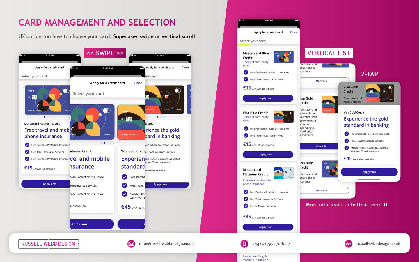
Banks and FI are increasingly integrating money management functionality into their mobile and desktop apps. There is a clear directive to push their customers to use their products, including Card Management and Selection, more actively.
Card Management and Selection – Cards have become a ‘must-have’ feature in modern financial application. Retail Services have responded, and to up’d their offer with effective use of colour, animations and UX patterns. i.e Here we see superuser swipe or mobile vertical scroll
In the western world, 76% of people use mobile banking services. Differentiation, whether that be through the quality of financial advice or expertise of financial service, has to be clear.
Creative font selection can derail already strong UX
Unless you have a solid reason to use a particular font type, stick with web-safe fonts. This is a common misunderstanding when implementing an out-the-box or white label product, as they allow your client to go crazy either with their brand font or one that simply doesn’t work online (or both).
Use your other UX tools to differentiate and stuck with the main players below;
Arial (sans-serif)
Georgia (serif)
Verdana (sans-serif)
Trebuchet MS (sans-serif)
Garamond (serif)
Tahoma (sans serif)
Courier New (monospace)
Times New Roman (serif)
Know Your Users. Know your competition
It would be a mistake to believe that money management applications are exclusively relevant for older adults. In reality, the target demographic for such applications is growing younger. Keep an eye out for millennials who, according to CBInsights, will inherit the largest share of the wealth of any generation – so mobile is absolutely key.
Be conscious of the challenger banks that are making waves and be distinct or what your differentiation actually is, and mobile is leading this charge.
Portfolio on Mobile – Leading the charge for Generation Z – Performance, Allocations through to Valuations all offer feature parity on web and mobile. Although Gen Z are prominently mobile – gear your efforts equally across all platforms to offer the complete package.
My conclusion on app challenges
It’s clear the challenges are many. Whether you’re be UX junior looking to soak-up the World Wide Web of experience or a seasoned veteran looking to fine-tune your UX skills, the key challenges when designing financial money management apps** are;
Not Following the Iterative Design Process to Resolve Issues
Clients must have an understanding of the iterative process and an Agile mindset. No Big-Bang please. Accept this and then you and your team can then ‘go fast’.
Laser Focussed on Design Systems and Best Practices
Non UX-ers need their outcomes. Without maintenance, allocation and expertise, a Design System that doesn’t rock, will impact UI delivery.
Blindly Following a Predefined UX Process
Adapting the Design Thinking process to suit. When implementing a white label product out-of-the-box, prototyping and testing default patterns will yield little value, focus on what makes your offer unique.
**Can be attributed to other domains, of course.
Pique’d your interest?
This is but part of a selection of design information russellwebbdesign generated for the creative community out there. Please contact me further to discuss how your brand can benefit from the new channel: info@russellwebbdesign.co.uk
If something has peaked your interest. Please leave a comment below.
Delight, speed and satisfaction are rewriting our UX playbooks in finance. While at the bleeding edge of this digital transformation, a modern UX-er has rapidly emerged, changing the rules of the game.
Strong UX has taken modern banking to the next level
Designing an ecosystem that can scale to deliver multiple connected products is really the ultimate UX/UI case study. Part of that skill-set is the new must-have that is dark mode.
Here is my take on this new visual aesthetic.
Delight, speed and satisfaction are rewriting our UX playbook in finance.
*Names and visuals have been changed to reflect NDRs and client confidentialitySimple | Clear | Close Three simple principles that complement each other and form the basis for the individuals experience
MYBANK* Europe – 3.8 million retail banking clients
This case study is based on MYBANK*. As part of a broader digital transformation, I led full-throttle Discovery sessions laying the UX foundations for this region’s third-largest banking group, with total assets at CHF 229 billion;
120-person strong team
1-2-1 Leapfrog Workshop
A demanding 3rd party agency
Goals and How-to retool
The goal here is to give back to the design community a mindset for transitioning handcrafted light-mode UI, to the dark side. As this mode has become the new black, UX / UI designers need to re-tool themselves with the skills to set effective palettes, to design in context and to know the rules or at least know how to break them.
Ominpayment Form – Financial users are familiar now with the ‘from’ and ‘to’ light mode design paradigm. Pushing that further, UX-ers today are tearing up the rulebook by adding in additional functionality around scheduling and note functionality in dark mode?
Using dark mode as default
Designing with a predominantly dark palette, swapping out light backgrounds, lightning text and icons has more recently become a non-negotiable design requirement with today’s clients. For mobile I get it, all apps should have both light and dark UI — or day and night themes that switch automatically. But what happens when your users are purposely choosing dark mode – all the time?
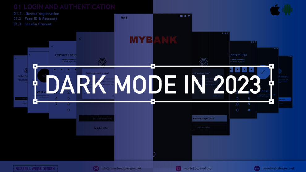
Login and Authentication – Device registrations, biometrics and timeouts. As dark mode becomes the users preference, should designers be moving this UI style to the top of their to-do lists?
How dark mode has crept up on us
Early computer systems were always in dark-mode as characters were inverted. The Mac brought WYSIWYG and what we now know as light mode, or ‘printed paper’ mode. This became the default, with designers rarely even thinking about other colour palettes.
Although prevalent in certain digital environments, ‘dials-and-lights’ interfaces (car dashboards spring to mind) have always been dark, controls and readouts follow established dark patterns.
Account Types – Established patterns in finance are fundamental to delivering a best-in-class mobile banking applications. Single-column scrolling and wide-and-shallow IA are familiar patterns.
An app with a dark palette consumes as much as 90% less energy, especially with AMOLED screens. For battery saving reasons there is enough justification for your clients to build in design capacity for this mode. Be mindful of your users’ environment, a bright rectangle glaring at them in a dim room is not good.
Most streaming-video services default to dark mode as users do much of their viewing at night. This is why TV have dark bezels – right? Dark backgrounds reduce the overall brightness of the display, so can be used in any lighting condition. A typical dark-mode page is five times less bright than exactly the same content in light mode.
Defining a dark colour palette
Designers have been reducing contrast in light-mode for years.
Black text is rarely black anymore (and not just disabled text)
Note the emphasis is on contrast. The term colour contrast is misleading. To give context, let’s map out a mini deep-dive on colour theory.
Quick recap on colour theory
Hue—The spectrum on which a colour appears.
Saturation—How intense a hue appears.
Brightness—The amount of black or white that is added to a colour.
To most designers, developers, and product managers—the term colour means the hue part only. Red or green, for example. Contrast implies that contrast relates to hue, but it does not. Contrast indicates the difference in brightness levels of two elements.
Small differences equal low contrast, large differences high contrast – socontrast is a comparison.
Account statements – This brand was laser focussed on contrast. UI decisions hung off their mission statement of ‘Simple. Clear. Close’, all in Dark mode. Note: Check out the white line surround
Contrast in Dark Mode
When dark-mode palettes are implemented properly, their low overall output should provide extremely high contrast, without anyone on a project team worrying that the display is too harsh.
But you still need to keep the contrast as high as possible, which trips up a lot of designers. Dark-mode design suggestions, guidelines and inspiration sites too often throw away everything we know about colour theory, especially;
Contrast
Visibility
Readability
Universal design
Don’t start with a black palette
A quick, easy way to start creating a dark palette is to create shades and tints of all your colours.
Keep the hue and saturation, change the brightness.
Colour theory tip
Shade = adding black to the colour.
Tint = adding white i.e, pink is a tint of red.
How-to build a powerful dark colour palette
Choose another dark colour from the palette as a background (or make a shade of one)
Create shades of all your colours i.e. adding black to the colour.
Use a number of dark hues for backgrounds making branded elements pop.
Instead of just using lines or grayscale, use various dark shades of the brand’s principal colour to set-off sections.
Finally, check contrast in a dark room with real users.
Even Google suggests very dark, highly saturated accent colours, but with lots of very low-contrast, grey backgrounds. Discarding simple lines around card edges and replacing them with dark-grey backgrounds doesn’t solve the contrast argument. Of course, this is just one opinion (albeit the worlds’ largest search company) – white key-lines can work as well.
Card Management – Providing the complete UX picture is essential for developer handover. Shimmering and Empty Space UI can utilise a grey illustrational aesthetic. Contrast Card UX to give definition against dark backgrounds and colour lines.
Grey is not the only fruit!
Hollow icons for available tabs and solid icons for the selected tabs, while not a colour theory issue, is an effective way to differentiate them. Using simple text for tabs, in grey or red is an issue for the colourblind, not acclimated to night or glare.
Bad contrast impairs readability and users become confused when part of the page scrolls, but other parts do not. Contrast and differentiationis not just text and icons but the entire experience.
Card Management – Colour palettes vary per client. Purist clients with a pre-existing ‘darker’ brand come alive in this universe. Employ sharp contrast, hues of black and bold principal primary colours.
Conclusions on dark mode UX
More menu – Employing an effective Design System allows clients to configure which iterative choice fits their brand and suits their user base. The ‘More Menu’ is a classic example, from flat lists to grouped cards with descriptions.
Enable iteration by employing a high-impact Design System with global reach
Personalising a gold-standard, multi faceted, flexible Design System, empowering over 220 global organisations, employing a 6 sections, over 500+ components, catering for 3 industry-standard digital platform
From foundational elements like typography, to light and dark colour mode across all tokens, icons and logo, a rich library of icons to container, cover and sheets, to selectors components, drop downs, empty states, models, navigational and informational elements.
Modern UX designers should champion dark mode as the default option for mobile apps. Embracing this trend not only aligns with user preferences but also enhances the app’s visual appeal and overall user experience;
Not just about style
Design choices such as a colour palette have enormous implications around usability and perception.
Design basics
Size, spacing, and contrast in dark-mode are still critical.
Test, test and test again
Don’t forget to test your solution in a real-world environment (i.e a dark room). Try to understand how people would use your product, and make sure you’re designing for their context and their needs.
Pique’d your interest?
This is but part of a selection of design information russellwebbdesign generated for the creative community out there. Please contact me further to discuss how your brand can benefit from the new channel: info@russellwebbdesign.co.uk
If something has peaked your interest. Please leave a comment below.
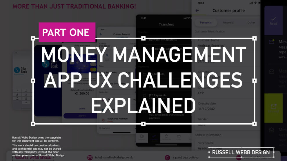
This two-part case study will be exploring UX design challenges within the financial ecosystem that different flavours of UX designers can face. Part I focuses on why wealth management apps are becoming super relevant and how certain UX designers experience different challenges.
Along the journey, I will also be supercharging the project objectives;
Catch-up feature parity
Prioritising critical features
Stakeholder education (Design Systems)
Let’s kick off by asking ‘What type of UX-er are you?’
Silvr Bank – Europe’s Best Digital Bank*
*Silvr Bank is a fictitious organisation but these are real-world challenges I have experienced in real-world projects with real-world clients.
The overarching goal with Silver Bank* is to design an interface for a thriving Generation X user group, with an emphasis on growing the fledgling millennial users – i.e mobile-first. The C-level were looking to expand and improve their digital offer.
3,000 employees | 85 branches | 2nd biggest player in its market
What type of UX-er are you?
UX Designer types – How UX designers approach their challenges depends on many factors. Experience, background and where a designer is on their journey are all influencing characteristics..
The challenges are many, so to focus this case study and depending on where you are in your UX journey, both as an individual and within a team, I have split these challenges in to three typical UX professional personas;
Mr ‘UX-design-is-completely-theoretical’ Designer
The brainstorming UX Designer
The UX Consultant on-a-mission
In this post, let’s drill-down on challenges faced by our first persona;
Mr ‘UX-design-is-completely-theoretical’ designer
This designer is at the beginning of their journey. They are a sponge, soaking up the design thinking processes and navigating their way through YouTube UX tutorials. Along the way they do need to get their hands dirty and experiment. To push back on theories, effects and laws. Learn to go with their gut and develop that inner self, that inner individual designer.
Laser Focussed on Design Systems and Best Practices
Design Systems from Hell – The benefits of a fully functional Design System are clear. Consistency. Speed. Best Practice. Collaboration. But when there isn’t a dedicated team or individual maintaining Component and updates. This is when the theoretical designer falls down and you get four bottom sheet options for iOS.
Maintenance of a fully functioning Design System has its own set of challenges. Inevitable non-creatives will ask;
For a ‘Design System’, where are the outcomes for non-creatives?
Who and how is it maintained (and who pays for it)?
Product teams will inevitably be looking for final deliverables they can understand (and charge for). This typically manifests itself as desktop and mobile UI screens. So while your designer is focused on perfecting their Design Token Figma file, the rest of the team are simply waiting for consistent UI.
Get you hands dirty… then give-back
Experienced designers learn their trade. The rest gain practical knowledge while learning the theoretical way. So experiment, make mistakes, try again, share your experiences, and then give these lessons back to the design community as an experienced designer. [For example, this post]
(Too much) user experience psychology
Which option matches which theory. The real skill comes for a UX designer to cut through the noise and go with the science. I have my opinion – Do you?
Theories and Laws can become overwhelming;
Retention Theory – Proportion of the information vs. time spent on a page
Serial-Position Effect – Recollection of the first and the last in a list of words
Hick’s Law – Response to multiple stimuli is delayed forcing user to ‘stay longer’
The Schema Theory – Human brains like to organise knowledge into meaningful units, or schematas
… I could go on, (my go-to is personally Gestalt Principle). From another perspective, and another theory:
Humans are fickle creatures, they don’t follow the rules.
These theories alone can help with design decisions, but there is no ABC, no tried-and-tested foolproof formula. So make the intelligent choice, be brave and go with your instincts.
Explore other perspectives on money management challenges
You now have a snapshot on why these management apps are so prevalent from one designer type perspective. But what challenges do other UX designer types face, see Pt II – Money Management App UX Challenges to explore how experience and perspective can influence the challenges and solutions you may face as a certain designer type.
Pique’d your interest?
This is but part of a selection of design information russellwebbdesign generated for the creative community out there. Please contact me further to discuss how your brand can benefit from the new channel: info@russellwebbdesign.co.uk
If something has peaked your interest. Please leave a comment below.


