Print design is the process of creating and formatting projects using layout software that is ready to be printed by the end user. Especially helpful when multiple persons or agencies are working on the same project.
TL;DR; The branding exercise showcasing a need for a standout, flexible, unique, and impactful logo marque. From sketching, client involvement, standardising the colour palette to finessing the design into a fully-fledged product.
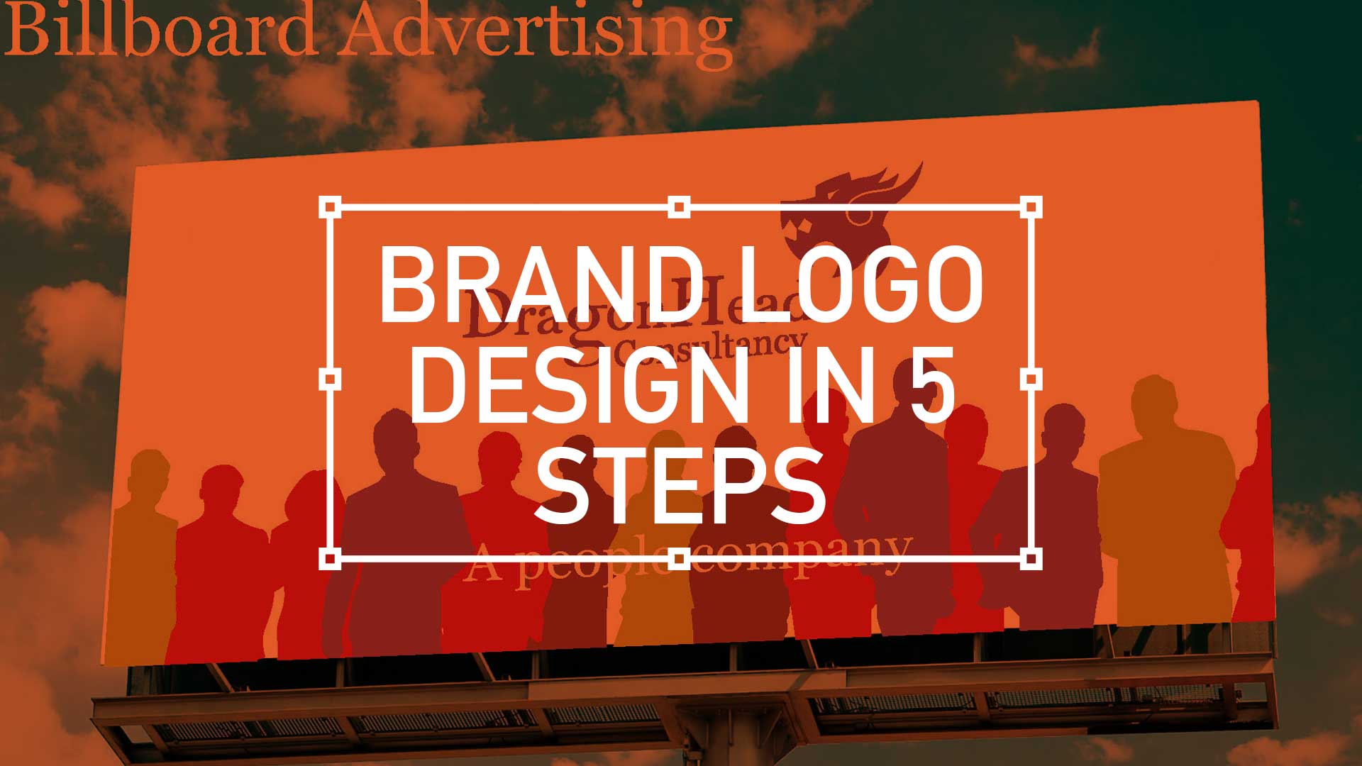
I have recently been involved in a branding exercise for a company that has over over 20 years experience in consultancy, project management and business analysis. This isn’t a new sphere of business, there is plenty of competition out there so a stand out logo marque that was…
Flexible
Unique
Impactful
… was essential. So I presented a limited selection of ideas as I feel, after a certain amount of years, I’m qualified not to waste the client’s time presenting numerous options. This is a concept shared by the likes of David Airey on his site logodesignlove.com
When you have four seconds to get the public to snatch your flyer, you need to make to easy for them. The currency trick is always going to a winner, you’ve got that first two seconds. Now you need to ABC.
This is the first 12 steps to take your mobile design skills to the next level
Packed with Design Tips
This years edition is crammed full of the most inspirational and can do mobile design tips. Whether it be common sense or insider knowledge, this calendar is sure to inspire and teach you each and every day for the year in front of you.
Format
Planner Size Closed 210mm x 297mm
Full colour with Georgia, Handwriting Dakota and Gotham typeface
Available in in limited edition print of PDF download
2012 Mobile Design Tips
Mobile design is what YOU make it
The future of mobile design is what you make it. It can said it’s made up of more than 12 things. In fact, it’s all of these things so please get back to me with your Top 12 for mobile design.
This is but part of a selection of design resources russellwebbdesign generated for the mobile space out there. Please contact us further to discuss if your brand really wants to benefit from this new immersive experience here: info@russellwebbdesign.co.uk
Whether you are working in publishing, online or advertising, the fundamental ideas (which may overlap) about the practice of good ‘layout’ composition will always form the basic structure of your design. The elements form the ‘vocabulary‘ of the design, while the principles constitute the broader aspects of its composition. Here I have compiled a loose set of principles that all revolve around the fundamentals of layout graphic design.
This is Part 1 of a 2-Part series: To jump forward to this second part please click here
1. Spectrum of colour
The Colour Spectrum
If you find yourself searching for inspiration and you have a tight deadline (usual story!) you can always gather a choice selection of compelling images and apply this technique. Essentially you are creating with the creative, it’s an effective demonstration of imagery and a (relatively) easy application of technique – what client wouldn’t be happy with this exciting, *warm colour spectrum of ideas?
*Warm colors are a group of colors that consist of reds, yellows, and oranges.
2. Text Manipulation
Calender Promotion though text manipulatioin
Through the calender year designers have the luxury of using calender promotion to deliver a punchier design. Here Valentines Day is effectively used and it is the negative space that forms an important part of the layout. There are two types of this type of space: positive and negative space.
3. The Douple Page Stread (DPS) as a DPS
DPS as DPS
Elevating your design by including a homage to past layouts is a trusted and effective design principle. See he News of The World’s final edition for the ultimate example.
4. Subject Matter
Subject matter and design lead
Taking the subject matter of ‘Golf’, I have crafted a layout that touches a wide market appeal – this is a simple trick that draws in the fans of that subject.
5. Design for colour groups
Colur Groups
Having at your disposal an extensive range of images can definitely help with this principal. Here colour is used as a layout guide to help the potential end-user of these images realise an application. The relationship between these light and dark colour groups gives the layout depth and perception – this is also referred to as tone.
6. The youth of today
Youth of today
Demonstrating your quality and breath of photography using the designers classic CMYK technique is as popular as ever. As a principle, the repetition of familiar form provide graphic designers with another string to their bow.
This is two part examination of broad design principles russellwebbdesign generated for the design community. Please contact us further to discuss if your brand (ot it’s design) can really wants to benefit from effective communication and good graphic design: info@russellwebbdesign.co.uk
If this, or any other post has peaked your interest, please leave your comments below
Design a brand marque encompassing all the technical, sustainable and innovative aspects of Oakgrove Millennium Community
£500M brownfield site covering 74 acre
1,300 new homes (30% affordable housing)
IT-enabled (linking homes, shops and schools)
The Oakgrove area is a 30 hectare (74 acre) brownfield site, owned by Milton Keynes Partnership, on the eastern side of Milton Keynes. Description The site is envisaged to accommodate 1,100 new homes (of which 30% will be affordable), a neighbourhood centre, and open spaces. Development Stage An outline planning application has been approved by Milton Keynes Council. Start Date Construction is expected to start Summer 2011. Completion Date The development of Oakgrove is envisaged to be complete by 2019. Developer Homes will be built by Crest Nicholson.
The document amplifies the key principles, in a magazine-led manner, for the development of the site from an architectural perspective. It was adopted as principle driver that eventually won the £500m contract over 11 years.
The Oakgrove Millennium Community includes all of the Oakgrove and part of the Middleton grid squares. The site is allocated for housing, recreation, community and commercial facilities in the emerging Milton Keynes Local Plan.
Oakgrove is one of seven Millennium Communities being promoted by ODPM and English Partnerships as national exemplars for sustainable development. Each Millennium Community has to achieve particularly high environmental standards, whilst having its own unique identity. Oakgrove’s is based on making the most of high specification Information Communication Technology.
The draft Framework was subject to extensive consultation and the adopted version was amended where appropriate as a result of comments received.
A3 / A4 portrait / landscape promotional poster for GSA open day
When considering hierarchy, an effective poster should be …
Aesthetic – It should get attention so the message is delivered.
Focused – It should focus on a single message.
Ordered – The sequence should be well-ordered and obvious.
The flow of information should be clear from the layout and keep the word count as low as possible.
As Open Day’s approach architecture practices like to gather interest at the best institution by advertising their skill set though Open Day posters. This is a great opportunity to show potential Part 3 graduates why they should consider one practice over another and to ask questions directly.