Category: +Case Studies

Documented here are my UX Case Studies and their powerful results. These success stories are used here as a showcase, to fuel continuous learning for myself and others, and to optimise my design process. Enjoy…

  • Power up your designs with dark mode trend front-of-mind

    Power up your designs with dark mode trend front-of-mind

    Delight, speed and satisfaction are rewriting our UX playbooks in finance. While at the bleeding edge of this digital transformation, a modern UX-er has rapidly emerged, changing the rules of the game.


    Hard Skills:

    Journey Mapping

    Research

    Visual Design

    Soft Skills:

    Empathy

    Collaboration

    Critical Thinking

    Full List →


    Strong UX has taken modern banking to the next level

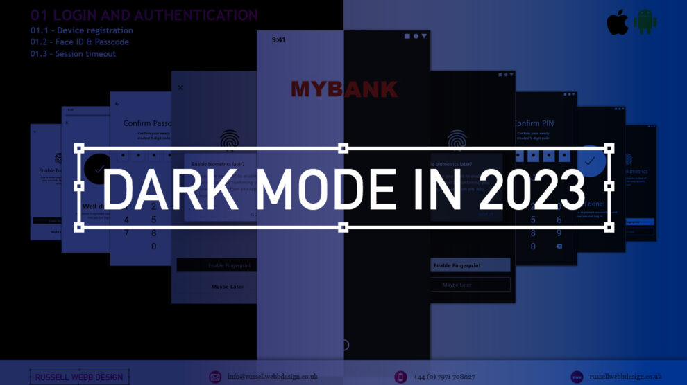
    Designing an ecosystem that can scale to deliver multiple connected products is really the ultimate UX/UI case study. Part of that skill-set is the new must-have that is dark mode.

    Here is my take on this new visual aesthetic.

    MYBANK* Europe – 3.8 million retail banking clients

    This case study is based on MYBANK*. As part of a broader digital transformation, I led full-throttle Discovery sessions laying the UX foundations for this region’s third-largest banking group, with total assets at CHF 229 billion;

    • 120-person strong team
    • 1-2-1 Leapfrog Workshop
    • A demanding 3rd party agency

    Goals and How-to retool

    The goal here is to give back to the design community a mindset for transitioning handcrafted light-mode UI, to the dark side. As this mode has become the new black, UX / UI designers need to re-tool themselves with the skills to set effective palettes, to design in context and to know the rules or at least know how to break them.

    Using dark mode as default

    Designing with a predominantly dark palette, swapping out light backgrounds, lightning text and icons has more recently become a non-negotiable design requirement with today’s clients. For mobile I get it, all apps should have both light and dark UI — or day and night themes that switch automatically. But what happens when your users are purposely choosing dark mode – all the time?

    How dark mode has crept up on us

    Early computer systems were always in dark-mode as characters were inverted. The Mac brought WYSIWYG and what we now know as light mode, or ‘printed paper’ mode. This became the default, with designers rarely even thinking about other colour palettes.

    Although prevalent in certain digital environments, ‘dials-and-lights’ interfaces (car dashboards spring to mind) have always been dark, controls and readouts follow established dark patterns.

    An app with a dark palette consumes as much as 90% less energy, especially with AMOLED screens. For battery saving reasons there is enough justification for your clients to build in design capacity for this mode. Be mindful of your users’ environment, a bright rectangle glaring at them in a dim room is not good.

    Most streaming-video services default to dark mode as users do much of their viewing at night. This is why TV have dark bezels – right? Dark backgrounds reduce the overall brightness of the display, so can be used in any lighting condition. A typical dark-mode page is five times less bright than exactly the same content in light mode.

    Defining a dark colour palette 

    Designers have been reducing contrast in light-mode for years.

    Black text is rarely black anymore
    (and not just disabled text)

    Note the emphasis is on contrast. The term colour contrast is misleading. To give context, let’s map out a mini deep-dive on colour theory.

    Quick recap on colour theory

    • Hue—The spectrum on which a colour appears.
    • Saturation—How intense a hue appears.
    • Brightness—The amount of black or white that is added to a colour.

    To most designers, developers, and product managers—the term colour means the hue part only. Red or green, for example. Contrast implies that contrast relates to hue, but it does not. Contrast indicates the difference in brightness levels of two elements. 

    Small differences equal low contrast, large differences high contrast – so contrast is a comparison.

    Contrast in Dark Mode

    When dark-mode palettes are implemented properly, their low overall output should provide extremely high contrast, without anyone on a project team worrying that the display is too harsh.

    But you still need to keep the contrast as high as possible, which trips up a lot of designers. Dark-mode design suggestions, guidelines and inspiration sites too often throw away everything we know about colour theory, especially; 

    • Contrast
    • Visibility
    • Readability
    • Universal design

    Don’t start with a black palette

    A quick, easy way to start creating a dark palette is to create shades and tints of all your colours.

    Keep the hue and saturation, change the brightness.

    Colour theory tip

    • Shade = adding black to the colour.
    • Tint = adding white i.e, pink is a tint of red.

    How-to build a powerful dark colour palette

    1. Choose another dark colour from the palette as a background (or make a shade of one)
    2. Create shades of all your colours i.e. adding black to the colour.
    3. Use a number of dark hues for backgrounds making branded elements pop.
    4. Instead of just using lines or grayscale, use various dark shades of the brand’s principal colour to set-off sections.
    5. Finally, check contrast in a dark room with real users.

    Even Google suggests very dark, highly saturated accent colours, but with lots of very low-contrast, grey backgrounds. Discarding simple lines around card edges and replacing them with dark-grey backgrounds doesn’t solve the contrast argument. Of course, this is just one opinion (albeit the worlds’ largest search company)white key-lines can work as well.

    Grey is not the only fruit!

    Hollow icons for available tabs and solid icons for the selected tabs, while not a colour theory issue, is an effective way to differentiate them. Using simple text for tabs, in grey or red is an issue for the colourblind, not acclimated to night or glare.

    Bad contrast impairs readability and users become confused when part of the page scrolls, but other parts do not. Contrast and differentiation is not just text and icons but the entire experience.

    Conclusions on dark mode UX

    Enable iteration by employing a high-impact Design System with global reach

    Personalising a gold-standard, multi faceted, flexible Design System, empowering over 220 global organisations, employing a 6 sections, over 500+ components, catering for 3 industry-standard digital platform

    From foundational elements like typography, to light and dark colour mode across all tokens, icons and logo, a rich library of icons to container, cover and sheets, to selectors components, drop downs, empty states, models, navigational and informational elements.

    Modern UX designers should champion dark mode as the default option for mobile apps. Embracing this trend not only aligns with user preferences but also enhances the app’s visual appeal and overall user experience;

    Not just about style

    Design choices such as a colour palette have enormous implications around usability and perception.

    Design basics

    Size, spacing, and contrast in dark-mode are still critical.

    Test, test and test again

    Don’t forget to test your solution in a real-world environment (i.e a dark room). Try to understand how people would use your product, and make sure you’re designing for their context and their needs.

    RussellWebbDesign: Get your fill of UX trends, case studies and best practice
  • Pt I – Money Management App UX Challenges Explained

    Pt I – Money Management App UX Challenges Explained

    A two-part deep-dive focussing on mobile UX design targeting seasoned designer-types, mastering Design Theory, and navigating lean Agile challenges.


    Hard Skills:

    Journey Mapping

    Research

    Visual Design

    Soft Skills:

    Empathy

    Collaboration

    Critical Thinking

    Full List →


    Welcome to Pt I

    Real-world app design challenges by persona

    This two-part case study will be exploring UX design challenges within the financial ecosystem that different flavours of UX designers can face. Part I focuses on why wealth management apps are becoming super relevant and how certain UX designers experience different challenges.

    Along the journey, I will also be supercharging the project objectives;

    • Catch-up feature parity
    • Prioritising critical features
    • Stakeholder education (Design Systems)

    Let’s kick off by asking ‘What type of UX-er are you?’

    Silvr Bank – Europe’s Best Digital Bank*

    *Silvr Bank is a fictitious organisation but these are real-world challenges I have experienced in real-world projects with real-world clients.

    The overarching goal with Silver Bank* is to design an interface for a thriving Generation X user group, with an emphasis on growing the fledgling millennial users – i.e mobile-first. The C-level were looking to expand and improve their digital offer.

    3,000 employees | 85 branches | 2nd biggest player in its market

    What type of UX-er are you?

    UX Designer types – How UX designers approach their challenges depends on many factors. Experience, background and where a designer is on their journey are all influencing characteristics.. 

    The challenges are many, so to focus this case study and depending on where you are in your UX journey, both as an individual and within a team, I have split these challenges in to three typical UX professional personas;

    • Mr ‘UX-design-is-completely-theoretical’ Designer
    • The brainstorming UX Designer
    • The UX Consultant on-a-mission

    In this post, let’s drill-down on challenges faced by our first persona;

    Mr ‘UX-design-is-completely-theoretical’ designer 

    This designer is at the beginning of their journey. They are a sponge, soaking up the design thinking processes and navigating their way through YouTube UX tutorials. Along the way they do need to get their hands dirty and experiment. To push back on theories, effects and laws. Learn to go with their gut and develop that inner self, that inner individual designer.

    Laser Focussed on Design Systems and Best Practices

    Design Systems from Hell – The benefits of a fully functional Design System are clear. Consistency. Speed. Best Practice. Collaboration. But when there isn’t a dedicated team or individual maintaining Component and updates. This is when the theoretical designer falls down and you get four bottom sheet options for iOS.

    Maintenance of a fully functioning Design System has its own set of challenges. Inevitable non-creatives will ask;

    1. For a ‘Design System’, where are the outcomes for non-creatives? 
    2. Who and how is it maintained (and who pays for it)?  

    Product teams will inevitably be looking for final deliverables they can understand (and charge for). This typically manifests itself as desktop and mobile UI screens. So while your designer is focused on perfecting their Design Token Figma file, the rest of the team are simply waiting for consistent UI.

    Get you hands dirty… then give-back

    Experienced designers learn their trade. The rest gain practical knowledge while learning the theoretical way. So experiment, make mistakes, try again, share your experiences, and then give these lessons back to the design community as an experienced designer. [For example, this post]

    (Too much) user experience psychology

    Which option matches which theory. The real skill comes for a UX designer to cut through the noise and go with the science. I have my opinion – Do you?

    Theories and Laws can become overwhelming;

    • Retention Theory – Proportion of the information vs. time spent on a page
    • Serial-Position Effect – Recollection of the first and the last in a list of words
    • Hick’s Law – Response to multiple stimuli is delayed forcing user to ‘stay longer’ 
    • The Schema Theory – Human brains like to organise knowledge into meaningful units, or schematas 

    … I could go on, (my go-to is personally Gestalt Principle). From another perspective, and another theory:

    Humans are fickle creatures, they don’t follow the rules.

    These theories alone can help with design decisions, but there is no ABC, no tried-and-tested foolproof formula. So make the intelligent choice, be brave and go with your instincts.


    Explore other perspectives on money management challenges

    You now have a snapshot on why these management apps are so prevalent from one designer type perspective. But what challenges do other UX designer types face, see Pt II – Money Management App UX Challenges to explore how experience and perspective can influence the challenges and solutions you may face as a certain designer type.

    RussellWebbDesign: Get your fill of UX trends, case studies and best practice
  • Part 1; How being more consultative can sooth the UX process – COVID Special

    Part 1; How being more consultative can sooth the UX process – COVID Special

    TL;DR; Boost your workflow without breaking a Zoom sweat in this COVID-friendly remote special.

    Simplify KO’s, pinpoint problems, and find your perfect toolset—faster than a remote ping. Discover the limits of your daily grind. Then, unleash the life-saving power of Dual Track UX Delivery as a consultative designer. ‍ 


    Hard Skills:

    Journey Mapping

    Research

    Visual Design

    Soft Skills:

    Empathy

    Collaboration

    Critical Thinking

    Full List →


    This is Part 1 of a two-part article looking at improved Ways of Working from a consultative UX perspective. I will be concentrating on;

    Jump forward to Part II, I will be deep-diving into;

    • Real world examples
    • Ways of Working
    • Dual track UX
    • Signposting
    • Conclusion
    • My Top 9 Take-aways
    (more…)
  • Part II – Designing a Secure Document Repository; Case Study 2019

    Part II – Designing a Secure Document Repository; Case Study 2019

    TLDR; Last month I posted Part I of how I designed a service integration project within the suit of financial apps for a large international retail bank and asset manager. Part II focuses on ‘My UCD Design Process’ and ‘Future Vision’ and ‘Design Systems’

    (more…)
  • Part I – Designing a Secure Document Repository

    Part I – Designing a Secure Document Repository

    TLDR; In the summer I was the lead UX designer in a time-boxed 3-month service integration project. Internally future-vision looked to position this product as the hero application within the suit of financial apps and services available at this large international retail bank and the worlds largest asset manager. This data integration would potentially push it front-of-stage.

    Read more
  • How user personas can help crystallise the early stage design process

    TL;DR; A large automotive client wanted to improve their dealer portal but the client needed guidance on understanding their audience’s needs and wants. Personas generation is a great to focus the team’s expectations and contributes to a better product and service.

    B2B UX Case Study – Automotive Dealer Portal

    I was recently asked to provide insight for a dealer portal for a very large automotive client. There was a definite opportunity in their market to improve their internal front end offering – but very early on it was clear there was a lack of understanding of who their audience was. How their needs and wants differed and what, as customers, they were looking for.

    So, before deep-diving in the UX,  I produced a selection of personas to focus down the teams expectations and unite the groups thinking. I’m taking for granted that we are all aware that personas represent a typical user, based on user research and incorporate user goals, needs, and interests. Here I created four (4) personas, Hilary, Gary, Donald and Bernie;

    1.1 – Hillary, a Competitive Owner / Consider

    "“My
    (more…)