Tag: UI

  • Money Management App on Android

    TLDR: UX proposal for a “pre-baked” financial phone – a phone with built-in features to ditch your wallet. Android for finance with offer easy account management (balances, top-ups, statements), discover and track local deals, store tickets for travel and events, and even integrate with home screen widgets for instant access.

    Your phone as a wallet

    Over time, I have been involved in development for alternative mobile payment systems many times. Along with QR Codes and NFC and Face recognition, who knows which direction the public will eventually choose. This is a study into on possibly direction: Pre-baked branded financial phone, utilising the native rich functionality of the Android operating system.

    It was key to point the App towards five distinct touch points:

    1. Account Service
    2. Reward and Bonus
    3. Ticketing and Events
    4. Widgets
    5. Pop-ups

    Get Started

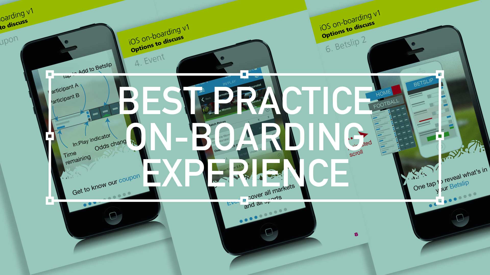
    Guiding the user through the start-up process is like taking them on their first date. By providing your customers with this gentle ‘hand-holding’ process you, as the UX designer, are reducing those barriers to entry and providing a step-by-step process that welcomes demographics from all levels.

    (more…)
  • Design habits – Tip your hat to your design heroes

    TLDR: Inspired by design masters, this can aide your creative process: User first through to competition analysis, (innovation nit imitation), to
    familiarity and then focus on value then finally beautiful execution

    As a junior designer, way back when, I visited our local design museum (I studied in London, UK, so my local design museum was fortunately the rather impressive Design Museum in Shad Thames) and fantasied over how great it would of been to be involved in, say, designing a Charles and Ray Eames leather recliner, or Dysons Cyclone Vacuum cleaner.

    Now I’m doing stuff I feel proud off, in the field of UX/UI, I thought it worthwhile to see if I could mirror the process these great designers took and document it from a UXers perspective. So, here we go. I started with the following criteria:

    • Give users choice.
    • Competition Analysis
    • Design with familiarity in mind
    • Prioritise features that add value – the “Magic Moment”
    • Beautiful execution
    • Todays’ Brave New World
    (more…)
  • Best practice for your on-boarding experience

    Best practice for your on-boarding experience

    TL;DR; As a guided experience for new users simplifying your onboarding to prevent that overwhelmed feeling.

    Simplify your Onboarding; A UX Guide

    Getting new sign-ups is arguable the ultimate challenge, but the process of helping people get started, called on-boarding, can prevent many users from feeling lost, overwhelmed, and confused. It’s your responsibility, as a professional UXer, to shake their hand and show them the ropes and take them on that ‘first date’.

    Drilling-down on the detail of the betting coupon - on-boarding
    Drilling-down on the detail of the betting coupon – on-boarding

    The Do’s and Don’ts

    Downloading and jumping straight into an experience you’ve just heard about is one of the most exciting parts of UX design.

    When formulating this, be conscious not build further barriers as part of the on-boarding. The ‘Skip’ or ‘Tell me later’ and continuous Swipe is an important tool.

    (more…)
  • Wireframing an on-demand Internet streaming media service

    Wireframing an on-demand Internet streaming media service

    I have been recently working with a colleague on a private project around the world of media streaming. We had got to a level where the tech was getting up to scratch, but the UX was missing.

    So, here it is.

    Download here Download the PDF: OnDemandStreamingService-Mobile_Tablet

    Mobile

    Mobile

    On – screen blueprint representing the skeletal framework of the service. These provide an informed perspective to hit, or in this case, promote what will be business objective and a creative idea. As usual these lacks typographic style, colour, or graphics, as the main focus lies in functionality, behaviour, and priority of content.

    (more…)
  • Wireframing an iPad Casino App

    Wireframing an iPad Casino App

    TLDR: Focusing on planning functionality and layout without design is the most efficient way of concentrating decision markers (especially business or product-owners) to agree on functionality without distraction. Think: function over form.

    Personally I love to use traditional pen and paper for wireframing. How about you?

    First launch feature areas

    This is the main ‘shop window’ to your experience. On first launch, the user to launched in the gambling casino world. Pre-selected games adopt the ‘parallax scrolling’ technique and occupy the prime real estate. There is also functionality to drill down via category types. Account Management and Help are all ‘front-of-store’, as is the ability to push sign up and login promotions.

    CasinoApp_Wireframing3

    (more…)
  • Low fidelity prototypes

    TLDR: Skip the fancy prototypes! Low-fidelity sketches are fast, cheap, and encourage better feedback – perfect for early UX stages to focus on functionality before aesthetics.

    basic is still the best?

    I’ve made a few assumptions here, first… you work in UX. Second, you’re familiar with Agile and third, you haven’t much time so I’ll keep this brief. Straight to it, here is a couple of the main advantages of low fidelity prototyping:

    • Get better and more honest feedback
    • More involved collaboration
    • Make the cost of mistakes cheap, not expensive
    • Refine the page flow, not the pages
    • Figure out the interaction design rather than the visual design
    lowFidelity-VersionControl
    (more…)