5 Radical Google Font Pairings for Creative Portfolios (That Actually Work)
…for Creative Portfolios
(That Actually Work)
Typography is the closest thing digital design has to a physical texture.
It sets the temperature of a website before a user even bothers to read the copy. Yet, a quick browse through most online portfolios or creative brand identity kits reveals a sea of the same corporate safety nets: polite, clean, and entirely forgettable sans-serifs.
If you’re designing a creative web portfolio or shaping a fresh digital brand identity, playing it safe is a one-way ticket to blending in. You need typography that brings a distinct vibe—something tactile, human, and unapologetically bold.
But here’s the rub for digital product teams
How do you inject raw, avant-garde personality into a website without completely tanking your accessibility?
The secret lies in the friction between display and utility. You use a high-energy, radical font to establish the brand’s vibe in your headings, then anchor it with an incredibly stable, highly legible typeface for the body text.
This lets you smash the design mould while maintaining the proper contrast ratios, semantic heading structures, and effortless readability that screen readers (and search engines) love.
Here are five radical, high-contrast serif and sans-serif Google Font combinations built to give your next digital project an instant edge.
1. The High-Fashion Brutalist
Syne + Fraunces
- The Vibe: Art-direction heavy, avant-garde, and structural.
- Why it works for Digital Teams: Syne (especially in its Extra Bold weight) is aggressively wide. It acts like a structural beam on the screen, which naturally forces you to write short, punchy headlines—brilliant for keeping a webpage scannable.
- The Accessibility Anchor: Underneath that heavy geometry, Fraunces steps in as a contemporary, slightly “wonky” serif. While it has beautiful organic details at large sizes, its regular weight at 16px provides crisp contrast and brilliant x-height readability, ensuring long-form text remains completely accessible.
| Fraunces [Headline] | Syne [Body] |
Verdict
Fraunces as a headline font, especially in bold is a winner. DIgigital Designer by its nature is grounded on screens and associated with technology, the future. Pivoting this to embrace traditional printing press technology, represented by the serif of the letter shape.
While Syne is an effective body font, the slightly elongated lower case letterforms do give the impression to the uneducated eye that they have been manipulated. The ‘loops’ are not perfectly circular, especially in the italic mode. This is a personal choice, but this purposeful imperfection doesn’t sit well with me. Let’s move on..
2. The Liquid Acid & Editorial
Climate Crisis + Instrument Serif
- The Vibe: Kinetic, fluid, and heavily expressive. Brilliant for digital studios focused on motion or interactive design.
- Why it works for Digital Teams: Climate Crisis is an asymmetrical, melted variable display font. It functions almost like a graphic shape on the canvas rather than plain text, instantly changing the mood of a landing page.
- The Accessibility Anchor: Pairing a melted font with a chaotic body font is a usability nightmare. Instead, ground the page with Instrument Serif—an elegant, razor-sharp, traditional serif. The extreme contrast between the fluid headline and the ultra-refined text body gives you that high-end editorial feel without sacrificing screen-reader navigation.
| Climate Crisis [Headline] | Instrument Serif [Body] |
Verdic
Climate Crisis is successful as a display font, but also is rooted in counterculture, youth rebellion and expanded the definition of personal freedom. If this is your aesthetic, then it works well. Stick to max 3 words, explaining your message in the subtitle.
Retaining and traditional headline font (Fraunces) and pairing it the the Instrument Serif immediately shouts class. One is taken back to a time when The TImes was the single source and the newspaper of choice, when reading was a privilege and serif fonts were de rigueur. As a readable font and provide a smart alternative to the digital mass that is out there.
3. The Neo-Grotesque Punk
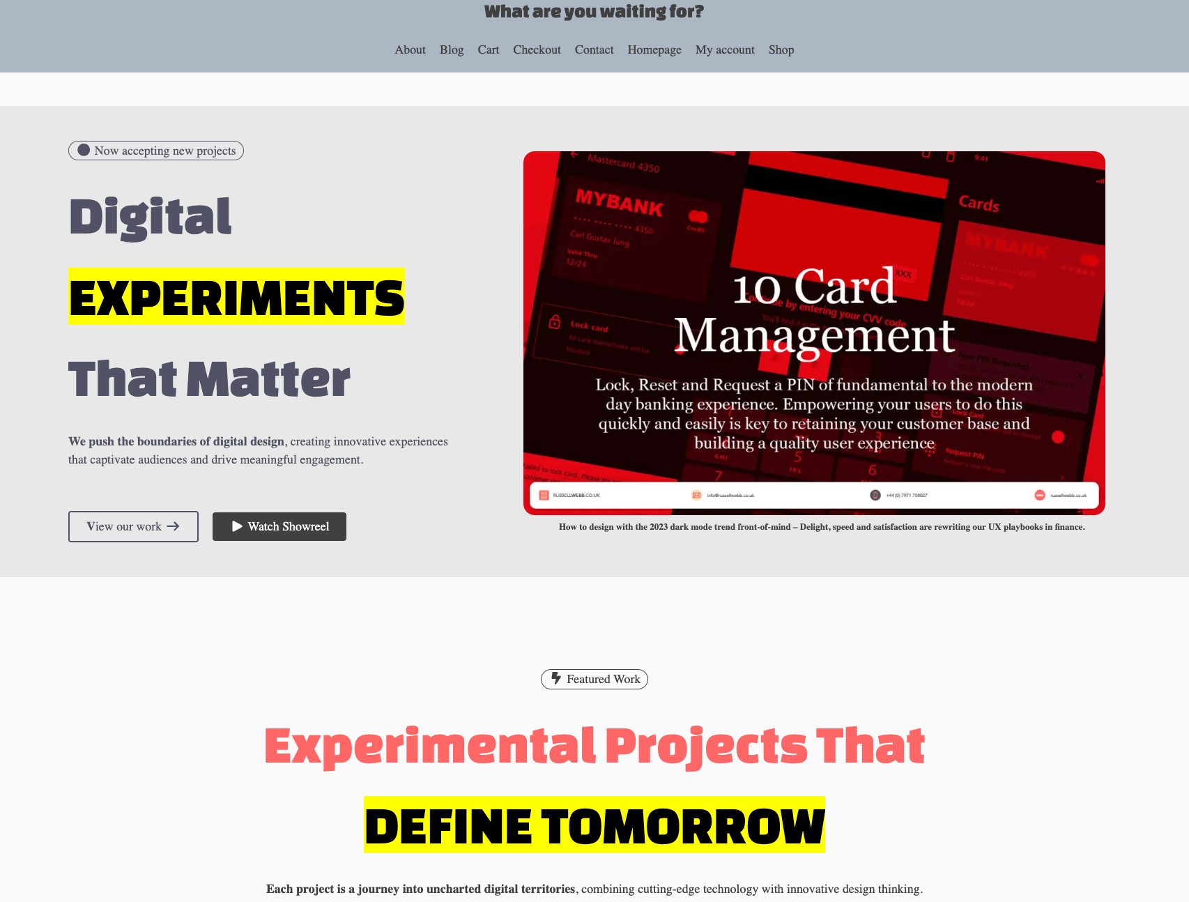
Germania One + Space Grotesk
- The Vibe: Raw, industrial, and sub-cultural. Equal parts Bauhaus and digital zine.
- Why it works for Digital Teams: Germania One is a radical hybrid of traditional blackletter and clean geometric shapes. It brings an instant street-level authenticity to a creative brand kit.
- The Accessibility Anchor: To make this punk aesthetic actually work on the modern web, pair it with Space Grotesk. It’s a stark, wide, highly legible sans-serif with just enough subtle, quirky tech accents to mirror the headline’s attitude, while keeping the open counter-spaces needed for comfortable reading on mobile screens.
| Germania One [Headline] | Space Grotesk [Body] |
Verdict
Typefaces can also represent certain movements, and can be very symbolic. Germania One has this connotation, unfortunately for the wrong reason. Although very stylish, with strong (on purpose) letterforms, the link to the National Socialists renders this font unusable – for me.
4. The Chiseled Cyber-Classic
Cinzel Decorative + Bricolage Grotesque
- The Vibe: Over-the-top drama meets modern code aesthetics.
- Why it works for Digital Teams: Cinzel Decorative brings sweeping, mythological flourishes and extended terminals to the screen. It is loud, theatrical, and intensely cinematic.
- The Accessibility Anchor: Balance the theatricality by anchoring the paragraphs with Bricolage Grotesque. This highly contemporary sans-serif features compressed counters and a robust, modern structure. It keeps your layout grounded and legible, proving that high drama can still play nicely with inclusive web design.
| Cinzel Decorative [Headline] | Bricolage Grotesque [Body] |
Verdict
Bricolage Grotesque is a solid choice and it has an admirable pedigree. The stumbling block arises when a designer wants to portray professionalism, but the headline font Cinzel Decorative pushes its Art and Craft decorative past too much. Sweeping uppercase mantles combined with expressive tail sweeps as characters descend below the lower baseline can contradict that professional edge. If you are looking to be ironic, or make an alternative statement – you should use it..
4. The Max-Contrast Screen Impact
Oi! + DM Mono
- The Vibe: Loud, pop-art, and unapologetically bold.
- Why it works for Digital Teams: Oi! is a twisted, ultra-fat slab serif that refuses to be ignored. It acts as an instant focal point on a landing page, making it a brilliant tool for statement brand identities.
- The Accessibility Anchor: Because the headline is so heavy, the eye desperately needs breathing room to process the rest of the information. Pairing it with a clean, lightweight, mechanical monospaced font like DM Mono creates the perfect functional offset. Monospaced fonts provide a distinct “maker” aesthetic while keeping text layout completely predictable and readable for users with visual or cognitive processing differences.
| Oi! [Headline] | DM Mono [Body] |
Verdict
Oi! is an interesting ultra-fat slab serif contender. It is very striking, but conversely this can also lacks eligibility. It is very pop-art and communicates a strong visible message, less so as a headline of a design / business problem.
The Golden Rule for Web Typography
Creative personality lives in your <h1> and <h2> tags; accessibility thrives in the <p> tag.
By letting your display fonts handle the brand’s raw energy while your body text handles the heavy lifting of legibility, you can build digital experiences that are both breathtakingly creative and effortlessly usable for everyone.
