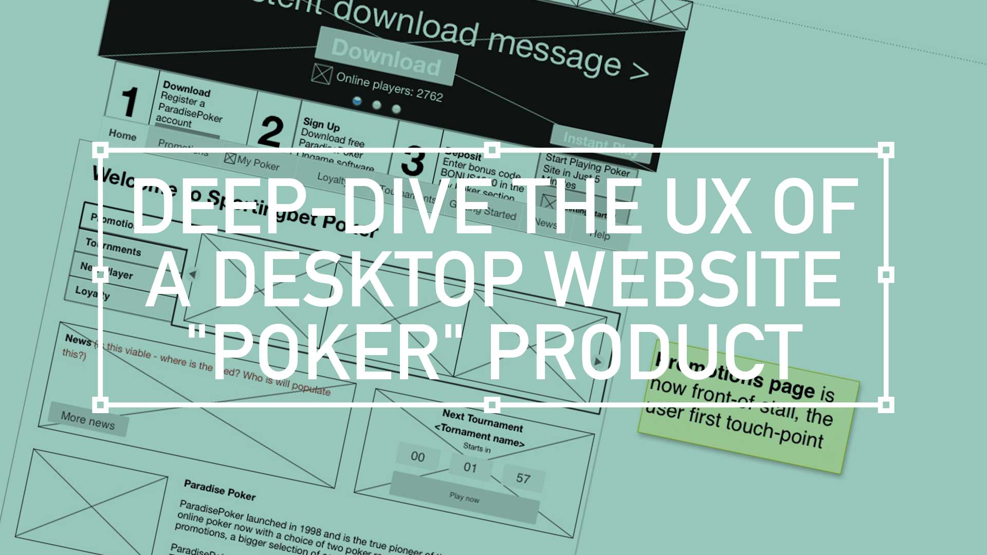
TL;DR; UX Designer Insights for a successful poker website, from app download, image selection, colour palette, with an emphasises on customer engagement.
Discover how Secure wallet features and VIP schemes can benefit from strong UX.
Sports betting thrills, but trust is the ultimate winner
Sports gambling is where the big bucks is, but in order to build faith, a potential customer must feel they can trust their next gaming experience with a site that provide the complete package. That includes Poker.
Welcome
download
trust
speed
stability
The immediate nature of a downloadable client remains as attractive as ever. With trust already established, the immersive focus for this type of UX is understood.
With an emphasises on speed and stability, this a high-stakes, real-time environment needs strong Home.

I have recently designed a best-in-class poker website. These are my top three take-outs
ABC to designing poker sites
A is for App Download
Registration
Deposit
Bet PlacemenT
superior speed
immersion

Functionality and the premier experience is still reserved for the desktop clients. To reinforce that, new users are encouraged to download the client app fro the full experience. So push, push and push that message, and using a high contrast colour palette.
B is for “Browse before buying”
Try before you buy
Growth

The poker playing public want to push their noses against the glass of your playing experience before they buy. So don’t force them to log in before they can download. ‘Try before you buy’ to push conversion, and grow the user base..
C is for “Choose the right image”
Inside the industry, Poker Managers try to avoid clichés: images with Aces and nice ladies are a no-no (within reason!). Image selection is always a challenge, playing cards must relate to the worlds most favourite poker game i.e. Texas Hold´em, must show two complete cards per play only. Visual element(s) connecting the product are important, background colour or patterns, headline/text styles and elements derived from logo all demonstrate creativity. Moving onto the UI, always try and add some “joy” for the eye and focus on readability.

My top three take-outs
Brand stand out
Bonuses
promotions
repeat offers
balances
Deposits
Bold contrast, no pale hues

Branding is crucial, so don’t build your poker website on pale hues to maintain brand consistency.
Charcoal, black and super black is your palette of choice.
Fresh content

Bonuses and promotions are the golden ticket to attracting and retaining players. But a static UI can quickly become stale.
Design a dynamic user interface that seamlessly integrates ever-changing bonuses and cash giveaways, keeping your poker platform fresh and engaging, and your players coming back for more.
Shared wallet

Ease of use and increased customer satisfaction should drive the transactional element of any poker site. Building loyalty through repeat offers that provide sticky sessions is also key.
A simple cashiering process; Checking balances and Making deposits should be a breeze and should not take players away from their current tables. Access to chips while on the table is a priority.
Conclusion
The idea of the homepage or lobby is to get players into the game. It should be simple, with multiple paths to register or log in or download the client application. The lobby should be your information hub. This default screen should be customisable either my regulatory domain or be platform specific.
Favourites can become a valuable UX tool here. It is proven that between games, the key driver to keeping customers engaged is Chat and Buddy Lists functionality.
As search is an amazing enabler, Tournaments should be searchable. An advanced level search should display an option to discover tournaments by By Name, By Buy-In Amount and Prize. Filter for Start Date and time and finally by start window (i.e. within 24 hours)
And don’t forget, users expect;
- Amazing customer support
- Secure wallet (including Deposit and Withdraw)
- Excellent VIP schemes

Pique’d your interest?
This is but part of a selection of design information russellwebbdesign generated for the creative community out there. Please contact me further to discuss how your brand can benefit from the new channel: info@russellwebbdesign.co.uk
If something has peaked your interest. Please leave a comment below.

Comments
One response to “Desktop Poker product”
RT @russellwebb: My ABC on the UX for your desktop website “Poker” product: Sports gambling is where the big bucks is… #UX #poker https:/…