<add summary>
How mobile payments will change your life
“A day in the life”
A day in the life for a modern consumer living their life through advanced mobile functionality experiences.
Check out my latest Case Study
<add summary>
A day in the life for a modern consumer living their life through advanced mobile functionality experiences.
TLDR: <add summary>

As a UXer,the agile concept, the Definition of Done (DoD). But how does it affect me is another question. Recently I have been invited to a couple of chats while looking at potential career opportunities, in one of them, one Dev Lead was interested in my DoD – so after, I decided I’d research, from a UX perspective, if this was something I should know as many projects fails because ‘done’ is poorly defined.
(more…)
Whether you are working in publishing, UI or advertising, the fundamental ideas (which may overlap) about the practice of good ‘layout’ composition will always form the basic structure of your design. The elements form the ‘vocabulary‘ of the design, while the principles constitute the broader aspects of its composition. Here I have compiled a second set of loose design principles that all revolve around the fundamentals of layout graphic design.
This is Part 2 of a 2-Part series: To jump back to the first part please click here

Patterns always been a safe bet for the design arsenal. Repetitive shapes form the back bone of effective graphic design
TLDR: Photoshop, the designers ‘must-have’ is such a flexible tool that there are many ways to set up your workflow.
After some 20 years I have found these two to be the most efficient, most transferable within a team, and most manageable i.e. avoiding the dreaded spinning-wheel-of-death

Fickle as clients can be, I’ve come to realise that there will always be amendments. Version after version, where the client/stakeholder/CEO wanna-be-designer suggests colours or positioning changes. Simply switching on/off layers and groups and saving as a state was an ingenious ideas by Adobe. Big pat on the back.

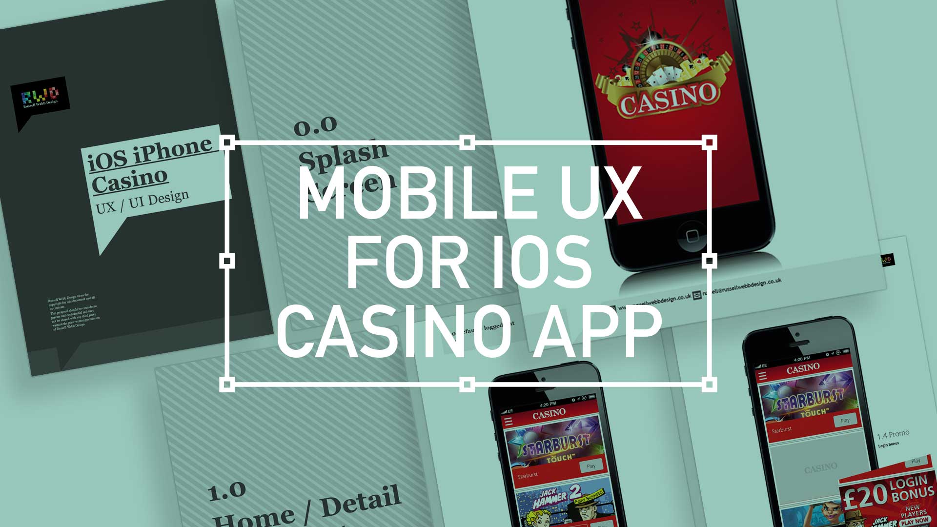
TL;DR; While the gambling industry continues to boom despite global financial woes, a reliance solely on branding through splash screens has its limitations. This post dives into why your home screen deserves more attention. Showcase promortaionl content, search (as navigation maybe?) and Quick Links as crucial building blocks, including introducing the popular hamburger icon for primary navigation and transform your home screen into landing page(s) into a powerhouse of usability and brand identity.
Next to essentials like food and water, one of the only other industries not effected by the world financial situation is gambling. In fact the industry is booming. There are many UX challenges in designing the perfect game play experience, catering for the green fingered punter all the way through to the seasoned veteran is a difficult balancing act.
Plus, as mentioned, in these more straighten times, to be conscious of not forcing the gambling experience on to the more vulnerable.
Modern smartphone don’t need 2-3 seconds to start up, so the original notion of the start-up or splash screen is now redundant. But brands love to position their logo ‘front of stall’ so for this reason, this screen is important. Keep it simple and remember, if you can’t get your brand message over in 2-3 seconds, think about a re-design.
This is the heart of the application, the place to show off what you have to offer – the ‘showcase‘ if you like. So make it impressive, make it big and try your best to impress.
(more…)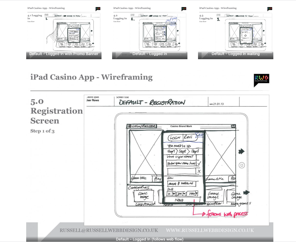
TLDR: Focusing on planning functionality and layout without design is the most efficient way of concentrating decision markers (especially business or product-owners) to agree on functionality without distraction. Think: function over form.
Personally I love to use traditional pen and paper for wireframing. How about you?
This is the main ‘shop window’ to your experience. On first launch, the user to launched in the gambling casino world. Pre-selected games adopt the ‘parallax scrolling’ technique and occupy the prime real estate. There is also functionality to drill down via category types. Account Management and Help are all ‘front-of-store’, as is the ability to push sign up and login promotions.
