TL;DR; As a guided experience for new users simplifying your onboarding to prevent that overwhelmed feeling.
Simplify your Onboarding; A UX Guide
Getting new sign-ups is arguable the ultimate challenge, but the process of helping people get started, called on-boarding, can prevent many users from feeling lost, overwhelmed, and confused. It’s your responsibility, as a professional UXer, to shake their hand and show them the ropes and take them on that ‘first date’.
The Do’s and Don’ts
Downloading and jumping straight into an experience you’ve just heard about is one of the most exciting parts of UX design.
When formulating this, be conscious not build further barriers as part of the on-boarding. The ‘Skip’ or ‘Tell me later’ and continuous Swipe is an important tool.
The power of UX onboarding animations
These delightful little movements and interactions that guide you through a new app are more than just eye candy. They pack a powerful punch, inject a dose of dynamism and sparking curiosity. For gambling creating a sense of anticipation and excitement is the go-to. Not only do they guide users intuitively, acting like friendly tour guides, they can also simplify the complex telling mini-stories that explain the app’s value proposition.
So, when creating these memorable experiences and building brand perception, designing quality micro animations will not only encourage users to come back for more, they will make the onboarding process more human and less robotic.

Make It Familiar

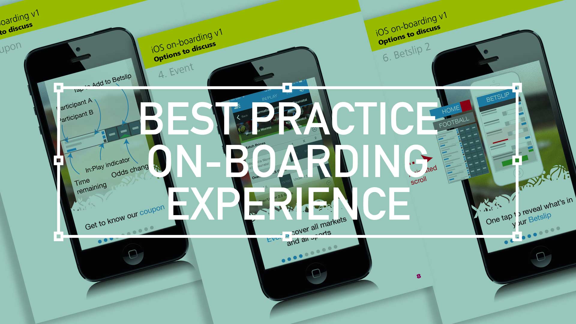
On first launch, this example allows the user to swipe through a series and graphical-orientated visualisations on what the App (or website) can actually do. Here the visi’s drills down on what and how the betslip works. You can imagine your customer finding this themselves, and there would a magical “sense of discovery” – but that moment isn’t guaranteed.
Be brief with effective copy

You should create and introductory experience that is easy to use, easy to learn, and easy to find – and keep it quick. Don’t assume you innately understand the needs of your new customers – so what you are second guessing they should know about your website or App, they may not want to know or even care.
On-boarding Styles and Patterns
This project, as with many Agile projects, had it’s quick wins. There is always a balancing act between the quality of the experience and cost in development time.
Simple overlay
This solution would be at the value end of the spectrum, a simple transparent overlay visually indicating what functionality is where.
Swipe through journey
As illustrated below, the familiar swipe through on-boarding process can be both engaging and useful. But the pay-off is increased development time and therefore more cost.
Appropriate UI

Drop down options or side drawers loaded with information and even images (modern drop downs often aren’t based on an actual UI drop down controls) is fast becoming the norm. Here, it is ‘best practice’ is use simple and bold graphics as opposed to screen grabs and this is a quicker method of communicating a concept.
Serve up what is important
The aim here is to produce cleaner screens because secondary elements are “hidden” in corners and edges. The “hidden” element here is access to all other sports. Some users only access the top three sports, therefore hiding the gateways to lesser known and sports with fewer betting opportunities is a useful UX trick.

Takeaways
The point of on-boarding is to give users the tools they need to benefit from your website or app. Spell it out as much as is needed while still being succinct.
Progress/ Swipe indicators; The longer the on-boarding process, the more necessary it is to show that the end is in sight – are a great way of doing this.
“Skip” and/or “Tell me later”; Test concepts with and swipe features to keep the process engaging yet not obstructive. Allow users a “sense of discovery” without making them feel lost with easy-to-digest content.
Transparent overlays; Interactive swipe – Use modals and bold and stylised UI snippets over actual screenshots.
Final Thought
- And finally, think back to that first date metaphor. You want them to tell their friends what a good time they had. Make your on-boarding experience as fun as possible and convert your new users into advocates of your product

Pique’d your interest?
This is but part of a selection of design information russellwebbdesign generated for the creative community out there. Please contact me further to discuss how your brand can benefit from the new channel: info@russellwebbdesign.co.uk
If something has peaked your interest. Please leave a comment below.
russellwebbdesign ©2014


Comments
One response to “Best practice for your on-boarding experience”
[…] brands are looking for that intelligent designer who can justify their decisions based on best practice, current trends and, unfortunately, office […]