TL;DR; Ask the right questions when requesting personal information. Advocate a staged registration process, comparing it to dating, and encourages keeping the registration form simple. Additionally, highlighting the significance of minimising the drop-off rate during the registration process and incorporating fun elements into the user experience.
The art of the frictionless registration
There are key considerations when it comes to asking strangers for their personal details. You have to ask the right way – to make each question relevant and necessary. You wouldn’t launch into your life story right away, so why assault them with a clunky, intimidating registration form? Remember to enhance your brand at every gateway; Positive UX will contribute to a positive brand perception

Fancy a date?
Recently, it has become ‘on trend’ to stage a registration process. This has many advantages. Instead of bombarding users with a never-ending questionnaire, break it down into digestible steps. Think of it as a thrilling adventure: each step reveals a bit more, culminating in a beautiful partnership. It’s like going on a date, first you ask the basics, then you subtly position yourself to let your date talk about themselves. Easy!
Let them reveal something about themselves. For example, if you can quickly get their email address and their name (and possibly their phone number) you can allow a potential customer to navigate around your site. Then if they want to add more value, i.e. book a flight, place a bet or purchase a product, then you move onto the next stage (of the registration process). That way they can measure the reward.
A staged registration process
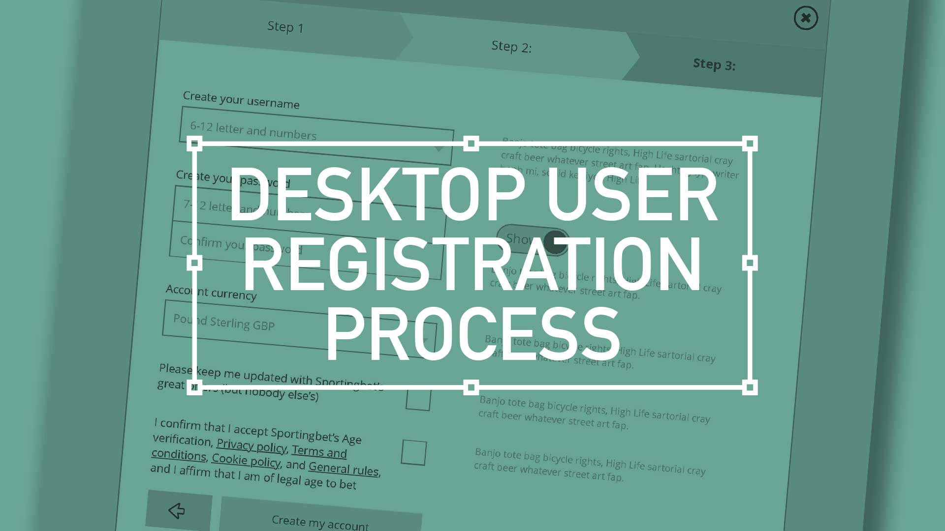
Step 1-3; A quick view


Step 1 – Say Hello
Cognitive load and anxiety
Step 2 – Tell us some more about you
Progress and Motivation
Step 3 – Here is a free account
Tech to the Rescue
Break the mould
As always, as you are designing the form(s), think Keeping It Simple Stupid (KISS), at all stages of the registration process. Keep asking the important questions;
- Do customers doesn’t need a username different from their email address?
- Why do I need them to type their password twice?
- If I default the Show Password option they can see what they are typing.
- Why would you new customers populate the wrong address if there is a benefit for them to use the right one?
(Postcode lookup is great if you have the backend database hooked up, and you are in a partner country)
Watch the Exit Door
All the stats point to increased drop-off if the benefits don’t outweigh the effort. If Registration is akin to pulling teeth, and if the process is unnecessarily long and drawn out – people will abandon your finely crafted flow. Some processes are strict and controlled on purpose, PCI compliance dominates when financials are involved and sometimes a UX designer has to dive a little deeper into. Still try and do it gracefully and intelligently – does the customer need to set their currency at sign up? Same for display preferences. Park all that unnecessary stuff in Account Settings, they can do it later.
Ask the right questions
The nuts and bolts of strong UX desktop registration


A bit more hand-holding
And finally, if you adopt the philosophy that all things on the web should, and could be fun, try and roll that out here, with your registration form. I don’t have all the answers, but maybe include some fun in your error messages, or as you gather momentum through the process is there an opportunity to add humour through bespoke ‘Please wait’ animations. It turns a chore into a charming experience
Your desktop registration process is the gateway to a beautiful relationship with your users. Make it smooth, delightful, and full of potential. They’ll thank you for it (and keep coming back for more).

Pique’d your interest?
This is but part of a selection of design information russellwebbdesign generated for the creative community out there. Please contact me further to discuss how your brand can benefit from the new channel: info@russellwebbdesign.co.uk
If something has peaked your interest. Please leave a comment below.